How to Pull Off a Tilt Shift Effect With Webkit CSS Filters
Thanks to mobile image editing apps like Instagram, the faux tilt shift fad seems to be at its height. But why should we let iPhones have all the fun? Let’s bust out a tilt shift effect using pure CSS.
In this tutorial, we’ll learn all about the new CSS filters in Webkit and how to implement an image mask in CSS. We’ll then use these techniques for our final tilt shift effect. We’re going to hit on all kinds of crazy stuff so read on and we’ll have some fun.
Sneak Peek
Want to see what we’re building? Jump ahead and look at the demo, then come back and see how to do this yourself.
Demo: Click here to launch.
Meet Webkit Filters
Over the past few years, CSS has been ever so slowly taking over the areas that we used to turn to Photoshop for: gradients, rounded corners, shadows, etc. Recently, Webkit took a big leap forward in this area with the introduction of CSS image filters.
What if you could alter the saturation, contrast or even blur of an image using pure CSS? The possibilities would be awesome. Prepare yourself, because you can do exactly that with a quick line of code.
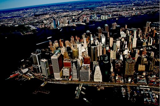
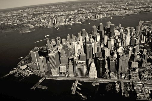
Starter Image
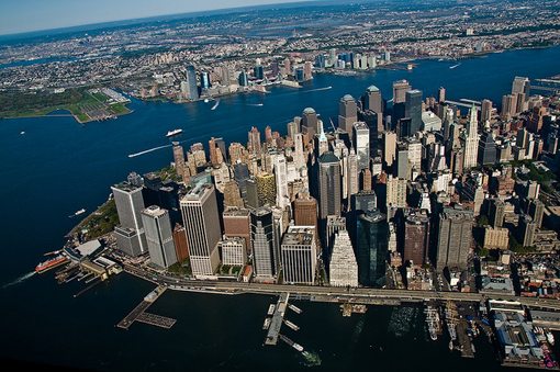
We’ll need an image to show off all of the techniques that we’re going to play with, so I grabbed the New York aerial shot below from photographer Nathan Siemers.
Brightness
Brightness can either accept a percentage (10%) or a decimal (0.1). Zero equals normal brightness so 5% increases the brightness and -5% actually darkens the image.
/*Brightness*/
-webkit-filter: brightness(-5%);
Blur
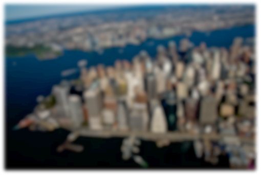
The blur filter accepts a pixel value similar to the blur on a box-shadow. The higher the pixel value, the heavier the blur.
/*Blur*/
-webkit-filter: blur(5px);
Contrast
Contrast accepts a percentage based value. 100% is normal, anything above that adds contrast, anything below decreases contrast.
/*Contrast*/
-webkit-filter: contrast(130%);
Grayscale
Grayscale allows you to gradually desaturate an image with percentages. 0% is full color, 100% is grayscale. The example below shows our image at 50%.
/*Grayscale*/
-webkit-filter: grayscale(50%);
Hue Rotate
Hue rotate allows you to shift the hue through the metaphor of a color wheel. You adjust the rotation in degrees with zero being the normal, non-adjusted value.
/*Hue Rotate*/
-webkit-filter: hue-rotate(30deg);
Invert
Does exactly what it sounds like it does, accepts a percentage from zero (default) to 100%;
/*Invert*/
-webkit-filter: invert(100%);
Sepia
Black and white not doing it for you? Add some age with the Sepia filter. Zero percent contains none of the effect, 100% is full power.
/*Sepia*/
-webkit-filter: sepia(100%);
Browser Support
Currently, there’s not much support for CSS3 filters. According to CanIUse, they should work in Chrome, Safari 6, iOS Safari 6, and Blackberry Browser 10. All of these require the “-webkit” prefix, but to future proof it, you may want to add the others:
-webkit-filter: grayscale(50%);
   -moz-filter: grayscale(50%);
    -ms-filter: grayscale(50%);
     -o-filter: grayscale(50%);
        filter: grayscale(50%);
Step 1: Tilt Shift HTML
Now that we know which CSS filters are available to us, we can begin building our tilt shift demo. To begin, lay out the following HTML in your favorite code editor:
<div class="tiltshift">
  <img src="city.jpg" alt="nyc">
</div>
Basically, just throw the city image that we’ve been using inside of a “tiltshift” div. That’s all the HTML that we need, let’s move onto the CSS.
Step 2: Basic CSS
Now let’s throw down some basic CSS to make the page look nice. We’ll give the background a dark gray color, center the image and give it a basic polaroid effect (drop shadow and thick white border).
body {
  background: #222;
}

img {
  height: 425px;
  width: 640px;
}

.tiltshift {
  background: url(city.jpg);
  height: 425px;
  width: 640px;
  margin: 30px auto;
  border: 10px solid #fff;

  -webkit-box-shadow: 5px 5px 10px rgba(0,0,0,0.8);
          box-shadow: 5px 5px 10px rgba(0,0,0,0.8);
}
The most interesting thing happening here is that I applied a redundant background image (it’s the same as the one we inserted via HTML). Basically, this will have the effect of stacking the HTML version of the image on top of the CSS version. This will allow us to manipulate them separately.
Step 3: Blur the Top Image
Now that we’ve got our foundation set, let’s jump back to the image rule to add in a blur and grayscale effect. Use a 2px blur and a 100% grayscale value.
img {
  height: 425px;
  width: 640px;
  -webkit-filter: blur(2px) grayscale(100%);
}
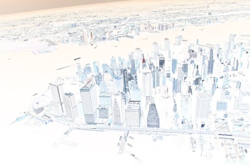
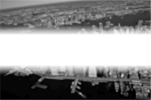
Step 4: Mask Out the Effect
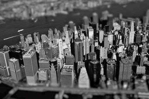
CSS filters are super easy to implement. The trickiest part of pulling off a tilt shift effect isn’t the blur, it’s only blurring part of the image. How do we do this?
Now that our top image is blurred and our bottom one isn’t, we can mask out the portions of the top image that we want to be sharp. This will give the illusion that the image goes from blurry, to sharp and back to blurry. To do this, we need to turn to another -webkit property: mask-image.
img {
  height: 425px;
  width: 640px;
  -webkit-filter: blur(2px) grayscale(100%);
  -webkit-mask-box-image: -webkit-linear-gradient(black 25%, transparent 35%, transparent 65%, black 75%);
}
With mask-image, we can build a gradient that will serve as a mask, just like in Photoshop. The black portions represent where the blurry image is fully visible and the transparent portions represent where the blurry image is invisible, allowing the sharp image to show through.
Given the code above, here’s what the top image will look like:
Step 5: Make the Bottom Image Grayscale
To finish off, make sure you go back and add the grayscale filter to the bottom image so the two match.
.tiltshift {
  background: url(city.jpg);
  height: 425px;
  width: 640px;
  margin: 30px auto;
  border: 10px solid #fff;

  -webkit-filter: grayscale(100%);
  -webkit-box-shadow: 5px 5px 10px rgba(0,0,0,0.8);
          box-shadow: 5px 5px 10px rgba(0,0,0,0.8);
}
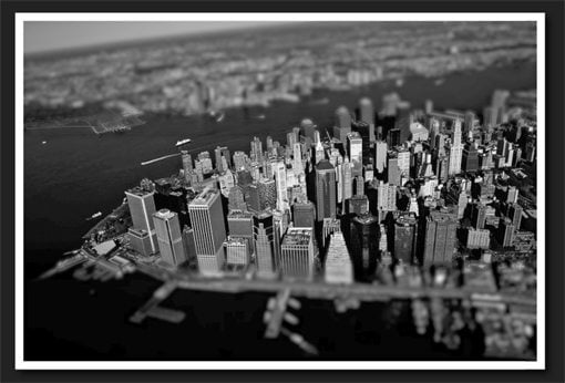
See It In Action
That’s all there is to it! We now have a nice little pure CSS tilt shift effect. Check out the live version in the demo below.
Demo: Click here to launch.
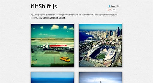
tiltShift.js
Talented developers Noel Tock and Adam Yanalunas have created an easy to use jQuery plugin that helps you use CSS filters to create a similar tilt shift effect. Download tiltShift.js and give it a shot.
Conclusion: Why Bother?
Tutorials like this always raise a big question: should we be using Webkit only properties in professional development workflows? The answer is always the same: no. This is an experiment, a fun way to learn about the possibilities for the future of CSS. One day, CSS filters could be a standard feature. For now, they’re just an idea.
The sad thing is that so many developers completely write off things like this until they’ve reached a more official status. As a member of the web development community, you should try out potential new features to see how they’re being implemented and be vocal about your opinion. Even if you feel like you’re an unimportant voice, remember that your opinion does matter and that you’re part of a larger whole that can and does affect the future of the web.
On that note, what do you think of CSS filters? Leave a comment below and let me know. I personally think they’re a blast and could lead to a lot of cool projects. Should all of this really be done with CSS though? You tell me.