Cycle Through Client Quotes With CSS Keyframes
Client testimonials are a popular website feature. They bring credibility to a company and instill a sense of trust. If your other clients love you so much, I might too!
As a fun experiment, today we’re going to set out to build a cool little quote section that will rotate between multiple different quotes using only CSS. Along the way, we’ll learn all about how to plan and create multi-step keyframe sequences. Let’s get started.
The HTML
To start this project, we need to decide on the structure of our quote. Typically, a client quote will have three pieces of text: the client’s name, where they’re from and what they said.
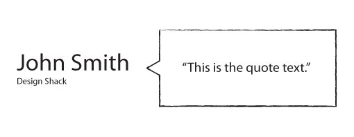
With this in mind, we can create a quote container that has three different pieces. The header will hold the client’s name, the small element will presumably hold the name of the company the client is from or some other related information, and the paragraph with hold the quote text.
<div class="quote">
  <h3>John Smith</h3>
  <small>Design Shack</small>
  <p>"This is the quote text."</p>
</div>
Because we used three different elements, we won’t need any additional hooks and should be able to easily target each piece of the quote in our CSS. As a side note, I arbitrarily chose an h3 here simply because h1 and h2 are typically used up for other purposes. Feel free to change this to whatever you like.
Now that we have our structure figured out, it’s time to expand it into three different quotes. To showcase the versatility of this project, I decided to fill my text with the last words of a few famous people. A little morbid, but as a placeholder it’ll do!
<div class="container">
  <div class="quote">
    <h3>Emily Dickinson</h3>
    <small>1830-1886</small>
    <p>"The fog is rising..."</p>
  </div>

  <div class="quote">
    <h3>Oscar Wilde</h3>
    <small>1854-1900</small>
    <p>"And now, I am dying beyond my means."</p>
  </div>

  <div class="quote">
    <h3>Thomas Edison</h3>
    <small>1847-1931</small>
    <p>"It is very beautiful over there."</p>
  </div>
</div>
Starter CSS
Once you have your HTML worked out, jump over to your CSS and enter something similar to the code below. Basically, I set an interesting background pattern and defined the container that will hold the quotes.
* {margin: 0; padding: 0;}

body {
  background: url('dark_geometric.png'); /*http://subtlepatterns.com/?p=1045*/
}

.container {
  height: 210px;
  width: 940px;
  margin: 0 auto;
  position: relative;
}
Quote Styles
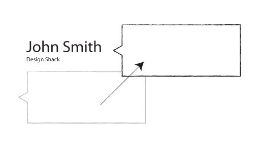
Next it’s time to style the quote divs. I used absolute positioning here so that all three quotes will occupy the same space. By default, they’ll create a vertical stack but we don’t want that at all. In our finished product, one quote will fade out, then another will fade in. Consequently, we’ll want them to be in the same spot.
I also set the opacity to zero so that all of the quotes will be hidden by default. Opacity is a quirky property that’s really a headache to work with. We’ll talk about this a little more later. The thing to note now is that, you won’t see anything with the opacity at zero so you’ll want to temporarily comment this part out while you style the quote section.
.quote {
  position: absolute;
  margin: 70px 30px;
  height: 80px;
  top: 0px;

  opacity: 0;
  -moz-opacity: 0;
  filter:alpha(opacity=0);
}
Quote Text Styles
Now that we have the general quote container styled, it’s time to grab each piece of text and style it individually. For this demo, we’ll make the text nice and big so set the h3 to 55px and the small to 18px, then use Helvetica for the font-family.
.quote h3 {
  font: 300 55px/1.2 "HelveticaNeue-Light", "Helvetica Neue Light", "Helvetica Neue", Helvetica, Arial, sans-serif;
  color: #fff;
}

.quote small {
  font: 300 18px/1.0 "HelveticaNeue-Light", "Helvetica Neue Light", "Helvetica Neue", Helvetica, Arial, sans-serif;
  color: #fff;
}
Our task with the paragraph is much more complex. Not only do we need to style it into a box, we need to remove it from the stack and stick it to the right of the other content.
To make this happen, we need to do a number of things so I’ve divided my styles for this into three different steps (shown below).
.quote p {
  background: #fff;
  font: italic 25px/1.5 Helvetica, sans-serif;
  text-align: center;

  position: absolute;
  left: 450px; top: -15px;
  padding: 30px;
  width: 400px;

  -webkit-border-radius: 5px;
  -moz-border-radius: 5px;
  border-radius: 5px;

}
For the first step, I handled the “icing” or standard visual stuff. I made the background white, set the font and aligned the text to the center. Next I handled the positioning and size of the actual box through the use of some padding and absolute positioning. I finished this all off with an optional border-radius, which rounds our corners off nicely.
Progress Check
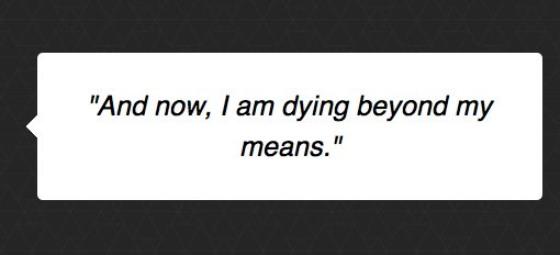
If we check on our progress by making sure one quote is visible, we’re looking pretty good! However, our quote is sitting in a plain old box. We’re missing the little triangle that makes it look like a speech bubble.

Adding the Triangle
To add in that little triangle, we have to turn to the :after pseudo element. Basically, we create an empty element, position it to the left side, and apply some tricky border voodoo.
.quote p:after {
  content: "";
  height: 0;
  width: 0;
  position: absolute;
  right: 100%;
  top: 50%;
  margin-top: -10px;
  border: solid transparent;
  border-right-color: #fff;
  border-width: 10px;
}
As you can see, that gives us the effect that we’re going for, pretty neat eh?
Animate That Sucka
Now that we’ve got our visual styling and positioning figured out, it’s time to come up with a way to fade out one quote and pop in another and repeat this process on an infinite loop. We could and should use jQuery, but today we’re trying to figure it out with pure CSS so we’ll turn to keyframe animations.
I’m going to be brutally honest here, I do this type of stuff almost every day and it still took me forever to figure out the proper sequence to use to make the keyframes fade in and out at the right time. I fiddled and fiddled and kept having awkward overlaps and results that weren’t at all what I wanted.
I tell you this so you know that you’re not alone if you still find yourself hitting walls that are difficult to overcome. Eventually, I did get my slow brain to wrap around the concept though.
I’m a visual thinker so I made a crude chart to see how it all works. Basically we want to stack these animations so that only one quote is visible at any given time. To pull this off, we’ll put create a thirty second animation and split it into three parts. The first and last parts will have an opacity of zero and the second part will have an opacity of one.
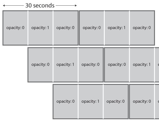
As you can see, we’ll need to delay the second animation’s start time by ten seconds and the third animation’s start time by twenty seconds. This way, if you draw a vertical line at any point of the chart, no more than one quote is showing at the same time.
Now, when I implemented this, I didn’t like how long it took the quotes to fade in and out. I want a quick fade in, a long period of visibility and a quick fade out. To do this we simply need to add a couple of more keyframes. Here’s the sequence I came up with:
@-webkit-keyframes "quoteshift" {
 0% {
   opacity: 0;
 }
 2% {
   opacity: 1;
 }
 31% {
   opacity: 1;
 }
 33% {
   opacity: 0;
 }
 100% {
   opacity: 0;
 }
}
We only need to set up the one sequence, but we apply it to the three separate quotes in three different ways. Basically, the only difference is the delay value, which makes the animation wait a few seconds before beginning.
.quote:nth-child(1) {
  -webkit-animation: quoteshift 30s 0s infinite linear;
}

.quote:nth-child(2) {
  -webkit-animation: quoteshift 30s 10s infinite linear;
}

.quote:nth-child(3) {
  -webkit-animation: quoteshift 30s 20s infinite linear;
}
That’s all there is to it! When the page loads, the first quote will fade in, then fade out as the second quote comes in (and so on).
Browser Compatibility
At this point you’re probably screaming at your computer screen that I’m an idiot who only uses Webkit prefixes. In truth, I only did this to keep things understandable. Now that we’ve got it all figured out, we can use our good old friend Prefixr to expand it out. When we do this, here’s the giant chunk of code that gets spit out:
/*QUOTE ANIMATION*/
.quote:nth-child(1) {
  -webkit-animation: quoteshift 30s 0s infinite linear;
  -moz-animation: quoteshift 30s 0s infinite linear;
  -ms-animation: quoteshift 30s 0s infinite linear;
  -o-animation: quoteshift 30s 0s infinite linear;
  animation: quoteshift 30s 0s infinite linear;
}

.quote:nth-child(2) {
  -webkit-animation: quoteshift 30s 10s infinite linear;
  -moz-animation: quoteshift 30s 10s infinite linear;
  -ms-animation: quoteshift 30s 10s infinite linear;
  -o-animation: quoteshift 30s 10s infinite linear;
  animation: quoteshift 30s 10s infinite linear;
}

.quote:nth-child(3) {
  -webkit-animation: quoteshift 30s 20s infinite linear;
  -moz-animation: quoteshift 30s 20s infinite linear;
  -ms-animation: quoteshift 30s 20s infinite linear;
  -o-animation: quoteshift 30s 20s infinite linear;
  animation: quoteshift 30s 20s infinite linear;
}

/*KEYFRAMES*/
@keyframes "quoteshift" {
 0% {
    -ms-filter: "progid:DXImageTransform.Microsoft.Alpha(Opacity=0)";
    filter: alpha(opacity=0);
    opacity: 0;
 }
 2% {
    -ms-filter: "progid:DXImageTransform.Microsoft.Alpha(Opacity=100)";
    filter: alpha(opacity=100);
    opacity: 1;
 }
 31% {
    -ms-filter: "progid:DXImageTransform.Microsoft.Alpha(Opacity=100)";
    filter: alpha(opacity=100);
    opacity: 1;
 }
 33% {
    -ms-filter: "progid:DXImageTransform.Microsoft.Alpha(Opacity=0)";
    filter: alpha(opacity=0);
    opacity: 0;
 }
 100% {
    -ms-filter: "progid:DXImageTransform.Microsoft.Alpha(Opacity=0)";
    filter: alpha(opacity=0);
    opacity: 0;
 }

}

@-moz-keyframes quoteshift {
 0% {
   filter: alpha(opacity=0);
   opacity: 0;
 }
 2% {
   filter: alpha(opacity=100);
   opacity: 1;
 }
 31% {
   filter: alpha(opacity=100);
   opacity: 1;
 }
 33% {
   filter: alpha(opacity=0);
   opacity: 0;
 }
 100% {
   filter: alpha(opacity=0);
   opacity: 0;
 }

}

@-webkit-keyframes "quoteshift" {
 0% {
   filter: alpha(opacity=0);
   opacity: 0;
 }
 2% {
   filter: alpha(opacity=100);
   opacity: 1;
 }
 31% {
   filter: alpha(opacity=100);
   opacity: 1;
 }
 33% {
   filter: alpha(opacity=0);
   opacity: 0;
 }
 100% {
   filter: alpha(opacity=0);
   opacity: 0;
 }

}

@-ms-keyframes "quoteshift" {
 0% {
   -ms-filter: "progid:DXImageTransform.Microsoft.Alpha(Opacity=0)";
   filter: alpha(opacity=0);
   opacity: 0;
 }
 2% {
   -ms-filter: "progid:DXImageTransform.Microsoft.Alpha(Opacity=100)";
   filter: alpha(opacity=100);
   opacity: 1;
 }
 31% {
   -ms-filter: "progid:DXImageTransform.Microsoft.Alpha(Opacity=100)";
   filter: alpha(opacity=100);
   opacity: 1;
 }
 33% {
   -ms-filter: "progid:DXImageTransform.Microsoft.Alpha(Opacity=0)";
   filter: alpha(opacity=0);
   opacity: 0;
 }
 100% {
   -ms-filter: "progid:DXImageTransform.Microsoft.Alpha(Opacity=0)";
   filter: alpha(opacity=0);
   opacity: 0;
 }

}

@-o-keyframes "quoteshift" {
 0% {
   filter: alpha(opacity=0);
   opacity: 0;
 }
 2% {
   filter: alpha(opacity=100);
   opacity: 1;
 }
 31% {
   filter: alpha(opacity=100);
   opacity: 1;
 }
 33% {
   filter: alpha(opacity=0);
   opacity: 0;
 }
 100% {
   filter: alpha(opacity=0);
   opacity: 0;
 }

}
As I mentioned before, our use of the opacity property is a little suspect because opacity support is a mess. Fortunately, Prefixr takes the lead on this and tries to ensure that our code is primed to work on as many browsers as possible. Unfortunately, it does go a little overboard by inserting all of those filter properties where they aren’t necessarily needed, so some clean up might be a good idea.
Selectivizr
We used some advanced selectors in the tutorial, so while we’re on the topic of browser support, I should point out that you’ll need to add Selectivizr and jQuery to your project to make sure older browser understand these.
Keyframe Support
Here’s the kicker, we’ve gone through all of this to make sure that we’ve maxed out our browser support on selectors and opacity, but in the end IE is still going to refuse to play along because there’s no keyframe support until IE 10.
Obviously, JavaScript is going to be the answer here if you’re going to use this in the real world. You can either do the whole thing in JS or simply use it as a backup for browsers that don’t support keyframes.
Demo
Here’s the live demo. Be sure to wait a while when you launch it, remember that the entire animation takes thirty seconds!
Demo: Click here to launch

Conclusion
Keyframes have come a long way since the days when they were only supported by Webkit browsers. However, keep in mind that because of our old friend IE, they’re still more in the realm of “fun to play with” than something you should bank on for important projects.
Leave a comment below and let us know if you enjoyed this tutorial and how you would improve it!