Four Simple and Fun CSS Button Hover Effects for Beginners
Today we’re going to take a step back from advanced discussions about CSS preprocessors and return to some good old basics. We’ll work up four super simple CSS buttons, each with a unique animated hover effect.
Follow along with me and create your own fun button styles. Also feel free to grab my code and use it on your projects. If you’re a CSS newbie looking for a good way to make your buttons more interesting, this article is for you!
What We’re Building
I’ve thrown all of the buttons into one demo so you can get a quick look of everything we’ll be going over today. Click the link below to check them out!
Demo: Click here to launch.
Global Settings
Before we get started on the individual buttons, here are a few global settings that I’ve applied across all of the examples.
HTML
For experimentation purposes, I’m just using a simple link and styling it as a block element. I always get a few nasty comments about this technique, if you want to use an input, be my guest!
<a href="#" id="button2" class="buttonText">Sign Up Now</a
[/code]
</div>
</ br>
<h3>CSS</h3>
For the CSS, I simply set the font to Helvetica, made sure the text was white and turned off any default text decoration (underlines) for the links.
<div >
[code lang="css"]
.buttonText {
font: 18px/1.5 Helvetica, Arial, sans-serif;
color: #fff;
}
a {
color: #fff;
text-decoration: none;
}
Growing Button
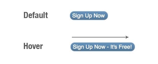
Our first button experiment is one of my favorites. Though we pretty much always expect some sort of hover effect when we mouse over a link or button on the web, we usually expect something fairly subtle so this one comes with a nice surprise: it changes its shape!
The basic idea is that you have a simple button with a message, in our example we’ll use “Sign Up Now.” Then when you hover over the button, it grows horizontally to reveal a part of the message that was originally hidden. Let’s see how this works.
Basic CSS
To start off, we just need to give our button a basic shape and color. Here I set the height to 28px and the width to 115px, added some margins and padding, and gave the button a slight border.
#button1 {
  background: #6292c2;
  border: 2px solid #eee;
  height: 28px;
  width: 115px;
  margin: 50px 0 0 50px;
  padding: 0 0 0 7px;
  overflow: hidden;
  display: block;
}
Fancy CSS3
Some people get excited when you use too much CSS on a simple button. For this reason, I’m separating out the lengthy CSS3 styles that I’ll be using. The styles in this section are completely optional and simply make the button look more modern and cool.
I started with a basic 15px border-radius to give us some nice rounded corners and then added a slight gradient overlay. The gradient starts at transparent and fades to black. This is a little trick I use to apply a quick darkening gradient that works with virtually any background color.
  /*Rounded Corners*/
  -webkit-border-radius: 15px;
  -moz-border-radius: 15px;
  border-radius: 15px;

  /*Gradient*/
  background-image: -webkit-linear-gradient(top, rgba(0, 0, 0, 0), rgba(0, 0, 0, 0.2));
  background-image: -moz-linear-gradient(top, rgba(0, 0, 0, 0), rgba(0, 0, 0, 0.2));
  background-image: -o-linear-gradient(top, rgba(0, 0, 0, 0), rgba(0, 0, 0, 0.2));
  background-image: -ms-linear-gradient(top, rgba(0, 0, 0, 0), rgba(0, 0, 0, 0.2));
  background-image: linear-gradient(top, rgba(0, 0, 0, 0), rgba(0, 0, 0, 0.2));
Animation CSS
Now it’s time to set up our CSS transition. This is fairly simple, the most annoying thing is that, like above, we have to repeat it so many dang times! Here I’ve set the animation to affect all changes, the duration to half of a second and the timing function to ease.
  /*Transition*/
  -webkit-transition: All 0.5s ease;
  -moz-transition: All 0.5s ease;
  -o-transition: All 0.5s ease;
  -ms-transition: All 0.5s ease;
  transition: All 0.5s ease;
Hover CSS
To finish it off, all we have to do is add a hover style that expands the width. I measured out 200px as a sufficient width to show the hidden text. Now hovering over the button gives you a nice smooth animation that reveals a hidden message!
#button1:hover {
  width: 200px;
}
Simple Color Shift
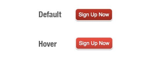
This is the simplest of all CSS button animations. It’s so simple that I hesitated to include it but because it’s a popular option I thought I’d throw it in. What happens here is that you have a background color that changes on hover, but we use a transition like the one above to gradually shift the color rather than having the change be immediate.
Basic CSS
The CSS is very similar to last time with a few notable changes. I’ve added in a different background color and changed the shape a bit. I’ve also center aligned the text and set the line-height to the vertical height of the button to center it.
#button2 {
  background: #d11717;
  border: 2px solid #eee;
  height: 38px;
  width: 125px;
  margin: 50px 0 0 50px;
  overflow: hidden;
  display: block;
  text-align: center;
  line-height: 38px;
}
Fancy CSS3
Once again, we have some completely optional visual styles. I’ve set a little less of a border-radius this go around, applied a similar background gradient and added the additional element of a box-shadow. Using rgba with the shadow, I set it to black and then reduced the transparency.
 /*Rounded Corners*/
  -webkit-border-radius: 10px;
  -moz-border-radius: 10px;
  border-radius: 10px;

  /*Gradient*/
  background-image: -webkit-linear-gradient(top, rgba(0, 0, 0, 0), rgba(0, 0, 0, 0.2));
  background-image: -moz-linear-gradient(top, rgba(0, 0, 0, 0), rgba(0, 0, 0, 0.2));
  background-image: -o-linear-gradient(top, rgba(0, 0, 0, 0), rgba(0, 0, 0, 0.2));
  background-image: -ms-linear-gradient(top, rgba(0, 0, 0, 0), rgba(0, 0, 0, 0.2));
  background-image: linear-gradient(top, rgba(0, 0, 0, 0), rgba(0, 0, 0, 0.2));

  /*Shadow*/
  -webkit-box-shadow: 0px 3px 1px rgba(0, 0, 0, 0.2);
  -moz-box-shadow: 0px 3px 1px rgba(0, 0, 0, 0.2);
  box-shadow: 0px 3px 1px rgba(0, 0, 0, 0.2);
Animation CSS
We can pretty much use the exact same transition setup that we used in the previous example:
  /*Transition*/
  -webkit-transition: All 0.5s ease;
  -moz-transition: All 0.5s ease;
  -o-transition: All 0.5s ease;
  -ms-transition: All 0.5s ease;
  transition: All 0.5s ease;
Hover CSS
To finish it off, simply apply a different background color on hover. Try choosing a slightly brighter variant of the color in Photoshop so the transition will look nice. Also check out 0to255.com for a great tool that helps you grab color variations.
#button2:hover {
  background-color: #ff3434;
}
Background Image Shift

This one is really interesting and can have dramatically different results based on your selection of background image. I’ll be using a very subtle pattern so consequently the effect will be quite subtle. Try using something bolder for a crazier final result.
Here’s the gist: you apply a background image to the button, then shift that background’s position on hover. Toss in a transition and you get a nice scrolling effect.
Basic CSS
For the most part, this is just like the previous example. However, notice that we now have a background image applied (this will repeat by default). I’ve set the initial background position to “0 0” just so you can get an idea of how this is going to work. When we set the hover styles later, we’ll simply shift this position vertically.
#button3 {
  background: #d11717 url('bkg-1.jpg');
  background-position: 0 0;
  text-shadow: 0px 2px 0px rgba(0, 0, 0, 0.3);
  font-size: 22px;
  height: 58px;
  width: 155px;
  margin: 50px 0 0 50px;
  overflow: hidden;
  display: block;
  text-align: center;
  line-height: 58px;
}
Fancy CSS
There’s nothing special here that we haven’t already gone over, just some rounded corners and a shadow.
  /*Rounded Corners*/
  -webkit-border-radius: 5px;
  -moz-border-radius: 5px;
  border-radius: 5px;

  /*Shadow*/
  -webkit-box-shadow: 0px 3px 1px rgba(0, 0, 0, 0.2);
  -moz-box-shadow: 0px 3px 1px rgba(0, 0, 0, 0.2);
  box-shadow: 0px 3px 1px rgba(0, 0, 0, 0.2);
Animation CSS
Once again we use the same snippet for our animation. This time around I upped the duration to 0.8 seconds so that it lasts a tiny bit longer.
  /*Transition*/
  -webkit-transition: All 0.8s ease;
  -moz-transition: All 0.8s ease;
  -o-transition: All 0.8s ease;
  -ms-transition: All 0.8s ease;
  transition: All 0.8s ease;
Hover CSS
Now it’s time to shift that background position. Remember that we started at “0 0”. Now we’re going to shift the image vertically by setting the second number to 150px. If we wanted to shift the horizontal position, we would change the first number.
#button3:hover {
  background-position: 0 150px;
}
3D Pressed Button
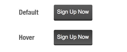
For our last trick, we’ll be mimicking a popular faux 3D button design that looks like it’s being pressed when you hover over it. This animation is so simple that we won’t even need any CSS transitions, but the end product is still a fairly nice, albeit instant, animation.
Basic CSS
Here’s the basic CSS for our last button. Notice that both this and the last example use subtle text-shadows to help the text stand out a little more.
#button4 {
  background: #5c5c5c;
  text-shadow: 0px 2px 0px rgba(0, 0, 0, 0.3);
  font-size: 22px;
  height: 58px;
  width: 155px;
  margin: 50px 0 0 50px;
  overflow: hidden;
  display: block;
  text-align: center;
  line-height: 58px;
}
Fancy CSS
This time the fancy CSS isn’t optional. If you want to achieve this effect, you’ll at least need the shadow and the gradient. The hard shadow is what gives the button the fake 3D effect. It’s not the most convincing illusion ever, but it still makes for a nice looking button.
  /*Rounded Corners*/
  -webkit-border-radius: 5px;
  -moz-border-radius: 5px;
  border-radius: 5px;

  /*Shadow*/
  -webkit-box-shadow: 0px 6px 0px rgba(0, 0, 0, 0.8);
  -moz-box-shadow: 0px 6px 0px rgba(0, 0, 0, 0.8);
  box-shadow: 0px 6px 0px rgba(0, 0, 0, 0.8);

  /*Gradient*/
  background-image: -webkit-linear-gradient(top, rgba(0, 0, 0, 0), rgba(0, 0, 0, 0.2));
  background-image: -moz-linear-gradient(top, rgba(0, 0, 0, 0), rgba(0, 0, 0, 0.2));
  background-image: -o-linear-gradient(top, rgba(0, 0, 0, 0), rgba(0, 0, 0, 0.2));
  background-image: -ms-linear-gradient(top, rgba(0, 0, 0, 0), rgba(0, 0, 0, 0.2));
  background-image: linear-gradient(top, rgba(0, 0, 0, 0), rgba(0, 0, 0, 0.2));
Hover CSS
This is our biggest chunk of hover CSS yet. Basically we reduce the length of the shadow and offset that transformation with a margin. This gives the illusion of the button being pressed. Flipping the gradient around also helps the illusion.
#button4:hover {
  margin-top: 52px;

  /*Shadow*/
  -webkit-box-shadow: 0px 4px 0px rgba(0, 0, 0, 0.8);
  -moz-box-shadow: 0px 4px 0px rgba(0, 0, 0, 0.8);
  box-shadow: 0px 4px 0px rgba(0, 0, 0, 0.8);

  /*Gradient*/
  background-image: -webkit-linear-gradient(bottom, rgba(0, 0, 0, 0), rgba(0, 0, 0, 0.4));
  background-image: -moz-linear-gradient(bottom, rgba(0, 0, 0, 0), rgba(0, 0, 0, 0.4));
  background-image: -o-linear-gradient(bottom, rgba(0, 0, 0, 0), rgba(0, 0, 0, 0.4));
  background-image: -ms-linear-gradient(bottom, rgba(0, 0, 0, 0), rgba(0, 0, 0, 0.4));
  background-image: linear-gradient(bottom, rgba(0, 0, 0, 0), rgba(0, 0, 0, 0.4));
}
Conclusion
After reading through this brief tutorial you should have an expert grip on how to implement basic CSS3 styles to make a button look nice and attractive. You should also have a decent understanding of how CSS transitions work and what it takes to make them cross-browser compatible. Finally, you should have some awesome ideas for creating cool hover effects.
Leave a comment and let me know what you think. Have you used any similar effects in the past? How would you modify or improve these examples?