Free 960.GS CSS Photography Template and Tutorial
Love it or hate it, the 960.gs makes for some incredibly fast prototyping. By utilizing preset classes you can accomplish fairly complex layouts with little to no effort.
Today we bring you a free single-page template, fully coded using the 960.gs. The template has a few nifty CSS3 effects and uses @font-face to implement some beautiful custom typography. Below you’ll find the download and a basic step-by-step tutorial for how to build your own.
You can download the template completely free of charge and use it however you like with zero attribution.
Download the Template
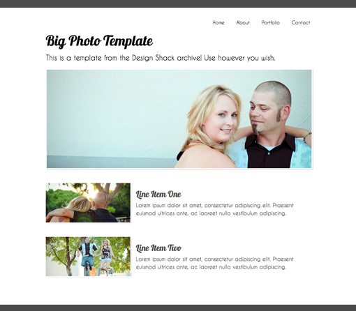
Here’s a quick preview of what the template looks like:
Download the 960.GS Resources
The first thing you’ll want to do is head over to the 960 Grid System website and click the download button at the top left of the page.
The download has a ton of stuff in it but really all we need is three CSS files: reset.css, text.css, and 960.css. These are the standard components upon which the grid system is built. The reset and text stylesheets are completely optional but we’ll use them to help ensure everything stays nice and consistent across various browsers.
The tutorial below will assume that you are fairly familiar with both CSS and 960.gs. If you need a crash course on grid systems, check out my 960 guide at Six Revisions.
Step 1: Start Your HTML and CSS Files
In addition to the CSS files that come with the 960.gs, we’ll need our own. Create a directory on your machine, throw in the files you downloaded and create an index.html file and a style.css file.
Paste the following code into your HTML to get started:
We’ve basically just linked to our various CSS files (probably way too many for a single web page but this is built to expand upon) and started the body HTML.
The design features thin gray bars at the top and bottom of the page. We want these to stretch all the way across the page so we place them outside of the 960 div.
Next, in between the header and footer is a div with a class of “container_12”. Since we’re using the the 12 column version of the 960 system this will create a div that spans most of the way across the page and is automatically centered horizontally.
Step 2: The Fonts
We’ll be using two custom non-web fonts for this project: Lobster and Caviar Dreams. Both of these can be found in the FontSquirrel @Font-Face Kit Library.
Download the kits for each font and place the various font files in your project file. In the CSS that comes with each kit you should find the @font-face code for embedding that font. Grab the snippet for each font and paste it into your stye.css file.
Using this code, we can now include these fonts in our font stacks by simply typing ‘Lobster13Regular’ or ‘CaviarDreamsRegular’.
Step 3: Header
Since we already added the header to our HTML, all we need to do make it appear is add some basic styling.
Basically all we’ve done here is given the header a height and background color.
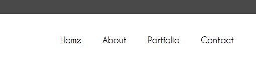
Step 4: Navigation HTML
The first thing that appears after the header is the navigation. This is a little tricky since it’s floated on the right side of the page. We could set a 960 class and then use the push command but it’s a lot easier to just not apply any class to the div and the float it right with CSS.
For the HTML we just need a standard unordered list with some links. I’ve thrown in some placeholder links here but you’ll obviously want to customize this for your own site.
Step 5: Navigation CSS
Next we need to set a whole bunch of styles for the navigation. Links, unordered lists, list items and hover effects all have to be worked out.
Notice that we’ve set the font to Caviar Dreams like we learned above and made sure that a few backups were listed in the event that the browser doesn’t load the proper font.
The strangest thing here is that we’ve used both a float left and a float right. To make the list items appear in a line instead of stacked, we have to float the “ul li” left. To make the set as a whole adhere to the right side of our container div, we floated the #nav right.
Everything else is just a bunch of basic styling such as color, font-size, etc. To differentiate the link on hover I applied a simple underline.
At this point your page should be starting to take shape. Make sure it looks close to the preview below.
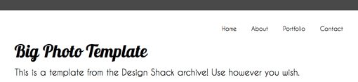
Step 6: Headline HTML
After the navigation, add in a div with an id of “headline” and a class of “grid_12”. The grid_12 class will make the width of the div equal to that of the entire container. Inside of that div place an h2 tag and a paragraph tag with some content.
Notice that after the navigation and headline divs there is a div with a class of “clear”. This is how the 960 Grid System clears previously implemented floats. Make sure you throw this in whenever you want to start a new row of content.
Step 7: Headline CSS
Next add in styles for the headline, the headline h2 tag and the headline paragraph tag. I set the h2 to 50px Lobster and the paragraph to 25px Caviar Dreams.
With that, your page should now have a top bar, a navigation area and a nice big headline.
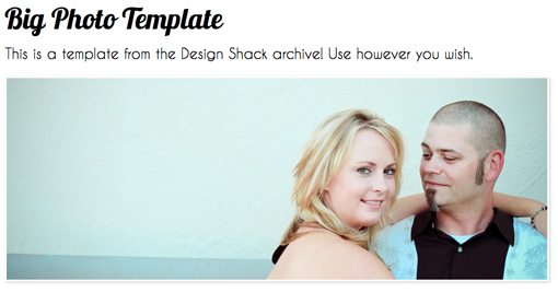
Step 8: The Big Photo HTML
To add in the photo, we’ll use an empty div with the grid_12 class and set the background using CSS.
Step 9: The Big Photo CSS
For the CSS we set a background image for the div, gave it a 3px border and applied a CSS3-box shadow. The white border wouldn’t show up on a white background so the shadow gives the image some depth.
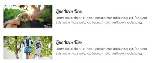
Step 10: Line Item HTML
The last piece of HTML we need is the boxes and text at the bottom of the page. We’ll style these with a class to make it easy to add more later.
To build this section we want two columns: one for the picture and one for the text next to it. This is where the 960.gs makes it easy on us. Since we’re using the 12-column version, we want our number to total twelve to stretch all the way across the container.
By applying the “grid_4” class followed by the “grid_8” class, we get two columns, the first of which is half the width of the second (8+4=12).
Notice we’ve doubled our code and inserted different pictures. This gives us two of the “lineItem” areas. Simply add another duplicate chunk to add a third or fourth.
Step 11: Line Item CSS
Next we add a bunch of styling to this area to make it look nice. Give the images a shadow and outline and apply the appropriate fonts.
Notice we’ve used “outline” instead of “border” here. This is a neat CSS trick that essentially allows you to have an image border that doesn’t screw up your layout.
When you’re finished, your line items should look awesome and will be divided into clearly defined columns.
Step 12: Footer CSS
The final step is to apply the same styles to the footer as we did to the header. This gives the site some nice heavy contrast on the bottom and top.
Final Result
That should give you a working finished product! Notice that most of our work was really in styling the objects that we placed on the page. We spent almost no time worrying about positioning. This is the main draw of grid systems like 960 and Blueprint.
We can argue semantics all day but in the end, these tools do help you focus more on design and less on layout woes. It’s likely that the more experienced you become with CSS, the less you’ll see the need to use a grid system to perform the layout for you, but until then it’s nice to have your problems solved before they even arise.
Conclusion
As is unavoidable in these types of posts, several people will no doubt leave comments bashing grid systems. The truth is, I rarely use them. However, I do see their value and I enjoy fiddling with them to see what I can come up with. Bottom line, if you don’t like 960.gs, don’t download the template!
However, if you’re comfortable with grid systems and like free stuff, download the file and tweak away! If you use it in a project throw a link below (optional) so I can check how you implemented it and extended the design. If you need a suggestion, that big photo is screaming to be turned into a jQuery slider.