Fun With Pulsing Background Colors in CSS3
Let’s finish the week with something fun shall we? CSS keyframe animations currently have very limited browser support, but they’re still quite interesting to learn about and experiment with.
Below we build a simple web page that leverages Webkit keyframe animations to gently shift the background color on a never ending loop. Intrigued? Read on!
Demo
To get a sneak peek at what we’ll be building today, click on the link below.
Live Demo: Click Here
Keyfame Animations: Still Just for Fun
With CSS3, it’s easy enough to have one color fade into another, say on a hover command. Set two different colors, toss in a transition and you’re good to go. But what if we want to have something that continually changes colors? The answer lies in keyframes.
Currently, support for keyframe animations in CSS is quite low. In fact, you can really only bank on it working in Webkit browsers like Safari and Chrome (Firefox 5 should see support as well). So the unfortunate part is that, as with many CSS3 tricks, this isn’t quite ready to use in production unless you’re fully prepared for a large number of your users missing out on the experience.
How Keyframes Work
Keyframe animations are one of the more complicated new features of CSS. In fact, it feels a bit more like programming than styling, even to the point of almost declaring a variable! Let’s do a quick and dirty run through to see how they work.
The first thing you want to do is declare the webkit keyframe block and name your animation.
As I hinted at above, your animation name is almost like a variable that you will call on later so make sure it’s both descriptive and easy to remember. For instance, for our experiment, we could use the name “colorPulse”.
Next, we fill this is with a sort of timeline for our animation. Think of it as declaring keyframes just like you would in an animation program, only here you’re using pure code. The percentages represent the state of the object at that point of the animation.
Here we are obviously animating the background-color property. At 0% the color would be red, at 50% it would be white and at 100% it would be blue. All of the tweening is done automatically so all that’s left is to apply the animation to a specific element and define the behavior. Here we apply it to a div.
As you can see, we used the name of the animation, this targets the stuff that we set up before. Next, we set the duration (10 seconds), number of iterations (infinite) and direction (alternate). The latter of these will cause the animation to run backwards and forwards: red, white, blue, white, red, white, blue, etc.
This is really just the shorthand for these declarations. You can also set them one at a time. Here’s a larger list of the animation properties that you can define:
Pulsing Website Background
Now that we have a feel for how this works, let’s take it further by building a real example. We’ll start off by styling out a basic page design and then finish by adding in our animation.
Background Color
In order to design the page, we need to choose a background color. This is an interesting task considering the project. Our goal is to create a background that pulses from one color to the next. I can’t stress enough how dangerous this is from a designer’s perspective. You’re almost doomed to create something so ugly that no one can look at it!
The best way we can approach this is from a position of subtlety. We want slow, smooth shifts that are pleasing and not jarring. If we pick colors that are too bold or bright, we’ll burn the viewers’ eyes out.
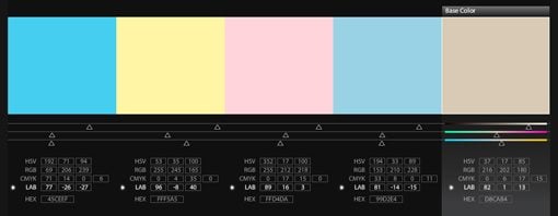
Since we just passed Easer, my mind is stuck in pastels and it occurred to me that such a palette might be perfect for this project. I fired up Kuler, searched for “pastel” and found the following palette.
These are the colors that we will use for our background. When combined with a really slow shift, it should give us a fairly mild and attractive effect.
Basic HTML
To lay the groundwork for our experiment, I created my typical cliché web design layout: a header, subhead and an image. We really don’t need much, just enough to make the page not incredibly boring.
CSS Color Pulse
Changing background colors using Webkit Keyframe animations.
[/code]
Basic CSS
Now we crack open a CSS document and add some styling to the elements we just created. Here’s what I did:
Now, this is a big chunk of code so let’s break it down a little. The first odd thing you should notice is the font: Allan. I used a Google Font for this. All you have to do for this is make sure the following snippet is in your HTML header:
The next thing that you might notice is that I used a lot of rgba values. This is an important aspect of the design. Since the background color will be constantly shifting, we have to be careful and make sure that our content looks good on all of the various colors. One easy way to do this is to add in some transparency so that the shifting background color actually affects the other colors on the page.
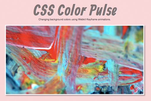
For the headline, I set the color to black at 50% opacity and applied a white text-shadow. This effectively creates a letterpress effect. Finally, I added a border and a shadow to the image. Here’s the result.
It’s admittedly a little bright here but fortunately the final effect will be less overwhelming!
Animating the Background
Now that we’ve got our design set up, let’s use what we learned before to add a keyframe animation to the background color. This can be done in one easy step using the syntax above and the colors we grabbed from Kuler.
As you can see, we place intervals at 0%, 25%, 50%, 75% and 100% so that our animation is nicely broken up. At each stop we placed a color from our Kuler palette.
Next, in addition to applying a standard background-color, which will serve as our backup, we declared the animation. Notice that I have it set to a whopping 40s. Again, since this has so much potential to be an intense animation, we want it to be very slow. In fact, I even like how it looks with the time set to double that.
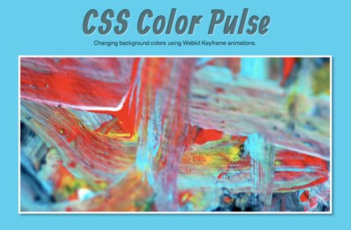
Finished Product
And once again, just in case you missed it above, here is the finished product. Notice how nice the transitions are from color to color. Since we started with a nice palette, the shifts are fairly natural and not too distracting.
Live Demo: Click Here
Conclusion
In the next few years you’ll begin to see more and more support for CSS keyframe animations. Right now they work great in Safari and Chrome, which consistently serve as a glimpse into the future of HTML and CSS, and are in line to work with Firefox as @-moz-keyframes.
The purpose of this article was to get you thinking about all of the non-traditional animations that you can create with keyframe animations. I hope you learned a thing or two and have been inspired to create your own unique applications.


