How and Why to Build Your Own Design Calculators
Design is a complex beast, web design doubly so. There’s a lot more than visual harmony and balance to consider, it’s often the case that you have to dig in and perform some real life mathematics (gasp!).
Oddly enough, I love thinking about this stuff, so much so that I actually build my own calculators rather than use the tools available from other developers. Today I’ll show you how and why to build your own design calculators so that you can master the numbers behind your designs.
Meet Instacalc
I’ve mentioned Instacalc once or twice before on Design Shack. It’s not a design tool at all, but a nerdy mathematic playground. So why in the world do I like it so much?
Instacalc is that perfect product that sits somewhere in between a normal calculator and a spreadsheet. It’s much more powerful than a calculator and not quite as complex as a spreadsheet.
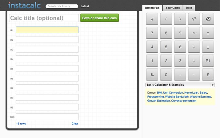
How It Works
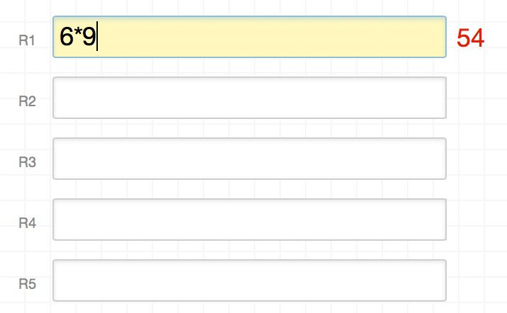
When you load up Instacalc, you’ll see a series of fields. These are where you insert your calculations. Simply type in a problem to instantly see the solution off to the right.
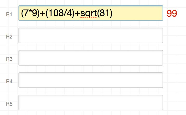
These fields can handle much more than simple formulas, feel free to get as complex as you need to, Instacalc will handle anything you throw at it with ease.
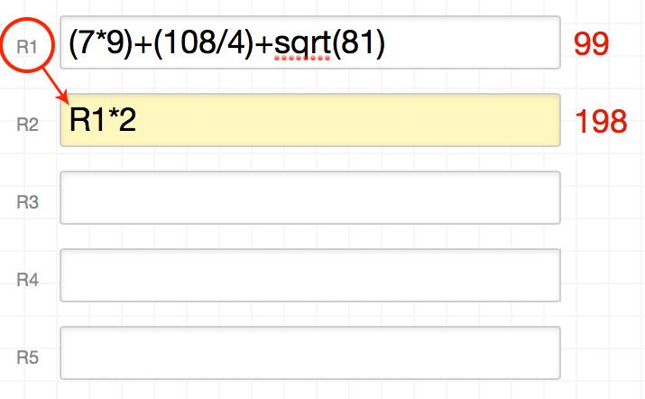
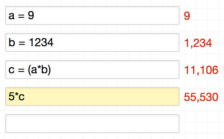
The real power in Instacalc though lies in its ability to references other rows to build on previous calculations. For instance, here we make a calculation in R1, then use the solution of that calculation to achieve something even more complex in R2.
In addition to directly referencing other rows, you can set up variables within each row, then references those throughout the rest of your calculations. Here’s an example:
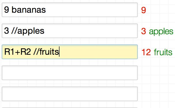
Instacalc also handles text pretty well. If you simply toss in text after a number, it will be ignored and won’t get in the way of the calculation. If you precede anything with “//”, this text will get carried over to the end result and placed after the solution as a comment.
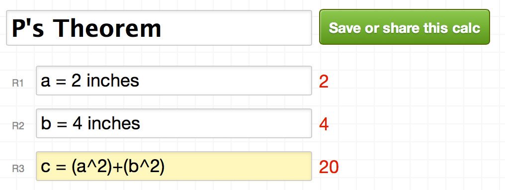
Finally, you can title, save and share any calculator that you create. This makes Instacalc a powerful tool for creating reusable custom calculators that can be referenced again and again by yourself and others.
Who Cares?
So there you have it, a fancy calculator tool. So why should you care? The reason is that you can leverage Instacalc to build and save your own design calculators. For instance, say you want to convert pixels to ems, how would you do it? Just hit up your calculator!
I know what you’re thinking. There are already a ton of pre-built, perfectly functional design-related calculators on the web. Why go through the trouble of making your own? I’m a huge proponent of using any tool that will help save you time, but I’m also all about understanding the processes behind those tools.
When you use some random online px to em calculator, you might get the answer that you’re looking for, but you don’t gain any knowledge or experience in the process. When you build and reuse your own calculator though, you’re forced to grasp the concepts at work in the calculations. You don’t have to do the math in your head, but you do have to know where the math comes from, and that’s a valuable bit of knowledge.
Basic px to em Calculator
Enough setup, let’s dig in and build some calculators. The first one that we’re going to attempt is our example from above, your basic run of the mill pixels to em converter. This is a really simple calculation and to understand what an “em” is on a fundamental level, you really should work the math out.
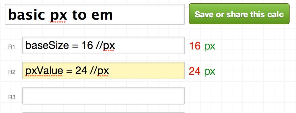
To begin, you must have a base font size for your HTML document, say 16px. We input this variable into our calculation like so:
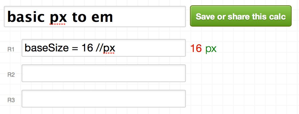
Note that this is a customizable value. If you want the base size to be 14px, simply replace “16” with “14”. Next, we need the value in pixels that we want to convert to ems. Again, we set up a customizable variable.
Here’s the educational part. To finish the calculator, you have to know how the conversion works. It turns out, to convert px to em, you simply take the pixel value that you’d like to convert and divide it by the base font size. To perform this calculation, we plug in the variables that we created in the two previous steps.
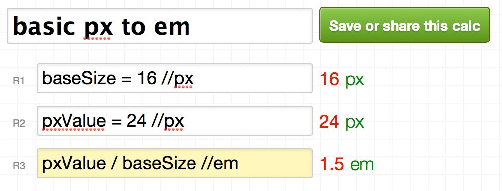
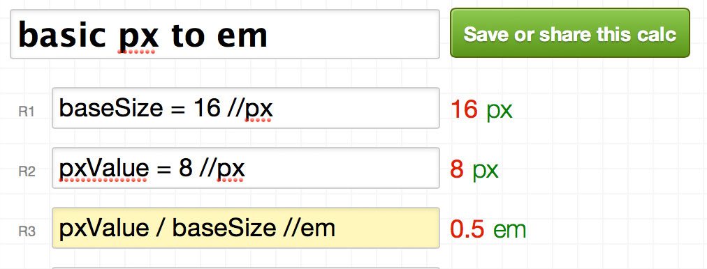
As you can see, using a base of 16px, 24px converts to 1.5em. If we change the px value to 8px, it converts to 0.5em.
Try It Out
That’s it! We now have a nice little px to em calculator. All you have to do is replace the base size and/or value to convert, and the calculator will spit out a solution. You can test out our calculator using the embedded widget below (go here if the widget doesn’t load).
em to px Calculator
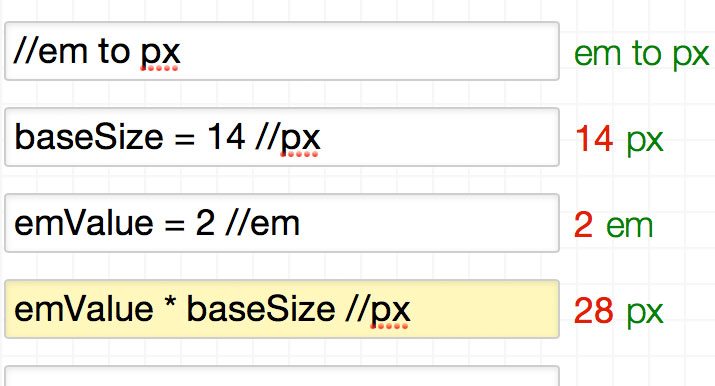
Now that we have the hang of how all of this works, let’s flip the calculation on its head and convert from em to px. Just as before, we need to create a base size and a value to convert.
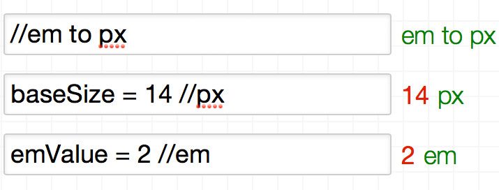
This time around though, we multiply the value to convert by the base size to arrive at the pixel conversion. So with a base value of 14px, 2em equals 28px.
Try It Out
Now our calculator is really smart! It converts px and em in both directions. Check it out using the embedded widget below (go here if the widget doesn’t load).
% to em Calculator
Sometimes, developers actually declare the base font size as a percent. For instance, 62.5% is a common base font size because it makes ems easy to mentally convert to px in your head (1.2 em = 12px, 1.4em = 14px, etc.). Why does this work? If we figure out the math, we can find out!
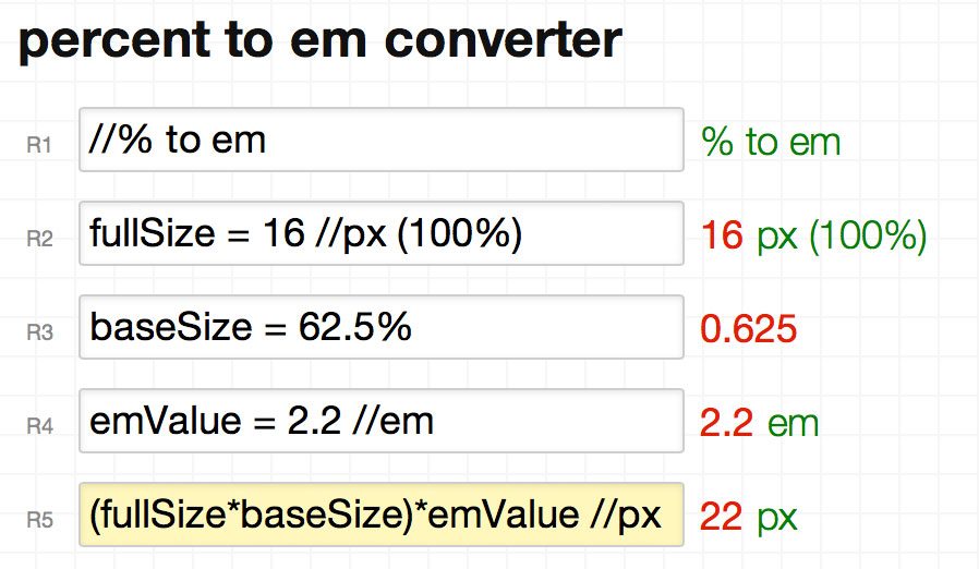
As you can see, to convert em to px with a base size expressed as a percentage, we first multiply the expressed base size by the browser’s full size starting pixel value (100% or 16px). We then multiply the result of that calculation by the em value that we want to convert to px. Have a play with this calculator below or go here to see it on Instacalc.
Golden Ratio Line Height
As a real life sample of when I created my own design-related calculator, check out the example below. After I read Pearsonified’s Ultimate Guide to Golden Ratio Typography I wanted to wrap my head around the complex formulas that he was tossing around, so built this calculator.
Basically, what it does is leverage the concept of the golden ratio to arrive at the ideal line-height for a chunk of text when given two inputs: font size and line width.
If I would’ve simply stopped after reading through Pearsonified’s article, I would’ve never really understood the mathematical principles that he was laying out. It wasn’t until I dug deep and played with the numbers myself that everything clicked.
Grid Calculator
Another place that we frequently use calculations in web design is when devising a grid layout. Grid calculators are a dime a dozen, but when you really understand the math behind them, you can roll your own grid frameworks that are perfectly designed for your unique situation. Here’s a sample grid calculator that I built to get you started.
What Will You Build?
You should now know all about Instacalc and how it can help you wrap your mind around even the most complex design-related calculations. Now it’s time for you to jump in and build a few of your own calculators. Leave a comment below and show me what you come up with!