Build a Library of CSS Image Label Options
Today I’m working on another awesome free download for PixelsDaily. Here you’ll be able to see my thought processes, goals and code, and later you’ll be able to download the whole project to use in your own work.
Basically, our goal here is to create a simple effect so that when the user hovers over an image, a hidden text label pops up into view. This is of course extremely easy to do so we’re going to go a step further by building a whole bunch of options for the developer to choose from. This will provide you with some good practice for how to create flexible effects that can be applied in different ways without too much code repetition.
Sneak Peek
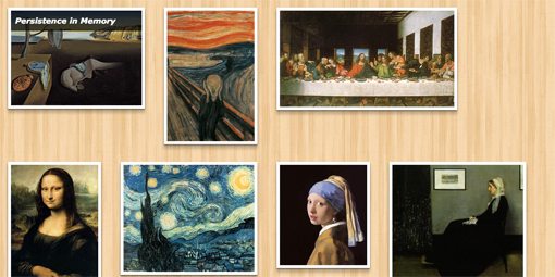
If you’re anxious to see the result before you go through the code, check out the demo below and hover over each image to see how it’s different.
Demo: Click Here to launch.
The Plan
Here’s what we want: a simple text label with a black background to appear over the image when the user hovers. Now, since it’s going to be animated into place, I came up with a total of ten different variations that equate to roughly the same element being used in different ways:
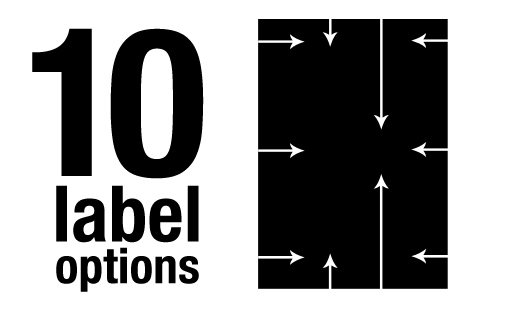
We have two main parameters to set here. The first is where the the label will come to rest (top, center or bottom) and the second is where it will come from (top, right, bottom, left). What we’ll want to do is provide a basic repeatable HTML structure for developers to use when adding an image, then give them some classes that can be applied to control everything about the label’s behavior. With this in mind, we can proceed to the first step.
The HTML
<div class="label top">
  <p>Persistence in Memory</p>
  <img src="img1.jpg" />
</div>
For the HTML, we need a simple wrapper div that contains a paragraph and an image. The paragraph will serve as the hidden text label and the classes applied to the div will tell us two things: first, that we want to give this div the label treatment and second, which label treatment to give it.
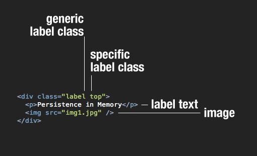
We could skip the generic label class, but that would mean that all of the styles associated with every label would have to be duplicated in each version of the label, which would make for a big fat mess of unnecessarily repetitious code. This way we can apply most of the styling to one single class and save the changing styles to our specific classes.
Now let’s expand this out so we can try the ten different effects that we’re aiming for in our final result. We’ll keep all the divs for this tutorial, but the classes should be flexible enough that you can use block level list items as well if you’re building a gallery. We really just want to make sure each image effect works in an individual setting.
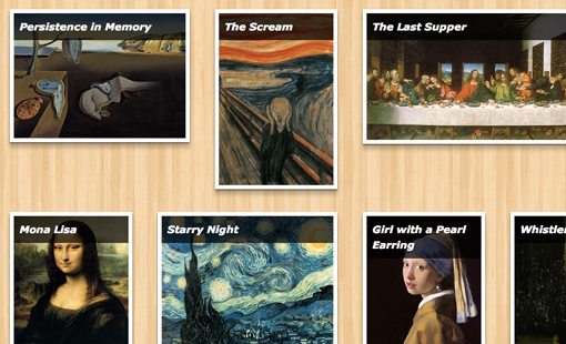
<div class="label top">
  <p>Persistence in Memory</p>
  <img src="img1.jpg" />
</div>

<div class="label bottom">
  <p>The Scream</p>
  <img src="img2.jpg" />
</div>

<div class="label bottomright">
  <p>The Last Supper</p>
  <img src="img3.jpg" />
</div>

<div class="label bottomleft">
  <p>Mona Lisa</p>
  <img src="img4.jpg" />
</div>

<div class="label topleft">
  <p>Starry Night</p>
  <img src="img5.jpg" />
</div>

<div class="label topright">
  <p>Girl with a Pearl Earring</p>
  <img src="img6.jpg" />
</div>

<div class="label centertop">
  <p>Whistler's Mother</p>
  <img src="img7.jpg" />
</div>

<div class="label centerbottom">
  <p>The Kiss</p>
  <img src="img8.jpg" />
</div>

<div class="label centerleft">
  <p>American Gothic</p>
  <img src="img9.jpg" />
</div>

<div class="label centerleft">
  <p>Water Lilies</p>
  <img src="img10.jpg" />
</div>
Starter CSS
Now that we’ve got a good idea of what our HTML structure will look like, it’s time to jump over to our CSS. To start off, toss in a lazy man’s reset (or something more robust if you prefer) and a background pattern.
* {
   margin: 0;
   padding: 0;
}

body {
   background: #f5f5f5 url('wood_pattern.png');
}
Now it’s time to implement some generic label styles. Most of what we need to do will specifically apply to the paragraph, but there are a few things that should be done here as well. Start off with the specific styles that you need to make the layout work. since we’ll be working with images of varying sizes, I used inline-block for the display context with a top vertical alignment. I also set the overflow to hidden and the position to relative, both of which are vital for this experiment.
Next I threw in some optional visual styles. These are separated so that a developer who downloads these files can easily see how to customize the look and feel of the items without screwing up how they work.
.label {
  /*Position*/
  display: inline-block;
  vertical-align: top;
  overflow: hidden;
  position: relative;
  margin: 20px;

  /*Skin*/
  border: 7px solid #fff;
  -webkit-box-shadow: 0px 2px 4px rgba(0,0,0,0.5), 0px 10px 7px rgba(0,0,0,0.2);
     -moz-box-shadow: 0px 2px 4px rgba(0,0,0,0.5), 0px 10px 7px rgba(0,0,0,0.2);
          box-shadow: 0px 2px 4px rgba(0,0,0,0.5), 0px 10px 7px rgba(0,0,0,0.2);
}

/*Extra Padding Fix*/
.label img {
  display: block;
}
Notice the peculiar block positioning context applied at the end here. For whatever reason, this layout was giving me an extra four pixels of padding at the bottom of each image that couldn’t be manually overridden. This fixed this problem.
Status Update
At this point we’re looking good. Our images are lining up nicely and have the styling that we want. The only weird part is that the text labels are all screwed up and that’s what we’re going to attack next.
Style the Labels
Now it’s time to style the labels. Once again, it’s very important to figure out which styles can be reused and which need to vary. To do this, I simply ran ahead and created a bunch of different individual labels, then looked through to see where my code was redundant.
The realization is that each label will have to have absolute positioning (which works with the relative positioning from before), padding, a set width, transitions and visual styling. These properties will be identical, no matter what direction we’re coming from or what the final resting place of the label will be.
.label p {
  /*Position*/
  position: absolute;
  padding: 10px;
  width: 100%;

  /*Skin*/
  background: #000; /*fallback*/
  background: rgba(0,0,0,0.7);
  color: #fff;
  font: bold italic 18px/1.5 Helvtica, Verdana, sans-serif;

  /*Animation*/
  -webkit-transition: all 0.5s ease;
     -moz-transition: all 0.5s ease;
       -o-transition: all 0.5s ease;
      -ms-transition: all 0.5s ease;
          transition: all 0.5s ease;
}
Status Update
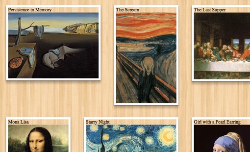
As you can see in the image below, all of our labels are working now and look perfect. Notice that they’re all positioned at the top by default, keep this in mind as we move forward and shove them around.
Position Each Label
From here, we have a lot of styling to do. Really we have a tiny bit of styling to do, but we have to do it ten different times because each label is unique. For each label, we need to position the paragraph element out of the bounds of the picture, then bring it back in on hover.
To begin, we want a label that will start just above an image that will fly downward on hover and rest at the top. To do this, we set the top value to -50%, which then changes to 0% on hover. Similarly, for the same effect from the bottom, we start with a bottom value of -50% and change that to 0%.
My method here is very specific so take note. The trickiest part of this whole idea is figuring out how to make it work on a wide range of image sizes. We don’t want the developer to have to manually enter in a size every time, it should just work when someone slaps on the required classes.
By utilizing the top and bottom properties the way we are, we ensure that nothing is image-size-specific. The value of 0% on the bottom property will always push our label down to the bottom of the image we apply it to, no matter how far that may be.
/*TOP LABEL*/
.top p {
  top: -50%;
}

.top:hover p {
  top: 0%;
}

/*BOTTOM LABEL*/
.bottom p {
  bottom: -50%;
}

.bottom:hover p {
  bottom: 0%;
}
Next up, we need to style our labels that swing in from the sides. We can swing in from the top left, top right, bottom left and bottom right. Here are the values for these. The method is straightforward and just like the two we just went over. Each time we set the resting position just off to one side, then bring it back into view with the hover. For these, the left and right properties come into play in addition to the top and bottom properties.
/*BOTTOM LEFT LABEL*/
.bottomleft p {
  bottom: 0%;
  left: -150%;
}

.bottomleft:hover p {
  left: 0%;
}

/*BOTTOM RIGHT LABEL*/
.bottomright p {
  bottom: 0%;
  left: 150%;
}

.bottomright:hover p {
  left: 0%;
}

/*TOP LEFT LABEL*/
.topleft p {
  top: 0%;
  left: -150%;
}

.topleft:hover p {
  left: 0%;
}

/*TOP RIGHT LABEL*/
.topright p {
  top: 0%;
  left: 150%;
}

.topright:hover p {
  left: 0%;
}
To finish off, we need to code our centered labels. These are the hardest of the bunch to figure out. On hover, you want to place them fifty percent of the way down or up, minus half of the height of the label. So when we want to slide in from the top, we set the top value to 50% and apply and negative margin of 20px (half the height of our labels). Unfortunately, this does assume a single line of text and the specific font-size that we’ve set up. If either changes, then the height will be different and the item won’t be centered. The only way I know around that is to use some sort of display: table setup.
/*CENTER FROM TOP*/
.centertop p {
   top: -50%;
}

.centertop:hover p {
   top: 50%;
   margin-top: -20px;
}

/*CENTER FROM BOTTOM*/
.centerbottom p {
   bottom: -50%;
}

.centerbottom:hover p {
   bottom: 50%;
   margin-bottom: -20px;
}

/*CENTER FROM LEFT*/
.centerleft p {
   top: 50%;
   left: -150%;
   margin-top: -20px;
}

.centerleft:hover p {
   left: 0%;
}

/*CENTER FROM RIGHT*/
.centerright p {
   top: 50%;
   left: 150%;
   margin-top: -20px;
}

.centerright:hover p {
   left: 0%;
}
Optional: Going Further
Now, if you’re crazy about repetition, you can go even further with making sure your code is as brief as possible. We separated out each label above for the sake of readability, but the result is a lot of values that are repeated throughout. We could go in and either manually combine selectors or use Sass @extend and come up with a much more concise result. The tradeoff here of course though is that you’re repeating your selectors because some appear in multiple places.
.top:hover p, .topleft p, .topright p {top: 0%;}
.top p, .centertop p {top: -50%;}

.bottom:hover p, .bottomleft p, .bottomright p {bottom: 0%;}
.bottom p, .centerbottom p {bottom: -50%;}
.bottomleft:hover p, .bottomright:hover p, .topleft:hover p, .topright:hover p, .centerleft:hover p, .centerright:hover p {left: 0%;}
.bottomleft p, .topleft p, .centerleft p, .centerleft p {left: -150%;}
.bottomright p, .topright p, .centerright p {left: 150%;}

.centerbottom:hover p {bottom: 50%;}
.centertop:hover p, .centerleft p, .centerright p {top: 50%;}
.centertop:hover p, .centerleft p, .centerright p {margin-top: -20px;}
.centerbottom:hover p {margin-bottom: -20px;}
See It In Action
We’re all finished! Be sure to check out the live demo below and hover over each image to see the different effect.
Demo: Click Here to launch.
Conclusion
This project forced us into a lot of good thinking. We had to consider several times how to keep our code brief and free of repetition. We also consistently asked what was best given that we want others to be able to download and change our code with very little trouble. Sometimes when we saw a way to make our code more concise, it came at the price of readability and ease of use, which isn’t the best method for a free download.
Feel free to grab this code and use it however you like. Also keep an eye out for the download sometime in the coming weeks on PixelsDaily.