Build an Infinite Scrolling Photo Banner With HTML and CSS
Today we’re going to embark on the challenge of creating an animated banner of photos that automatically scrolls horizontally through an infinite loop. The best part: we’re going to do it without a single line of JavaScript.
To make this banner truly useful, our goal will be to use individual photos dropped into our HTML, not simply one long CSS background that repeats. This is pretty tricky but we’ll walk you through exactly how it works. Let’s get started!
The Idea
The concept here is simple. Let’s say you have a photography website or design portfolio and want a simple banner across a web page that automatically scrolls horizontally through some images like this:
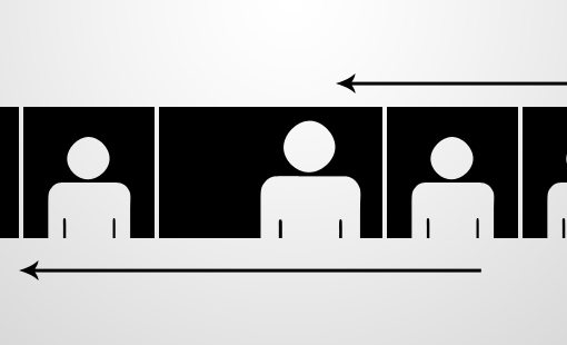
As you can see, we basically just have a strip of images that move their position from left to right. This is a fairly popular technique. In fact, you can see it at work live on Gina Meola’s site.
This effect is easy enough with JavaScript or Flash, but as an exercise let’s see if we can pull it off in pure CSS. With the fancy new tools in CSS3 it’s actually a really easy project that is perfect for anyone looking to dip their toe into CSS animation.
Hurdles
As promised, this is a pretty easy project, but only because I’ve done most of the problem solving for you. In truth, it took me a while to figure out how to pull this off like I wanted. The reason for this is that there’s an easy way and a hard way to do it.
The Easy Way
The easy way is to take the images that you want to display, import them into Photoshop, then combine them into one long image. You can then set this image to your background in CSS, repeat it on the x-axis and toss in a CSS animation.
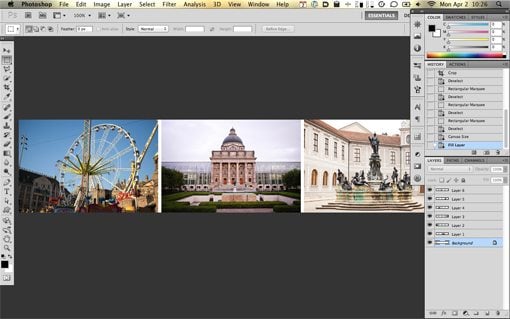
This works just fine and I was able to get it up and running in only a few minutes, but the problem is that it’s really not a versatile solution. For instance, let’s say I wanted to link each individual image somewhere, this would be impossible if they were in reality all one image. This same logic means that I can’t apply any special hover effects to individual images. Also, if I want to add or swap out images, it requires another trip to Photoshop to update the file. This is definitely not ideal.
The Hard Way
Let’s ditch the easy way because it’s neither a challenge, nor is it really the best method for achieving our goal. The hard way is to actually insert the images one at a time into HTML and have them take on the banner functionality.
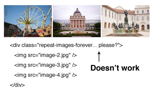
The reason that this is so difficult is because we want the animation to be infinite. In CSS, you can easily repeat a background image, but there’s no method for repeating something in HTML. Even if there were, we would only want one image to repeat after all of the others were rendered. As you can see, it’s quite the conundrum.
This is where keyframe animations come to the rescue. The interesting thing about this type of animation is that it will actually step up and take charge of the infinite repetition for us… sort of. It really loops the animation, not the images, but we can use that to create the illusion of infinitely repeating images.
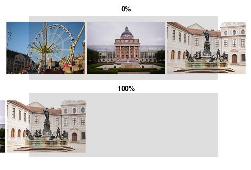
To see how this works, imagine if we just set up a row of images and then used keyframes to animate them. We’ll have a starting point (0%) and a stopping point (100%) like this:
As you can see, this is awkward because it leaves a bunch of unwanted dead space. Further, when the animation starts over, there will be a jarring flash as it goes back to the beginning. We’ll indeed have an infinite animation, but it will look horrible.
If you’re familiar with animation tricks, the solution should be clear already. What we need to do is make our first frame perfectly match our last frame, then when the animation repeats, it will be seamless and will give the illusion of an infinite stream of images.
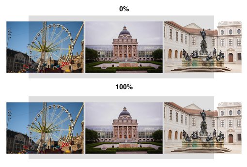
Unfortunately, to do this, we’ll need to repeat a few images in our HTML. This is sort of a pain but it’s not the end of the world and we only need to repeat enough images to fill the frame.
Let’s Build It
Now that we have the concept worked out, it’s time to code a demo! Let’s start with the basic HTML for our page.
HTML
To build a nice demo page, we’ll include a header (use html5shiv for IE) and some filler text, then a div containing our images. Notice that we have six unique images, then the first four are repeated. The initial at least partially shows pieces of these four photos.
<div id="container">
    <header>
	    <h1>Animated Photo Banner</h1>
	    <p>Lorem ipsum dolor...</p>
    </header>

    <!-- Each image is 350px by 233px -->
    <div class="photobanner">
    	<img class="first" src="image-1.jpg" alt="" />
    	<img src="image-2.jpg" alt="" />
    	<img src="image-3.jpg" alt="" />
    	<img src="image-4.jpg" alt="" />
    	<img src="image-5.jpg" alt="" />
    	<img src="image-6.jpg" alt="" />
    	<img src="image-1.jpg" alt="" />
    	<img src="image-2.jpg" alt="" />
    	<img src="image-3.jpg" alt="" />
    	<img src="image-4.jpg" alt="" />
    </div>
</div>
What’s with that non-semantic “first” class? Basically, to make the animation work, we need to target the first image and move it to the left (the others will follow). This should be easy enough with first-child but targeting pseudo elements and/or pseudo classes for animation is something with spotty support. I couldn’t get it to work in several browsers so I went the old school class route instead. Feel free to riot if you can’t get down with this method.
Starting CSS
To get started with our CSS, throw on a basic margin/padding reset to make sure our images line up properly everywhere. Next, add a dark background texture or color to the body and style the container, taking care to give it a width of 1000px and setting the overflow to hidden.
* {margin: 0; padding: 0;}

body {
	<!-- src: http://subtlepatterns.com/?p=1045 -->
	background: url('dark_geometric.png');
}

#container {
	width: 1000px;
	overflow: hidden;
	margin: 50px auto;
	background: white;
}
Next we’ll style the header and photobanner sections. For the header, give it a width of 800px so it doesn’t stretch all the way across the container. Also center it with the margin auto trick and apply some basic styles to the text.
For the photo banner section, give it a height of 233px and a width of 3550px. This seems crazy long but it allows the images to all be placed end to end and the container is taking care of our overflow so it won’t create any weird scrolling issues.
/*header*/
header {
	width: 800px;
	margin: 40px auto;
}

header h1 {
	text-align: center;
	font: 100 60px/1.5 Helvetica, Verdana, sans-serif;

}

header p {
	font: 100 15px/1.5 Helvetica, Verdana, sans-serif;
	text-align: justify;
}

/*photobanner*/

.photobanner {
	height: 233px;
	width: 3550px;
	margin-bottom: 80px;
}
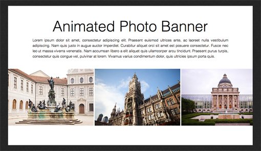
With this code, our demo page looks great. We’ve got a nice little container of content that looks just how we want. The images are static at this point so our next step will be to build the animation.
Bring It To Life
The keyframe animation process is pretty straightforward. To begin, we want to target that “first” class that we created and declare an animation. Here we name the animation, then set a duration and timing duration and set the repetition to infinite.
Moving down the line, we then define our frames using the @keyframes syntax. We only really need two frames here, one to start and one to stop. We simply set the margin to a negative value to move the line of images left far enough that the second iteration of the first image takes the initial spot.
/*keyframe animations*/
.first {
	-webkit-animation: bannermove 30s linear infinite;
	   -moz-animation: bannermove 30s linear infinite;
	    -ms-animation: bannermove 30s linear infinite;
	     -o-animation: bannermove 30s linear infinite;
	        animation: bannermove 30s linear infinite;
}

@keyframes "bannermove" {
 0% {
    margin-left: 0px;
 }
 100% {
    margin-left: -2125px;
 }

}

@-moz-keyframes bannermove {
 0% {
   margin-left: 0px;
 }
 100% {
   margin-left: -2125px;
 }

}

@-webkit-keyframes "bannermove" {
 0% {
   margin-left: 0px;
 }
 100% {
   margin-left: -2125px;
 }

}

@-ms-keyframes "bannermove" {
 0% {
   margin-left: 0px;
 }
 100% {
   margin-left: -2125px;
 }

}

@-o-keyframes "bannermove" {
 0% {
   margin-left: 0px;
 }
 100% {
   margin-left: -2125px;
 }

}
That’s all there is to it! With this code, your banner of images will begin its infinite loop through the six photos that we included.
Taking It Further
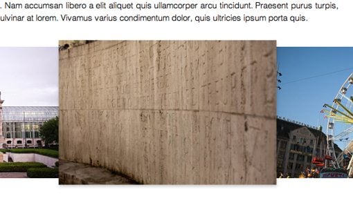
To really showcase the benefits of this method, I decided to go a step further and add in a simple hover effect for each image. This would’ve been impossible with the CSS background technique. On hover, we’ll scale the image by 20% and add a shadow.
.photobanner {
	height: 233px;
	width: 3550px;
	margin-bottom: 80px;
}

.photobanner img {
	-webkit-transition: all 0.5s ease;
	-moz-transition: all 0.5s ease;
	-o-transition: all 0.5s ease;
	-ms-transition: all 0.5s ease;
	transition: all 0.5s ease;
}

.photobanner img:hover {
	-webkit-transform: scale(1.1);
	-moz-transform: scale(1.1);
	-o-transform: scale(1.1);
	-ms-transform: scale(1.1);
	transform: scale(1.1);
	cursor: pointer;

	-webkit-box-shadow: 0px 3px 5px rgba(0,0,0,0.2);
	-moz-box-shadow: 0px 3px 5px rgba(0,0,0,0.2);
	box-shadow: 0px 3px 5px rgba(0,0,0,0.2);
}
Demo
We’re all finished! Click here or on the image below to see the live version.
Conclusion
We had a difficult goal at the beginning of this article. We wanted to create an infinitely scrolling banner of images using pure CSS. The biggest challenge here was how to get a bunch of HTML images to repeat. The trick of course was to set up a keyframe animation while making sure that our first and last frames matched perfectly. This allowed us to seamlessly loop the animation.
Leave a comment below and let us know what you think of this effect. How would you change or improve upon it?

