10 Easy Image Hover Effects You Can Copy and Paste
Hover effects are always a fun topic to explore. In the past, we’ve built some awesome examples of CSS hovers that were easy to copy and paste right into your code.
Today, we’re going to follow that up with ten new effects specifically built for use with images. Each example comes with an HTML and CSS snippet that you can steal and a live demo so you can see it in action.
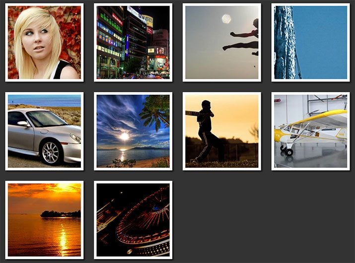
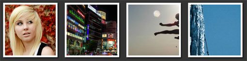
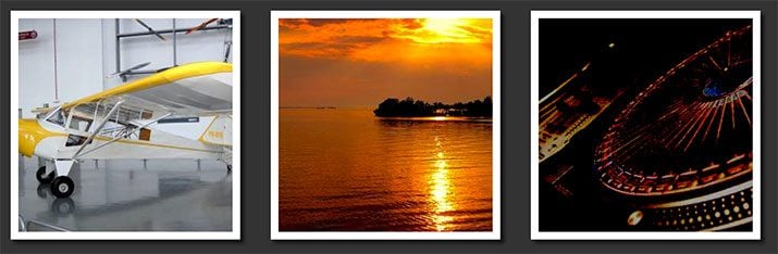
Sneak Peek
Before we get started, take a look at the demo below to see all of the various hover effects that we’ll be building.
Demo: Click here to launch.
Setup
Before we begin creating the individual demos, some basic setup is required. Here’s a chunk of CSS that we’ll be using to dictate the basic appearance of all of the examples.
* {
  -webkit-box-sizing: border-box;
     -moz-box-sizing: border-box;
      -ms-box-sizing: border-box;
          box-sizing: border-box;
}

body {
  background: #333;
}

.pic {
  border: 10px solid #fff;
  float: left;
  height: 300px;
  width: 300px;
  margin: 20px;
  overflow: hidden;

  -webkit-box-shadow: 5px 5px 5px #111;
          box-shadow: 5px 5px 5px #111;
}
Most of this is basic stuff: box-sizing allows us to manipulate the box model (feel free to apply more specifically if you don’t like the universal selector), and the pic class gives us a place to toss in some generic styling for each photo.
Zoom and Pan
Our first group of effects involves utilizing some tricks with hidden overflow. By clipping the image to the bounds of a div, we can pull off some pretty cool hovers.
Here’s a demo of the four hover effects in action:
Demo: Click here to launch.
Grow
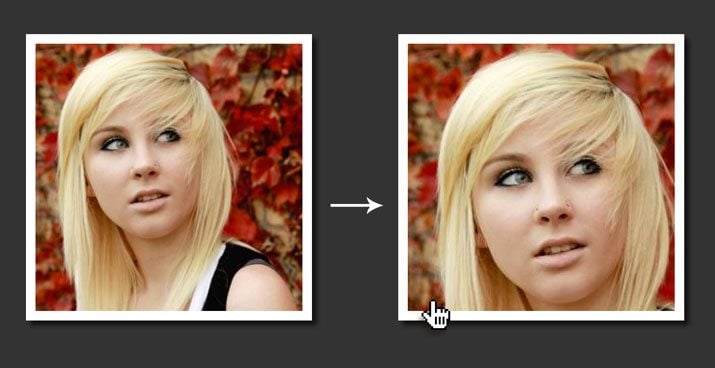
To begin, we’ll make it so that when the user hovers over the image, the photo enlarges while still staying within its bounds, resulting in a zooming in effect. Here’s the HTML.
HTML
<div class="grow pic">
  <img src="https://lorempixel.com/400/400/people/9" alt="portrait">
</div>
As you can see, we’re using the “pic” class from before along with a “grow” class. As usual, our images are being served up courtesy of Lorem Pixel. Note that the image we’re using here is 400px by 400px. Now let’s see the CSS.
CSS
/*GROW*/
.grow img {
  height: 300px;
  width: 300px;

  -webkit-transition: all 1s ease;
     -moz-transition: all 1s ease;
       -o-transition: all 1s ease;
      -ms-transition: all 1s ease;
          transition: all 1s ease;
}

.grow img:hover {
  width: 400px;
  height: 400px;
}
What we’ve done here is specifically targeted the image tag, set its height to 300px square and then increased this to 400px square when the user hovers. Again, since we have overflow set to hidden, this will result in a zoom effect.
Shrink
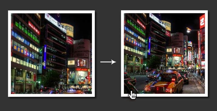
We’ve seen how to grow an image on hover, so let’s reverse that effect and zoom the photo out. The method is pretty much exactly the same, only this time you’ll start with the size at 400px and shrink it to 300px on hover.
HTML
<div class="shrink pic">
  <img src="https://lorempixel.com/400/400/nightlife/4" alt="city">
</div>
CSS
/*SHRINK*/
.shrink img {
  height: 400px;
  width: 400px;

  -webkit-transition: all 1s ease;
     -moz-transition: all 1s ease;
       -o-transition: all 1s ease;
      -ms-transition: all 1s ease;
          transition: all 1s ease;
}

.shrink img:hover {
  width: 300px;
  height: 300px;
}
Side Pan
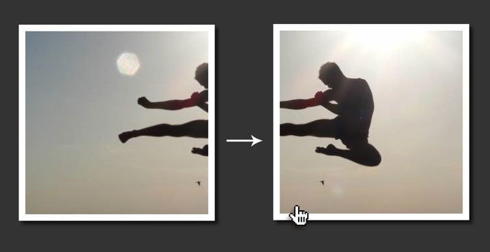
The next effect keeps the image the same size throughout, but pans it sideways as the user hovers. As you can see in our kicking example, this is a great way to convey a sense of action.
HTML
<div class="sidepan pic">
  <img src="https://lorempixel.com/600/300/sports/8" alt="kick">
</div>
Here we are using an image that’s 600px wide, but only 300px tall. Because we’re zooming sideways, we don’t need any extra height to pull off the effect.
CSS
/*SIDEPAN*/
.sidepan img {
  margin-left: 0px;
  -webkit-transition: margin 1s ease;
     -moz-transition: margin 1s ease;
       -o-transition: margin 1s ease;
      -ms-transition: margin 1s ease;
          transition: margin 1s ease;
}

.sidepan img:hover {
  margin-left: -200px;
}
For the pan, we’re not changing the image size like we did last time, but instead using margin to pull the image left on hover. If you want it to move right, use a positive value or margin-right.
Vertical Pan

A vertical pan can be cool as well. Once again, I’ll be using this effect to convey a sense of motion, but this is also great for communicating height if you want to pan up something like a tall building. The cliff in our photo helps push this concept.
HTML
<div class="vertpan pic">
  <img src="https://lorempixel.com/300/600/sports/5" alt="climb">
</div>
Last time we used an image that was 600px by 300px, this time we’ll flip that around and go with a photo that is 300px by 600px.
CSS
/*VERTPAN*/
.vertpan img {
  margin-top: 0px;
  -webkit-transition: margin 1s ease;
     -moz-transition: margin 1s ease;
       -o-transition: margin 1s ease;
      -ms-transition: margin 1s ease;
          transition: margin 1s ease;
}

.vertpan img:hover {
  margin-top: -200px;
}
Same drill as last time, only we’re using margin-top instead of margin-left. This will cause the top of the image to be in view by default and the bottom of the image to come into view on hover.
Fun with Transforms
Our next section of effects is a little more crazy. We’ll start with a simple tilt but then jump into some really unique and interesting hovers.
Here’s a demo of the three effects in action:
Demo: Click here to launch.
Tilt
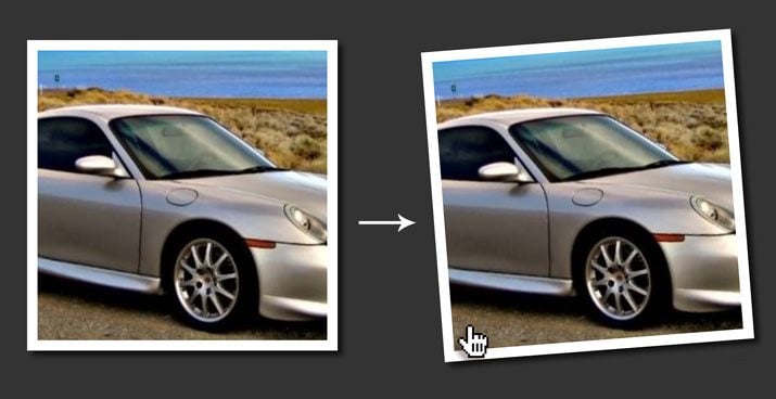
This one is super simple, all we’re going to do is rotate the image slightly when the user hovers over it. The result is a basic but fun illusion of a crooked hanging picture.
HTML
<div class="tilt pic">
  <img src="https://lorempixel.com/300/300/transport/5" alt="car">
</div>
CSS
/*TILT*/
.tilt {
  -webkit-transition: all 0.5s ease;
     -moz-transition: all 0.5s ease;
       -o-transition: all 0.5s ease;
      -ms-transition: all 0.5s ease;
          transition: all 0.5s ease;
}

.tilt:hover {
  -webkit-transform: rotate(-10deg);
     -moz-transform: rotate(-10deg);
       -o-transform: rotate(-10deg);
      -ms-transform: rotate(-10deg);
          transform: rotate(-10deg);
}
As you can see, all we had to do was rotate the image ten degrees. Easy and effective! Notice that this time around, we’re targeting the class itself, not the image.
Morph

This is where the crazy comes in. The image above doesn’t really do this one justice so be sure to check out the demo. What’s happening is that, when the user hovers, the image begins to spin. As it spins, it morphs from a square into a circle. The result is super fun to play with.
HTML
<div class="morph pic">
  <img src="https://lorempixel.com/300/300/nature/5" alt="beach">
</div>
CSS
/*MORPH*/
.morph {
  -webkit-transition: all 0.5s ease;
     -moz-transition: all 0.5s ease;
       -o-transition: all 0.5s ease;
      -ms-transition: all 0.5s ease;
          transition: all 0.5s ease;
}

.morph:hover {
  border-radius: 50%;
  -webkit-transform: rotate(360deg);
     -moz-transform: rotate(360deg);
       -o-transform: rotate(360deg);
      -ms-transform: rotate(360deg);
          transform: rotate(360deg);
}
What I’ve done here is set the morph class to spin 360 degrees on hover. As it’s spinning, the border-radius will gradually climb its way to 50%, resulting in a circle.
Focus
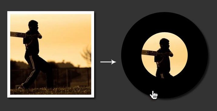
Here’s another weird one that uses border-radius to round off the image. This time though, we’ll not only increase the border’s radius but also its thickness. Combined with the border-box, this will create an effect that focuses in on on particular part of an image.
HTML
<div class="focus pic">
    <img src="https://lorempixel.com/300/300/sports/1" alt="cricket">
  </div>
CSS
/*FOCUS*/
.focus {
  -webkit-transition: all 1s ease;
     -moz-transition: all 1s ease;
       -o-transition: all 1s ease;
      -ms-transition: all 1s ease;
          transition: all 1s ease;
}

.focus:hover {
  border: 70px solid #000;
  border-radius: 50%;
}
What I did here was take our 10px white border and turned it into a 70px black border while cranking the radius up to 50% like we did in the last example.
Webkit Filters
This last set of effects is purely experimental. Unlike the examples above, all of which use multiple prefixes to ensure maximum browser compatibility, these only use the -webkit prefix because there’s no other support at the moment. If you’re not using Safari or Chrome, these aren’t going to work for you.
Despite the unfortunate constraints, Webkit filters let you perform some pretty awesome effects! Here’s a demo of three of my favorites:
Demo: Click here to launch.
Blur
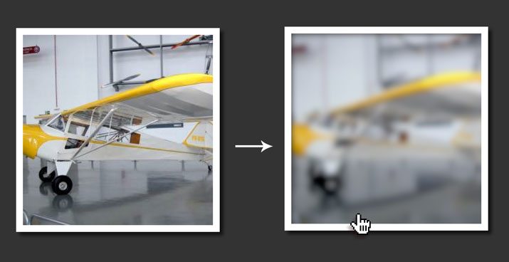
The first effect that we’re going for is a simple blur. Long has man sought to blur pixels with CSS alone and now it’s finally possible with one little line of code!
HTML
<div class="blur pic">
  <img src="https://lorempixel.com/300/300/transport/2" alt="plane">
</div>
CSS
/*BLUR*/
.blur img {
  -webkit-transition: all 1s ease;
     -moz-transition: all 1s ease;
       -o-transition: all 1s ease;
      -ms-transition: all 1s ease;
          transition: all 1s ease;
}

.blur img:hover {
  -webkit-filter: blur(5px);
}
AS you can see, we use the -webkit-filter property, then set the blur to 5px. That’s all there is to it.
B&W
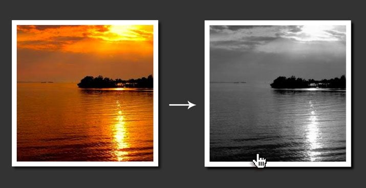
This time we’re going to drop all of the saturation out of the image on hover. It used to take two images to pull off this effect but with Webkit filters, we can cut this down to one.
HTML
<div class="bw pic">
  <img src="https://lorempixel.com/300/300/nature/2" alt="sea">
</div>
CSS
/*B&W*/
.bw {
  -webkit-transition: all 1s ease;
     -moz-transition: all 1s ease;
       -o-transition: all 1s ease;
      -ms-transition: all 1s ease;
          transition: all 1s ease;
}

.bw:hover {
  -webkit-filter: grayscale(100%);
}
Here I set the grayscale value to 100%. If you only want to drop some of the saturation out, try bringing down this number.
Brighten
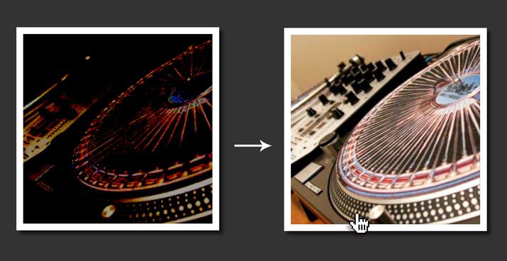
For our final trick, we’re going to darken a photo by default, then brighten it up to its normal state on hover. This creates a sort of reveal effect.
<div class="brighten pic">
  <img src="https://lorempixel.com/300/300/technics/2" alt="sea">
</div>
/*DARKEN*/
.brighten img {
  -webkit-filter: brightness(-65%);
  -webkit-transition: all 1s ease;
     -moz-transition: all 1s ease;
       -o-transition: all 1s ease;
      -ms-transition: all 1s ease;
          transition: all 1s ease;
}

.brighten img:hover {
  -webkit-filter: brightness(0%);
}
Here, 0% is regular brightness. Anything above that and you brighten the image, anything below and you darken it. We started at -65% and brought it up to 0% on hover.
Steal Them!
The examples above are all meant for you to steal and use as you will in your own work, so be sure to bookmark this page and come back to it the next time you’re looking for an interesting CSS hover effect.