Build a Super Easy CSS Slider With Thumbnails
Today’s project is another exploration of the types of practical applications that you can achieve with a little ingenuity and some fairly basic CSS. You’ll be blown away by how much you can achieve with just a few lines of code.
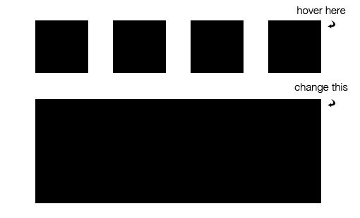
The final result with be a great way to display a strip of small image thumbnails that the user can hover to see larger images. Let’s dive in and see how it works.
The Concept
The basic layout here is pretty simple. We want a strip of thumbnail images and one large featured image. The tricky part is getting the featured image to change when the user hovers over one of the thumbnails.

Sneak Peek: Click here to launch the finished product.
With CSS, you can’t create two distinct divs and then have the contents of one serve as an action point for the other. It’s easy enough in JavaScript, but CSS gives you less freedom in the way that you stack your selectors.
However, if we’re clever about how we structure our HTML, this project is actually fairly simple to pull off. Let’s see what this looks like.
The HTML
To make this work, we’re going to need four thumbnail images and four full size images. The key to having the former act upon the latter is to wrap them up together like so:
<a href="#">
    <img class="thumb" src="thumb1.jpg">
    <img class="big" src="big1.jpg">
</a>
Here we have one anchor that surrounds both the small and the large image, and I’ve assigned a specific class to each. This will make it so that when the user hovers over one image, we can easily manipulate the other. We’ll see how all this works when we get to the CSS.
Now that we know how our page needs to be structured, we can repeat this pattern four times and throw it all into a container.
<!-- Images via http://lorempixel.com/ -->
<div class="container">
    <a href="#">
        <img class="thumb" src="thumb1.jpg">
        <img class="big" src="big1.jpg">
    </a>

    <a href="#">
        <img class="thumb" src="thumb2.jpg">
        <img class="big" src="big2.jpg">
    </a>

    <a href="#">
        <img class="thumb" src="thumb3.jpg">
        <img class="big" src="big3.jpg">
    </a>

    <a href="#">
        <img class="thumb" src="thumb4.jpg">
        <img class="big" src="big4.jpg">
    </a>

    <a href="#">
        <img class="big featured" src="featured.jpg">
    </a>
</div>
Notice that I finished off with a single large image. The reason for this is that the big images will slide into place on hover, leaving a big empty space when nothing is being hovered over. To fill this spot, I created a custom image:

This is all the HTML that we’ll need, now it’s time to jump over and style this sucker.
Container Styles
In your CSS file, create a style block for the container. We start by setting its position to relative. We’re going to use absolute positioning later and setting the container to relative positioning will give us a boundary to work with.
After that, set the height and width to the value shown below. These aren’t arbitrary mind you but have been carefully calculated. Each thumbnail image is 200px wide, times four equals eight hundred, plus margins (4*40) equals 960px. Similarly, the thumbnails are 200px high, the big image is 400px and there will be 30px of margins for a total 660px high.
.container {
  position: relative;
  height: 660px;
  width: 960px;
  overflow: hidden;
  margin: 0 auto;
}
The reason we’re setting a specific height and width is so that we can slide an image out of the bounds of the container and have it be hidden. To this end, we also apply an overflow value of hidden and finish up by centering it all with auto margins.
Progress Check
We’re looking pretty rough at this point, but don’t worry, everything is right on track!

Position Everything
As you just saw in the screenshot, your images are going to be all over the place at this point so now it’s time to coerce everything into its proper position.
Once again, this takes a little bit of hard thinking. We want all our thumbnails to group together and all of our big images to group together, but that’s not how the HTML is structured.
Given that each type of image (small and large) has its own class though, we can float all of our anchors to the left, and then separate out the large images by applying absolute positioning.
.container a {
  float: left;
  margin: 20px;
}

.big {
  position: absolute;
  top: 260px;
  left: 20px;
}
It’s very important to understand how this works so let’s run through it. Floating our links to the left made all of the images appear inline, one right after another. However, the absolute positioning on the big images pulls them out of this flow and places them specifically in the spot that we’ve designated using the top and left properties. This leaves only the thumbnail images to be floated.
Progress Check
With very little code we were just able to transform our mess of images into a nicely arranged layout. Note that you’ll only see one large image at this point because the others are stacked under it.

Bring It To Life
Now that everything is in place, it’s time to make it work. The first thing that we want to do is move all of the big images except our featured cover out of the bounds of the container. This involves taking a step back and revising some of our previous code.
Go back and set all of the big images to be 900px from the top. This will push them outside of the bottom of our container. While you’re in there, you should also set up a transition. Target the top property and set the transition duration to one second and the timing function to ease.
.big {
  position: absolute;
  top: 900px;
  left: 20px;

  -webkit-transition: top 1s ease;
  -moz-transition: top 1s ease;
  -o-transition: top 1s ease;
  -ms-transition: top 1s ease;
  transition: top 1s ease;
}
This code pushes all of the big images out of bounds, including our cover image. Use the code below to bring this back.
.featured {
  top: 260px;
  left: 20px;
  z-index: -3;
}
Here we used the top and left values that we had established before to fix the cover to one spot. The z-index value ensures that this image will remain on the bottom of the stack. If we don’t do this, we won’t even be able to see the other images when they slide in!
Hover Styles
Now that we’ve placed all of the big images outside of the container, we need to bring them back when the user hovers. This is accomplished by targeting the big images and returning the top property to 260px. I also added a shadow effect to the thumbnails so you can see the hover taking effect.
a:hover .thumb {
  -webkit-box-shadow: 0px 0px 15px rgba(0,0,0,0.5);
  -moz-box-shadow: 0px 0px 15px rgba(0,0,0,0.5);
  box-shadow: 0px 0px 15px rgba(0,0,0,0.5);
}

a:hover .big {
  top: 260px;
}
Because of the way we set up our HTML, each thumbnail automatically corresponds to its accompanying big image. So even though we’re hovering over the thumbnail, the browser sees it as all one anchor and doesn’t mind manipulating only the part with the big class applied. Pretty neat right?
See It In Action
With that, we’re all finished with our awesome slider. Take a look at the live demo below and hover over the thumbnails to give it a test drive. To showcase the versatility of this project, I included two alternate versions in the demo that implement slightly different animations. Be sure to check them out as well.
Demo: Click here to launch.
Conclusion
If you were paying close attention, you learned a lot of stuff in this tutorial. First, we overcame the challenge of how to use one piece of an HTML document to act upon another using only CSS, which is no small feat. In addition to this, we learned some cool positioning techniques and even dabbled a bit with manipulating the image stacking order via z-index.
If you liked this tutorial, leave a comment and let us know. Do you have any other uses for remote hovers like we used here? I want to hear them!
