Use Pseudo Elements to Create an Image Stack Illusion
Today we’re going to see if we can take a single image inserted via HTML and make it look like a messy stack of images using only CSS. The key: pseudo elements.
Along the way we’ll see how embarking on a project like this can quickly lead to some messy code and how we can combat that with some awesome DRY coding practices.
The Challenge
I was checking out some of the amazing content on our new downloads site, Pixels Daily, and I found a great little free PSD called Stacks that helps you quickly and easily build a stack of Polaroid-esque images in Photoshop.
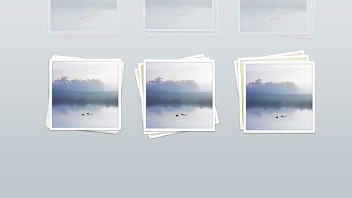
As you can see, it’s a pretty attractive effect. As soon as I saw it, I immediately wanted to try to pull it off with CSS. It’s a tricky situation though because there are multiple layers stacked on top of each other and we don’t want to clutter up our markup with three images for every gallery item. So how can we perform this illusion while minimizing our HTML markup?
It turns out, the answer that I was looking for lies in pseudo elements. This is a perfect use case to display the magic of :before and :after. Let’s get started.
The HTML
To create our first stack, the only HTML we’ll need is a div with an image inside of it. That’s all! The rest of the fancy footwork will all be performed via CSS. Make sure you add the “stackone” class to the div.
<div class='stackone'>
   <img src="http://lorempixum.com/200/200/city/7" />
</div>
Basic Styles
Nothing complicated here, just a basic margin/padding reset so our browsers get on the same page. Also, the borders on our images will be white so you’ll want to give the background a tint of some kind.
* {margin: 0; padding: 0;}
body {background: #ccd3d7;}
Top Image Styles
Now it’s time to turn our boring image into something a little more interesting. Here’s a chunk of code to get you started:
.stackone {
	border: 6px solid #fff;
	float: left;
	height: 200px; width: 200px;
	margin: 50px;
	position: relative;
	-webkit-box-shadow: 2px 2px 5px rgba(0,0,0,0.3);
	-moz-box-shadow: 2px 2px 5px rgba(0,0,0,0.3);
	box-shadow: 2px 2px 5px rgba(0,0,0,0.3);
}
There’s a lot going on here so let’s tear it up piece by piece. These four lines determine our size and positioning:
float: left;
height: 200px; width: 200px;
margin: 50px;
position: relative;
Because we’re going for a gallery effect, we’ve floated the images to the left and set a fairly arbitrary margin of 50px to space them out nicely. The height and width are set to the dimensions of the image that we used in our HTML (200px by 200px).
The most interesting part of this chunk of code is the positioning context, which is set to relative. As of right now, this isn’t doing anything. I’ve only included it because I know that we’ll be using absolute positioning on the pseudo elements later and I want the position for those to be “relative” to this item rather than the page as a whole.
Icing
The rest of the code is purely for aesthetic appeal. I added a fairly thick white border along with a box-shadow, being sure to utilize all of the vendor prefixes for maximum compatibility.
border: 6px solid #fff;
-webkit-box-shadow: 2px 2px 5px rgba(0,0,0,0.3);
-moz-box-shadow: 2px 2px 5px rgba(0,0,0,0.3);
box-shadow: 2px 2px 5px rgba(0,0,0,0.3);
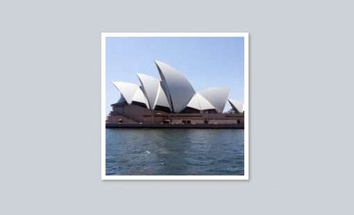
Progress Check
At this point the top of our image stack is looking great. With just a few lines of code we’ve pulled off a decent looking instant camera style effect.
The First Pseudo Element
Now it’s time to add in our first piece of the stack. Basically what we want to do is make it look like there’s another image under our current one. We can do this with the :before pseudo element and much of the same code that we used above.
To being, we use the following syntax:
.stackone:before {
	content: "";
}
Here we’ve targeted the class that contains our top image, then implemented the :before pseudo element with no content. This effectively adds another item to the document flow for us to work with. Now let’s style it like we did our previous image:
.stackone:before {
	content: "";
	height: 200px; width: 200px;
	background: #eff4de;
	border: 6px solid #fff;
	-webkit-box-shadow: 2px 2px 5px rgba(0,0,0,0.3);
	-moz-box-shadow: 2px 2px 5px rgba(0,0,0,0.3);
	box-shadow: 2px 2px 5px rgba(0,0,0,0.3);
}
The key thing to notice here is that we’re not really working with an image. I could load in another image, but it would be a bad idea considering there we are making stacks of three. For every one image in the gallery, we don’t want to load in three! Fortunately, since most of the surface area of the pseudo elements will be hidden, we can simply use a solid color and still pull off the effect we’re looking for.
Positioning
At this point, things aren’t looking so good. In fact, we’ve really messed up our image!
As you can see, our pseudo element is interfering with the image. To fix this, we need to add some positioning context, then push it to the back with z-index. I’ve split up the different chunks of styles here so you can clearly see what’s going on with each block.
.stackone:before {
	content: "";
	height: 200px; width: 200px;
	background: #eff4de;
	border: 6px solid #fff;

	position: absolute;
	z-index: -1;
	top: 0px;
	left: -10px;

	-webkit-box-shadow: 2px 2px 5px rgba(0,0,0,0.3);
	-moz-box-shadow: 2px 2px 5px rgba(0,0,0,0.3);
	box-shadow: 2px 2px 5px rgba(0,0,0,0.3);

	-webkit-transform: rotate(-5deg);
	-moz-transform: rotate(-5deg);
	-o-transform: rotate(-5deg);
	-ms-transform: rotate(-5deg);
	transform: rotate(-5deg);
}
By using absolute positioning, we can then push our image into place given the starting position of the original image. As we said, z-index then pushes the image to the background, which helps with the interference that we were getting before. Finally, we tossed on a transform effect to pull of the messy rotation that you see in the original Stacks PSD.
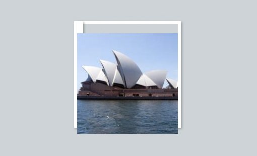
Progress Check
At this point, everything looks great! Our second photo (well, fake photo) is sitting nicely under our first and has enough rotation to set it apart. One more and we’re home free.
The Second Pseudo Element
As you can probably guess, to add a third photo to the stack, we need to utilize the :after pseudo element. This works exactly like what we just did, so there’s no need to walk through it in detail. The primary differences will be a different background color, position and rotation.
.stackone:after {
	content: "";
	height: 200px; width: 200px;
	background: #768590;
	border: 6px solid #fff;
	position: absolute;
	z-index: -1;
	top: 5px;
	left: 0px;
	-webkit-box-shadow: 2px 2px 5px rgba(0,0,0,0.3);
	-moz-box-shadow: 2px 2px 5px rgba(0,0,0,0.3);
	box-shadow: 2px 2px 5px rgba(0,0,0,0.3);
	-webkit-transform: rotate(4deg);
	-moz-transform: rotate(4deg);
	-o-transform: rotate(4deg);
	-ms-transform: rotate(4deg);
	transform: rotate(4deg);
}
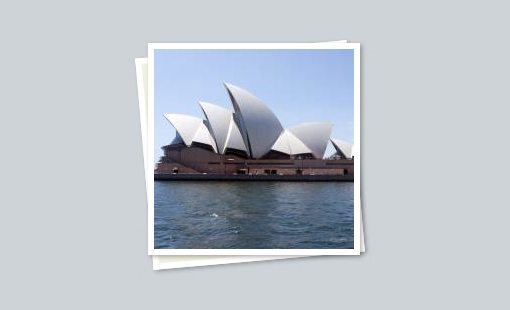
Progress Check
Would you look at that? We’ve finished our first image stack! It’s a pretty snazzy effect considering it really only uses a single image.
A Flawed Workflow
Given that the original PSD had several different image stacks to choose from, I wanted to do the same thing with CSS classes. To do this, we could easily copy and paste all of the code above into a new “stacktwo” class and change the rotation/positioning for the pseudo elements. Bam: you’ve got yourself a new stack.
Here’s the problem though: I did this with a whopping eight different stacks and the result was a horrendous blob of code. Seriously, it was uglier than a 1997 table-based layout. The problem of course is that I’m repeating myself over and over. More than half my code is comprised of pure redundancy. I can’t in good conscious pass on such horrid practices to you.
DRY CSS
Andy Hunt and Dave Thomas coined the term “DRY” in relation to programming, which stands for “Don’t Repeat Yourself.” To make an inane semantic point, CSS isn’t technically a programming language, it’s a style sheet language. However, if we treat it like a programming language and apply the concepts of DRY coding, we end up with a much better result.
Let’s see if we can apply these practices to make our code a little briefer and more extendable.
Let’s Try That Again
If we create a bunch of classes and follow on our current path, our CSS is going to get unwieldy. Right off the bat, we’ll have to declare each class individually and then pass in a big chunk of code to each. And this is before we even approach the pseudo elements, which will literally triple our code!
.stackone {...}
.stacktwo {...}
.stackthree {...}
.stackfour {...}
.stackfive {...}
.stacksix {...}
.stackseven {...}
.stackeight {...}
Given that a great deal of the styles will be shared, let’s cut back on our code and place some of these styles all in one declaration block.
.stackone, .stacktwo, .stackthree, .stackfour, .stackfive, .stacksix, .stackseven, .stackeight {
	border: 6px solid #fff;
	float: left;
	height: 200px; width: 200px;
	position: relative;
	margin: 50px;
	-webkit-box-shadow: 2px 2px 5px rgba(0,0,0,0.3);
	-moz-box-shadow: 2px 2px 5px rgba(0,0,0,0.3);
	box-shadow: 2px 2px 5px rgba(0,0,0,0.3);
}
This takes our core styles and applies them to all of the starter classes in one go, which is much better than repeating ourselves over and over. As an optional next step, you could get even fancier with your selectors.
Notice how all of our classes start with the same five letters: “stack”. Given this information, we can pull out the arbitrary substring attribute value selector and target any classes that begin with this string of five letters.
div[class*='stack'] {
	border: 6px solid #fff;
	float: left;
	height: 200px; width: 200px;
	position: relative;
	margin: 50px;
	-webkit-box-shadow: 2px 2px 5px rgba(0,0,0,0.3);
	-moz-box-shadow: 2px 2px 5px rgba(0,0,0,0.3);
	box-shadow: 2px 2px 5px rgba(0,0,0,0.3);
}
How fancy is that? This one selector targets all of those classes for us! Even better, if we choose to add eight more stack classes to the mix, this selector will still function perfectly.
Let’s take this to the extreme and see how brief we can make our code. The key here is to find everything that’s repeated and instead attempt to use it only once. As you can see, I started with the declarations that can be applied to only the “stack” classes. Then I moved onto styles that could be applied to the stack classes along with the :before and :after elements. Narrowing it down yet again I set up a declaration block for only the :before and :after styles. Finally, I ended with the different color that we’re using for the :before classes.
div[class*='stack'] {
	float: left;
	position: relative;
	margin: 50px;
}

div[class*='stack'], div[class*='stack']:before, div[class*='stack']:after {
	border: 6px solid #fff;
	height: 200px; width: 200px;
	-webkit-box-shadow: 2px 2px 5px rgba(0,0,0,0.3);
	-moz-box-shadow: 2px 2px 5px rgba(0,0,0,0.3);
	box-shadow: 2px 2px 5px rgba(0,0,0,0.3);
}

div[class*='stack']:before, div[class*='stack']:after {
	background: #768590;
	content: "";
	position: absolute;
	z-index: -1;
}

div[class*='stack']:before {
	background: #eff4de;
}
What we’ve done here is literally taken hundreds of lines of code and compressed them into a small space. This is fantastic for maintenance, loading times, and your general sanity! It’s a little bit tricky to wrap your mind around DRY principles at first, but once you do you’ll never look back.
Other Stacks

From here out, each stack will be fairly unique so we will have to code the rest one at a time. A little Sass or Less would go a long way towards helping out this portion but you guys are sick of me ranting about the wonder of preprocessors so I did it the long way.
/*STACK ONE*/
.stackone:before {
	top: 4px;
	left: -6px;
}

.stackone:after {
	top: -2px;
	left: -6px;
}

/*STACK TWO*/
.stacktwo:before {
	top: 0px;
	left: -10px;
	-webkit-transform: rotate(-5deg);
	-moz-transform: rotate(-5deg);
	-o-transform: rotate(-5deg);
	-ms-transform: rotate(-5deg);
	transform: rotate(-5deg);
}

.stacktwo:after {
	top: 5px; left: 0px;
	-webkit-transform: rotate(4deg);
	-moz-transform: rotate(4deg);
	-o-transform: rotate(4deg);
	-ms-transform: rotate(4deg);
	transform: rotate(4deg);
}

/*STACK THREE*/
.stackthree:before {
	top: 5px;
	left: -15px;
	z-index: -1;
	-webkit-transform: rotate(-10deg);
	-moz-transform: rotate(-10deg);
	-o-transform: rotate(-10deg);
	-ms-transform: rotate(-10deg);
	transform: rotate(-10deg);
}

.stackthree:after {
	top: -2px;
	left: -10px;
	-webkit-transform: rotate(-5deg);
	-moz-transform: rotate(-5deg);
	-o-transform: rotate(-5deg);
	-ms-transform: rotate(-5deg);
	transform: rotate(-5deg);
}
Browser Compatibility
In my testing, the browser compatibility here was actually pretty impressive. Everything should work fine in Safari, Firefox, Chrome, Opera and IE9+. For IE7, you get a simple image gallery without the fancy stack effect, which I consider to be completely acceptable as this is a purely aesthetic touch similar to rounded corners.
IE8 is the tricky one because it partially supports enough stuff to really screw everything up. You can decide how to approach this issue however you like, but the solution I came up with was to use a horrible, dirty hack to target only IE8, which is to append \9 to any IE8 only styles. Utilizing this technique, I simply hid the :before and :after elements so that IE8 gets a simple image gallery like IE7.
div[class*='stack']:before, div[class*='stack']:after {
	background: #768590;
	content: "";
	position: absolute;
	z-index: -1;

	/*Dirty IE8 hack*/
	height: 0px\9; width: 0px\9;
	border: none\9;
}
The fancy selectors are where IE8 tends to get tripped up, it actually supports before and after as long as you stick to the single colon syntax. If you list out the classes with commas rather than using the attribute value selector, you should be able to get IE8 to perform the stack effect.
Conclusion
We packed a lot in today. We built a cool image stack illusion, learned how to implement :before and :after, and then discussed best practices for coding while utilizing a DRY mentality. I hope you learned something and had as much fun as I did!
Keep an eye out on PixelsDaily in the days ahead for an awesome free download containing all of the source code for this tutorial along with eight awesome image stacks that you can use in your projects.