Design Critique: Mobile Me
 Apple have recently announced a new suite of online applications called MobileMe. The aim of the development is to allow you to keep all your information in sync between several devices (e.g. your iPhone, Mac and Windows PC). In addition, Apple have created a new online site at me.com, which will hold a suite of applications including email, calendar, address book and photos.
We’re going to take a quick look at the design and layout of this new online service, and explain what works well and what we think could have been done better.
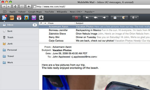
This section of the service has done a great job of emulating a desktop application. The existing .Mac webmail application was already excellent, so porting this across has not changed a great deal. Design features which stand out include:
- The use of a lighter font to separate the subject and following message content
- Adding a new email indicator to the top toolbar, and the page title, to show your unread messages whilst using other applications
It is interesting to point out the lack of branding running through the site – nowhere is the ‘MobileMe’ logo featured, and the user is free to use the service without being confronted with too much Apple-centric branding. This is a distinct step away from Microsoft or Google online applications, which both use branding extensively.
Photos / Gallery
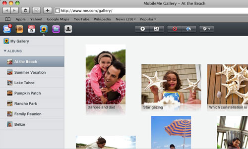
There are a plethora of modern AJAX galleries online, all with their own pros and cons. Apple’s now integrates with the iPhone, iPhoto and your Mac, along with offering different viewing methods.
The addition of reflections to the photos looks typically Apple, but seems to make reading the caption underneath more difficult. It raises the eternal dilemma – at what stage do superfluous effects become more of a hinderance to the user than a positive addition. That said, there are several design elements which are notably good:
- The permanent share-able URL in the top right makes showing others your photos very simple
- The simple design of the album settings popup
- The ability to resize all photos at once (no mean feat to achieve whilst keeping load times down)
Considering the lack of any Flash, the gallery pages do a great job of showing content in a dynamic and appealing way. The technologies used are nothing new, but have been used to very good effect.
Calendar
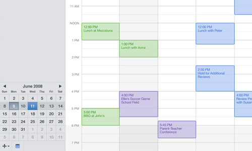
The previous online calendar on .Mac was relatively poorly designed, with little to no interactivity and various restrictions. The new version offers not only a much more accessible and practical design, but also a variety of new features.
We particularly like the dragging and dropping of calendar appointments which snap to place in the grid structure of the page as they are moved. Features such as this illustrate how JavaScript can really allow online applications to feel as natural and robust as desktop counterparts. Other aspects which stand out are:
- Transparency in event backgrounds allow you to still see time intervals
- Excellent use of subtle colours in the small calendar in the lower left to make it immediately obvious what day it is, which day you’re looking at and where the month begins and ends
- Slightly larger line spacing between events in the month view (making the online calendar actually easier to read and scan than the desktop version)
One inconsistency found here is the difference in design of the ‘settings’ screen when compared to the equivalent in the gallery section. It would have made sense to standardize this across all the various online applications. However, on the whole we think that the design of the online calendar is actually better than the desktop version, and hopefully some of the interface features (increased line spacing, less rounded corners etc) will be brought to the desktop version in a future update.
iDisk
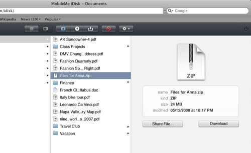
The use of JavaScript and AJAX provides, for the first time, a practical interface for managing files and folders. Flipping through directories is seamless, as is dragging and dropping files as the page does not need to be reloaded for changes to take place.
The pink/purple icon for the iDisk is, to be frank, awful. The contrast between the two colours clashes and could certainly have been designed better. I’m not sure why a departure from previous aluminum drive icons, or the iDisk globe, was needed – either of these would have been more aesthetically pleasing.
However, the layout and view options look good and files/folders are clearly defined. There isn’t a great deal to say in relation to this section – it’s straightforward and does what it says on the tin.
Lessons to take away
- Branding isn’t always essential – put the user interface first and offer a simple service
- Be careful not to use visual effects when they come at the detriment of user experience and accessibility
- Icon design is not easy, but avoiding colours such as bright pink is generally a good idea!
- It is certainly possible to create online applications which look, feel and respond in a similar – if not better – way to desktop counterparts
- Pay attention to line spacing, as it can make text much easier to read
Do you have any other comments and opinions on this new service? Let us know below!