10 Mistakes Every Designer Makes… and How to Avoid Them
We all have them – design projects we’d like to take back. Some of them you can attribute to a bad design brief or youth; others you just want to hide forever. The good news is that you can often avoid design mistakes; the bad news is that every designer will fall in at least one of these traps at some point in his or her career.
But part of the key to avoiding designer mishaps is knowing what they are, so you can be aware if you feel yourself slipping into one of these bad habits.
1. Making Poor Typography Choices
Typography can make or break an entire design project. Poor type choices include those that consist of too many typefaces, illegible typography and using type that does not match the mood and tone of the content. (If you want a giggle, take a look at these “23 Really Bad Font Choices” from graphic designer Douglas Bonneville.)
How to avoid it: There are a couple of things you can do to help create better typography.
- Stick to two or three font families per project.
- Pair fonts that have similar “feels” to lettering, such as very round, or similar x-heights or pick a “plain” typeface to pair with something more elaborate.
- Pair a serif and sans serif for visual interest.
- Be aware of the thickness of font strokes against the background. Make sure to create enough contrast between lettering and the canvas so that every word is easy to read.
- Make sure the tone of the type matches the tone of the content. You would not use exclamation points at the end of every sentence on a website for a lawyer, so don’t use a typeface with that same sentiment.
2. Not Proofreading

Typos are death to designers. Turning in a “final version” that includes typos is unprofessional and will not bring clients back. No one wants to end up on one of those blogs with silly misspellings or phrases. Proofreading mistakes can be costly as well. Most clients will not accept a print job with an error, a reprint doubles the cost (and eats away at your profit).
How to avoid it: Finish your project. Walk away and then come back and read it again. Repeat if necessary.
3. Forgetting to Package Files
When it’s time to send the final product back out to a client, don’t just send an image file or raw document. That’s not enough. You must package everything you used for the project for a complete send-off. Forgetting to package properly can cause multiple problems for anyone who opens the work – photos may be missing, fonts could get replaced, other elements could be lost or corrupt.
How to avoid it: Package everything and provide all source files with completed projects. (Many client contracts could stipulate this as a requirement as well, making it an even better habit.) If you are using Adobe software, use the “Package” function and it will wrap up everything in a folder for you. It is possible to manually package items as well. Create folders for images and graphics, fonts, video or any other elements you use. Include that folder with the final design.
4. Building Graphics and Logos in Raster Format

Repeat after me: Raster is wrong. (Well, not always but you get the idea.) In most instances, graphics such as logos or backgrounds should be designed in vector format. Raster files, such as digital photos, are made from millions and millions of pixels. At certain sizes, these pixels become evident. (Learn more about the differences between raster and vector images in a previous Design Shack article.)
How to avoid it: Design using vector formats for graphic elements. Vector never loses its crisp, clean resolution because it uses lines and curves to create images, not pixels. So no matter where you decide to use a graphic element – web, print, mobile, wherever – it will always have the same look and feel.
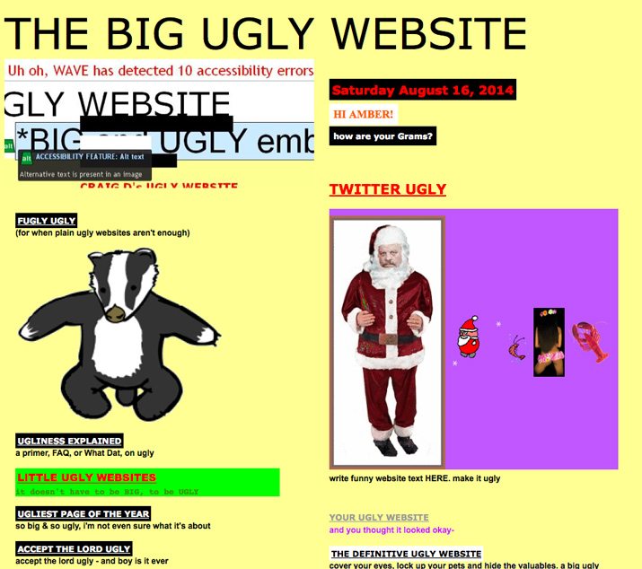
5. Fearing White Space
Most designers know to use space, but still fall into the space trap because they are trying to get too much information into one space. The result is a cluttered mess that only hurts the design project.
How to avoid it: Give every element room to exist. Elements should all have some padding to keep them from running together.
- Group like elements and add extra space around them to pad them from other elements.
- Always think about leading and body copy. (Leading should almost always be greater than the point size, and the small the text, the more necessary the space.)
- Edit copy down so that you get the message into the space in a way that fits.
- Think about equal spacing around and inside elements. Boxes and text should float comfortably inside their “boxes.”
- Use a grid to help organize information and space.
6. Improperly Kerning Type (or Not Kerning)
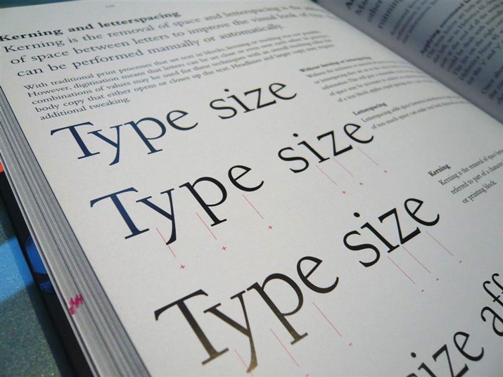
There are certain letter combinations in every typeface that could use a little help. Forgetting to kern is the obvious difference between a complete project and an incomplete one. If you are using lettering as a dominant element in any way, a touch of manual adjustment is probably in order. (You can learn all about kerning in “8 Simple and Useful Tips for Kerning Type.”)
How to avoid it: Kerning is the adjustment of space between a pair of letters. Some letter pairs create gaps (or push letters too close together) and making words difficult to read; manual kerning adjustments can fix that. Pay close attention to every large word in your project (pretty much anything bigger than body text) and adjust letters as needed. Proper kerning can save embarrassment – depending on the letter combination – and just adds a bit of finesse to projects.
7. Forgetting to Account for Bleed
If you print it, you probably need to bleed it. Bleed – an outside-of-the-print-area margin – ensures proper cut for a finished printed project. If you forget to set a bleed from the start, it will take work on the back end to get an element print-ready. Further it can result in rework or part of an essential image area being cut out of a final job.
How to avoid it: Check bleed requirements for every printed project with the printer before you get started. And stick to the specs.
8. Using Too Many Tricks
Tricks are like typography: Use too many and you just end up with a mess. Add-on effects such as shadows and animations and embossing should be used alone. The same is true of trendy elements. These tricks can date a design in a hurry, especially if a trend is short-lived. You might also run the risk of getting grouped into the masses if you jump on a trendy effect. Let your content dictate how the design comes together, not the go-to effect of the week.
How to avoid it: Pick one trick and stick to it. That’s enough. Opt for more classic design styles for projects that have a long shelf life.
9. Using Too Much Color
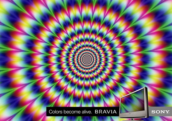
A weak or unplanned color palette can create problems of its own. Too many colors can appear cluttered, busy and informal while lack of color altogether can feel stark. Other color choices such as those with paired and oversaturated hues, can strain the eye and even appear to vibrate when viewed.
How to avoid it: Pairing colors is a lot like matching typefaces. Stick to two or three colors and tints for maximum impact. Add in a neutral for balance and be aware of how type looks on top of colored frames. Colors should have enough contrast to create separation and should connect emotionally with the message being delivered.
10. Making Everything Perfectly Symmetrical
Perfect symmetry can be boring. If every element in every design project is symmetrical, you and the people looking at your projects will lose interest.
How to avoid it: While symmetry works for some design projects, mix it up and try creating things that have a more off-kilter feel. Unsymmetrical designs can still have the same balance and harmony as elements with symmetry, but they also create more flow and interest.
Conclusion
Now that you know what not to do, how many of these design mistakes will you admit to making? I will raise my hand and admit to making every one of these mistakes at least once. Thankfully awesome colleagues caught many of them before the final projects ever saw the light of day.
What other design mistakes do you see way too often? Share them (and your tips for avoiding these problems) in the comments.
Image Sources: Markus Spiske, WikiThreads, sandbaum and Image Editor.