10 Reasons Why the Best Design Is Invisible
Good design is not something the average user look at and says “wow, that’s a great design!” Good design is something that is easy to use, read and interact with. It makes users want to engage and experience your website, app or physical material and evokes a specific emotional response.
As a designer you may spend days, weeks or months working on a project that does not look like anything especially spectacular to those outside the design community, and that is probably a good thing. Good design is pretty much invisible.
1. Tricks Don’t ‘Sell’ Design Projects
One of the biggest mistakes designers make is adding embellishments or “tricks” to the design to show off their skills. These techniques can be helpful in the creation of a functional design; they can also get in the way of success.
Step back and think about every design trick or technique you are using. Then ask yourself a couple of questions:
- What am I trying to accomplish with this technique?
- Does it contribute to user emotion or interaction?
- Why did I use this technique?
- How often has it been used lately?
- Is this something I would have used a year ago or will I use it a year from now?
While these questions don’t provide a specific use it or not answer for certain design techniques, they can help you better thinking about why you are using a certain design trick or technique. If you are using it for function, readability or to connect with users, keep moving forward. If you are using it because you are bored with the design or just want to try something new, it may be time to reconsider.
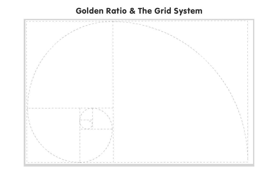
2. Unseen Mathematical Principles Create Harmony
There are plenty of mathematical theories that go into creating design with perfect harmony. A handful of time-tested theories have long-shaped our collective definition of what looks good. But users will never see them – you would not lay a spiral or grid over a finished piece would you?
Designing with these principles in mind can help. (You can learn more about everything from the Golden Ratio to the Rule of Thirds in the previous Design Shack article.) Use these concepts as you work and then remove them from the final product.
3. Color Has Plenty of Meaning
Color is a lot more than just a guide on the screen. Color creates emotional connections and associations for people consciously and subconsciously. Choosing a color palette takes time so that the feel of the project matches the message the design is supposed to convey.
Carefully consider how color plays into this. Think about your intended audience and how they might feel about a specific color. While there are some very general color associations – such as red for passion and green for nature – there are other cultural associations that may not be as common.
4. Copy Can Engage and Wow
Every word in a design project should carry weight and meaning. Work to eliminate unnecessary words and edit for grammar and readability. Create copy that has a tone and voice that will appeal to the type of user who will engage with it.
And make it easy to want to read. Here are a few things to keep in mind when writing copy that will go almost unnoticed.
- Use simple language and words. Stick to a reading level that is at the eighth-grade level.
- Instructions should be explicit and direct.
- Use a visual cue with words when possible. (For example, “Stop” might appear in a red box.)
- Copy should be free of misspellings or other errors.
- Talk to or with users or readers and not at them with the copy.
- Use a voice that is consistent with your brand.
- Users often have short attention spans, write copy so that it can be read and scanned quickly.

5. Simple is Easy to Understand
How often have you heard that phrase? It still applies to design today. Boiling down an entire message or design concept to something easy for the user will create success. Maybe C.W. Ceram better explains it: “Genius is the ability to reduce the complicated to the simple.”
Everyone would like to be a design genius, right?
6. Readable Text Should be the Focus
Let’s be perfectly clear: It does not matter how pretty or special or cool your typeface is if people can’t clearly read it. Readability should be a top concern for all designers in all projects.
And users won’t even think about the text if they can read it. On the other hand, any difficulty in deciphering letters or words can cause immense frustration and users will abandon your project all together.
When thinking about readability, remember the principles of typography:
- Contrast
- Space
- Size
- Emphasis
- Density
- Organization
7. Interactions Should Work Seamlessly
When it comes to interacting with a design, from a website or app to reading a magazine, users should not have to think about how things work. Every interaction should happen with ease.
Think about this common example: When you are typing an email, a red line appears below misspelled words to let you know there is a mistake. Users know what this means and it happens without thinking about it. That good design and superb interaction.
8. Design Should Mirror Reality
Design is believable when it is real. It is also believable when it is so fantastical that users would not expect it to be true. These two extremes help designers shape how to create experiences that are relatable to users, giving the design credibility.
Interactions should mirror physical movements. Movements and actions that are effortless should appear that way when designed as well. Actions that are difficult should evoke that feeling. Think of it this way: Up arrows increase sound or size or move a user from bottom to top of a page. If it worked any other way there would be confusion.
At the same time, designers can create something so creative and wild that users don’t expect it to be real. (Think video games here.) The interactions are unique and spectacular but in no way rooted in reality.
Whether you decide to design within the realm of reality or far from it, the concept boils down to one thing – user expectations. The design has to work and function in a way that users simply understand.
9. Change is Not Always Obvious
Especially when it comes to web design and technology, small changes happen behind the scenes of a design all the time. But pushing updates too frequently can annoy and frustrate users, so some elements of the design should change without most people even knowing it.
One of the best examples of this was explained by Information Architects Founder Oliver Reichenstein in an interview with The Verge, when the company changed the typeface for the iA Writer app: “To give you an idea, with the new Retina displays we had to optimize the typeface so it looks like it used to look on the iPad 2. To do this we had to grade the typeface, producing subtly different versions for each class of display so they have the same visual weight.
“To the user the type looks exactly the same on the retina display as on the iPad 2. This required a lot of tweaking from our side (to find the right definition), and the deep professional knowledge of Bold Monday. Users don’t notice this, but they don’t need to. Good user interface design takes care of irritations before they appear.”
10. Create Design Magic
It sounds so very simple, right? But as a designer, you have to weigh all the possibilities and techniques and tools at your disposal to make something that looks great, is easy to read and understand, and that users will want to interact with.
That’s where the magic comes in. Spend plenty of time perfecting projects by thinking about these things. It is fine to use tricks – we all do – but use them with purpose. After you complete a design draft, step back and look at the project. Ask yourself if there are things you can strip away to make it better, and if so do it.
Conclusion
Design is a word that immediately makes you think about visuals. So it can be difficult to think about how a lot of what designers do is never really seen by users. Good design creates a feel and connection between the project and the user.
Good design is a beautiful pairing of powerful visuals such as an image or color or word and “invisible” elements that bring it all together. So we’ll end with this:
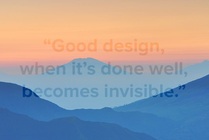
“Good design, when it’s done well, becomes invisible. It’s only when it’s done poorly that we notice it.” – Jared Spool, software developer and programmer