10 Things Only a Designer Would Notice (And Why They Matter!)
Don’t think your poor design choices won’t be seen. Keen graphic designers are judging your shortcuts and rolling their eyes.
Just because these are things that only a designer would notice, it doesn’t mean they aren’t important. (Do you really want all that judgement from your peers?) Here’s a list of things that make my skin crawl… Make sure you’re not guilty of these design faux pas!
1. Your Fonts Don’t Match
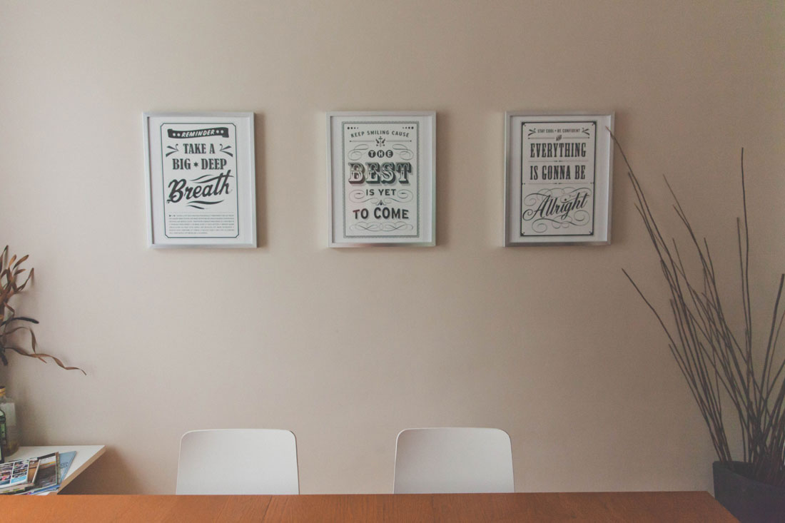
Does the bowl in the headline font mirror the bowl in the body text? Do the typefaces have distinctly different weights or families but still match?
The process of airing fonts isn’t just a matter of picking two typefaces and calling it a day. They have to match in feel, meaning, and visual language. These elements help create harmony and consistency that not only make typefaces look good, but that can also contribute to readability.
Want some advice? Here are 10 great Google Font combinations you can copy, great if you are unsure about your font choices or are too lazy to care.
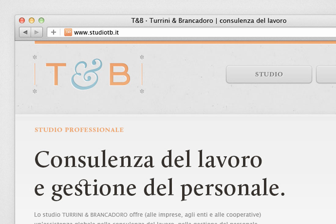
2. The Correct Color Mode
A brand color palette should look the same on screens and printed materials. That super bright logo on your website is the result of not changing the color mode to RGB before uploading. And it’s majorly annoying!
I am flabbergasted by the number of websites that I visit – and also the number of screen-based presentations – that use the wrong color mode. This is an embarrassing mistake and one that should be pretty obvious.
If the color looks like this…

…instead of this, then you are using the wrong color mode. Fix it right now!

3. If There’s a Favicon/App Icon
One of the first things I notice when visiting a website is the presence (or lack) of a favicon. That’s the little icon in the title bar of the web browser. The second thing I notice is whether it matches the website identity and if the tiny icon is something readable.
It’s a small detail, but an important one. Don’t leave this design element unattended. And while you are at it, be sure to create an app icon as well.
4. Paper Quality
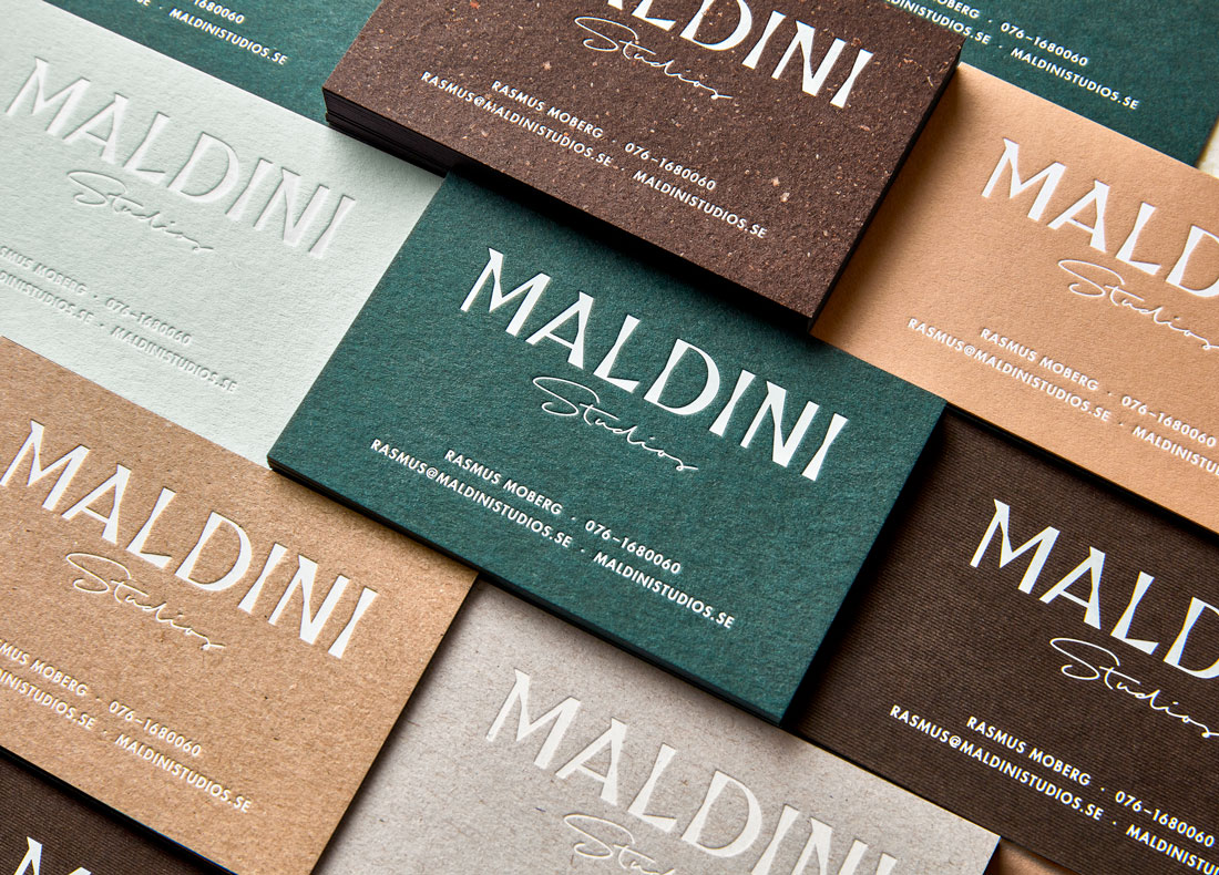
If you’re going to spend the time and money on creating something with a physical design element – a postcard, invitation, poster or packaging – make sure to use paper that communicates something about the project.
The print quality and feel of the item in your hands can say almost as much as the graphic design. These things are inexplicably intertwined. Nice paper with a texture or heavier weight communicates value. Don’t ever forget it.
5. Image Quality
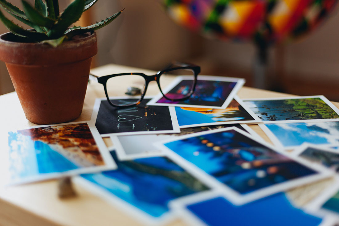
From icons to photographs, image quality is one of those things that goes completely ignored (because everything looks great) or sticks out like a sore thumb. Just one bad image – pixelated, blurry, difficult to understand – can ruin an entire design. Bad images are distracting and can look unprofessional.
Remember to think about high-resolution oversized and retina screens when creating digital designs. Upload images with this in mind so that you don’t inadvertently offend users with the highest visual quality devices.
6. Your Notebook/Note Taking

As a designer, I tend to pay attention to how those around me write and take notes. Are they neat and informative? Are they sketched and interpretative? Are they part of the conversation or just random doodles? Are you using a pen or pencil or tablet? I’m taking note for a couple of reasons:
- Because I am a visual learner and am interested
- To figure out the problem solving process in action
- To try and figure out if we are on the same page creatively
(I’ll only judge if you never take notes at all.)
7. Rich Black vs. Pure Black
Have you ever picked up a newspaper or magazine and the black text had a ghost effect with halos of cyan, magenta or yellow? That’s from using the wrong type of black for printing processes.
Black text in printing should use pure black, a four-color process color of 100 percent black (or K) and 0 percent of all other colors (C, M, and Y). PrintNinja has a pretty good guide here.
The opposite is true in digital publishing, where rich black – a black created by combining multiple colors in the RGB space – is preferred.
8. Your Design “Tricks”
Drop shadows, outlines, loading animations. I see all your tricks. And so does every other designer out there. That doesn’t mean these tricks are bad per se, just make sure you use them wisely.
A design trick should be used to contribute to the overall experience, and a design should be limited to one trick. Anything more than that gets overwhelming fast.
9. UX Consistency
On the home screen, the call to action button has a hover state. On a secondary page, it does not. One form uses autofill and an intuitive keyboard, but another does not. These inconsistencies in the user experience can be painfully obvious to other designers. And most other users as well.
While these inconsistencies can sometimes be difficult to track down, analytics and user data can be a good place to start. If there are forms that are not converting or elements with significantly lower click rates than comparable elements in the design, that’s a cue that an inconsistency might exist.
10. Complementary Materials
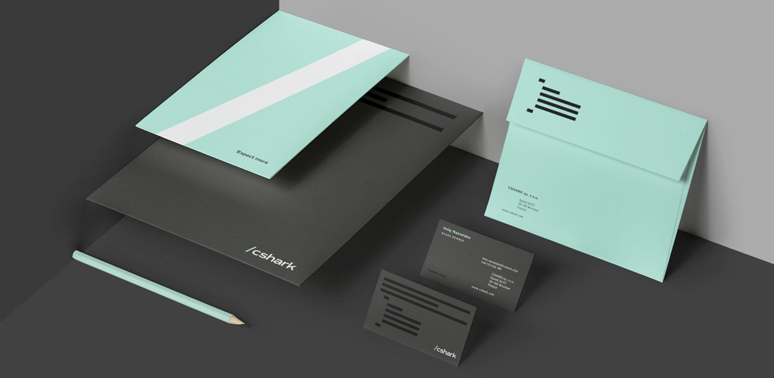
Do all of the materials for the same brand or campaign has a similar look and feel? This includes digital and print elements. A stack of complementary materials can be one of the strongest tools a designer can create.
Brand identity and consistency are so important in a world where so many messages are coming at you all the time. Being able to visually identify something quickly can help connect designed materials and users quickly and create more loyalty between users and brands they engage with.
So Why Does This Matter?
This is a list of things only designers will notice, but all of these things have much broader implications for projects in general. Paying attention to these details matters because they contribute to the overall feel of a project.
That’s not something most users can pinpoint, but they do notice. Some of these things can be surprisingly obvious to the untrained eye:
- Typography that’s just a little off or jarring. It’s hard to describe and difficult to read./li>
- Inconsistent brand colors when CMYK and RGB color modes and mixed and matched inappropriately.
- Photos or graphics that are difficult on the eyes and cause squinting or a second look due to poor quality.
- Print materials that are hard to read because of text that uses four-color rather than one-color black.
All of these things contribute to the overall message you want to communicate. Users might not know why a design does or does not work, but they will show it in the amount of time they spend with it.
So much of what makes a “good” design is often invisible to the user. But believe me, designers see it all.