10 Tips for Designing Icons That Don’t Suck
Almost every designer is thinking about app design these days. One of the smallest features of every app is the icon used to represent it on the screen of every mobile device and in the app stores. Designing a great icon is more than just putting a logo in a box. You need something that stands out among all the other app icons out there.
A good icon can be used in a variety of ways – for apps, social media and even on smaller printed projects or business cards. And all it takes is a little design and planning.
1. Make It Easy to Read
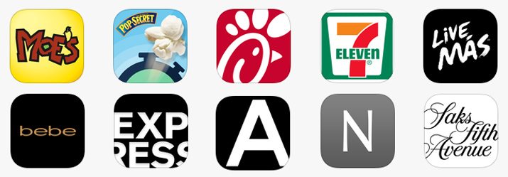
An icon needs to be easy to read. (And we’re not talking about text.) Visual legibility is key.
The icon should include a visual that is highly recognizable because of branding or because it is easy to understand. Think about the icons on the desktop of your computer for example. You know where things are located because of the simple nature of icons – documents are stored in folders, music is played from a button in the form of a musical note and images are stored in a location that looks like a Polaroid photo.
When it comes to visual legibility, branding is a big part of the consideration. Big, household brands often have icons that are a part of their logo or an iconic image. People tend to recognize these elements right away even at small sizes. This can be a little tougher for new or smaller brands or icon concepts and designers may opt to go with other techniques for optimum impact.
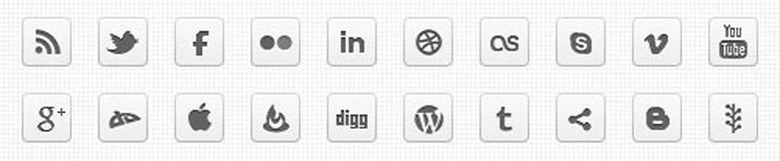
2. Think Icon, Not Image
An icon is not a photo in a box. An icon can include an image, but may also be a text representation, logomark or combination of those elements.
It just needs to be highly visual and recognizable. Most logos do not include actual photographs, but are a more graphic representation of an idea. (This concept is emphasized by the need to create a vector-based icon.)
An image can also become difficult to read at small sizes and get lost in a sea of other icons on a user’s phone or other device. A more graphic representation can often carry more visual weight.
The mobile app icon for the Macy’s department store above is a good example of this. The large white star in the center of a red box is easy to identify. The icon varies from the standard treatment of the company’s signature icon in that the color is reversed to add emphasis to the icon. A red background will likely stand out more than a white one against a variety of user wallpapers.
3. Avoid Words
One thing you won’t see in icons is the use of words. There simply is not enough room for an icon that is filled with stuff to read and comprehend.
As a rule of thumb, avoid text altogether unless it is part of your logo. Even text that is part of a logo should be carefully considered before using in the primary logo design.
The icon should be designed in such a way that creates identity without words. Further, remember how many icons are actually used in context to the devices they appear on. Most include a line of descriptor text under the actual icon block.
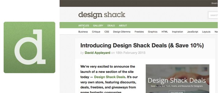
The Design Shack icon, for example, is one that uses a single letter “d” with color and type treatments consistent with the website. This unified branding and easy to read letter create a visual tie and connection, without words.
4. Use Vibrant Color
Want your icon to stand out? Go bold with color. A vibrant color choice will help you app stand out on a variety of backgrounds and will grab the attention of users.
The last thing you want from an icon design is for it to blend in with all the other options available. This makes blue – especially sky and navy hues – a color that you will likely want to avoid because so many other icons use it.
If blue is your primary logo or brand color, try to pair it with something brighter for impact. Consider a “new neutral” such as lime green, or opt for a seasonal hue such as a bright orange in the fall or bright pink in the spring.
5. Develop a Symbol or Simple Logo
You likely have a logo for your brand, but when it comes to icons a symbol is also important. A symbol can be a simple graphic representation or snippet of a logo or image.
It just needs to be sharp and memorable. More brands are incorporating iconic symbols into their standard branding and logos in order to create a full connection between smaller icons and larger design projects.
Think about messaging and photo sharing app Snapchat. The ghost symbol has become so recognizable that it can appear as the icon users are familiar with, in other color schemes and shapes and even as a standalone image on a billboard. This is a prime example of a symbol that works.
6. Remember Scale
While most of us think about icons as those tiny things on our phones or desktop computers, an icon is not always small. It should be designed in a way that makes it usable regardless of size.
This is especially important because of the constantly changing digital landscape, the emergence of more retina displays and because different platforms and devices may render icons at different sizes.
Built it large and then scale down.
7. Create in a Vector Format
When it comes to scale and size, format is also an important consideration. An icon needs to be created using a vector-based design.
Having a vector image will give you the freedom to make changes and save the icon for a variety of devices, sizes and viewports without creating a lot of individual images. Because the reality is you will need multiple versions of an icon sized for a variety of projects.
The benefit of vector is flexibility. But there is a catch. For many applications or platforms, you will likely have to save a copy in a non-vector format for upload.
8. Think Outside the Design Box
In recent months there have been a lot of icons that use single color backgrounds with a white icon, flat design techniques and long shadows. While these trends can be a lot of fun, don’t get stuck inside the design box. Do something different with your icon.
If everyone else is working with square edges, consider something more rounded. Add a hint of texture to the background to stand out from all the flat color. Don’t feel like you must model your icon on what everyone else is doing.
9. Make it Monochrome
There’s a fun little trick designers have used for years to test out the effectiveness of small-scale designs – make it monochrome. If your design communicates the same message with or without color, it probably works. If the icon needs color to be read, keep working on revisions.
Personally, I start almost every design project in black and white and then later begin to add color. It’s the sketch on a computer concept. If you sketch it on paper and it works before you really start adding color, the idea likely has a solid framework.
10. Think Square
Your icon and any parts inside the square frame need to also fit squarely. This does not mean that the design or image has to be exactly square in shape, but the basic aspect ratio for every icon has an equal height and width.
So, if you have a symbol that is super vertical or horizontal, you will need a way to fill the space around it so that it does not get lost in the background. Opt for a concept that fills a significant portion of a space that will be mostly square. (Even a rounded, circular icon has an equal height and width.)
Conclusion
It may sound cliché, but the key to good icon design is to be … well … iconic. It is that simple.
Design with simplicity, color and visual recognition in mind. Think about interfaces and current trends so that you design fits with standards. (You would not design a skeuomorphic icon for an iOS mobile app these days, would you?) And have fun; an icon is a users’ doorway to your digital interface.
Image Sources: Ash Kid, Casey Fleser, Roland Tangalo, Gustavo da Cunha Pimenta and Microsiervos Geek Crew.