3 Web Design Rules You Should Actually Try to Break
There are a ton of design rules that get stuck in your head. Things more senior designers suggested, elements of design theory, or lessons learned in classes along the way. But maybe you should actually break some of these rules?
Design trends and concepts change a lot over time. Technological advances, in particular, have changed some of the rules. Design is an evolving process and what works today, might change tomorrow. With that in mind, here are three design rules you should actually try to break.
1. Use Sans Serif Typefaces for Web Design
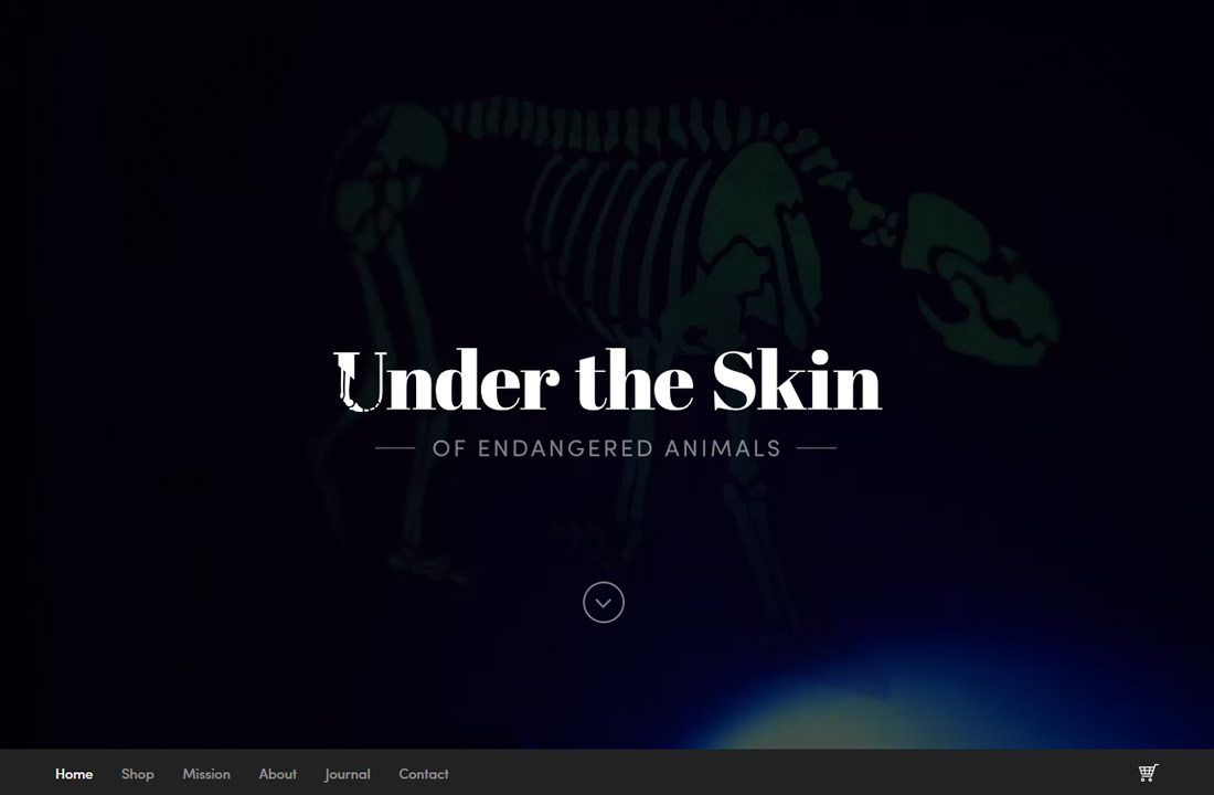
Every web designer used to say that you needed to use sans serif typefaces online. It’s just not the case anymore. Break that rule!
A good mix of readable typefaces is the new norm. This includes serifs, sans serifs and even novelty and script styles. The key to choosing the right typeface (or type palette) is picking from lettering styles that are easy to read.
There’s been research to back up this idea as well. Jakob Nielsen of the Nielsen Norman Group, which focuses on user experience, research and training, said better screens are changing the landscape of typography guidelines for website design. Here is the conclusion from that study:
The old usability guideline for online typography was simple: stick to sans-serif typefaces. Because computer screens were too lousy to render serifs properly, attempting serif type at body-text sizes resulted in blurry letter shapes.
Unfortunately, the new guideline is not as clear-cut as the old one. Legibility research is inconclusive as to whether serif fonts are truly better than sans serif.
The difference in reading speed between serif and sans serif is apparently quite small. Thus, there’s no strong usability guideline in favor of using one or the other, so you can make the choice based on other considerations — such as branding or the mood communicated by a particular typographical style.
So go ahead and break the old sans serif rule. Here are a few things to look for when thinking about which font to choose and whether it is highly readable or not.
- Opt for uniform stroke widths in a medium or regular weight. Super light or thin type can be tough to read.
- Stick to an average x-height. Letting that is super skinny and tall can come with readability concerns.
- Look for consistent and adequate letter spacing, without overuse of ligatures or flourishes.
- Use ornate typefaces for small blocks of text and only with distinct intent.
- Opt for serif or sans serif typefaces for larger blocks of copy. Pick letters with distinct letterforms that are easy to read at a glance.
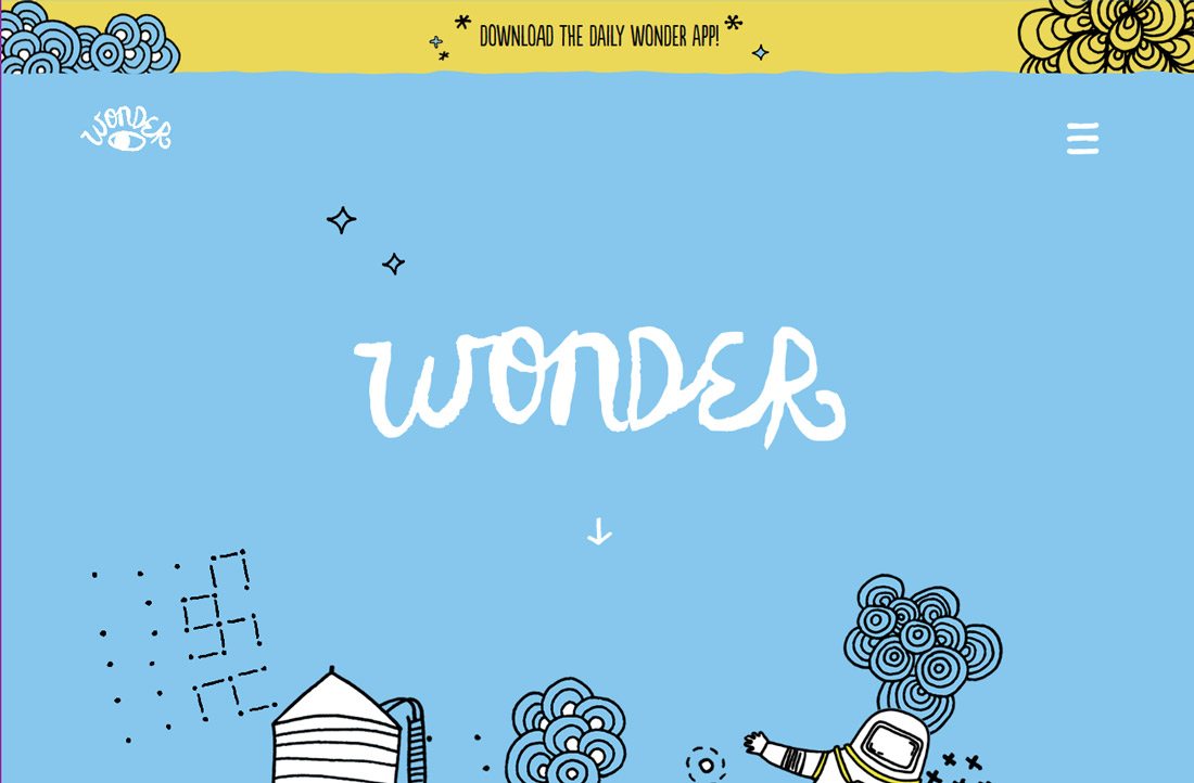
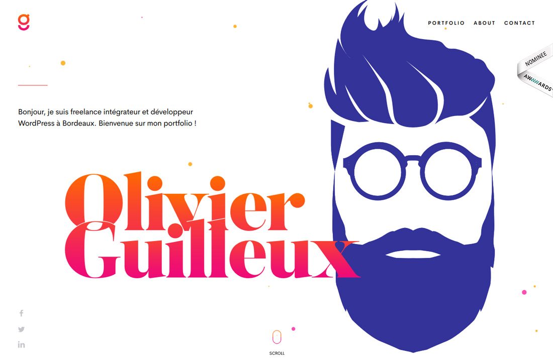
2. Stay Away from Bold Backgrounds

For a while it seemed like the only acceptable colors for a website background were white and lit neutrals. No way!
Bold, bright background colors can make a great background element. Color can make a great first impression on users, set the tone for the design and is a fun and interesting way to break up the same old design patterns.
The second part of this breakable rule, is to limit the number of colors in your color palette. While it is a good idea to have a distinct brand palette, you can go for a little more pizazz with individual design projects.
The color palettes behind Material Design combined with the use of more bold color choices has opened up what is considered classy and tacky. More color is acceptable. More websites and big brands are using color to help create an interesting and engaging experience. And users seem to like it.
While you do need a simple palette as your go to standard for consistency, add in some extra (and brighter) colors for specific projects. You don’t have to redesign all of your brand materials to have bright purple or green backgrounds, but you can incorporate more trendy colors into projects in a number of ways.
- Consider a color photo overlay.
- Opt for a bright headline color.
- Swap out that neutral background for something more memorable.
- Use a brighter hue for buttons or call-to-action elements. (They don’t all have to be red or blue.)
- Use color-blocking hover states to encourage interaction.
3. Create Symmetrical Balance
Early in my design career, too many veteran designers pushed the power of perfectly symmetrical designs for creating harmony and balance. Looking back, many of these concepts were just boring and way too safe.
Asymmetry can help you create more visual interest and balance without a split-down-the-middle design. While there is a place for symmetry, creating balance with weight, space and elements that counter each other can be so much more interesting.
To make the most of asymmetry in design projects consider the following to create a sense of harmony and visual flow:
- Balance elements and space against each other. A heavy element can feel more balanced when paired with white space.
- Put an emphasis on motion to the eye moves through the design as intended. Think about how people read, and start with heavier elements and text on the left that “move” toward the right .
- Use color to create focal points.
- Space everything on a grid to create a sense of organization and flow.
- Pay attention to weight. Asymmetrical designs shouldn’t feel “lopsided.” The user should move through content with ease. Use static elements such as navigation to create a container for asymmetrical elements.
Conclusion
Breaking design rules can be invigorating … or disastrous. Make the right choice as to what rule to break (and when) by thinking about the goals for your project or design. How will breaking a rule make this project work better? Does it enhance usability, function or ability for the user to understand the message?
If the answer is yes, then your project might be the perfect canvas for breaking a rule and trying something new and different. Don’t just break a design rule because you are bored. (That’s really not a good reason to do much of anything.)