4 Simple Tips for Writing Copy That Matches Your Design
When it comes to design projects, sometimes we (designers) get caught in a trap: creating a design without understanding the content. The first step to creating an outstanding project – before you ever open a piece of software – is to read over the content. Then think about the design and how the copy goes with it.
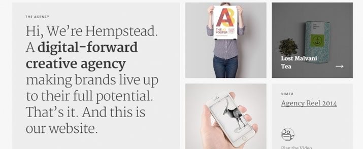
Does the copy actually need to match the design? Should designers help write the copy? Yes, most definitely. (As a bonus, all images in this post are examples of great copy and design pairings from the Design Shack gallery.)
1. Design for Content

Design and content go hand in hand, and one is completely useless without the other. Sadly, too many projects don’t make the right connections between the visuals and the copy.
Design traps frequently include:
- Mismatched tone and visuals
- Poor punctuation, spelling or grammar
- Contrasting styles
- Pretty aesthetic with choppy text (or vice versa)
- Trapped design spaces with copy holes
- Too much copy crammed into too little design space
- Lack of hierarchy and readability
- Forgetting the audience and who they are
The fix to all of these issues is creating a content and design plan where the two intersect. Design is nothing without great content and content is nothing without great design. This makes it imperative for designers to understand the basics of copywriting and why the words matter.
Sometimes this includes working with the rest of the team in the creation of the words or edits that make it all come together in a more succinct and understandable way. Designers should be fluent in reading and writing copy for every project they take on. Designers should also feel comfortable enough to suggest changes to the copy or design plan if they notice any of the above traps along the way.
2. Understand Tone and Voice

You know the first thing you need to do is read the copy, how does it speak to you? What’s the tone of the writing? Is it consistent, clear and easy to follow?
Now imagine how the copy looks – I know this sounds silly, but keep going. Does the copy evoke imagery of any sort? (This might be in the shape of letterforms or a persona or a strong visual image.) Start there with the design.
What’s more problematic from a design perspective is if there really isn’t a tone or voice to the copy. That’s when you can help.
- Ask questions about what the tone and voice should be – fun, serious, jovial, straightforward, chaotic – and use design to create it.
- Make sure you know and understand the audience so that the design and copy is for them.
- Help rewrite some of the copy during the design process to include more cues and emotional connection. (We’ll focus more on this below.)
- Think with purpose. What is the overall goal of what you are designing? Make sure the copy and visuals lead the reader or user to that action.
Remember the basics when creating a voice for the copy (and matching visuals): It should connect to the way you talk. Copy should be conversational, smooth and written using straightforward words. When it comes to the corresponding design, it needs to be readable.
3. Copy to Focus On

As a designer, you will not be tasked with most of the copy creation, but there are certain key elements that you may work on by default. Every design has three main pieces of copy – headlines and subheads (or big text), the story (main body copy) and a call to action.
Headlines and Subheads

Headlines and subheads are arguable the most important pieces of copy in any design. They are the largest copy blocks and what will draw people into the other text. These are often pieces that don’t come with the other text when it is handed off to a designer. That means you need to be comfortable writing the copy. (You can’t really complete a design with lorem ipsum can you?)
When writing the big words, think of them as a link between the main content and design. The words and design choices you make (including size, typography and color) can amplify the meaning of the words.
Ask yourself the following questions to help ensure the best copy possible:
- Who is the audience and does this text speak to them?
- What emotion do the words (and related design choices) convey?
- Is the text attention-grabbing or provocative? Will the reader keep moving through the text?
- Does the text push the reader to the next level of text?
- Is it easy to read on the canvas?
Design and Content Story

In most design projects the main content will come to you. It is vital that you have a good understanding of this story so that you can design for it and create supporting text.
What is often missing are bits of microcopy that flow throughout the content story. This is especially true for website and app design projects. The small bits of text that appear in buttons, navigation, menus and throughout the design can make or break the content plan. These small pieces of copy should be carefully written, need to use like phrasing for like actions and match the overall tone of the project.
Call to Action

Calls to action are the reason for the project in the first place. Every piece of marketing material, website, business card or package design is there you encourage people to do something. But sometimes these pieces are an afterthought.
Calls to action are often parts of the microcopy. Sometimes they are provided, sometimes not. When planning copy and design for calls to action it is important to make this element insanely clear and easy to understand.
- Consider a simple typeface with a medium, uniform stroke width.
- Keep the action short (i.e. “Click Here” or “Call Today”).
- Does copy leading up to the action support performing that action? (If not, consider a rewrite.)
4. Make it Readable

As a designer (whether you help write the copy or not), you main objective is to make it all readable. Create visual interest paired with words that are easy to comprehend.
To do this well, you’ll become a bit of an editor. Read the copy as you put it on the canvas. Are there errors in spelling or grammar? Are they odd breaks or hyphenation problems? Fix them. Rewrite or tweak the text if necessary to do so. The project will be better for it.
And remember to make the text readable. This might include some changes to the copy or formatting along the way.
- Contrast is your friend. This includes size, color and typography options. Put emphasis on specific words and phrases that are key to the message.
- Stick to a handful of highly readable type families. Sans serifs work well for a variety of projects. Regular weights are almost always easier to read than thin or condensed versions.
- Break up the text visually. You don’t always have to rewrite text to make it better. Sometimes adding extra paragraphs or turning large blocks of text into bulleted lists or pull outs can make a huge difference.
- Use active words and pair with interesting visuals.
Conclusion
Now that you know the specifics of what your design is supposed to do, you can start creating it. Use color, typography and other techniques to create an aesthetic that goes with the text. Better copy does equal better design.
But there is a catch – don’t get caught up in trends or things you want to try when you take on a project. That is where things can go astray. Remember, design for the content you have. Maybe the next project will be better suited for that minimal framework you have been eyeing.