Designing an Infographic? 5 Elements You Must Include
Designing an infographic is just like designing a website. It starts with a concept, goals and even a wireframe.
The big difference is that all the information for an infographic is contained in one unit, whereas a website has multiple pages and ways to engage users. You can almost think of an infographic as a flat, or static, mini-website. You can also design a one-page website as an infographic!
Here are five essential elements to help you make the most of your next infographic design.
1. A Data Story
A good infographic starts with a solid story. This is often rooted in some sort of data that is visualized to make it more understandable.
Before you fall into the I-don’t-have-any-numbers-trap, data is not just number crunching. Data is any information that can be used to make a comparative analysis or a how-to guide. Data visualization is just one way to make that information easier to see and understand.
For purposes of an infographic, the story probably needs to be succinct. This is not a novel, it is an idea that comes to life with a few hundred words, great headlines (or headers) and a visual theme that ties it all together.
2. Visual Style and Flow
An infographic needs a strong visual presence to draw users in. Most infographics read from left to right and top to bottom in a more vertical than horizontal format. This style is by design because it mirrors natural eye movements and reading patterns.
But there are a few other things you can do to enhance visual style and flow:
- Use a color palette. It just like any other design project.
- Adhere to a style guide. Even this small-format story needs to include consistency.
- Place information using the inverted pyramid, meaning that the most important information is at the top and gets less significant as the user moves down the image.
- Keep it readable. Optimally, users should be able to see most of the information at a glance and everything should be readable. If you find that your infographic needs to be a little on the large size, break it into manageable parts so that all the information from one section is viewable at one time.
- Remember scale. With data visualization, context is important. Turn any text that you can into a visual element, but remember to provide enough context so that it is easily understood. If one element is twice as big as another and you use circles to represent this, one circle should be double the size of the other. (Simple, right?)
Infographics are appealing because they mimic the way our brains work. This visual representation of information is easier to think about, understand and retain.
3. Typography Palette with Hierarchy
Infographics thrive on big lettering.
As with any other design project, create a typography palette with one or two typefaces. But don’t be afraid to make the type larger than you typically would. Infographics often contain multiple small blocks of type. Make that type easier to scan and read by increasing the size and line spacing.
Also, make a point to have a special character style for short headers or big numbers you want to highlight. Think of this as the novelty typeface that draws users to the key bits of information in the infographic. Novelty and headline typefaces may be used multiple times in an infographic, unlike other projects. Make sure to pick a typeface for these elements that is bold, but not overwhelming.
Don’t be afraid to use color, bold or black character styles and multiple variations from the same type family – bold, italics, regular, caps, and so on – to provide maximum impact.
4. Plenty of Space
Because infographics can contain a lot of information in a small container, white space is important.
Use space to draw users to certain bits of information and provide emphasis. Use strategic spacing to give users a break in the right places as they digest information. (Think of these spaces as natural pausing points.)
Space can also help balance heavy text elements, large or complicated images or information and keep the overall design feeling manageable. Some designers almost fall into the old-school advertising design trap where every bit of the canvas must contain information when creating an infographic. Don’t let that happen to you. Space can be just as important as the information adjacent to it.
5. Call to Action
Don’t forget that your infographic should always have a goal. Why did you make it? What should people who see it do?
- Remind users to share.
- Include an embed code or link to drive users back to your website. (Some of the infographics in this post do that.)
- Don’t forget to include branding or identification.
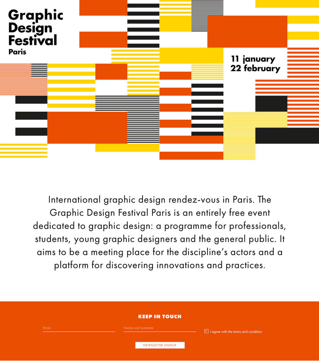
The website above is an infographic and is different from the other flat infographic examples. (Also note the call to action midway down the page.) Don’t be afraid to think differently when creating an infographic.
Conclusion
Here’s a bonus tip: Don’t clutter the infographic with everything you know about a topic.
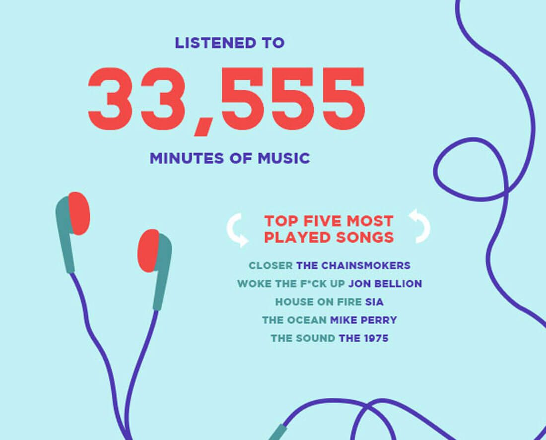
An infographic should provide succinct, streamlined information to the audience. It is a good place to give users an overview of a topic and entice them to learn more on your website or through another sales funnel. (It should be fun, like the year in review above, and make users want to keep learning more.)
Keep the infographic to a single topic so it is easy to understand and clear to users what they should do next at a glance. The best infographics are visual enough to grab users in an instant but have enough depth to encourage reading and thought about the topic. It’s a delicate balance.
The best way to create better infographics is to study the work of others. Keep a folder of infographics that appeal to you and figure out what works and why. You’ll likely find a mix of strong storytelling and superior visual composition.