5 Modern Website Background Ideas for 2017
White, stark backgrounds are so 2016. It’s time to give your website a quick refresh with a new, more modern background treatment.
While many minimal styles are still in, the lack of color is not. Designers are opting for grays and bright colors instead. Background effects are also pushing more boundaries with cool geometry, asymmetrical patterns and abstract art. Today we’re delving into modern website background trends, packed with examples and inspiration!
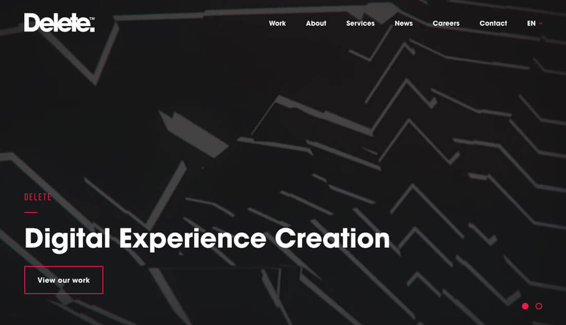
1. Geometry on Photos
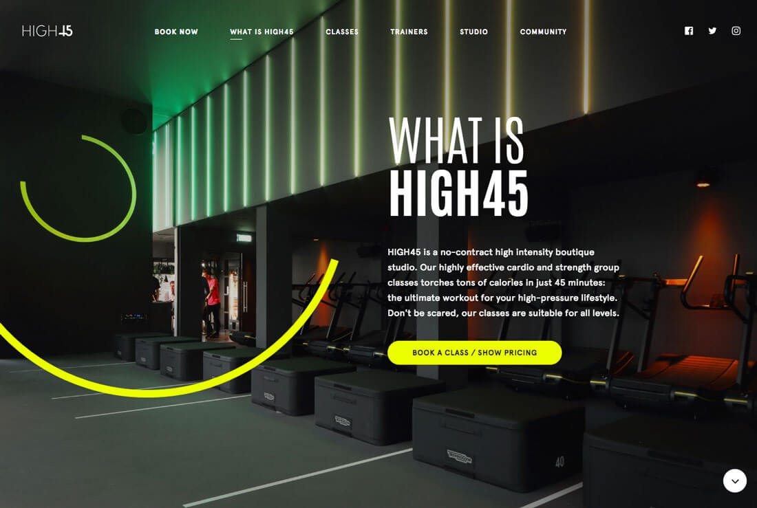
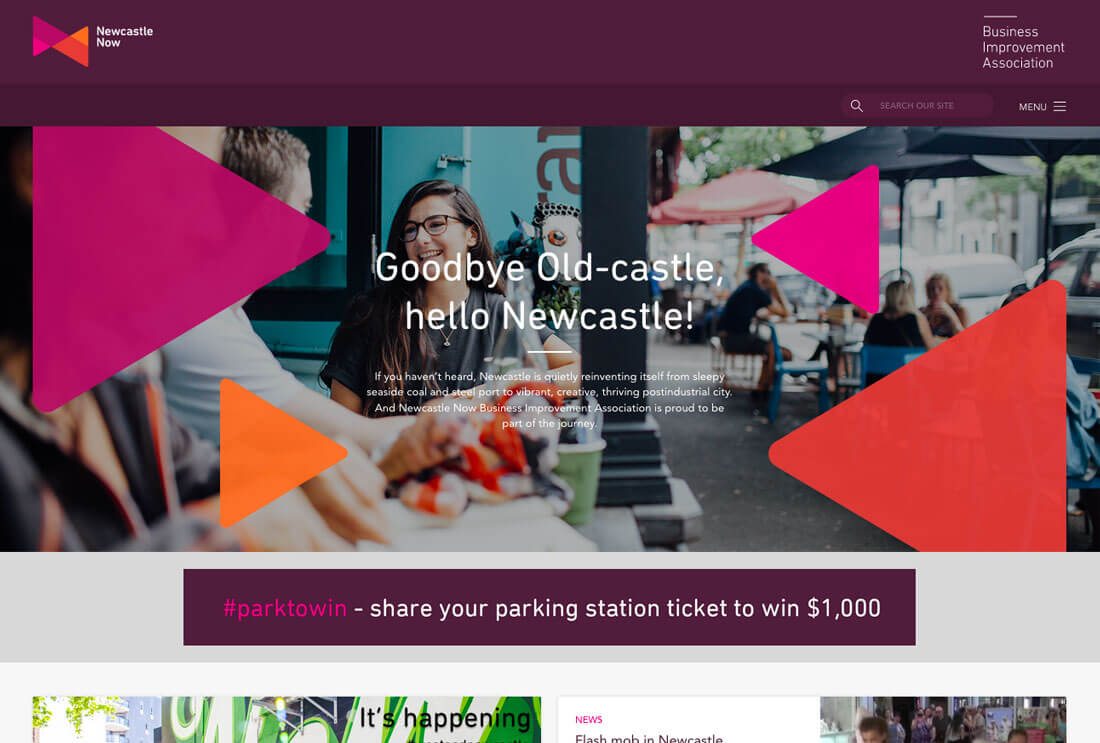
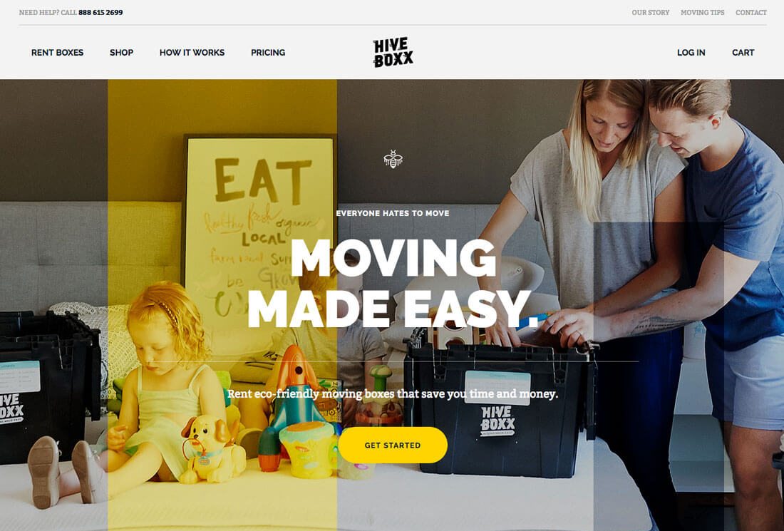
Hero images and illustrations are still one of the most popular background design styles. Big images are engaging and are a good way to draw in users.
While they are not a background per se, in most instances oversized, full-width images are the backdrop on the homepage. Images are layered with text, navigation elements and calls to action (hence usage as a background).
What’s new about hero imagery is layering images with cool geometric elements for a more interesting visual. From swirls to rectangles to elements that feel more tactile, designers are adding basic shapes to the design.
What makes this work is using geometry with purpose. You can’t just drop some neat hexagons on a photo and expect it to work. Geometric elements should be placed to help draw the eye to the right part of the image or lead users to a specific action. Geometry can add a pop of color in a dark or more stark design to encourage this eye movement. Shapes can also be used to help emphasize brand identity – particularly if the same shapes are in your logo – to create a stronger connection.
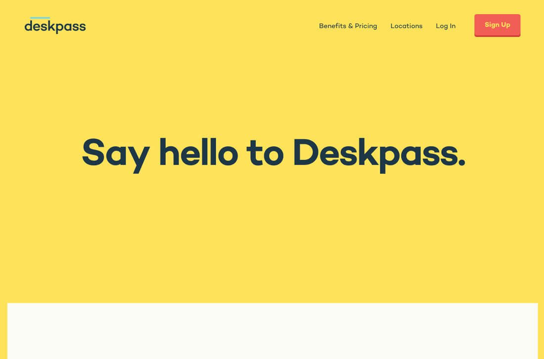
2. Shades of Gray
Switching up a minimal-style design is as easy as adding a little gray. Instead of a barren, white background, more websites are popping up with pale gray backgrounds with an otherwise completely minimal design pattern.
The great thing about gray backgrounds is that the color can be rich and warm or cooler in feel. The undertones can match brand colors or surrounding imagery. Or, go with a pale black-based gray for a hue that is almost flat.
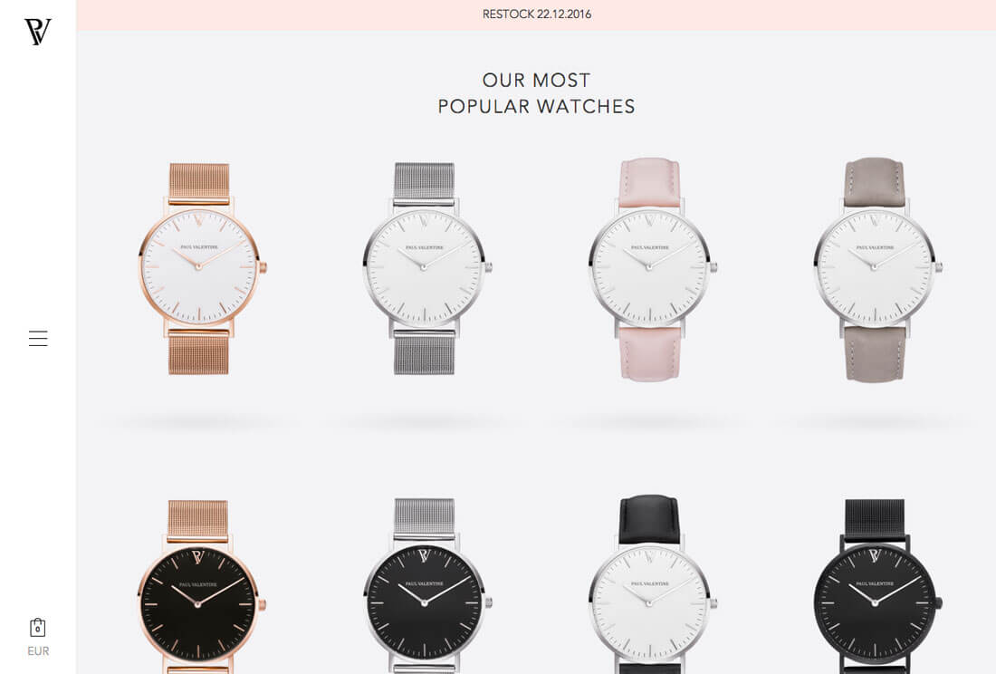
Whatever gray variation you choose, remember that the elements around it will help shape how the color feels to users. It looks quite soft, for example in the Paul Valentine site when paired with a pastel pink, but much more mod in the S. Dallyn portfolio site.
3. Layers of Bright Color
Just as geometric shapes can be used to create layered backgrounds, color blocks can have much the same effect. Bright color choices are a bold and interesting background choice.
These colored backgrounds can serve multiple purposes from drawing users into the design to adding visual interest to a space that might lack images or other visual elements.
The basis of this trend is rooted in other color trends that have majorly impacted design recently. Many of the colors and layers have a Material Design feel (or some carryover from flat design styles). This merging and shifting of trends is a natural evolution and one that’s easy to incorporate because it can be more of an adjustment to an existing website than a complete overhaul.
4. Asymmetry
Get off the grid! (Or at least adjust it so that everything isn’t so symmetrical.)
A background does not have to have bunches of tiny elements or patterns that line up perfect. It doesn’t have to be a solid color or image.
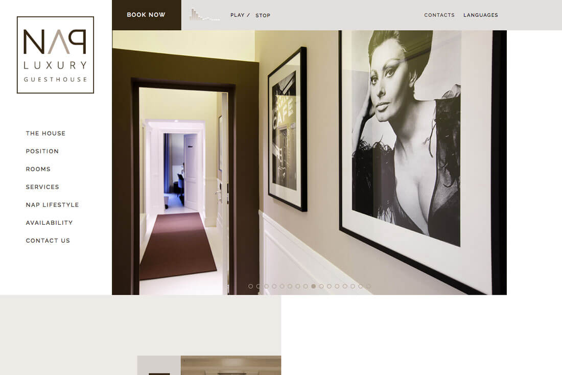
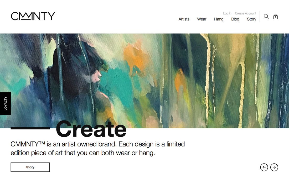
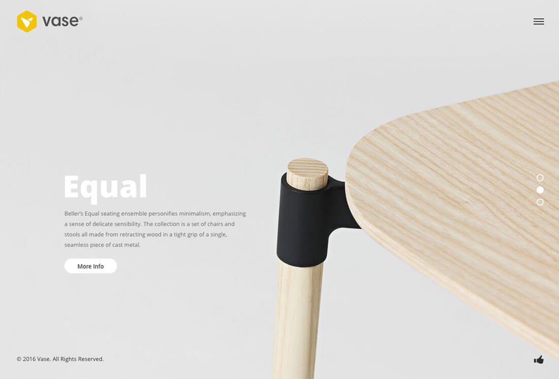
It can be a combination of these elements, positioned in a way to create perfect balance that you can’t cut right down the middle. Options might include a hero image that doesn’t take the full width of the screen with more white space on one side than the other, in the way showcased by Nap Luxury Guesthouse. It might look like a CMMNTY, where text elements and white space have equal counterweights for an effect that almost forces to users to look at the letters. It might be the subtle offset of an oversized product image with text and a call to action, such as vase.
However the design comes together, think about the background in terms of balance but not cookie-cutter. Try something different. Asymmetry is often bold, surprising and visually interesting (especially with so many perfectly symmetrical options out there.)
5. Abstract Art
Don’t have a great background idea? Try something abstract. Combine colors and shapes and swashes for a fun visual that might not look like anything at all.
When it comes to designing your website, you need a visual differentiator so that when users come to the website there’s something interesting that grabs their attention. If the design just looks like everything else, users might not have any reason to stick around.
Give them something neat to look at. Pair it with irresistible text that makes them want to engage with the design. Dare to be bold, different and interesting.
Conclusion
Is your website design suffering from an old, outdated or overused background style? (It’s Ok to admit it; it happens to all of us at some point.)
Now is the time to refresh the design with a more modern background style. Use the examples above as inspiration to try something different and create something that might even be outside your comfort level.