7 Rules for Creating a Simple Design
Keep it simple, stupid. This concept dates to 1960 when the U.S. Navy implemented the KISS principle, which maintains that most systems work best if they are simple, rather than complicated. The same is true of pretty much any design project as well.
Most graphic designers learn about KISS early in their careers. So how can you do it? Creating a simple design is a little more complicated than you might think. Here are seven rules to design by, that help you cut away all the clutter and create a beautifully simple account.
1. Set One Goal Per Page
The beginning of a simple design starts with a goal for the project and specific goals for each page of the website. Each page should lead users to one action, excluding the navigation and footer.
This could be anything from clicking a link, entering information in a form, watching a video or playing a game. But every page should focus on a single user action or conversion.
Too many things to do can overwhelm users. They can lose sight of what actions should be completed and might make the less desirable choice. Plan the design so that each page leads users to a single goal. Every actionable button above the scroll and below the scroll on the same page should do the same thing. This consistency helps users understand why they are on your site and what they are supposed to do; the simplicity of those choices make the design easy and engaging.
2. Stick to Two Type Families
There are so many design guidelines that recommend three typefaces for a project. You can streamline that even more with two robust type families.
Look for a type family that includes multiple weights with plenty of contrast between the regular and bold or black options. For even more flair, opt for a display choice that includes a few alternate characters that you can use in oversized headlines.
Then all you have to do is mix and match from a body typeface and display typeface to get great combinations of lettering for the entire design. Use two type families just as you would if you selected more options with specific uses for certain weights or styles.
You’ll find that this can help you create a highly readable and easy to use typography palette that’s easy to manage and has visual consistency.
3. Use Consistent Alignment
Left, center or even to the right – whatever alignment you like, stick to it throughout the design. This includes aligning like items, such as text boxes and elements that aren’t alike but fit together in groupings.
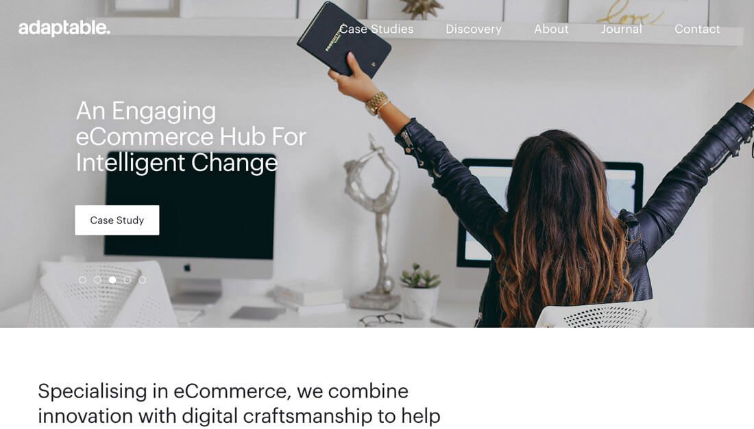
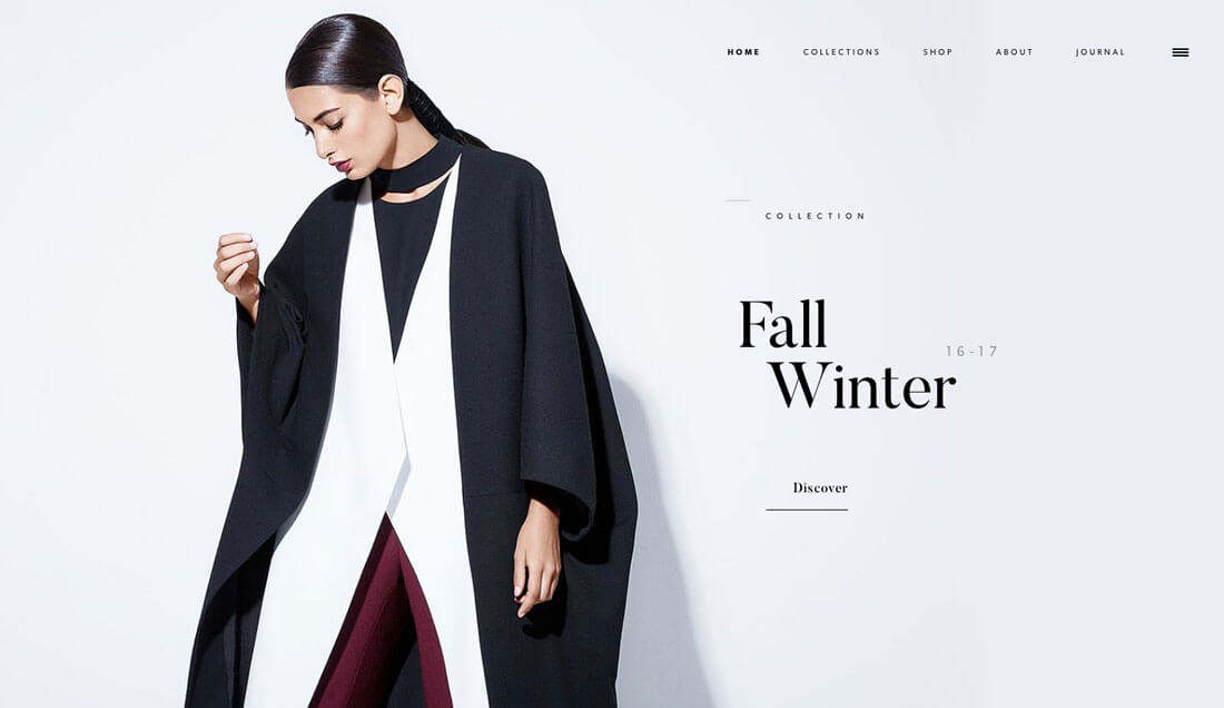
Adaptable does a great job of this with the text on the homepage slider. Despite text with different numbers of lines on the image, each headline lines up with the call to action button. The spacing between elements is also consistent.
What’s more is that this consistent alignment carries through on the scroll with other headline and CTA pairs.
The alignment matches the flow of the slider, which also moves in a complementary direction. Left and center alignments are the most common options when it comes to text elements because they are the most readable. With longer text, left alignment is the preferred option.
4. Establish Hierarchy
Users should not have to think about what to look at or how to move across a design. Even the simplest visual compositions should have a distinct hierarchy.
It starts with a dominant visual. It can be an image or video or text display or anything else that will make a first impression.
Then there should be some sort of text that tells the user what the design and website are trying to communicate. This is typically in the form of a simple headline that works with the dominant visual.
Third is a secondary bit of text or action for users to complete. The final visual element is a navigation menu. Users expect to find all of these elements and the eye is trained to move through the elements in basically this order. Make it easy for them by designing in that manner.
5. Give Elements Plenty of Space
If you don’t know it by now, commit this to memory: White space is your friend.
Give every element in the design plenty of room. Space will help draw attention to individual elements, take up “space” so you aren’t tempted to clutter the canvas and help create an overall design that has focus.
The trick to using space well is consistency. Set rules for the amount of space that will surround individual elements or fit between lines of text. If the design ends up looking too barren you might need to pull back on spacing just a bit. You’ll know spacing is right when you open the design fresh and go right to the places you want users to see first. (Not sure what they are? Go back to No. 4 – Establish Hierarchy.)
6. Amp Up Contrast
High contrast design elements – from color choices to the size of elements — can give a project just the right amount of visual finesse it needs, even in the most minimal of frameworks.
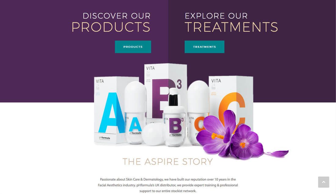
For a trendy option, try a bright contrasting color palette to grab user attention. Bold colors will make a simple design feel more complex and interesting that a black and white option. To make the most of contrasting color, opt for hues from opposite positions on the color wheel with similar saturations. If that option is too much for your liking, try other color wheel based pairs. (You might even find an unexpected new favorite, such as the purple and teal combination above.)
7. Use Consistent Icons and Elements
Consistency in design is one of the best (and worst) kept secrets of killer design. It’s one of those things that gets forgotten way too often as design projects are littered with multiple button styles or social media icons that just don’t match the rest of the website’s iconography.
User interface elements should not be an afterthought.
It’s important to create an icon and user interface element set and rules and user them throughout the project in the same manner. (You can even buy or download an icon font or user interface element kit if you don’t want to create these from scratch.)
Pick a color for elements, use the same hover action or effect for each (one for elements that are clickable and another for elements that are not) and size elements based on usage. (It’s acceptable to have both an icon size and an oversized option for elements that are a little more graphical.)
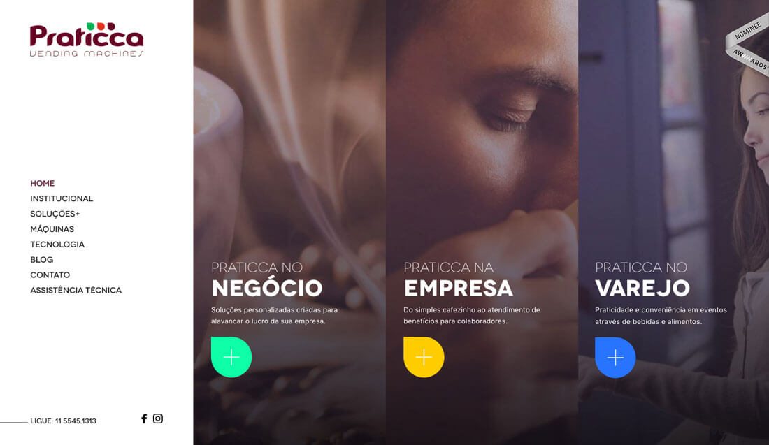
Praticca Vending Machines uses oversized icons for example to cue users in that there is more information. A + is located inside a colored icon. All three icons are identical aside from the color. They all do the same thing on hover and all act the same way when a user clicks. The same icon is used smaller throughout the site to start new bits of content and help users scan the copy.
Conclusion
A simple design does not have to be completely minimal or lack fun elements or user interface goodies. A simple design is one that is highly usable and intuitive, allowing users to engage without question or complicated instructions.
While there is a place for more complex websites or user interactions, most website designs can benefit from the KISS approach. Don’t overthink it, and users won’t have to either.