7 Tips for Creating a Memorable Design
It’s the goal of pretty much anyone with a website: to have users that come back again and again. They share your content; they engage with you regularly; they tell others about the website. They remember the website.
It doesn’t happen by accident. A memorable design is a tool that will help create this user connection. Here, we’re going to look at seven ways to create a lasting impression with seven stunning examples of how to do it. Learn how to create a design that sticks in the long term, and doesn’t fly under the radar!
1. Make an Impression

Users will remember the first thing they do on your website, as well as the last thing they do. It’s important that the memory is a good one.
Strong visuals on the landing page and a seamless finish to an action are key.
Tosco Music does a great job making a first impression that starts with a combination of interesting visual effects:
- Left-hand navigation
- Strong contrast between elements
- Strong video content above the scroll
- Beautiful typography
The design also makes a good final impression as well. Users can find out more about a musical act they are interested in or are invited to sign up for the company’s email with a simple form that’s hard to miss. Each interaction is simple, seamless and gives the reason for users to come back to the site.
2. Tell a Story
A website is your gateway to the world. It’s an opportunity to tell people who you are and why you matter. Whether the story is that of a brand or a travel blog, effective storytelling is the thread that keeps users hanging on.
Telling that story is a two-part process:
- Strong text to tell
- Interesting visuals to show
You’ll need both elements to put together a complete package.
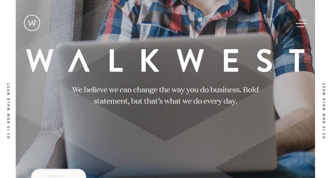
Walkwest starts by making a bold statement, and then they tell you a story to back it up. If you are in need of their services (public relations or marketing), this is something that’s likely to resonate with you. The way the story is told is simple with nice images and simple, short blocks of text.
But not only does the website tell a story, the design leads you through it with interesting scroll patterns and visuals. The user becomes immersed in the interaction to learn more. And it all happens in a matter of seconds.
That’s memorable storytelling.
3. Use Color Effectively

Too much color and a design can cause users to abandon the site, too little color and the design can be forgotten. Right in the middle is an interesting mix of color that will stick with users.
The trick to color is to create a palette that works for your content but also contrasts with a lot of the other things users come in contact with regularly. (Just think of how many websites you click on every day that have the same color blue for the background.)
Hillman Living uses a stark image with little bits of intentional color to grab your attention and help users focus on the chairs in the image. (That’s what they are selling.)
Move down the page and the aesthetic flips to a more traditional minimal style – with a white background – but each chair has the same color accents. This color use sticks with you. It’s hard to get the oranges and reds and blues out of your mind. (And they company is betting on the idea that you’ll think about them enough to buy.)
4. Do Something Fun
What comes to mind when you think “fun website?” A game? A movie preview? What about design techniques such as color, imagery and typography?
Any of these elements can make your design feel like fun.
- Smiling faces in images or video
- Bright, saturated colors
- Something to do (a game)
- Light, playful language (particularly in a similar typeface)
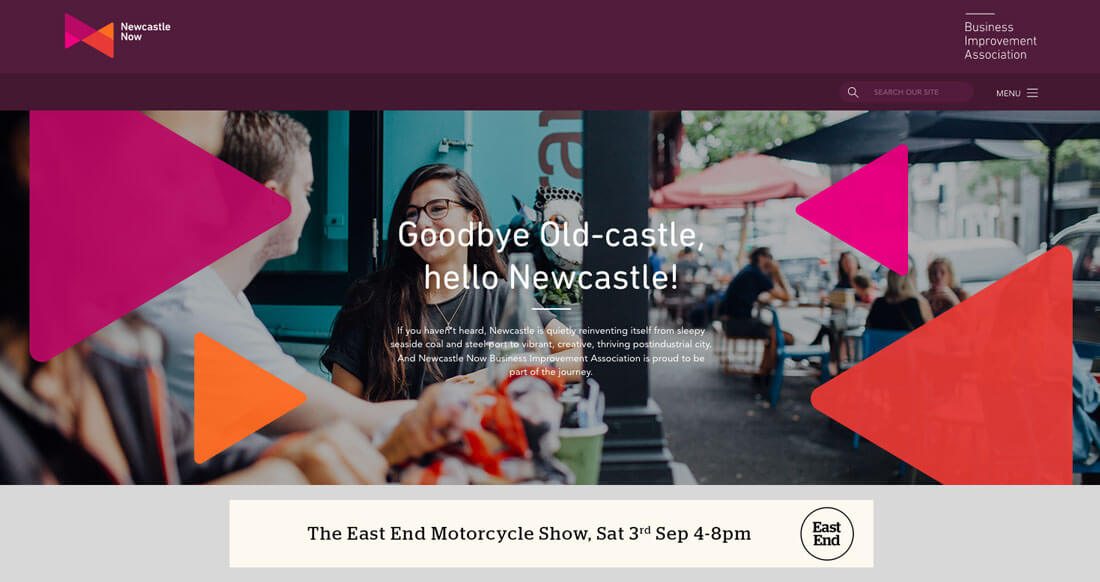
Newcastle Now does many of these things. The site is for a region that’s trying to reinvent itself and everything about the design is fun and interesting, from the color palette to the funky shapes as design elements to happy people doing interesting things in all of the imagery. The design makes you feel like you want to jump into the scene and laugh with the characters on the screen. (Bet you would remember that!)
5. Engage the Senses

It’s all about the writing and imagery when it comes to connecting with a users’ senses.
One option is to interact with users and provide feedback. For example, a user inputs something into the website and something else is returned. (Think of it as a back and forth that happens in the same way as texting a friend.) Another option is to entice them into thinking about your design in the way that Coffee Times Coffee does.
You probably won’t find a coffee drinker that doesn’t seem to smell the aroma when watching the video clips on the website homepage. (Some even claim to hear the beans in the grinder.) Either way, the design becomes more than just an image on the screen to the user, it invokes another pleasant memory through the senses. (One that is likely to linger for a while … or at least until another cup of coffee.)
6. Mix It Up

Some websites are designed to have new content all the time, because they do connect with a repeat user base. (E-commerce is one common example, as are news or magazine-style websites.)
Changing the content or tweaking the design can provide new an interesting experiences for users that encourage them to think about your site more often and return to it. The key is that the new experiences should still feel like your content and design (so this can be pretty tricky).
Nike is one of the leaders in this area. The content on the homepage tends to be different with almost every visit, but each new homepage element is equally engaging. The other thing Nike does well is that every bit of content on the website homepage is tied to current events so that the things users are thinking about right now are exactly what they get from the worldwide sports gear retailer.
While you probably don’t have the resources of Nike, it’s a great place to start in terms of information (and inspiration) gathering. Make a point to visit the homepage every week for the next month or so and look at the changes. How can you use those concepts to mix up your content?
7. Remember the Finish
You’ve got a plan to delight designers with your homepage, the visual are stunning, there’s a great call to action, but don’t forget the finish. Just as important as the first impression is the final impression. Knowing how to design this can take a little more work because users might leave your website from a different location than where they enter (at least you hope they do).
Dig through your analytics and find the page where most users are leaving and make that experience a good one. Create an offer to give users something – a good discount or printable/digital element – or lasting memory of the best part of your website.
The key is that users leave happy. (It is equally important to ensure that they don’t leave because of an error of some sort.)
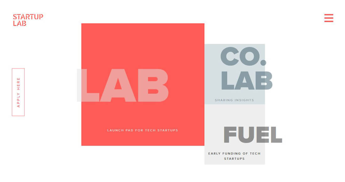
Startup Lab includes a finishing action on the left side of every page – it’s a form that users are supposed to fil out. The finish is memorable because the action is easy to find, the form is easy to fill out and users accomplish a goal within two clicks of wherever they are on the site.
Conclusion
Memorable website design is one of those tricky areas because it almost happens to users subconsciously. Do you ever stop and say “I’m going to remember that website!”? It’s doubtful.
But you do tend to remember some of the elements of what makes a website good. You think about the message later or get that afternoon craving for coffee.
I’d love to see more examples of websites that have made a lasting impression on you. Share them with me on Twitter and tag Design Shack.