8 Rules for Creating Effective Typography
Today we’re going to discuss something that is both a hot trend and timeless art: typography. The basic rules outlined below will help you become more aware of how you structure and use typography in your designs.
Being conscious of these rules can improve nearly everything you create that contains a headline or major typographic element. Let’s get started!
1. Learn the Basics
Your first step towards more effective typography is to learn a bit about the art. If you’re unfamiliar with it’s concepts, you might think that typography must be a fairly simple discipline. Surely, if you know the alphabet you’ve won half the battle right? All that’s left is to change how it looks a bit and you’ve got yourself a font! In reality, typography is quite complicated and is as much science as it is art.
The anatomy of a typeface involves very specific jargon, precise measurements and general standards that must be known and respected. As with many forms of design, you can only get away with breaking a rule if you know it well and are doing it intentionally to make a statement.
One of the best places to learn about typography online is I Love Typography, a blog dedicated to beautiful type. Here’s an image from ILT showcasing some terms that you should familiarize yourself with:
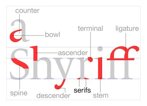
As you can see, making pretty letters quickly gets complicated. The graphic above does an excellent job at explaining these terms visually, but this is by no means an exhaustive list of the terms and concepts you need to familiarize yourself with. For instance, terms like x-height, kerning, and baseline aren’t even addressed in the graphic. To get a better grip on all of these, you should spend a few minutes browsing a typographic glossary.
What The Heck For?
The answer to this question is obvious: “Because you’re a designer!” If you regularly create designs that utilize words, you’re delving into typography whether you intend to or not. Taking some time to learn the basic principles will make you vastly more aware of the characteristics of the typefaces you choose and the manner in which you are using type as art.
2. Watch Your Kerning
This post is not meant to be a comprehensive study of typography so I won’t examine each of the terms mentioned above in detail. However, kerning is something that lots of designers, new and old, overlook completely. I was recently discussing this subject with the senior art director of a major women’s fashion website. The single thing that frustrated her most about the designers under her is their consistent lack of effort regarding kerning.
What is it?
Kerning involves adjusting the spacing between two letters in a given font. Note that this is a separate issue than tracking, which adjusts the space between all letters simultaneously. You might think that an expensive program like Adobe Illustrator would automatically solve all kerning woes for you and that this is therefore not a problem that arises in your artwork. Think again. Check out the example below:
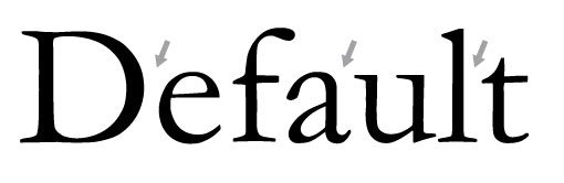
If you’re not used to looking for kerning issues, the problems may be subtle, but they’re there. Notice how the uppercase “D” in the example above stands out significantly from the rest of the word. By default, many typefaces, especially those with pronounced serifs, can possess inconsistent letter spacing. This is usually not a huge problem in a paragraph or sentence as the inconsistent spacing sort of blends out in blocks of smaller copy. However, when you’re dealing with only a few words, such as in a headline or logo, sloppy kerning issues can destroy the entire aesthetic.
Kerning issues can get complicated when dealing with web fonts and CSS but are quite easy to fix if you are creating text as a graphic (for print or web) in Illustrator, Photoshop, etc. Simply insert your cursor between two characters and use the option (PC = alt) key in conjunction with the left and right arrow keys to adjust the spacing. Remember to not focus on the letters so much as the negative space between the letters. Try to make this space visually consistent throughout the word or phrase.
3. Be Aware of Font Communication
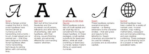
Font selection should never be an arbitrary process. Simply looking through your entire library to find a font that you like will rarely produce an effective result. The reason is that there is an inherent psychology associated with certain types of fonts. To see what I mean, consider the following examples:
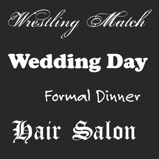
If you’re perceptive, these font selections will seem very poor. The reason is that there is a major disconnect between the visual personality of the font selections and the words written with them. You would almost never see the world’s leading ultimate fighting champion exclaimed in a pretty script font. By the same token you would probably never use Cooper Black on your wedding invitations. We have become accustomed to seeing different types of fonts used for certain purposes.
Every font communicates certain attributes on both a conscious and subconscious level. Two of the major areas of communication are gender and era. Consider the examples below.
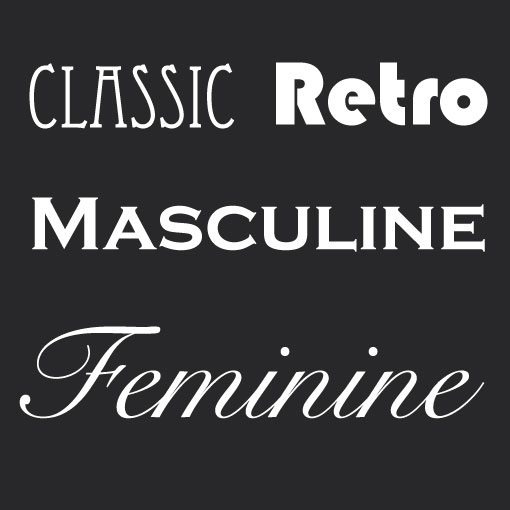
Notice how the first two fonts strongly communicate a specific bygone era. Similarly, the next two fonts each possess strongly associated gender-based characteristics. Thick fonts with hard edges tend to look more masculine and manly while curvy, thin fonts appear feminine and girly.
This all may seem a bit obvious, but your typographic skill will improve by leaps and bounds if you are able to take this knowledge out of the implicit and instinctive part or your brain and turn it into explicit and intentional action.
More on Typefaces
To learn more about specific types of typefaces, check out Adobe’s Type Classification Chart.
4. Alignment
Alignment is an extremely important concept in typography. For some reason, non-designers tend to instinctively center align everything. Somewhere in life we learn that if something is centered then it is balanced and therefore better. In reality, center alignment is the weakest, hardest to read alignment and should be used very selectively.
The first two paragraphs above are left-aligned. This is how we are used to reading because it is generally the format we see in books, magazines, etc. The center-aligned paragraphs are much harder to read due to the lack of a hard edge. There’s no consistent starting or stopping point for each line so your eyes take a moment to adjust to each new line. The difference is subtle in practice, but huge in principle.
This doesn’t mean that you should only use left alignment at all times. Just be sure to constantly ask yourself how important readability is vs. the particular aesthetic you might be trying to achieve. Ideally these principles would always work together, but in reality they are often opposing forces that require compromise one way or the other.
Another thing to be aware of is mixing alignments. No matter which alignment you choose, try to be consistent throughout your design. It’s often (though not always) appropriate to center-align a headline over left-aligned copy, but experimenting with mixed alignments beyond this could result in a visually cluttered and confusing page.
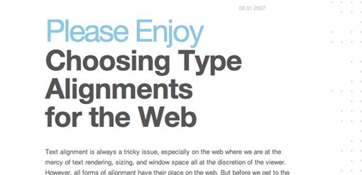
For more information on font alignment, check out the article below.
Choosing Type Alignments for the Web
5. Choose a Good Secondary Font
After you’ve chosen a primary typeface, the next step is to choose another font that will accent it. This is as opposed to a font that will conflict with primary choice.
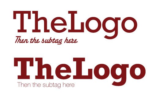
There are several problems with the first example in the image above. First, the types of fonts chosen are very poor. The supporting font is more ornate (and harder to read) than the primary font! This detracts from the primary font and should be avoided. Also, even if the first problem weren’t an issue, the two fonts are simply too similar in thickness to be used together. Even though they are drastically different in style, their similar stroke weight doesn’t provide enough visual contrast between the two.
The second image uses more appropriately contrasting fonts and utilizes a thinner, simpler font for the subtag. Your fonts definitely don’t have to contrast this much (the effect was intentionally exaggerated for the example), just make sure that they are different enough to prevent visual confusion and that more emphasis is placed on the primary font.
6. Size Matters
I’ve created tons of printed promotional ads in the six years that I’ve been a designer. One of the things that you learn very early working with promotional materials is that headlines should grab the reader instantly. You’ve got a second or two at best to get someone’s attention in the print world. If you miss that opportunity, you’ve lost your potential customer.
What this means practically is that when you’re creating a headline, don’t simply type it out: design it. Consider the following two examples:

The first headline requires you to read each word to get a sense of what the message about. Everything is the same size, width and color which leaves zero emphasis on any part of the message. The word “could” is just as visually important as the word “win.”
By contrast, the second headline is much stronger even though it utilizes the exact same message. I’ve de-emphasized the words that are not so important and really screamed the words that are. The problem with the first headline is that the viewer must be willing to take the time to read it. The trick then is to get the viewer to read the important parts as soon as they see the headline, almost as if by accident.
Looking at the second example the first thing you should notice is the word “WIN” followed by “THE BAHAMAS.” At this point, if you’re the target audience, we’ve piqued your interest and you are far more likely to take the time to see what this message is all about.
7. Use Typography As Art

Stop thinking of typography as simply headlines and body copy and start thinking of it as a design element. Typefaces are meticulously designed and therefore possess an aesthetic that can be a valuable asset to your design arsenal. This of course goes well beyond building faces with letters. If you want to create a typography-centric design, think about how you can incorporate attractive type as the hero.
Also, never feel as if you’re confined by the structure of existing fonts. Expand on the font shapes to suit your needs. Try adding swirls, texture, blotches, spats, and anything else you can think of to spice up the look of the type.

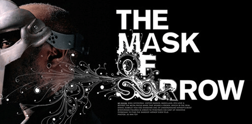
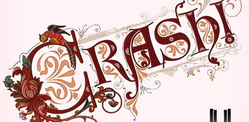
8. Find Good Inspiration
The best way to learn to create effective and attractive typography is to find and study some existing examples. Below are some great articles for finding inspiration online, but don’t stop there. Good and bad typography examples are as close the nearest fast food joint. Keep a lookout everywhere you go for what others are doing and think about why it does or doesn’t seem to work well.
Gorgeous Examples of Floral Typography
40 Examples of Beautiful Typography in Advertising Design
Gorgeous Typography Examples in Advertising Design

50 Examples of Vintage Typography

Break the Rules
Remember that these rules are simply meant to be guidelines to help you create great typography. Along the way you’ll find that some of your best work blatantly breaks one or more of the principles outlined in this article. As I said before, the moment you fully understand a given rule in design is the moment when you have permission to break it. Just make sure the disregard isn’t arbitrary but executed with purpose and to achieve a specific goal.
Additional Resources
- Typedia: A Shared Encyclopedia of Typefaces
- Typophile
- The Elements of Typographical Style Applied to the Web
- 15 Tips to Choose a Good Text Type
Rules tend to be constrictive but I hope these eight suggestions have instead successfully opened up your typography possibilities.