An in-Depth Guide to Working With Typography in Illustrator
Adobe Illustrator is a fantastic application for crafting typographical masterpieces. However, whether you’re creating a simple paragraph for a print ad or a complex typographical piece of art for a website, there are several tips and techniques you should know for how to manipulate type within the program.
Below you’ll find a brief overview of some of the basic commands you should familiarize yourself with as well as some must-know keyboard shortcuts and even a few obscure features that you may not even know exist. Let’s get started!
Working with Typography: The Very Basics
Before we get into how to specifically use Illustrator to work with typography, it’s important to discuss the basic terminology that we’ll be using. Most print designers learn these terms in the very beginning of their education but web designers often skip what I’d consider to be the ABCs of design and go straight to learning how to take designs from Photoshop to HTML.
So for anyone just getting started or anyone who has been designing for years but skipped over the basics, here’s a quick and dirty crash course on a few variables you should know when working typography.
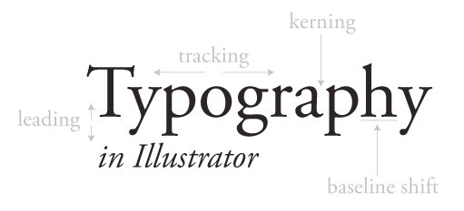
The image above points out several key terms you need to know. We’ll look at each of these in-depth as we discuss how to use Illustrator to manipulate them but for now you should simply make sure you understand each term.
Kerning and tracking control the horizontal flow of a block of type. Kerning refers to making adjustments to the spacing between two specific letters. Tracking is similar but adjusts the spacing between all the letters in the block simultaneously.
Similarly, leading and baseline shift control the vertical flow. Leading adjusts the spacing between two lines and baseline shift allows you to move specific letters up and down.
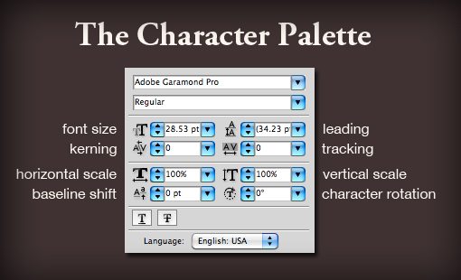
Each of these corresponds to a setting that can be either manipulated directly or adjusted incrementally through the character palette.
Illustrator vs. Photoshop
Whether you’re designing for print or web, I highly recommend ditching Photoshop for crafting typography. Photoshop is great at a lot of things but working with type is not one of them.
Not only is Illustrator much more powerful and flexible when it comes to type, it’s a whole lot prettier too. To see what I mean, consider the screenshot below.
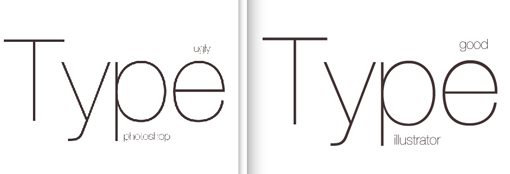
This is a side-by-side comparison of two windows that I had open, each with a similar block of copy. The left shows the Photoshop preview and the right shows the Illustrator preview. As you can see, Photoshop is choppy and ugly while Illustrator is smooth and beautiful.
Photoshop will show you a decent preview at 100% (Command+1) but at almost any other zoom level the text looks like crap and is not at all a good indication of what your final output will look like.
Illustrator on the other hand is brilliant at displaying vector graphics at various levels of zoom (way zoomed out it gets a little messy but still better than Photoshop).
Kerning in Illustrator
Why kern? The biggest rookie mistake you can make with typography is to assume that Illustrator, Photoshop, or any other app will spit out perfectly spaced type by default.
Unfortunately, the peculiarities and unique qualities of each font cause perfect letter spacing to be quite difficult to hard program into software. A good old fashion pair of human eyes is simply the best tool at your disposal for making these adjustments.
Consider the example below:
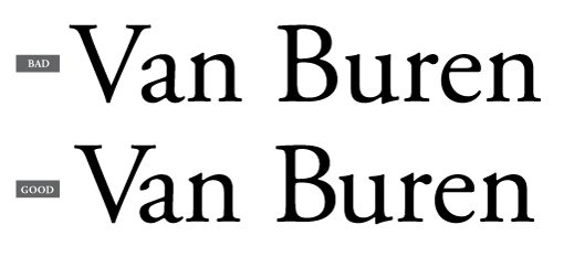
The example on the top is the way Illustrator places the text by default and the example on the bottom shows the same example with some manual kerning adjustments. I purposely didn’t highlight where the adjustments have been made so you can learn to spot the areas that need addressing.
One of the most important places to keep an eye on is the spacing between uppercase and lowercase letters. Letters like “V” that don’t make a nice block shape are particularly bad and almost always have to be adjusted to avoid awkward spacing.
Kerning might seem ridiculously meticulous and not worth the effort, but it’s absolutely something you should be paying attention to as a designer. It’s one of those things you can go your whole life without noticing but once you finally see the light you’re ruined. You’ll start mentally adjusting the kerning in restaurant menus and on billboards and bus advertisements.
Baseline Shift
The other one that you might be wondering about is baseline shift. Surely there are no practical reasons to mess with the baseline shift of a letter, right?
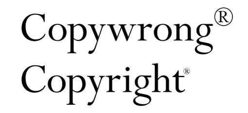
As we can see in the image above, there’s at least one extremely common necessity for applying baseline shift. The default superscript action often results in a seemingly gigantic registered trademark or copyright symbol. Though this can be adjusted in preferences, it’s still going to be necessary to make manual adjustments to the size and baseline of the character in most cases.
Keyboard Shortcuts
Here’s the fun part. You may know many of these from your work with Photoshop but a refresher is always good. I’ll be using the Mac keyboard shortcuts here so PC users should keep in mind that Command = Control and Option = Alt.
Kerning
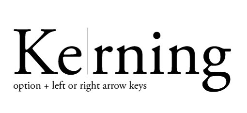
To adjust the kerning between two letters, place your cursor between them and use the Option key in conjunction with the left and right arrows.
Tracking
To adjust the tracking, you use the same keyboard shortcuts that you used with kerning, only here you make a specific selection and the adjustments will be carried out uniformly across all of the selected characters.

You can either select specific characters as in the shot above or simply click on the entire block with the direct selection tool to adjust everything within.
Leading
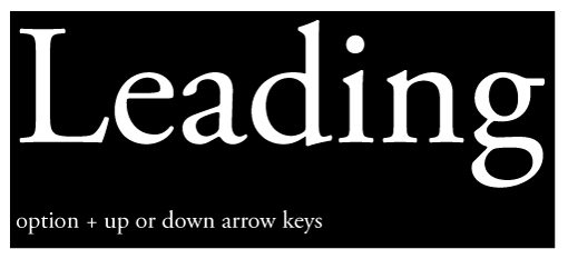
You guessed it, leading is the same keyboard shortcut as the previous two but this time using the up and down arrows instead of the left and right.
Here you can select either the entire block or just the lines you want to adjust.
Baseline Shift
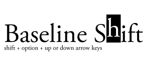
Baseline shift throws a curve ball by adding the shift key into the mix. Select a letter then use the shift key plus the up and down arrow keys to adjust the height.
Other Handy Shortcuts
- Greater Incremental Changes: Command key in conjunction with shortcuts above
- Increase/Decrease Font Size: Command + Shift + > or <
- Alternate Kerning/Tracking: Command + Shift + [ or ]
- Change Justification: Command + Shift + L, R or C (left, right or center)
- Reset Kerning/Tracking: Command + Option + Q
Working with Columns
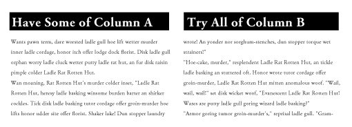
For some reason, many people are still under the impression that Illustrator can’t handle multiple columns of type. The truth is, it has had this functionality for years and is pretty decent at it.
This is where the InDesign crowd jumps out of their seats and demands attention. Yes, InDesign is amazing for page layout and hard to beat for complex multi-columned arrangements. However, this isn’t an Indesign tutorial so I don’t want to hear any complaints.
To create multiple columns of text in Illustrator, simply create a text box, fill it with text and go to “Area Type Options” under the type menu.
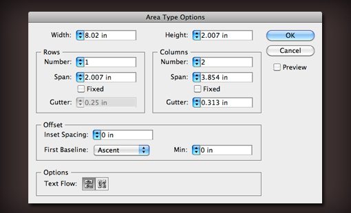
Here you can set the number of columns and rows, adjust the width and the gutter, set the flow of the text and more. The result is a single text box that automatically flows your type across as many columns as you want. The result will update live as you change the size of the text box.
Character and Paragraph Styles
Illustrator allows you to save the attributes of your text in a reusable style. This is perfect for those times when you frequently work with multiple brands and need to quickly change between the styles outlined in their respective brand guidelines.
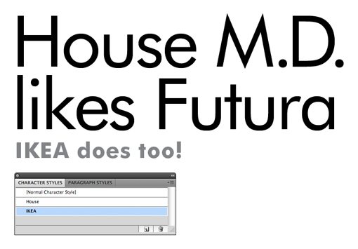
Creating character and paragraph styles is as easy as setting some text the way you want it, selecting it, and then hitting the “new” button in the character or paragraph style palette.
When you want to apply this style to another piece of text, select the text and then click on the style that you just set up. Double clicking on the title will allow you to rename the style.
Setting Tabs
To set up tabs in Illustrator, hit Command+Shift+T and bring up the tab palette. Here you can drag out tabs just like you would in most text editors.
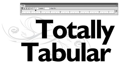
You’ll notice that the floating tab palette is a bit annoying and hard to position. To fix this, select the text you want to adjust and hit the little magnet icon on the far right. This will automatically line up the palette to the text and make it a lot easier to correctly setup your tabs.
Sampling Other Text
In Illustrator, the Eyedropper tool is much more than a utility for color sampling. You can also use it to quickly match styles between elements.
For instance, if you create two blocks of copy, style one, then want the other to match, select the non-styled version and then eyedropper the styled version to quickly make them identical.

By holding shift down, you can sample just the color without grabbing the associated styles. If you have no selection, eyedropper the text style you want to duplicate, then Option-Eyedropper other text objects to apply that style.
Finally, double-click the eyedropper in the tool palette to adjust what is and isn’t copied over in the sample.
Advanced Find and Replace
Illustrator has one of the best find and replace utilities that you’ll find in any app. In fact, it beats that of every dedicated text editor I know of (found under the Edit menu).
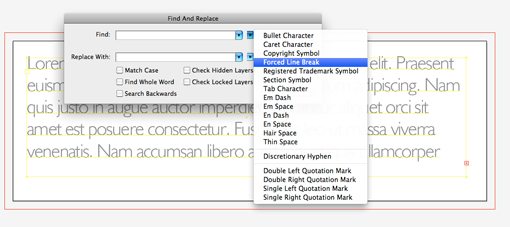
The reason for this is the little flyout menu that contains all those little things you always want to find and replace but don’t know how. This includes forced line breaks, tab characters, thin spaces, etc.
Illustrator even allows you to quickly find and replace fonts. Just click on the “Type” menu and go to “Find Font…”
Conclusion
I could talk about Illustrator type tips for days but the above represents a good overview of the information necessary to get started.
One of the main purposes of this post is to really encourage all the dedicated Photoshop fans out there to give some of the other Creative Suite applications a shot. Illustrator may seem like it’s only useful to gifted artists, but in truth it’s perfect for any vector-based work you need done whether or not you are a skilled illustrator.
Leave a comment below and tell us your favorite Illustrator type trick. There are plenty more to choose from and I hope to learn a thing or two from your responses!