Blurred Images in Web Design: How to Make Them Work
It’s an undeniable fact: using blurred images is a trending web design technique in 2015. It seems like everywhere you look there’s some element of blur.
But this is not a solution to some of your photo problems. It’s a distinct technique that takes practice to perfect and attention to detail to get it right. So before you jump on the trend, think about the options for using blurred images to decide if it is right for you and how you can make the best use of this technique in your projects.
Blurred Photos are Trendy


We could devote entire pages to the number of websites using blurred images. The trend is a big deal right now.
That’s the first thing you need to consider when moving forward with an idea that includes blurred imagery.
- Do you want to be a part of the trend?
- Can you use the trend in a way that’s a little different than other websites out there?
- Is it your style or a little too overused for your tastes?
- Will you be OK with the site design after the trend runs its course? Or will you need a redesign?
There’s absolutely nothing wrong with creating something that’s trendy. But it is a decision that you should consider from the start. Creating a website with blurred images – depending on your preferred style and usage – can be a time-consuming undertaking and if you are not experienced in photo editing software, could require additional training.
Blur is a Technique to Use with Good Images
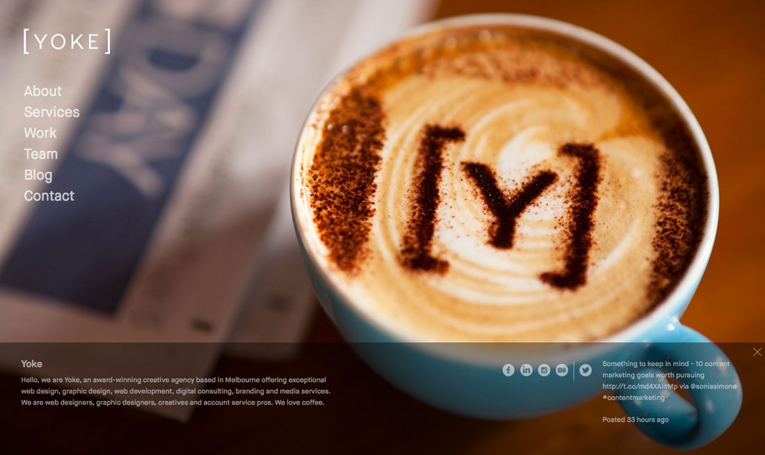
This might be the most important sentence you will read when thinking about blurring images. It only works if you have good images to start with. Blur is not a way to “fix” a poor image.
To say it another way. If you are given a blurry photograph and told to make a website out of it, that’s not trendy. That’s a bad photo. If that’s your situation, this is not the technique for you. (You might want to start thinking about creating an art element with typography or looking for stock images.)
But if you have a nice image that you want to get a few more miles out of or use in a new way, the blurred technique is a possibility. There are multiple ways to think about blurring (we’ll focus on each below) but the first step is to understand how to actually create the blur. Adobe has a pretty nice tutorial to get you started in Photoshop.
Blur the Whole Image

One of the things that has contributed to the blurred image trend is another trend: Use of hero headers. Designers are putting the techniques together to create full-screen style, blurred images as the dominant visuals on the landing pages of websites.
The website for Trellis Farm uses an iconic image of a farm to give you a sense of place for its website. For added interest, the photo is black and white – to convey that old-timey feeling – and layered with a great typeface to grab your attention. The scroll continues that feel while adding color to the mix. The blur is nice because you know what’s in the picture, and it helps the user focus on the text and next actions to take on the screen.
Why it works:
- A blurred background can bring focus to layers on top of the image such as text. Just make sure to select an impactful typeface.
- It can create new interest with an image that you use regularly, such as a standard brand photo.
- It can be used with almost any type of content in almost any color scheme for universal appeal.
Backgrounds and Layered Images
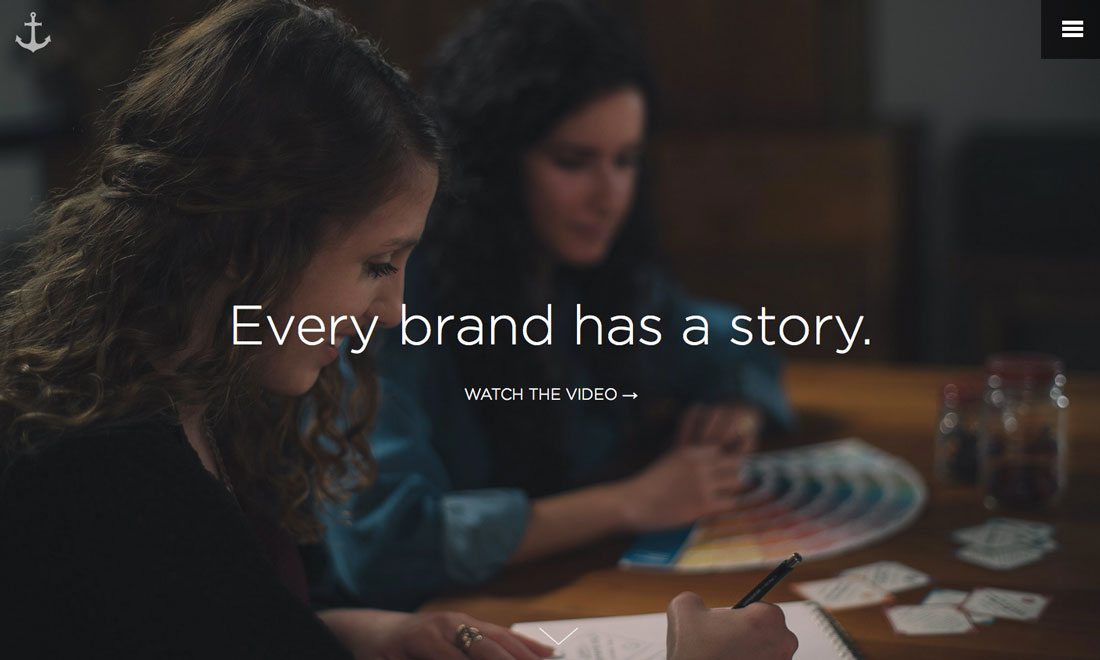
Blur is not a full-image only technique. Specific parts of an image can be blurred for impact. While it is more common to see blurred backgrounds with a sharp foreground focus, some designers take the opposite approach for a fresh option that has a blurred foreground with an in-focus background.
The Anchour agency uses blur in photos on its landing page. The technique used in the image can be part of the actual photography or you can create the same effect in photo editing software. The trick here when you are creating this style of blur is that you can’t tell it was “created” and it should look natural as if the photo were taken in that manner. (In photo editing software, you can accomplish this using the Gaussian blur tool with small, incremental adjustments.)
Why it works:
- Blur creates visual contrast and can tone down the busy feeling of an image.
- It changes the perspective of the image and the user’s view of the visual.
- It adds dimension to an image that might otherwise feel flat for an almost 3D rendering.
Dramatic Blur for Abstract Art
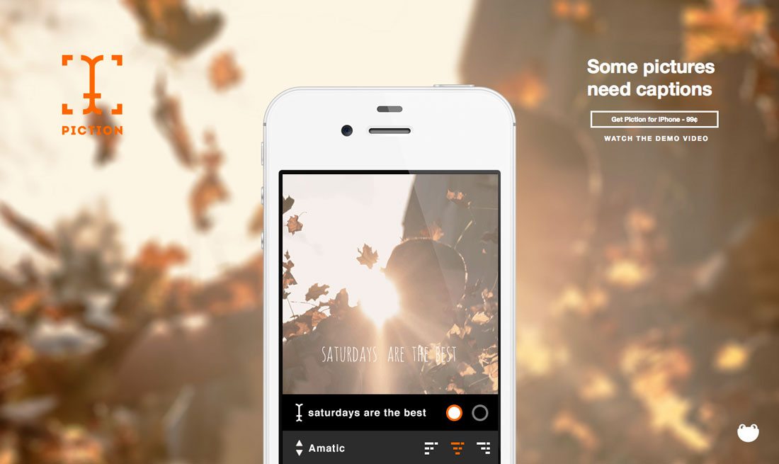
When you need a background image for your website but can find a pattern or color that does the trick, a photo with a dramatic blur can be the perfect fix. Consider a dramatic blur to be anything that makes the photo content undiscernible at a glance, and it could make the photo completely unrecognizable.
This is a popular option for websites that are launching or promoting a digital project with an abstract blurred photo background behind a phone showing the product. Piction uses the same image in the background and in the phone with different levels of zoom and blur for a quite eye-catching design.
Why it works:
- Brings focus to the featured product.
- Creates a custom background rather than using a pattern that might be on other websites.
- Gives the designer control over color and feel when it comes to how the abstract blur works from sharpness to soft colors and shapes to readability of the background image and connect to the brand.
Subtle Blur for Any Image

A small degree of blur can work in plenty of other types of photos as well and does not have to be use solely for a full-screen image. Designers can add a hint of blur to an image that needs a little foreground focus to help users look at the right parts of an image, to stylize a logo or just to create a more complex visual.
Zeo’s logo uses a subtle but nice blur in the round design. The blur forces you to look at the logo more closely because of the interesting shape and edging one side of the logo has in comparison to the sharpness of the other side. The technique is further emphasized because the website design as a whole uses blur in other places, such as in the background of the dominant image on the landing page.
Why it works:
- Small blurs can create an element of surprise.
- It draws focus to specific parts of a photo, with visual focus. (Take a look at some of the promos on the Zeo site for other uses of subtle blur for photo focus.)
- It can give you the right amount of contrast to layer other elements on a section of an image, such as text, in the same way a full-screen blur can work with a hero header.
Use It for Video, Too
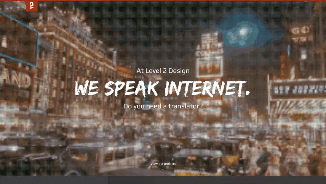
You can pair the blur trend with another hot design element as well – video. You can use it just like you would with any other image technique. It works in the same way (although the editing tools and process are a little different).
Level 2 Design uses blue and a screen-type effect to add interested to a full-screen video. (Refresh the browser to see more blurred videos.) The effect is fun and fresh and works with video that is supposed to have an old school feel. The quick video loops are highly readable and attention-grabbing.
Conclusion
There are plenty of ways to use blur effectively for web design projects. The secret – if there really is one – is to create a blurred effect that seamlessly blends into the rest of the design. And you can do that almost by thinking about blur in extremes.
Use a lot of blur for high impact and an abstract feeling. Use a minimal blur to create subtle contrast and set focus. As with any design, test it out on a few users before launch and see what they think. Do they notice the blur? (Most non-designers won’t really think about it.)