Border Design: 8 Tips & Modern Examples
Graphic designers have been using borders for as long as they have been designing things. And they’re a fun element to play with. We’re taking a look at eight border design concepts (most of them you can actually download as project starters), along with tips for usage and some examples that you can try in projects.
Sometimes a great border can help separate your design for other elements, such as around the perimeter of an ad. Other times, a border can serve as an element to help break up different parts of a design, or frame messaging or content.
While borders are most frequently thought about in terms of print design, they can be a valuable digital design tool as well. A good border defines a space so that users know where a design begins and ends. (Pretty simple, right?)
1. Ink and Tattoo Style
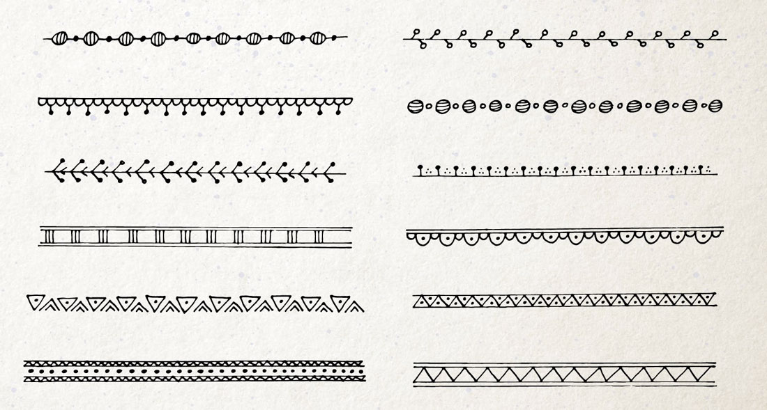
A simple lined ink border can create a distinct edge on a project with a bit of a funky flair, especially with ink elements that have a tattoo-style design.
This border style often features a simple and subtle pattern that repeats around the edge of the design. Often the design is a single color – typically black or white – depending on the background.
While these styles often have a delicate nature in isolation, they don’t often have a distinct masculine or feminine feel and usually take on the properties of surrounding elements.
Tip for using this border style: Look for patterns that repeat closely. From a distance, this border style might almost look like a solid line, but with a close look, a pattern emerges, delighting users.
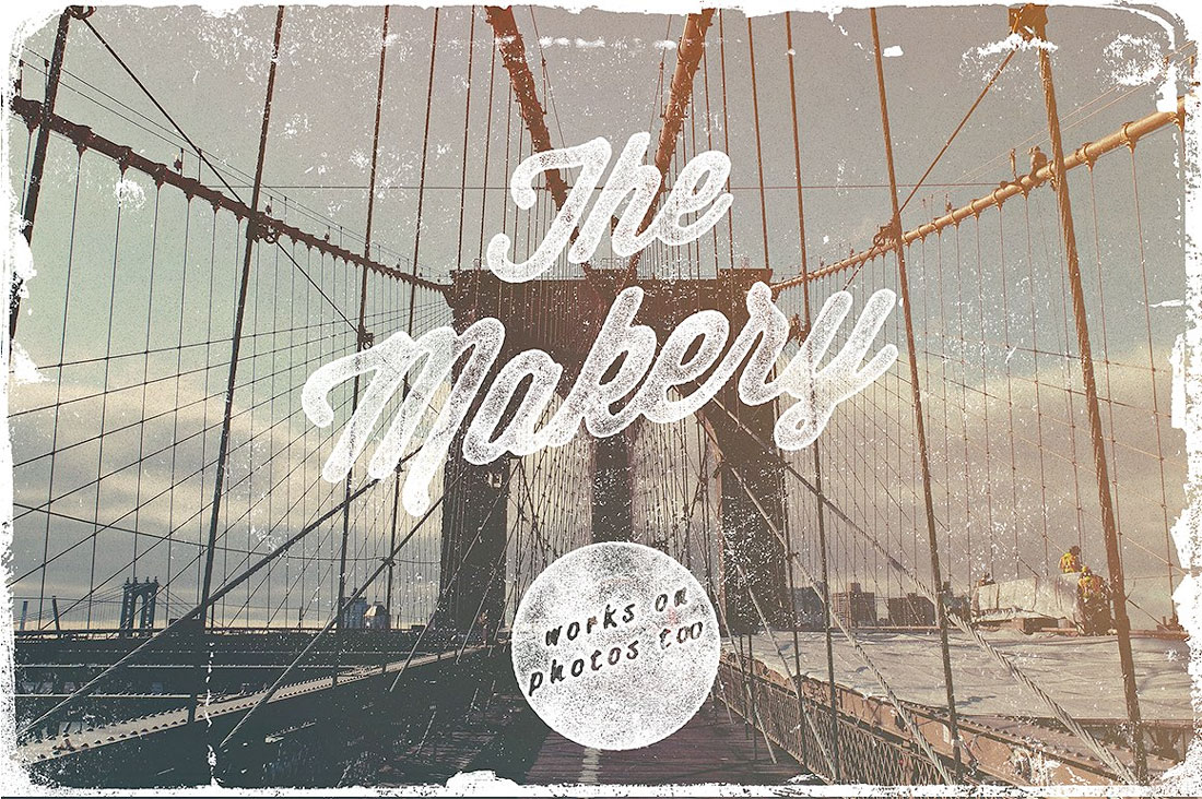
2. Vintage Frame
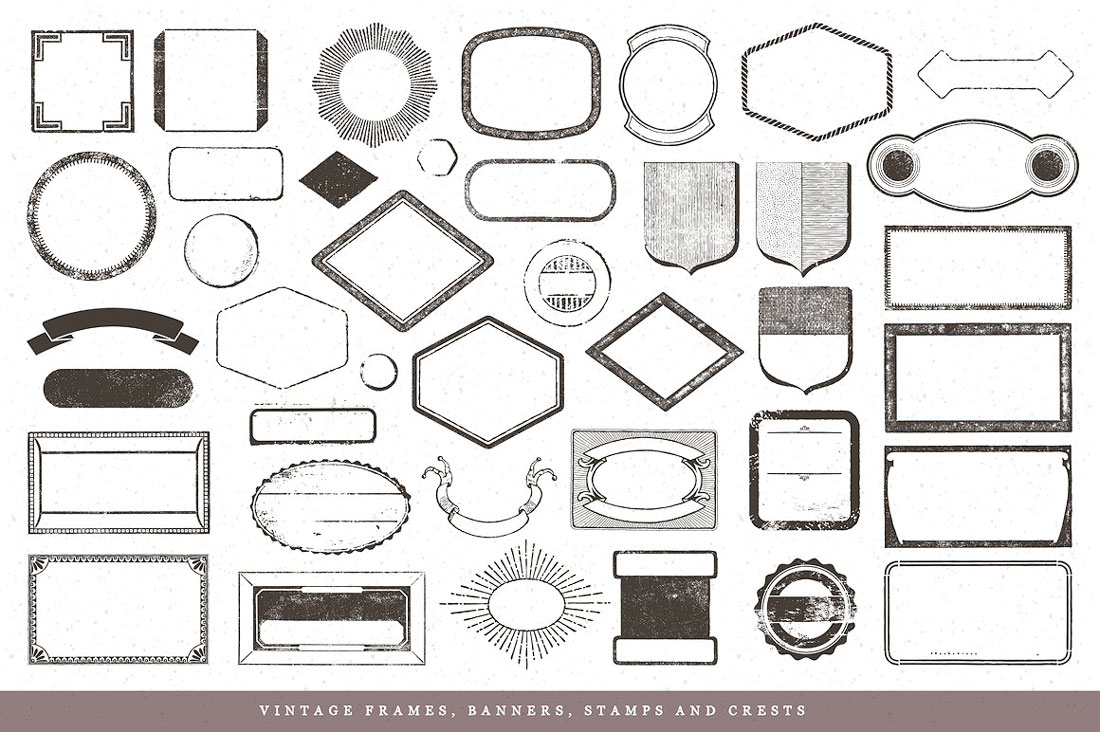
Vintage or distressed badges and frames are a totally trendy choice when it comes to border design as well. These elements create distinct containers for content and you can use this style of border design for logo elements, display text for a homepage or poster or just to add emphasis to a specific part of a design.
Characteristics of a vintage-style border or frame include a mix of thick and thin strokes, often with some type of distressing or other texture added. The idea is that this border should have an old or stamped design to it. (Think of the stamp on a giant wooden crate.)
Tip for using this border style: Use a combination of strong lines – even if they are roughed up or speckled – with sharp or minimally rounded corners to really get that vintage feel.
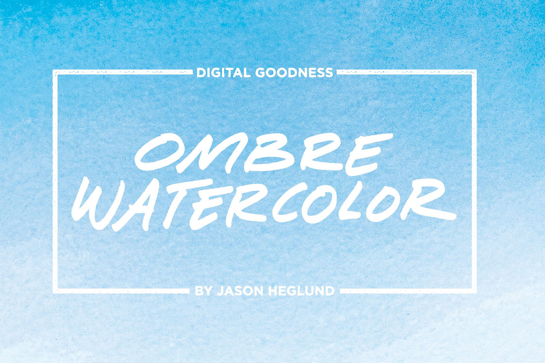
3. Watercolor
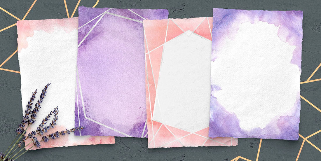
Any design element that’s generally trending can be repurposed as a border design as well.
Watercolor textures and effects are a great example of an overall trend that can make a great border option. Due to the flexibility and wide range of watercolor styles, this kind of border can serve as a light frame that transitions into the main design area or a harder edged border to designated the physical edges of a project.
Tip for using this border style: Opt for an oversized, bold hue and pattern for watercolor borders. This creates a modern look and feel. The example above is particularly nice because of the mix of both watercolor and geometric shaped textures.
4. Retro Styles
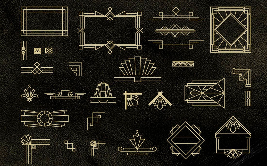
Because borders were a common technique a long time ago, and aren’t as thought about now, a retro border style can be an appropriate option.
Evoke an emotional connection with times past or a certain era with a retro border style, such as the art deco option above. The trick to using a retro style is not to try to mix too many techniques because a retro style can be a dominant visual effect.
Tip for using this border style: Pair the strong lines of a retro option with a fun texture in print, such as foiling or embossing to add extra emphasis to the border style.
5. Feminine Lace
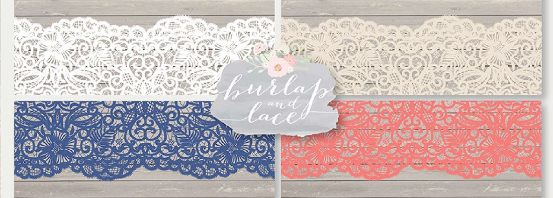
Because many projects that include borders are often printed, such as invitation or cards, feminine lace styles are popular (especially with the wedding industry).
These lace style borders have a more delicate look, and you need to pay particular attention when pairing them with background elements so that the border is still readable. Look for a background and border style with plenty of contrast so that each element stands on its own.
Tip for using this border style: Experiment with thick and thin lace border styles. These patterns can get overwhelming quickly and sometimes a thinner lace border can add just the right touch to a project.
6. White-Out Borders
Look for a border style that actually “erases” some of the main content area so it fades into the background. These white-out borders are often referred to as grunge style, thinks or uneven edges and patterns.
It’s a fun option for print or digital projects through and flips the idea of a border upside down. Pair a high contrast element with a white border for maximum impact. If you are looking to create this technique, apply a texture layer over the background.
Tip for using this border style: Use a white border over a photo for the white-out effect to really shine through. In digital design, this effect takes on a whole new look on white backgrounds because the foreground almost fades into it.
7. Simple Lines
A border design doesn’t need a lot of effects to be spectacular. Simple lines can be that special thing that pushes a good design to great. Play with weights, color and how you join strokes to figure out the best border placement for your projects.
Simple line borders are nice because they work practically everywhere. Use them on a light background or a dark one. Use them on a photo or blank canvas.
Tip for using this border style: Consider white space in relation to a simple-line border. A thicker border with more whitespace can actually help draw the eye into the main content in the center of the design. If there are too many things happening with the border design, users might never look past it and find what you want them to see.
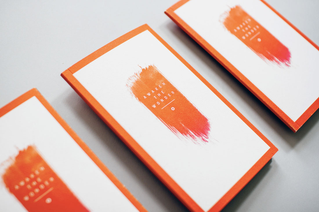
8. Inset Border
There’s no rule that a border has to be all the way on the edge of the canvas. Consider an inset border to create a more layered design effect.
An inset border visually “shrinks” the canvas to the area within the border – note the text above is contained inside the border area. It can help the eye focus quickly on an important element in the design.
Use this technique to help users focus on a certain block of text, call to action or engaging visual.
Tip for using this border style: Leave enough room around the outside of the border so that space looks intentional, and use equal spacing on the left and right and top and bottom.
Conclusion
Modern border design is more than a single half-point stroke around a photo or graphic element. There are so many other ways to create a border that’s as much a part of the design as an element to separate it from other things.
Create a border that helps users focus on the part of the design that’s most important to you. From elaborate edging to simple frames, a modern border design can help make your design stand out.