Breaking Design Principles on Purpose
Rules. They keep our designs clean, consistent, aligned, and focused. The core principles upon which good design is built are absolutely essential to the education of any designer.
The great thing about design rules though is that they can and should be broken, granted that you know what you’re doing. Read on to see some examples of effectively breaking design principles in order to improve a project.
2 Million+ Digital Assets, With Unlimited Downloads
Get unlimited downloads of 2 million+ design resources, themes, templates, photos, graphics and more. Envato Elements starts at $16 per month, and is the best creative subscription we've ever seen.


Know the Rules Before You Break Them
Like many other professions and industries, the world of web professionals subscribe to a set of fundamental requirements that all members of the community should have a solid grasp on. We tend to refer to these fundamentals as the principles of design and any design worth its salt will display a certain level of aptitude in these principles.
Some designers acquire their grasp on design principles through formal training or education while others achieve the same level of competency through practice and general understanding. Neither method is right or wrong but if you are a high level designer in any function, you exercise solid principles of design, whether you know it or not.
There are a lot of aspects to web design and having control over these fundamentals isn’t the only requirement to finding success in the field. However, without them we are certainly taking the hard road to success. But, like any good set of rules, the principles of web design are on occasion better off when bent or broken entirely.
What are Good Design Principles?
So just what are the principles of design? Well, this is a topic that has been covered quite a bit and any amount of research (google searching) will reveal that there is no single correct answer.
Different agencies, companies and professionals may all construct lists of their personal design principles. While a lot of these individual sets of principles may contain variations, there is a significant and noticeable overlap. Jeremy Keith has done us the favor of putting together a great collection of design principles to browse through.
A quick look through these resources will reveal quite a bit of consistency between different perspectives. Any reasonable set of these principles will include points about proper spacing or use of white space, focusing on the users, enforcing consistency, keeping your design as simple as possible, making it useful, and avoiding redundancy, among others. All of these are good things. They have been defined as crucial to the design process because they are effective tools for building a successful product or service online.
If a solid set of design principles is so crucial to our designer toolbox, then why would I suggest that breaking them might be a good idea? Well, for a few reasons really.
First off, exploring outside the boundaries of good design is a great exercise in exploring the boundaries of right and wrong, leading to a better understanding of what makes one choice better than another. But the reason we are really interested in is that there are use cases for breaking the rules that improve the experience for the user.
Breaking the Rules for Benefit
I think it’s important to state that I have never found a case where creating a site against all principles of good design has turned out to be a remotely good idea. The purpose of this article, and the examples contained within it, is to demonstrate how flipping the switch on one or two standard principles can result in a benefit to your users. Understanding just where you want to step over the line and how will depend on the project at hand but I am hopeful that a few examples will get the ball rolling and help you think about ways this can be helpful to you.
Double-check Popups
Let’s start this party off with a little design faux pas that we should all be pretty familiar with. I’m talking about the eye-roll inducing “Are you sure…” popup message. We see this pattern in all kinds of contexts, from web sites, to games and all kinds of software interfaces. We run into this so often I’m starting to expect my front door to ask me if I’m sure I really want to close it.
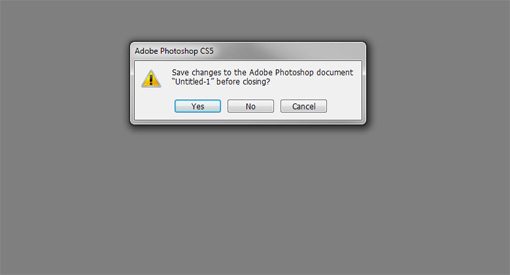
I’m tossing you a softball here. We know this design pattern exists to keep us from accidently closing that file that we forgot we made changes to or perhaps didn’t save. Even if we click “no” 99% of the time that 1% could be a reminder to save a file you spent hours working on or avoid making a decision that was initiated on accident. We’ve grown quite used to this behavior so it might be hard to consider it an exercise in breaking the principles of design but if we stop and think about it, it becomes quite clear that this is an example of breaking the rules for the benefit of users.
Having a message popup on the screen after a user takes an action is a redundant system that generates extra clicks and prevents the user from accomplishing a task in the quickest and most simple way. Indeed, all of these things are in direct violation of good principles of design, yet the pattern remains and remains effective. Until the humans that use our designs prove to be flawless, breaking the rules in this way will remain a good idea.
Not So Simple
How about something less clear cut and common than the first example? Let’s dig into simplicity. No shortage of design documents point out simplicity as a core component of a good design and a primary task for a designer. Indeed, we spend a lot of time and effort figuring out how to take complex behaviors and design them in a way that visitors can consume them in a simple manner. There are plenty of examples of simplicity in action but finding effective examples of the simplicity rule reversed doesn’t prove to be much of a challenge either.
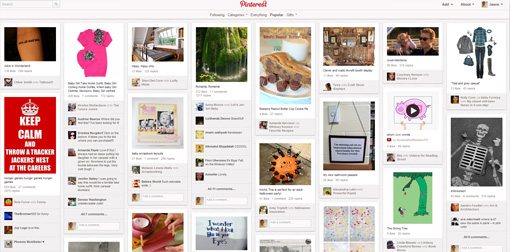
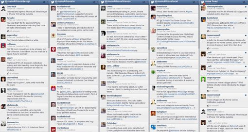
You don’t have to look past some of your favorite apps or websites to see a high level of complexity put into play as a design strategy. What makes complexity the preference for a particular design? Well our two examples have some commonalities and some differences.
First, both designs strive to present the user with as much information as possible. Second, in both instances the experience is designed to lack a pre-determined focus. Instead of delivering primary or secondary content to the user everything is presented on an even scale and the user can scan the information and key in on the content that naturally draws the most interest.
This actually works quite well for sites like Pinterest or Twitter feed applications because it removes manual interactions. Instead of clicking buttons to filter the information in a finite number of ways the user can rely on their own brain to pick out the information most important to them at the time. This allows the experience to be infinitely personal and self-driven.
If the Shoe Fitts’
Well what about something like Fitt’s Law? Certainly breaking a law will always lead to a negative outcome! Fitt’s law argues that reducing space between actions as a part of our design improves usability. But is it so hard to imagine a scenario where two different actions, both an equally probable choice for our user, would lead to two completely different behaviors?
Take, for example, the experience of checking out on your favorite online store. Often times, when we add an item to our shopping cart or hit a checkout button we are taken to a screen that reviews the items we would like to purchase and gives us several options, allowing us to choose how to proceed from here. Some popular options include proceeding with the purchase, continuing the shopping spree, or clearing out or editing your choices. All of these actions relate to the behavior of you shopping so it makes sense they would populate a common area.
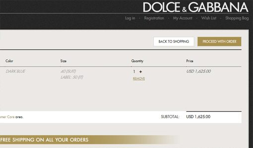
Dolce and Gabbana’s checkout process follows Fitt’s Law. Our users might want to go back to shopping or go proceed with their order, placing the options together as they have assures that either decision can be made equally quickly. The problem with this pattern is similar to our first example. If the user clicks the wrong button one time out of a hundred you’ve cost more time and caused more frustration than you did with the 99 quick correct clicks.
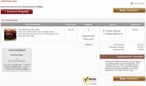
On the Godiva checkout screen, we can see the buttons more clearly defined. It’s going to take you a little bit longer to get to one depending on where your mouse (or finger) is but that’s just the point. There are times when we want to break our users out of that “Don’t make me think” mindset that we work so hard to establish. On occasion we need them to think about their decision, and the process of finding and getting to the button that you want to click will force the user to recognize just what that button is going to do.
Moderation is Key
Perhaps closing with a website devoted to chocolate was more than coincidence. The key to operating effectively outside the lines of good design principles is to use moderation. While it might make sense to separate some buttons it likely won’t make sense to hide one of them citing a need to make your users think a little bit. Along the same lines you’ll most certainly find that this approach of breaking the rules is incorrect in most situations.
It is only in our pursuit of a deep understanding of design that we seek out these scenarios that live in the minority. If you are comfortable with your level of expertise with the principles of design this is a great exercise. On the other hand if you are on the beginning end of being a designer this game of devil’s advocate can be a wonderful learning tool.
Either way, it’s in our best interest to understand design principles as rules rather than dogmas. When the content drives the design and the user comes first we shouldn’t let rules get in the way of delivering the best design. Have you had the opportunity to break some design principles for the betterment of a project? If so what were the results?