Breaking Free of Design Crutches
You don’t want to talk about this topic, you don’t even want to think about it. That’s because, like most of us, you’re probably guilty of using quite a few “crutches” to get you by. Those little things that you default to in almost every design with almost no thought.
Let’s bring them to light. Let’s talk about what I see designers doing again and again and what I struggle with myself. Let’s stop hobbling along and start running towards great design.
Designing With Crutches
What are your design crutches? Nearly every designer has at least one, most of us have a few. Even if you can’t see them at first, they’re there. Hiding in the background, holding us back from our full potential by keeping our designs firmly planted in our little comfort zone. It’s nice here, it never rains and we get free bagels on Fridays. There’s no reason to change anything, move along, thank you very much.
But wait, what are these proverbial crutches anyway and how are they holding you back? To ask this question is to invite disruption into the heart of your design process. Warning, danger, caution, turn back now. This might not be pleasant.
Basically, a crutch is anything that you defualt to in design rather than spending the time to invest a little bit of original thought. It can take the form of almost anything: a layout, font, color scheme; any key decision that you make throughout the design process that can be easily bypassed by turning to “ye olde faithful,” the same one you use every time when you reach this decision point.
Style vs. Crutch
This concept of a design crutch is a tricky one to approach because the little bugger makes its home so close to the practice of developing a distinct style.
When I accuse you of reverting to the same old lame design tricks again and again, you can simply reply, “this is my style” and effectively win the argument. Every good creative person has a particular style that they’ve developed that carries a noticeable uniting thread through everything they do, from Da Vinci to John Williams. So why can’t you?
First of all, you sir, are no John Williams. Secondly, though they seem close, these two concepts are in fact distinct. Having a visual style is all about putting your fingerprint on your work. It’s a subtle art, honed carefully over years of experience. When done right, it strengthens your work rather than weakening it.
Compare this to your crutch. It’s not something completely unique that everyone can instantly identify with you, nor is it something that legitimately makes your work stronger. It’s just that thing that props your current work up to the standards of your previous work. You’re not soaring above and beyond what you’ve done in previous projects, you’re hobbling along at a crippled pace with the innovative days far behind you.
Common Crutches
It’s all fine and well to vaguely discuss design crutches from a theoretical perspective. This helps keep them solely in the area of problems that other designers struggle with. Let’s hit a little closer to home by calling out some specific crutches that lots of designers struggle with and see if you can idenfity with any of them.
The Almighty Burst
I’ll start by picking on my print design brethren just to show that this isn’t only a web designer problem. Some day in a time long forgotten, one designer needed a way to catch the viewer’s attention. He didn’t want to redesign his whole ad to incorporate this new message, so he decided that he’d just create an object that could literally be stuck anywhere on the ad regardless of general layout practices. Thus the burst was born.

The design community ranted and raved. This was the savior of lazy designers everywhere. Suddenly pointy bursts were everywhere, screaming for attention wherever they could get it. Some bursts had subtle points like the one above, others streched the jagged spears to the limit as if wielding a weapon that would hold viewers captive.
I have no problem with the burst existing. It does indeed serve a legitimate purpose and can be quite effective. I have a problem with the burst killing all innovative thought in the area grabbing user attention. It was abused so bad that it wasn’t uncommon to see six or seven bursts in a single full page newspaper ad, which of course made it lose all usefulness whatsoever.
Web designers can snicker and roll their eyes at this point. We never resort to such overused fads. Or do we?
Even now as I look at this intentionally cliché example, I can’t help but think, “that’s actually kind of nice.” The problem is that the ribbon has become the burst of the web design world. These things are everywhere. They might look nice, and I commend the first few guys who used them, but at this point they represent a block to original thought. Why come up with something new? The ribbon works!
Following Someone Else’s Lead
I think a healthy chunk of the web design community is guilty of this one, including myself. For years I’ve followed the design trends at Apple very closely, so closely that I often mirror them in my own work. When Apple started putting table reflections on their product shots, I decided to stick reflections on the dog food bags I was featuring in countless ads at the time.
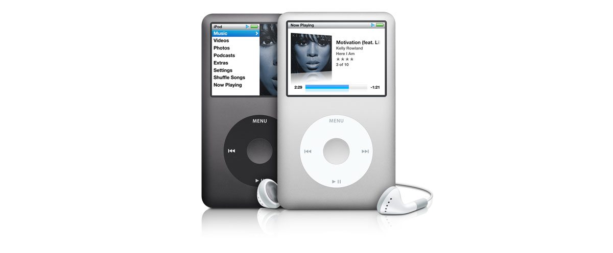
Apple was my crtuch. I knew their designers were good and that saved me a lot of work. By doing whatever they did, my work always stayed attractive and even gradually evolved over time.
The problem of course was that I wasn’t continually working out my design muscles, and so I got weak and fat, so to speak. It’s easy to depend on the industry to tell you what to do next, but doing so kills your ability to think for yourself and come up with amazing creative that’s all your own.
Maybe you hate Apple and tend to follow some other company known for good design such as Nike. It doesn’t matter who it is, if you’re not doing your own thinking, then there might be a problem.
Don’t confuse this with inspiration, we have an entire gallery here devoted to that. Inspiration, when used properly actually encourages you towards unique thought, not away from it.
Helvetica
This one cuts deep because we all love this typface so dang much. Do I think Helvetica is awesome? Absolutely. Is it beautiful? You bet! Is it a huge crutch for designers everywhere? Yep.
Choosing the proper typeface for a project is a time-honored tradition. It involves proper consideration of a number of factors: context, tone, mood, time period, etc.
Some typefaces communicate a concept better than others. The design of the letters tells a story, sets a scene; if you’re stuck on Helvetica for every single project, your story is always the same.
Photoshop Layer Styles
Layer styles are great aren’t they? They’re non-destructive, scaleable and they save you loads of time. What’s so bad about that?
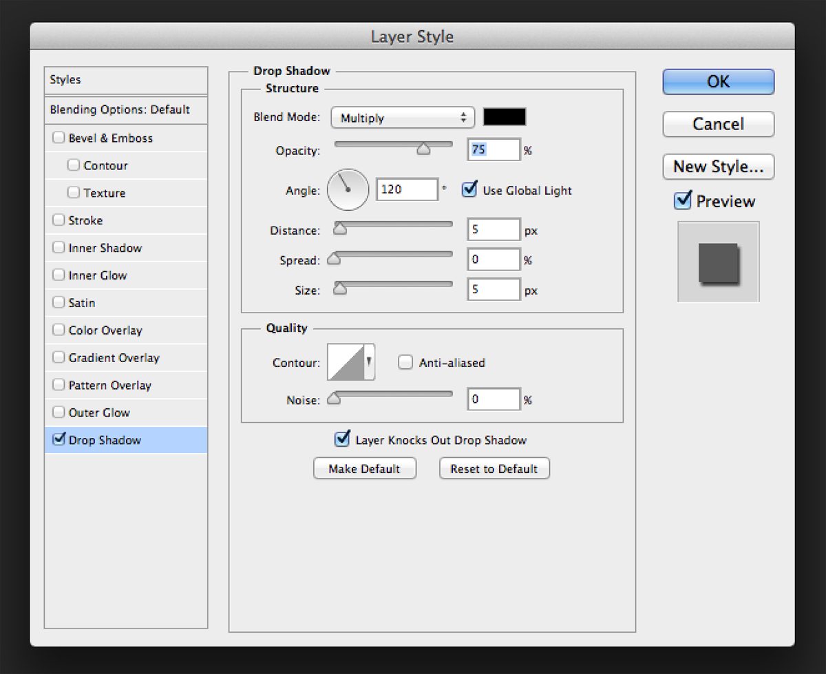
The problem here is that I’ve noticed myself using the same layer styles the same ways with the same settings on almost every project. You get a feel for using these one way and it’s hard to force yourself to switch things up. A drop shadow at something other than 120 degress? Blasphemy!
Once again, we see how a perfectly good tool can be so easily misused and/or overused to the point that it’s just another way to prop up our boring old designs.
I’m not telling you to drop Photoshop layer styles completely, I just want to encourage you to take another look and consider how to switch things up. What if you turned an inner glow dark and used it as a vignette? What if you changed your drop shadow’s blending mode to Color Burn?
Experiment with new ideas, play with buttons that you never push, you’re not going to break it, I promise. You might just find something new and awesome.
What Are Your Crutches?
Getting out of your same old tricks and techniques might just be the refresher you need to fall in love with design all over again. Dropping your crutches and getting back to walking on your own will make your work better, which benefits both you and your clients.
Now that I’ve got your gears spinning on this topic, leave me a comment and let me know what you struggle with. I’ve shared some of my crutches, what are yours?
Awesome stock images provided by BigStock.