Choosing and Creating Backgrounds for Design Projects
From patterns, to videos, to images, there are a lot of things to choose from when it comes to selecting the perfect backdrop to any design project. While the texture or image you choose is not necessarily intended to be a main part of the overall message, it can have quite an impact.
Backgrounds can be subtle, bold, static, dynamic or non-existent. And backgrounds in today’s projects are often more than just a beige canvas, and are an integral – and integrated – part of the overall design scheme. The trend in background design may even lead some to ask where the background ends and the foreground begins. Today we’re sharing a few tips and tricks for how to choose an effective background.
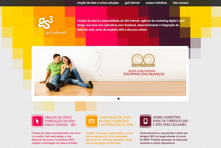
Solid Color or Gradient
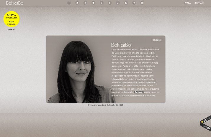
One of the most popular and classic background styles is that of a single or color with a subtle gradient. Either option can work beautifully for print or digitally based projects and can be designed using almost any color scheme, contributing to why this option is so popular.
Neutral hues are the most popular option for solid color background use. This logical choice works with almost any foreground element without being obtrusive or making it difficult to place elements on the canvas. More designers, though, are opting for brighter or bolder single-color backgrounds with a more simple overall design scheme. This trend emerged with flat design principles as more people took chances with color and simple typefaces and elements.
There are two schools of thought when it comes to using gradients as backgrounds: fade to white or black or to mix multiple contrasting colors. Either option can work, depending on use, but fading to white or black is by far a more simple solution. It’s also easier to pull off. Gradients are also a more dated look right now, as the trend has fallen out of fashion. (But like most other trends, it will likely re-emerge.)
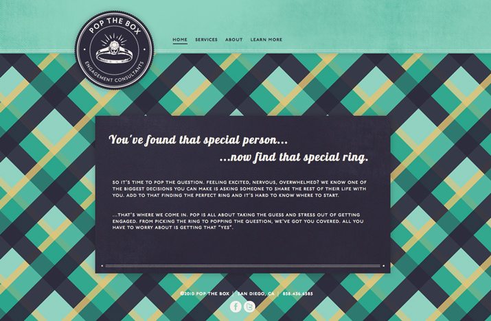
Subtle Pattern

Another popular design is the use of subtle patterns to create texture in the background. This can be accomplished using color and simple shapes or lines or small objects.
These tiny patterns or bits of texture can help add a three-dimensional feel to the design, or in the case of printed projects, physically include an element of texture. Patterns that you don’t really see help “lift” other design elements off the canvas, bringing more attention and focus to them.
Subtle patterns can be created using shapes and lines or small images. Either option can work in a variety of effective ways. Subtle, in terms of pattern, does not always correlate to color. Subtle patterns can be woven into almost any color scheme, from faded neutrals to bold hues. The key when patterns are designed for the background is to keep them there. Too much color or contrast in the background design can cause it to compete with other elements that may be more important to the overall message of the design project.
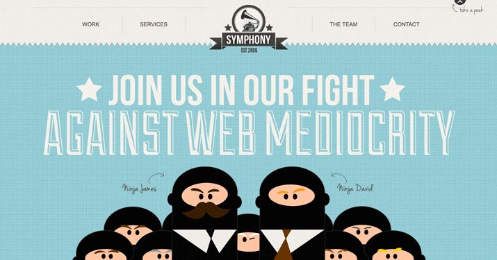
Bold or Large Pattern
Oversized or large patterns, especially those using high-color, can be one of the most fun things you can do with background design. It can also be one of the most difficult.
Most designers who opt for bold or large patterns do so by using them in key locations on the canvas and pairing with something else that is more subtle or as a complete canvas backdrop that is paired with colored box overlays for content and other design elements.
Bold patterns are pretty trendy and often set a certain mood for a design project. They tend to “feel” fun and lighthearted. They are often used with color choices that are bright to further contribute to that overall mood.
Another option with large patterns is to use the pattern in an oversized manner. With this concept, you may only see the pattern repeat one or two times. Designers often use the oversized “pattern,” if you can really call it that, in more monotone color schemes. This concept borders on the line of oversized and bold or can be toned down for a more subtle background design.
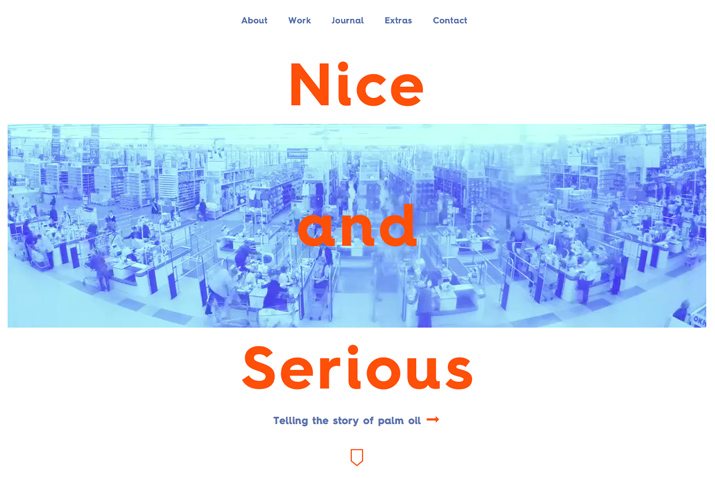
Photo or Video
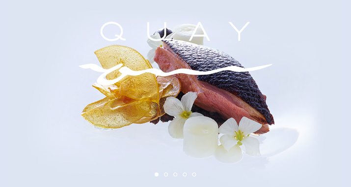
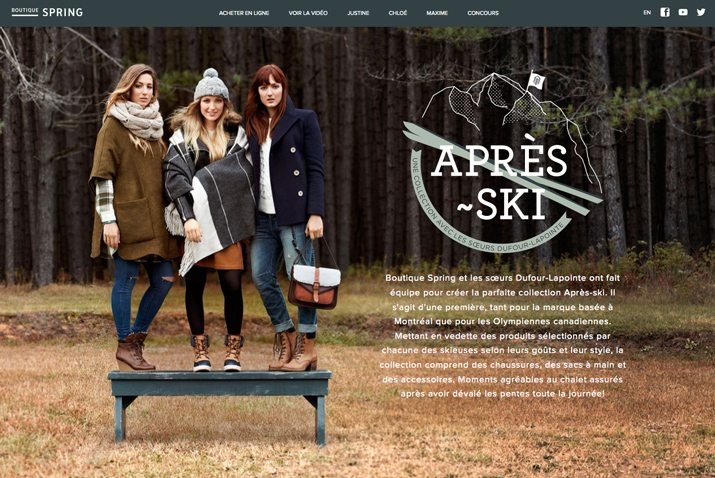
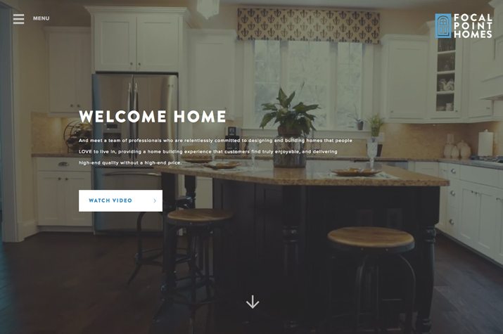
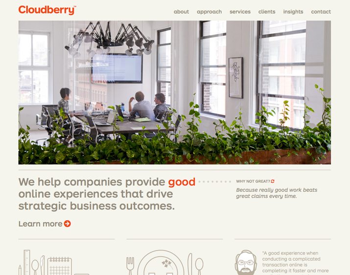
A picture is worth a thousand words. This is the idea behind photo and video backgrounds in design projects. Image-based backgrounds can be most effective when used to tell a story in a way that words or other visuals can’t.
Full-screen photo or video backgrounds – still or as part of a slider – are incredibly popular. This type of background is so engaging that many users won’t even notice background versus foreground in the design because when done right all of the pieces seemingly merge together.
This technique is not always easy to produce. Images have to be stellar to make it work. Images also must include open areas for other elements such as text or buttons on websites. They must also fit the canvas and sometimes multiple canvases when used as part of a responsive web design.
But the main benefit to a photo background is connection. People love to look at images. Select a photo background that tells the story of the design project you are working on and consider using faces as a key element in the photo to further draw people into the design.
Big photo backgrounds have been popular for a while in a variety of project types, especially websites. More commonly, print designers are using them as well. Full-canvas photos can make beautiful brochures, business cards and other printed materials. Full-canvas video, on the other hand, is a distinctly web-based trend that is starting to take over a number of sites that once used full-screen photos. Faster web connection speeds and loading times have made it even easier to use this format in design projects.
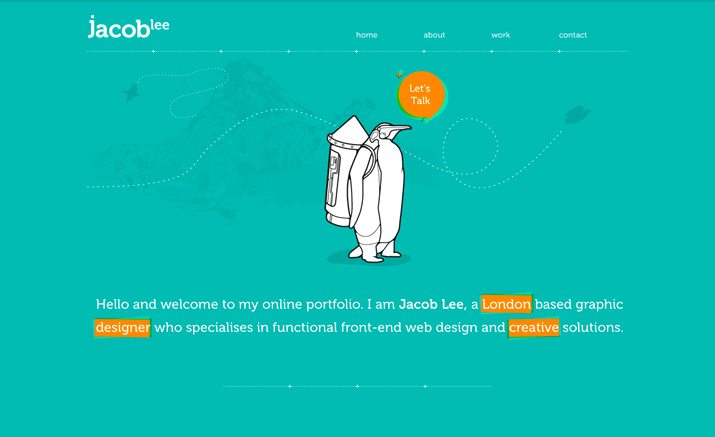
Illustration
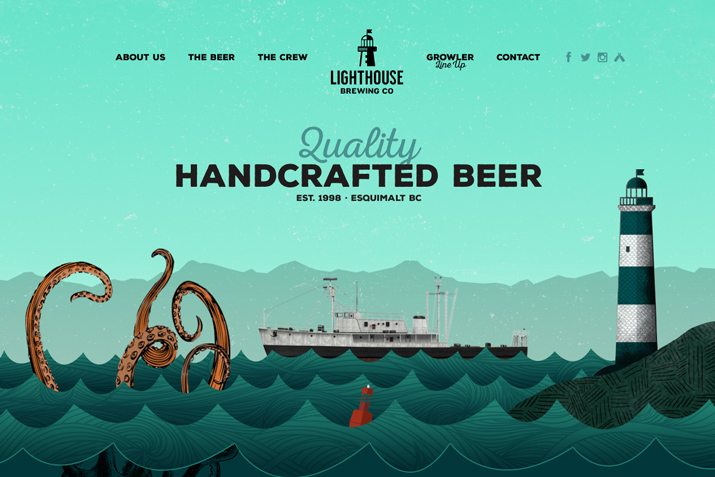
Much like photo or video backgrounds, illustrations provide an interactive visual experience. Illustrated backgrounds often seem to merge with the foreground but can be subtle as well.
The nice thing about an illustration is that is a truly customized visual. Most designers that use illustrations create or contract unique designs. There is no worry that some other project will include the same stock visual or a similar pattern.
Illustration can also help set a specific mood for a project. Popular elements in design projects with a younger audience, illustrations are often lighter and easy to digest, even when paired with more serious content.
No Background
Some backgrounds are not backgrounds at all. They are just white space.
This is an especially popular option right now while minimalism in design is a major trend. The lack of a background, paired with other simple design techniques can create a visually stunning package.
The key to making a “background-less” design work is in careful attention to other design details. While it is most popular in website design – think how easy it is to make a responsive website when you don’t have to consider the background – it translates well to print projects.
The use of large amounts of white spaces brings the full attention of the audience to the elements on the canvas. It makes every object seem a little more important that it might otherwise. The risk with no background is that of losing audience quickly because they are not visually engaged enough.
Tutorials and Resources
Now how do you start putting all these ideas into action? We’ve also gathered a mix of great tutorials and resources so you can try to develop a variety of backgrounds on your own.
- Solid Color Backgrounds: Select and download a solid background for personal or commercial projects.
- Ultimate CSS Gradient Generator: Set color options and get the code to import a gradient right to your website.
- Tutorial – Create 5 Subtle Background Patterns: Learn how to make your own background patterns in this simple Photoshop tutorial.
- Tutorial – Create Geometric Patterns in Illustrator: Learn how to create big bold patterns using vector-based shapes.
- Tutorial: Create Repeating Patterns in Photoshop: Learn to create a pattern, add color and add depth.
- Tutorial – Create a Fullscreen HTML5 Background Video: This tutorial takes you through the CSS needed to create a video background.
- Subtle Patterns: The site, and matching plugin for Photoshop, includes plenty of backgrounds.
- Zen BG: This tool allows you to create a number of different background types.
Conclusion
As you can probably see from the examples above the best backgrounds can include more than one type of design technique. A background may use a subtle pattern that is animated or an oversized photo. The combinations are almost limitless.
The key with any background concept, or design project for that matter, is to create something that people will want to interact with. The background should be part of the overall design plan, not an afterthought. Keep this in mind: Just because it’s not the first thing you see, does not mean it isn’t one of the most important.
Stock Photos Courtesy of Creative Market.