Choosing the Right Display Typeface: 5 Tips for Success
One of the biggest trends in web design is a large hero image or video at the top of a page with a few words to guide users into the site. This kind of aesthetic puts a lot of pressure on the designer to come up with just the right display typeface to pull the design together.
With so many typefaces to choose from, this can be a bit of a daunting task. But you can find a great typeface with a little planning and luck. Here are five tips to get started with a few beautiful examples of display typography.
What Is Display Type, Anyway?
Before we jump into the tips, are you comfortable talking about display typefaces? (If so, skip to Tip No. 1.)
If not, a display type is often large, eye-catching lettering that is used for headlines or the big words in a design. Display type is not unique to web design, it’s a term that’s used by print designers as well.
Display type comes in two primary forms for the web.
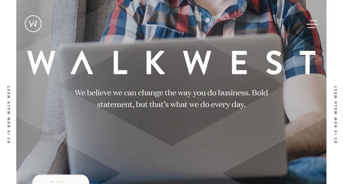
- The main website headline on the homepage, such as Walk West (above).
- The main headline or header on each page throughout the website design. While often not as large or flashy as the main headline on the homepage, these bits of display type are the elements that carry each individual page.
1. It Needs to Be Readable

Display type must be readable in order to be effective. This should sound like a no-brainer, but with so many cool novelty typefaces to choose from, it’s not hard to find websites where the main headline is not easy to read.
There’s no rule about what type of type category, display lettering should come from. Serifs and sans serifs work equally well. Even some novelty typefaces are an ideal match.
The things that matters is that lettering is big enough, spaced out enough, and contrast with other design elements enough to stand out on the screen. Imagine what the words would look like if they were to scream “READ ME.” That’s what a display typeface should do for users.
2. Lettering Needs to Match the Words

This might be one of the hardest concepts in the world to understand until you see it in action: The letters need to match the words.
Here’s an explanation. Some words just look bad in certain typefaces. It’s hard to explain. Maybe the word includes s several times and that letterform does not look great in the character set. The same thing can happen particularly with glyphs or odd characters such as %, $ or &. Or maybe you picked a typeface where I, l and 1 look alike and all of those characters are in the display. (You need to pick something else.)
Lettering should pass the eyeball test, meaning it should look appealing. The words should have a certain feel or flair or flourish to them that’s desirable. If you see any oddities in the characters combinations, users will too.
3. Give Yourself Flexibility
Think about how display type will be used throughout your project. Do you need multiple weights and styles to create the right headline package? Does the typeface you selected work for those secondary display spaces as well as the main headline?
You’ll want to think about all of those uses and give yourself enough flexibility with the typeface you select to us it in multiple ways. Too often a display typeface will look great for super-sized type with only a word or two to think about, but effective usage gets a lot trickier when it comes to using it in those secondary spaces.
It will be a lot easier to work through the design and create that consistency if the selected typeface works in multiple situations. For additional flexibility and design consistency, consider an entire typeface family for display uses. Go a little bolder with the main headline and use a thinner option for secondary display (maybe even try it with a color).
4. Be Wary of Thin Strokes
The following statement is subject to controversy: Thin strokes are difficult to use effectively when it comes to display type.
Yes, letters with thin strokes can look amazing. Yes, some designers pull it off beautifully. But most do not.
Go back to Tip No. 1. It all comes back to readability.
Imagine that you’ve used a typeface with a super-thin stroke for your main display and it looks great on 27-inch desktop monitors (maybe like the one you are designing on). Now look at it on your tablet or phone. What do you think now? Is it still just as readable? (Probably not.)
If you need more convincing, remember Apple tried this with IOS 7. Users complained that the typeface used for the operating system was too thin and difficult to read. They took these complaints to heart and subsequent releases included a thicker-stroked font.
5. Think About the Image
How do the words – and letters – work with the image or video they are paired with? It’s an important element. The most beautiful typeface in the world can appear awkward if the tone does not match the image and messaging in the rest of the design.
Contrast is also a contributing factor, particularly with video where the dark and light parts of the image may move. The words always need to be recognizable on the backdrop.
More designers are opting for solid color backgrounds – this is a pretty fun trend with plenty of bright, bold website designs – so that text is the primary focus. If you love your lettering, this might be a great option.
The solid background with bold display type option, really gets users to focus on the words themselves. The color is used as a draw to bring attention to what you want to say. This text combination works with a number of font options and can be altered to fit almost any color scheme from high color to a minimalist black and white design. The only thing that really matters is that you pick an absolutely lovely typeface!
Conclusion
Display type is the first thought you put into a user’s mind. That first impression can determine whether a user sticks with your site or moves on to something else.
To make the most of that key interaction, ensure that every word is easy to read, sets the right tone and helps users move through the design to give you the highest chance at success.