Design a Rockin’ Band Website
Earlier this year, we put out an article outlining 5 Reasons Band Websites Suck. Today we’re going to follow up that post by creating a band web page design that steers clear of the problems encountered by most sites in this category.
We’ll create the mockup in Photoshop and learn about a few features as well as some solid design theory along the way. Let’s get started!
The Project
Download Free Layered PSD
Today’s post is yet another project pulled from our Design Dilemma program. Two separate designers, Nathan Futo and Roman Hurton, both wrote in this week asking for help designing an initial layout for a band website.
As our previous post proved, this can be quite the tricky task and the end product is often cluttered and ugly. We’ll tackle this problem head on by creating a simple and flexible layout that anyone can use to hold lots of content.
The Project
Today’s post is yet another project pulled from our Design Dilemma program. Two separate designers, Nathan Futo and Roman Hurton, both wrote in this week asking for help designing an initial layout for a band website.
As our previous post proved, this can be quite the tricky task and the end product is often cluttered and ugly. We’ll tackle this problem head on by creating a simple and flexible layout that anyone can use to hold lots of content.
Getting Started: The Background Photo
The first step is to create a Photoshop file that is around 1200px by 1600px at 72dpi and in RGB. Next, we want a nice photographic background for our site. Something dramatic but not too distracting and still looks good even when most of it is covered up by other content.
I recommend that you either buy a cheap stock photo or take your own, but because this is just an example I cruised over to Flickr Creative Commons and grabbed this corn field photo from Snake-Eyes Photography.
When you throw this photo onto your PSD, it should leave a large portion of empty space at the bottom. To fix this, set your background layer to black and apply a mask to the corn field photo. Then grab your gradient tool and stretch a linear gradient vertically from white to black. This should give your photo a gradual fade to black without actually damaging any of the original pixels.
Where possible, you always want to use masks to make non-destructive changes. This makes for an unrivaled amount of flexibility that comes in handy when you want to change things around. Modifying the actual layer destroys the original image and prevents you from returning to that point.
The Layout
The biggest problem with band websites is that so much stuff gets crammed onto the homepage that the end result is a cluttered mess. The content tends to look disparate and cobbled together instead of appearing to be a cohesive unit with distinct parts.
The easy way out is just to tell you to not put so much on your homepage, but this is often not a very practical solution. Instead, you need to learn how to create a page filled with photos, blog posts, music players, Twitter feeds, tour dates and more while still maintaining an attractive design. Can it be done? Absolutely! And it’s actually a lot easier than you might think.
To start, set up some guides in your document so that they create a single, centered column that’s 960 pixels wide. If you have Photoshop set to snap your selections to any guides, this will help you draw out a few boxes for the content.
Next, create four white boxes arranged like those shown below. This will be the basis of our entire layout. Too easy you say? Nay! This simple and flexible grid pattern can hold a wide variety of content. In fact, feel free to arrange the boxes however you like and even try splitting them up differently. As long as your spacing stays consistent and your alignment is strong, you can create simple boxes to hold anything you want.
I added a drop shadow to my boxes to help them stand off the background a little better.
The Header
To undergo this project, I’ll assume that you’re working for a real band. Such groups usually have lots of resources to work with: photos, album covers, etc. For our hypothetical site, I didn’t have any of these. Fortunately, I was actually in a rock band in college and still have all our promotional material so I’ll be using random stuff from that collection to fill the page.
The first thing we need to do is fill that header box. This could easily be anything you like, an announcement for an upcoming album or tour, a band photo or even better, throw all of the above into a jQuery slider.
For this project, I’ll just throw in a simple band photo. Rather than cropping your photo to fit the space, try placing it directly over the layer with the white box and applying a clipping mask (Command+Opt+G). This should automatically fit your photo to the bounds setup by the white box layer. This is just another non-destructive technique that offers more flexibility than cropping.
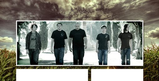
To help the photo stand out, I gave it white inner stroke. As odd as it seems, be sure to apply this to the white box layer and not the photo layer directly.
You’ll notice that this photo is quite cool compared to the warm background. I think this makes the photo look like it doesn’t belong so I added a warming adjustment layer to make the two more consistent.
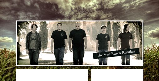
As you can see, I also threw on a little graphic with the band name. The photo is too busy to place text over directly so the little offset rectangle makes for increased readability and doubles as a nice graphical touch.
Navigation and Logo
While we’re working on the header, we need to place in some standard website elements: namely the logo and navigation area. These are pretty simple, just align the logo on the left and the navigation on the right. I drew out a few little black boxes for the navigation tabs. This provides some nice repetition with the element we added above and helps the text stand out on the sky background.
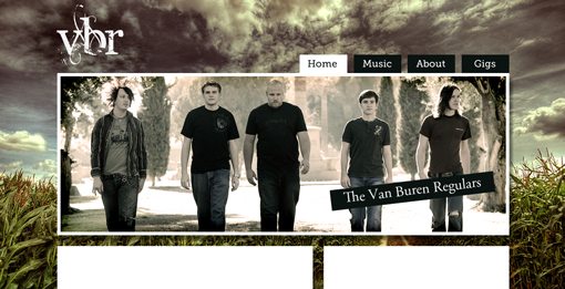
With that, our header is finished and we can now proceed to the middle section.
Show Dates and New Album
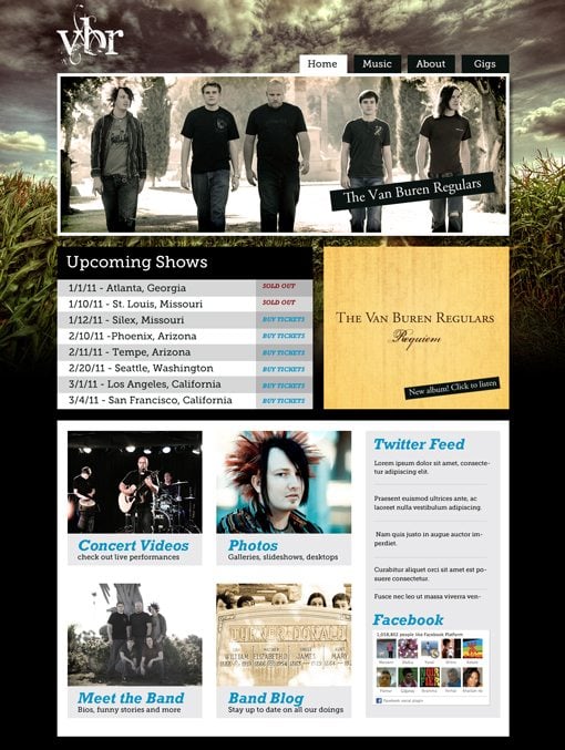
The middle section is the easiest. Simply use these two boxes to hold any content that you think is important. For instance, I created a basic tour schedule and a banner advertising a new album. This is also the perfect place to throw a music player if you have one, just be sure to set the music to only play when people want it to! There’s nothing worse than a site that unexpectedly blasts you with music when the page loads.
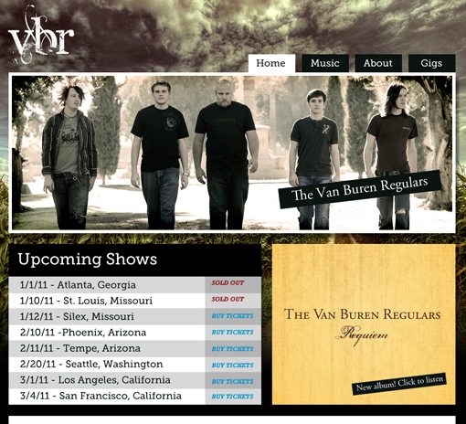
Notice that I used the same Slab-Serif font (Museo) that we saw on the navigation for the show dates. Where possible, keep your typefaces fairly consistent and restrict yourself to two to three main families.
Everything Else
The bottom section is the largest and therefore the most complicated. We’re really going to cram a ton of content in here while trying to stay structured and clean.
To pull this off, we’re going to use the same trick we used on the overall site layout. This time we’re simply nesting another module system inside of our biggest primary module.
To start, draw out a few boxes and arrange them in another grid pattern. This time I went with four large squares and a sidebar.
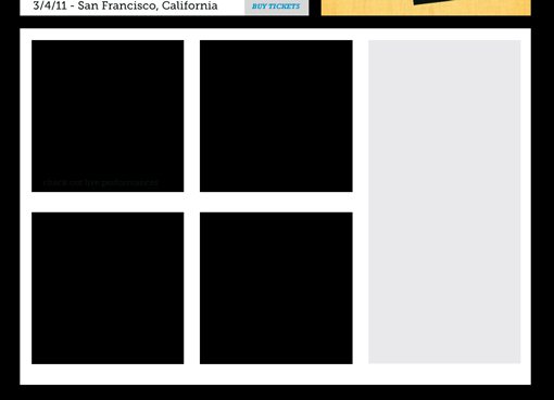
Next, toss in four photos and apply clipping masks just like we did before so that they conform to the boxes you set up. At the bottom of each square, add some text describing where the link will lead.
Finally, use the sidebar as a social media hub. Throw in your Twitter, Facebook, Flickr, etc. widgets here and style them when possible to match the look of your site.
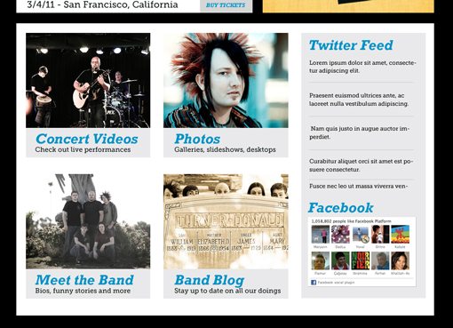
You can really see here how much this layout system can hold. Even if you have twice the content that I’ve placed here, it’s easily expandable and still won’t look cluttered.
Finished Product
That finishes off our site design! Here’s the finished project (click for larger preview).
Conclusion
To sum up, yes, band websites often suck but they don’t have to. Using the methods above, you can easily create nice, clean layouts that hold tons of content without looking like a MySpace disaster.
Leave a comment below with a link to any great band websites you’ve seen or created. Ask yourself whether the site could be improved with a more cohesive layout or whether you already nailed it. We’d love to see some of your work!
Also be sure to stop by our Design Dilemma page to submit your own design-related quandaries. If we think it’s relevant to our readers, we’ll turn it into a post like this one!


