Design an Edgy Flyer Using Your Own Photography
Today we’re going to take on a design project from start to finish using primarily resources that we create ourselves. We’ll walk through taking the photo, editing it in Adobe Lightroom, and using it as the main element of a flyer design that we’ll take on in Photoshop.
Along the way you’ll learn some great and practical techniques that you can apply immediately to your own work. Let’s get started!
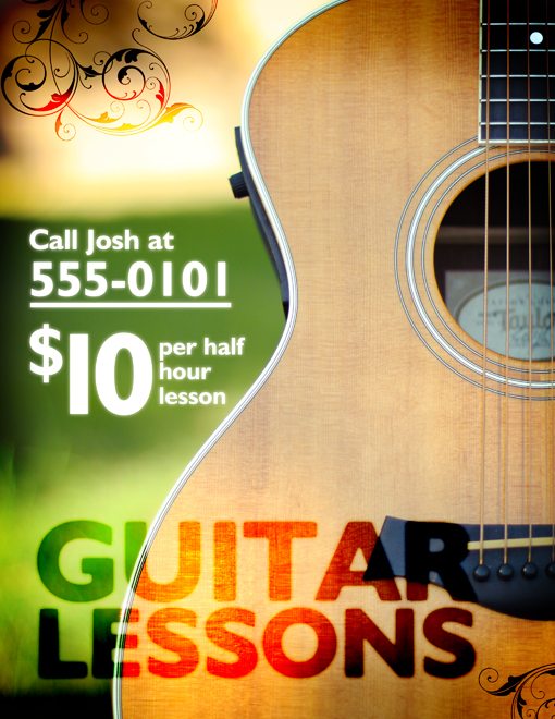
Final Design
Just so you can see where it is we are going on this crazy trip, here’s the finished flyer for our hypothetical guitar lessons business.
Why Not Stock?
Sometimes designers who are perfectly capable of taking an amazing photo themselves will waste hours and hours looking for an affordable stock image to use in a design. As I’ve mentioned in the past, I’d like to help break you of this whenever possible for a number of reasons.
First, using your own images ensures that the photo is unique, which is essential if you ever do any work for major brands. Secondly, you can’t beat the affordability (free!). The project we’re undertaking today is a simple flyer advertising guitar lessons. Such a task would be taken on by many designers and non-designers alike and simply isn’t large enough to merit a stock photography budget.
Step 1: Setting Up The Shoot
For this photo shoot I used the best and most affordable light source I could find: the sun. You definitely don’t need a bunch of expensive lighting gear to take on modest photography projects and this is a perfect example.
Next, I grabbed the most expensive piece of equipment used in the entire shoot: my beloved Taylor 414ce. I bought this guitar with my own hard-earned burger job money when I was fifteen and it’s been with me for a long time. All I did to set it up was throw it on a standard guitar stand that I had lying around and carried it out to my backyard.
Here’s the basic setup:
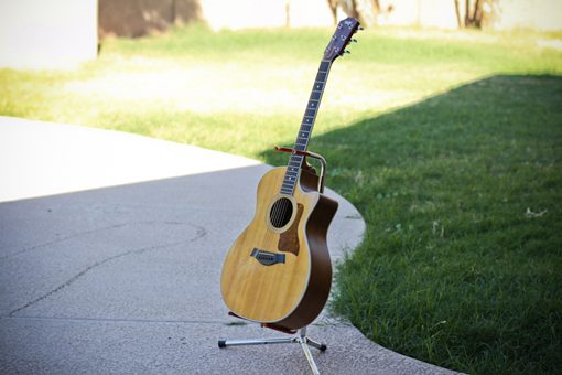
Notice that the sun is actually really bright at the time I started shooting. Placing the guitar in the sunlight might be your first impulse, but it’s a bad one. The harsh light will make for horrible shooting conditions. On people it causes squinting and awkward face shadows, on reflective surfaces like this it causes seriously blown out highlights.
As you can see, I’ve placed the guitar in open shade. It’s out in the open so it’s not covered or too dark, but there’s still plenty of shade to keep the highlights under control. This is perfect for most of the photo shoots that you’ll undertake until you learn how to shoot in the sun. The ideal time of day to shoot is an hour or two before the sun goes down. This will make for lots of shade and usually some beautifully golden lighting conditions.
Taking the Photo
The next step is to take the photo. This is where I got a little cocky. I took a single photo, then went inside and imported it, thinking I would have what I wanted. Unfortunately, it never works like that; in a few minutes I was back outside shooting more photos.
Having learned my lesson, this time I experimented with different angles, crops and camera settings. I took more photos than I knew I would ever need so that I would have plenty to shoot from. I highly recommend that you do the same whether you’ve been shooting for years or this is your first serious photography attempt.
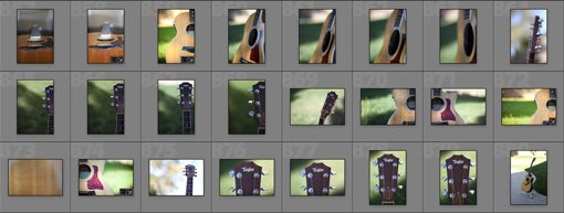
Since I played with a few different settings at this stage, we’ll first select our photo and then discuss how I shot it.
Choosing The Right Photo
To make things challenging in the design stage, I chose a photo without a lot of copy space. This is a constraint that you’ll often have to work around with stock images but can usually avoid it when you take the photo yourself.
As you can see below, at this stage the photo really isn’t all that great.
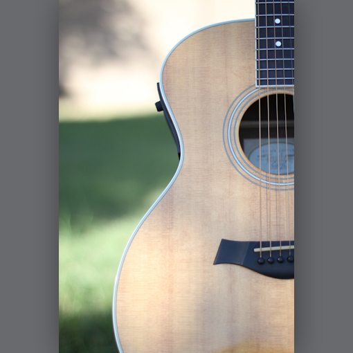
The crop is crooked, the colors are notably non-saturated and the overall contrast is fairly low. Fortunately, Lightroom can handle all of these problems with ease. Before we get into fixing it though, let’s discuss how I shot it.
Camera Settings
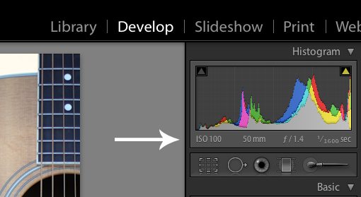
As you can see above, Lightroom tells me all the settings that I used to take the shot. First of all, my ISO was at 100. A low ISO rating ensures that there is no color noise, which can really ruin a photo. However, you can only get away with a low ISO in bright conditions. Fortunately, I was working outdoors so there was plenty of light.
Next up, you can see that I was at a 50mm zoom. This is natural because I was using my 50mm 1.4 prime lens and it doesn’t shoot in anything but 50mm. This is an amazing and affordable lens by the way and I highly recommend that you pick one up.
My aperture was set to 1.4. I did this because I wanted a nice, blurry background. However, the side effect of a very shallow depth of field is that it’s hard to get your focus just right. Looking back, I probably should’ve shot at around 2.8 so the strings would be more in focus, but this works.
Since I was shooting in the bright outdoors with a wide open aperture, my camera was letting in tons of light. For this reason, I was able to shoot at 1/1600th of a second. This is a pretty fast shutter speed that eliminates most blurring from camera shake and allowed me to shoot handheld.
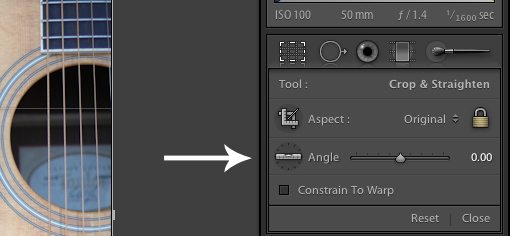
Straightening the Photo
To straighten the photo, grab the straighten tool (shown below) and draw a line along something that should either be perfectly vertical or perfectly horizontal. In this case, the strings on the guitar made a perfect reference point.
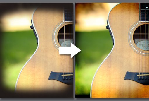
Lightroom Magic
Now that we’ve got our crop worked out it’s time to make the photo look more like something captured by a professional with ten thousand dollars in equipment. I would love to tell you I tweaked and tweaked this photo like a pro, but in all honesty I did little else than a single click.
I used a Lightroom Preset called Hotel Del that adds a lot of beauty and warmth with zero effort. I find most of the presets available online are a little strong for my taste so I create modified versions with the effects backed off. That’s the case here as well. I just applied my custom “Hotel Del – Less” preset and the image below was the result. You can either use the preset as is or follow my lead in creating a backed-off version.
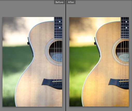
Admittedly, the colors have gotten pretty crazy but that’s exactly what we’re going for here so this wil be just perfect for our flyer.
With that, our time as a photographer is finished. We can now export the image into Photoshop and start converting it into a flyer.
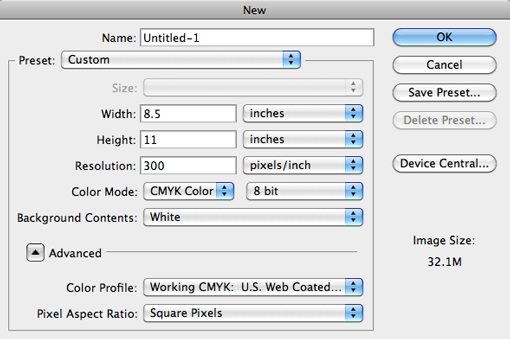
Getting Started in Photoshop
Now that we’re all done with the photo, open it in Photoshop. Since I’m creating a printed flyer, I threw the photo onto a 8.5″ by 11″ CMYK canvas at 300dpi. If you’re designing for the web, you can probably get away with 72dpi, RGB and any size you like.
Adding a Vignette
The Lightroom preset actually already added a preset to our photo, but as the name of the article implies we’re going for an edgy look so we’re going to really exaggerate the vignette.
On a new layer, take a soft black brush and paint around the edge of your canvas. Then set the blending mode of that layer to Color Burn and reduce the opacity to around 45%.
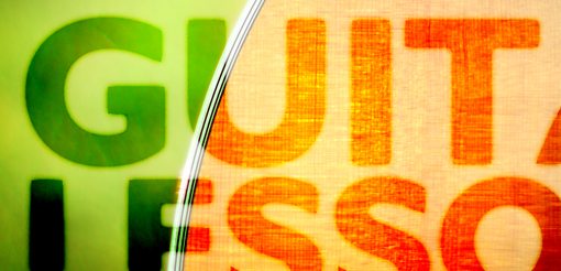
Adding The Headline
I decided to do things completely backwards with this design and place the headline on the bottom (don’t tell any marketing professors). For the font I chose a bold humanist in all caps. I also varied the size so that both words were about the same length.
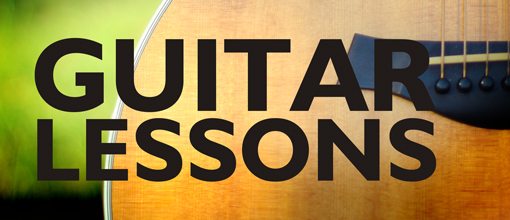
Blending the Text
Next I looked again to our good friend Color Burn and reduced the opacity to around 90% on the text. This admittedly makes it a little harder to read but the effect is really nice.
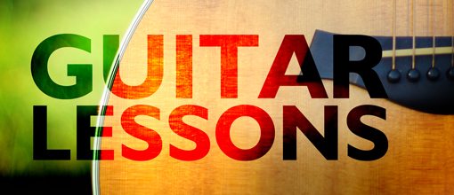
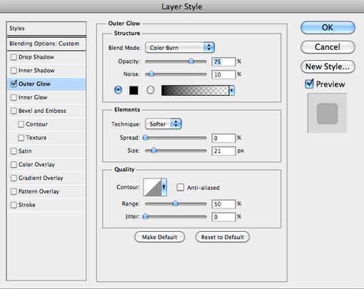
To push that burned-in effect even further I want to ditch the hard edges on the font. To accomplish this, add an outer glow with the settings shown below. Notice that I’ve change the default color and blending mode. This means that your initial outer glow settings will look very different than the effect that we want.
The result is a nice, almost wet edge that makes that boring Humanist font look grungy and cool.
Lesson Info
The next thing to do is decide what information should be on the flyer. I figure the basics are the following:
- The price
- The length of a lesson
- The phone number to call
The key here is to take these three key pieces of information and actually design them. You’ll be tempted to throw them into a bulleted list and call it a day, but where’s the fun in that? Here’s the layout I came up with.
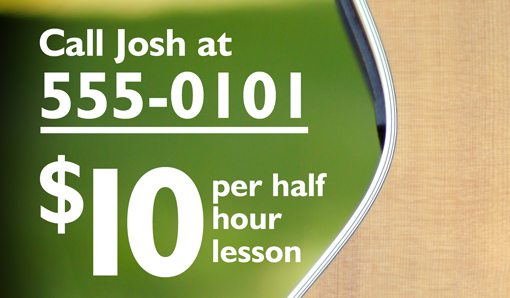
To make this information stand out a little better, I applied another Outer Glow, this time with more typical settings. Just tweak the default effect until you get something you like.
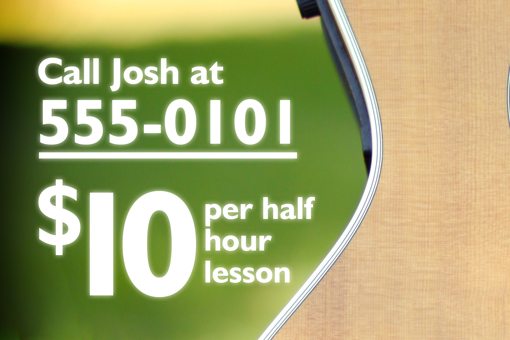
Finishing Touches
To make the designer look a little fuller, I threw in some cliché but effective graphic swirls in two of the corners. You can find a million free Photoshop brush sets online that will do just fine.
And with that we’re all finished!
Conclusion
To sum up, we were able to shoot a usable photograph using minimal equipment and only natural lighting. We then put very little effort into editing the photograph in Lightroom and it came out looking great! Finally, we added some text using a few blending mode and layer effects tricks in Photoshop to complete our flyer design.
I hope you enjoyed the tutorial and learned a thing or two. As always, thanks for reading!