Design Trend: Dark Color Palettes & Animation
Have you taken note of all the super dark design patterns lately? Designers are experimenting with some funky, dark design patterns that feature animation in the same color scheme.
These animations include everything from simple movements that happen on their own, to hover effects and full cinematic experiences. Let’s dive into this website design trend and explore a few ways to make it work for your projects.
About the Trend
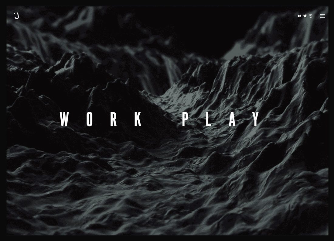
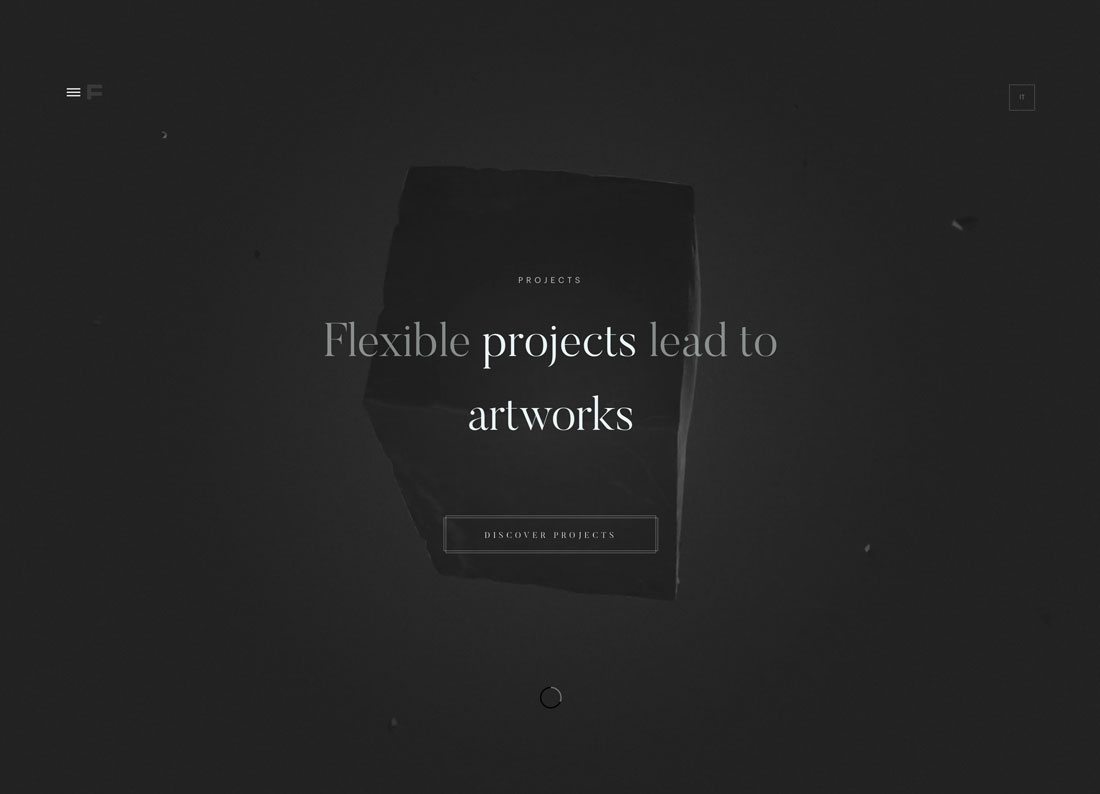
Dark animation is a trend that combines two elements in a distinct way – a dark monochrome color palette and a cool animation. The result is a stunning layered design that’s subtle and moody.
While the trend can be difficult to do well – and doesn’t always have a great mobile user experience – what drives this visual pattern is interest. Because of all the dark elements, the user is forced to look at the design.
There’s a true element of mystery that drives engagement with these projects as the user gets entranced in seeing what will happen with the animated element and looking for subtle changes and effects. What will happen next?
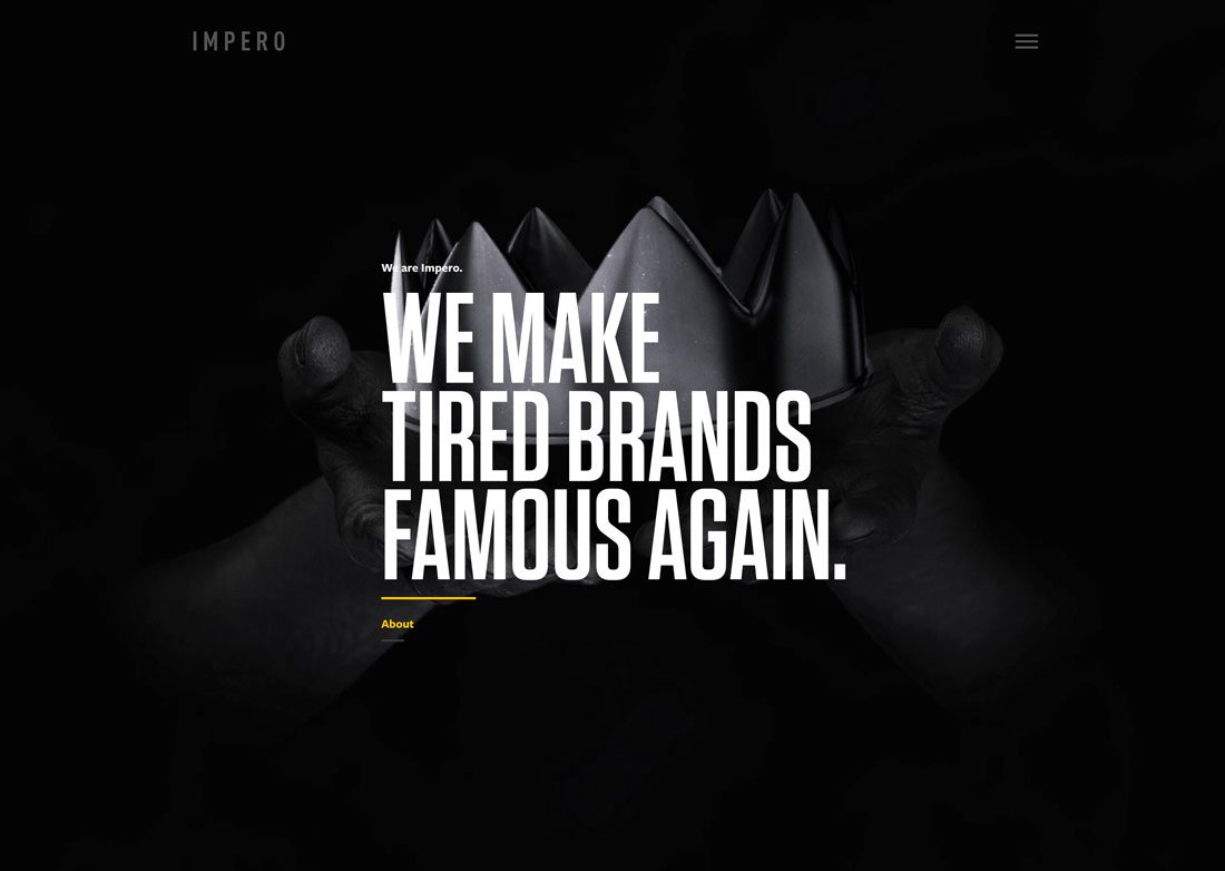
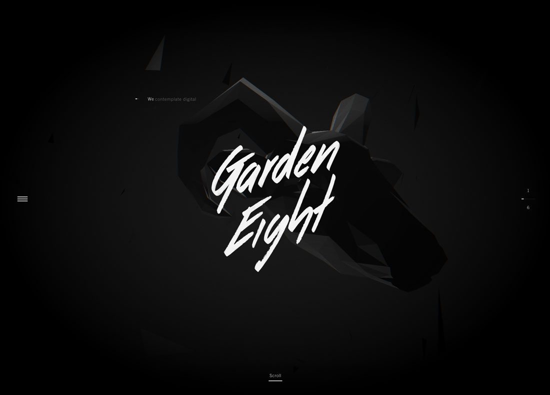
Every one of these designs is composed in a different way. There’s no particular type of animation that works best and there’s no set color that has to be used, although a lot of these designs use a palette of rich blacks and grays.
Animations can be as simple as a hover effect or as elaborate as a molding shape or produced video.
It seems to work because it evokes a sense of mystery. And users want to solve the puzzle.
Why It Works
It’s actually hard to explain precisely why this design trend works. When you think about it without seeing the website design projects, you wouldn’t think that dark animated patterns would be successful.
- There’s not a lot of color.
- There’s very little contrast.
- The designs are almost overly simple.
But maybe that’s why this trend does work. It breaks the rules enough to draw users into the design.
The other contributing factor is that darkness and mystery go hand-in-hand. And people just love a good mystery. They live being able to see hidden elements or solve a complex problem. The dark color scheme with an animated effect provides a way for users to unlick a mystery.
These projects also have a distinct emotion pull as well. Dark colors are moody. The color variations in these palettes are complex and interesting (from a design perspective anyway). There’s an element of depth that’s hard to articulate, but fascinating to explore.
Add up all the emotion and mystery and you can get an idea of why users are drawn to this visual pattern.
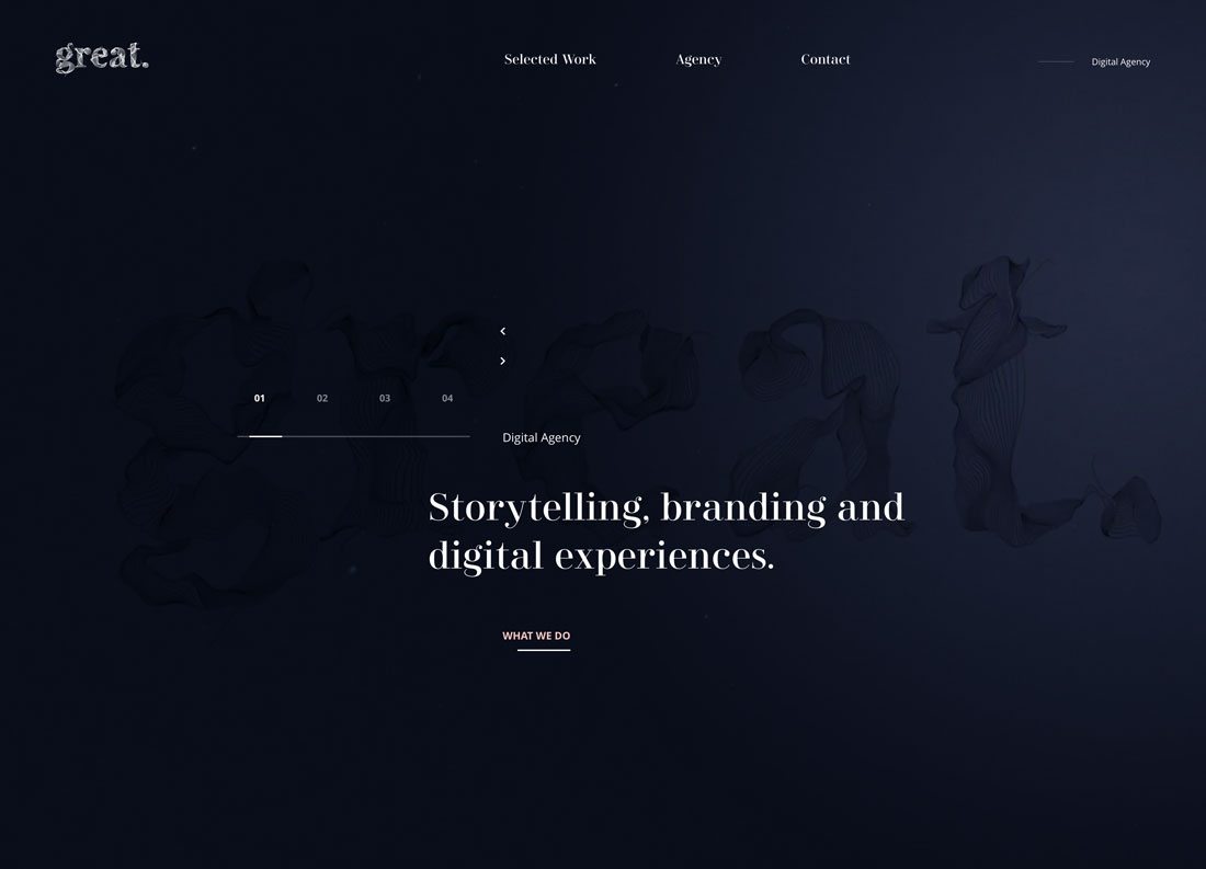
It Doesn’t Have to Be Black
While most of these designs feature black color palettes, they don’t have to.
Other dark hues can be effective as well and give designers the ability to create a dark animated design pattern and stay on brand with the color palette.
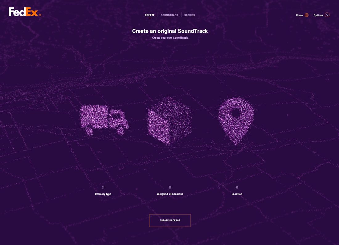
Regardless of the color, the key to making these color palettes work with animations is richness in color selection. A range of tones (mixing a color with gray) and shades (mixing a color with black) can provide a varying range for a monochrome color palette. (Just look at the different purples in the FedEx design, above.)
While contrast is not the focus of this design trend, it is important. Without enough contrast in the monochrome design, the animation will get lost in the background, rending the design ineffective.
A Few Precautions
This design trend is not for everyone, and it’s very tough to pull it off effectively. Dark color animated patterns have faults:
- The don’t render all that well on mobile devices.
- There are some inherent accessibility issues.
- There might not be enough visual interest for some users.
- Navigation and call to action placement can be challenging.
- Environmental conditions – lighting, etc. – can make the design more difficult to see.
- Some users won’t apprreciate the moody tone.
- Users can get bored with the design quickly, decreasing time on site.
Tips for Trying This Design Trend
If you aren’t afraid of the challenges presented by this design trend, and have a content model that matches the moody tone of a dark color animated design scheme, there are a few things you can do to help ensure the success of the project.
- Stick to a one-page design: Too much of a funky design element can be overwhelming. If you plan to use this concept, limit it to a one-page design or one page in the design.
- Use a contrasting color: White text works exceptionally well on dark backgrounds. The same goes for other elements. Make sure that buttons, navigation elements, messaging and the call to action is easy to see and read. While the animation and background might not contrast significantly, other elements must be easy to identify.
- Simplify animation: Overly complex looking animations can overwhelm this design. Stick to simple movement and motion that’s not too fast.
- Design in layers: What makes this concept work is designing in layers. Create separation between the background and animated elements for an effect that feels somewhat tactile and real. Layering will also help you plan for just enough contrast to make elements visible.
- Use bold typography: Not only should text elements include plenty of color contrast, you’ll likely need to use a strong, bold typeface to ensure that text doesn’t fall into the design. It should jump out of it. Look for typefaces with thicker lettering and simple strokes to ensure maximum readability.
What’s Next?
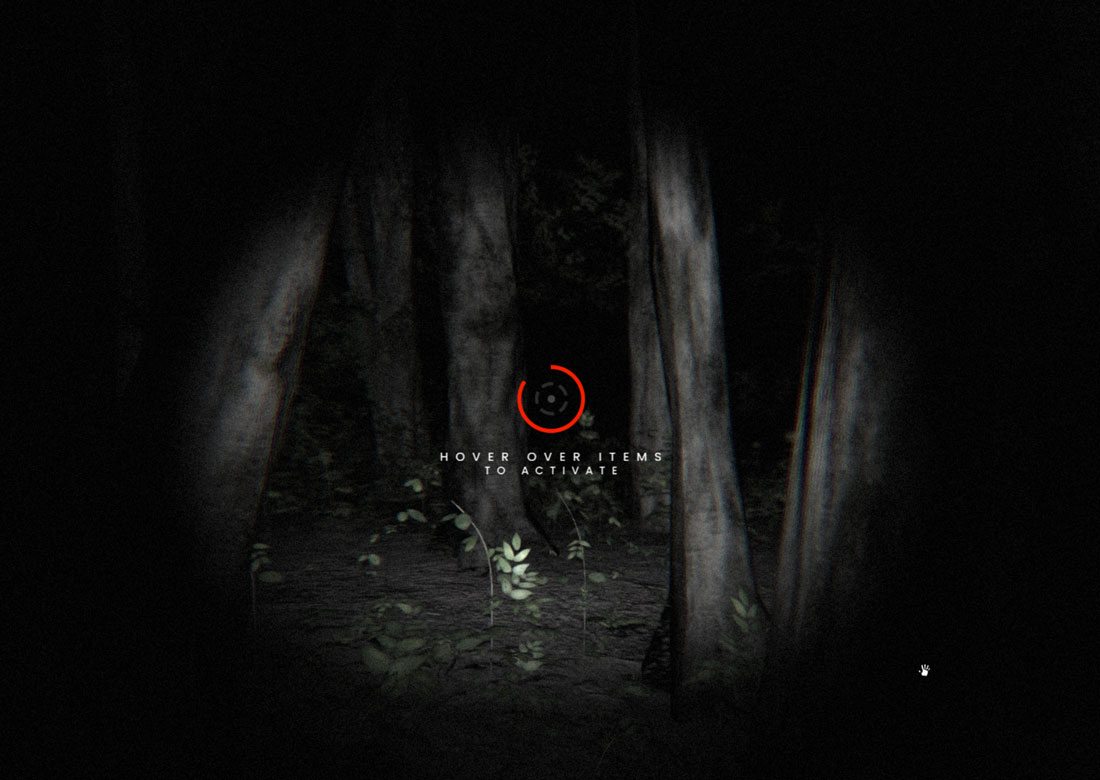
As with any design trend, this aesthetic will continue to evolve. While we can’t truly predict what will happen next, some designs provide a clue.
Dark color and animation could be a featured design in the world of virtual reality. VR is a playground for gaming and video, which already uses a lot of dark coloring.
This design trend might be a perfect fit for those types of projects, such as the new Blair Witch Project video trailer/game website, above.
Conclusion
Dark color schemes have been around for a while, but this new twist with similar colored animations is interesting. It tends to be one of those things that designers absolutely love – in part to the moody feel – or hate because of the challenges it presents to users.
Either way, this style is being used more frequently. While it does work best for certain types of projects (note the number of agency and portfolio sites in the examples), it can be an interesting way to mix up a design. Try it for a single slide or page and see what users think before you invest in a fully dark color animated design pattern.