Design Trend: Incorporating Whimsy
Whimsy: capricious humor or disposition; extravagant, fanciful, or excessively playful expression. Adding a touch of whimsy to a project is an easy, and fun, way to lighten up the mood of the design.
From small elements to a full-scale whimsical design, these touches can draw in users because of their simple charm. Whimsy is most often associated with more feminine projects and common for designs that focus on children, but that’s not always the case. Many of the trendier retro styles that have been growing in popularity also incorporate a distinct sense of whimsy. Here are a few ideas to help you incorporate whimsy into your projects.
Handwritten Typefaces

A simple handwritten typeface adds an element of charm that has almost immediate impact. The style of lettering needs to seem authentic and portray the mood of the project for the greatest impact.
The thing to avoid is overused, clichéd handwriting styles – such as permanent marker typefaces. For the best use of handwriting styles, it needs to actually look real, and handwritten. Too many computer-generated options lack that authenticity.
When selecting a handwritten typeface consider these things:
- Look for an option with alternative letter styles. If you are using letters multiple times, you want them to have slight differences, just as they would if you had penned them by hand.
- Keep handwriting style text to a minimum and only use it for a few words, such as a headline.
- Remember the tone. Lightweight typefaces pair with light content. Heavier styles need heftier content.
Watercolor

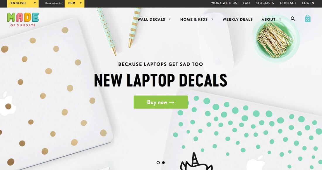
Watercolor is one of those things that can be tough to use but look amazing when done well. There are lots of ways to incorporate it from backgrounds to parts of the imagery, such as with Made of Sundays above.
When using watercolor it’s important to know what you want to do. It works best when you go all out with it, as in the instance of a background, or if you use it for smaller elements.
It also works best when there aren’t a lot of other competing visuals, such as photos or other big pops of color. Experiment with it and if it feels the least bit overwhelming, back off the design a bit.
Illustrations

Nothing grabs attention like a cool little drawing. It’s something that can help users identify with you. It can become part of your identity and something that you “own.”
And you don’t have to have a huge illustrated mural to accomplish this. A small, simple sketch can suffice.
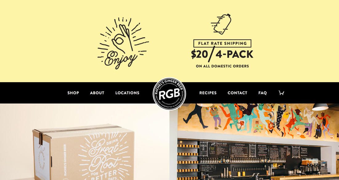
Rachel’s Ginger Beer, above, does just this with a few neat little drawings that connect to the brand. They aren’t the main logo but are used to accent and add a hint to whimsy to the overall design. The illustrated icons and used for the website design and on products such as tote bags.
Bright Color

Nothing says lighthearted fun like bright color choices. Bold, bright, saturated colors are visually interesting and can create that sense of fun and adventure.
While many more whimsical designers use bold yellows, oranges and greens with deep saturation, you don’t have to. Even tints of these happy hues can be effective.
The flat and material design trends contributed to the adoption of these color palettes. Palettes for these styles are a great place to start if you are unsure of how to get a color that communicates whimsy. Here are two great starter options:
Thin Lines and Strokes

Another way to keep the design light is to stick with thin lines and strokes throughout. This can include borders for images, strokes for typography and the main imagery itself. Thin elements have less weight and create a sense of lightness on their own. Add that to other whimsical features or messaging and you’ve got a simple whimsical outline.
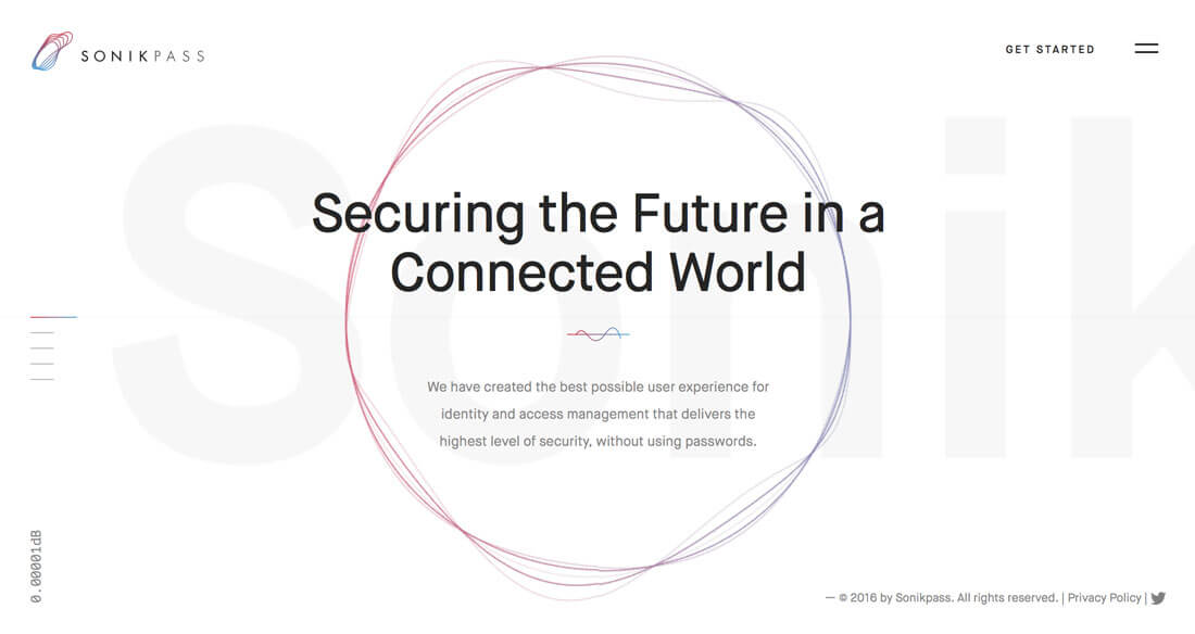
For the most impact, remember to use contrasting elements and don’t get caught with everything being too skinny. Note how Sonikpass, above, mixes thin and heavy lines. What’s nice about the thicker elements is that they have much more muted colors, so the weight is not overpowering. It’s a good yin and yang style design that’s aesthetically pleasing, uses the trend well and is easy for users to interact with.
Simple Animation

While animation is primarily used in website design as a tool to help create user engagement or provide instruction, it can also just be fun. From hover effects to stage changes to dancing or bouncing elements, simple bit of movement are light, and promote a positive feelings on the part of the user.
The best uses of animation right now follow those concepts while adding whimsy. To accomplish this, most of the designers are combining animation with one of the other techniques mentioned here – particularly use of bright color or illustrations – to delight and engage users.
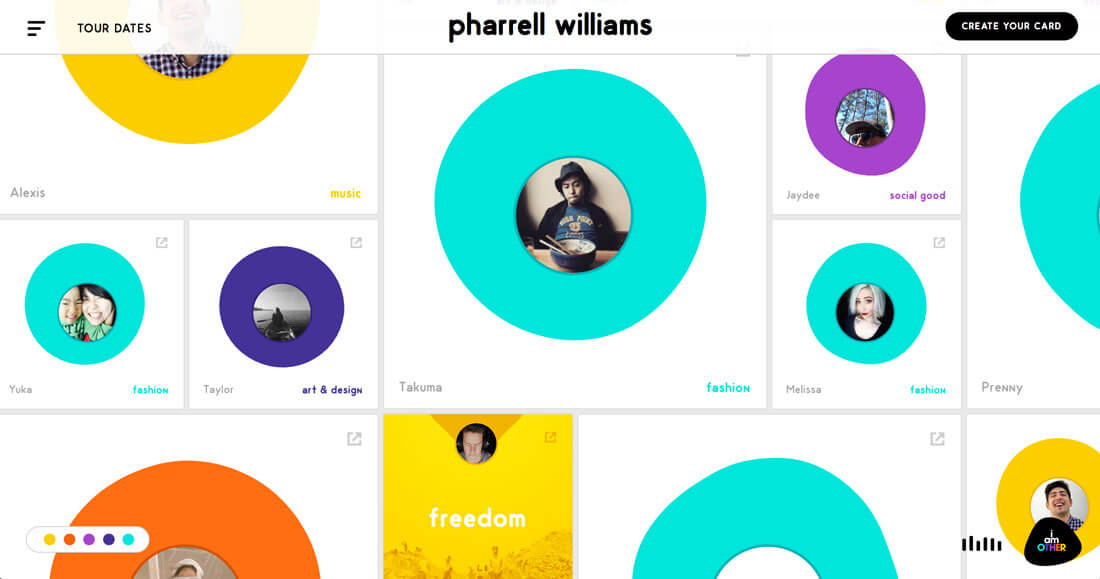
The Pharrell Williams site, above, incorporates plenty of fun movement. The blob-style shapes pulsate, a color overlay provides a great hover state to help users read text and animated actions help you navigate the design with ease (it moves in every direction).
Purposeful Imperfection

One of the best ways to incorporate whimsy is through purposeful imperfection. We all make little mistakes and that’s OK. Use those little blemishes to your advantage.
Imperfections can happen anywhere in the design and come in many forms:
- A stroke that’s just a little thicker or thinner than others.
- Subtle differences in the characters of a typeface family.
- Lines and illustrations that aren’t perfectly straight, aligned or square.
- Mixing and matching of elements that don’t innately belong, such as interchanging lowercase and capital letters randomly or combining unusual color choices.
- Animations that are just a little bit off balance.
- Asymmetrical alignments.
- Juxtaposition of reality and fantasy, such as a design that includes actual photographs and hand-drawn sketches or typefaces.
Conclusion
If you like whimsical concepts but are afraid to delve too deep into the trend, start small. Add a single type of element with a whimsical flair to see how it fits into your overall design scheme.
Whimsical design patterns tend to work particularly well on smaller designs, such as one-page websites or one-page printed elements because the techniques can get a little overwhelming when used en masse.