Design Trend: Obstructed Text
Some websites look great, even if they defy conventional wisdom or tenets of design theory. A new design trend is showcasing that very idea with elements that cover or obstruct some of the text in the design.
It’s an interesting trend because it goes against everything we commonly talk about with design – that it must be readable to connect with users quickly.
Needless to say, this can be a tricky technique to pull off effectively, but the designs are striking and impactful when done well. Here’s a breakdown of the trend and some ideas for how you can try it yourself.
Simple Obstruction
If text is covered in a design, then everything else must be super simple visually so that the user doesn’t get lost in too many effects.
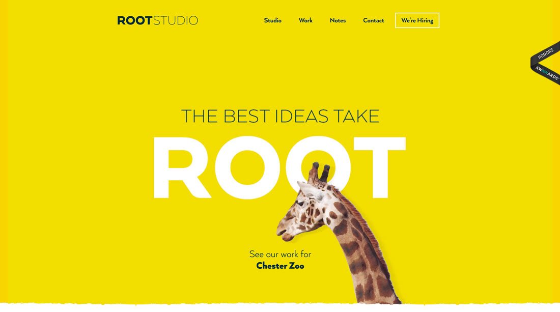
Root Studio does a great job of this with a first impression that grabs attention with color and the simple animated giraffe that covers part of the oversized lettering. The trick here is that even though some of the letters are obstructed there’s no question what the word on the screen is. The letters are still readable, due to size, simplicity of the typeface and placement of the obstructive element.
The design team took special care with the text obstruction to maintain the integrity of “ROOT,” which is the brand of this particular website. At every responsive breakpoint, the text is no more obscured than any other. (This is where many of these designs fall short. They look great on desktop resolutions, but the text is too obstructed to be readable on smaller screens.)
Three-Dimensional Layers
Adding a three-dimensional layered effect can help elements jump off the screen so users almost feel like they can reach out and touch them. Text can serve as that background element in some cases.
Just make sure that the layer on top of the text doesn’t cover too much of the word (or words). And it is always vital to make sure that text obstructions don’t result in unwanted words because of the placement of other elements.
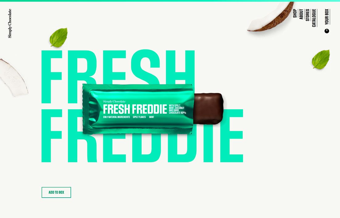
Simply Chocolate uses this layering effect well. It works mostly because of the combination of oversized lettering that uses common words in a bold typeface and a top element that’s not really large and contains the exact same words that are obscured by the candy element.
This treatment makes the big letters in the background more of a graphic element than readable one, creating a fresh bit of contrast and superb layering effect. (You might find yourself scrolling through all the different candy flavors to see how they create the effect in different ways.)
Forget the Rules of Space
Sometimes text obstructions don’t actually cover the letters but encroach on their space.
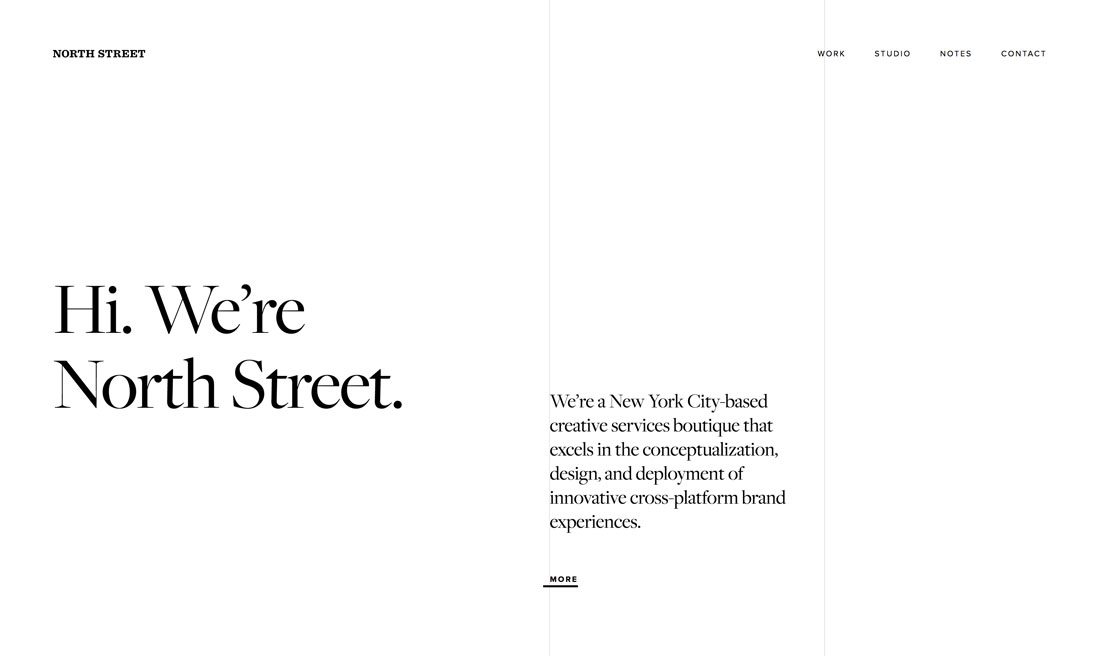
It’s one of those rules that North Street breaks without the design feeling cluttered or disjointed. The company description bumps right up against the center vertical rule on the screen (the rest of the design uses this divider for a split-screen aesthetic.)
If anyone said they were going to use this treatment, you’d probably try to convince them otherwise, but here it works. The visual composition is so light – thanks to plenty of white space – and they typeface choices are bold enough that the lightweight gray line almost just falls into the background even though it gets in the space that should be reserved for text.
A second gray line further splits text in the navigation, but most users probably won’t even notice the obstruction.
For Large Lettering Only
Looking at all the examples here, you’ll probably notice a common theme. All of the obstructed lettering is quite large and uses simple typefaces.
Small lettering won’t typically give you enough room to cover part of the text in a way that appears purposeful. If you plan to design with a text obstruction, it should be intentional and have meaning.
Covering small lettering is incredibly difficult, in terms of purposeful design and readability. That’s why the technique is paired with oversized typography.
These large, often sans serif, typefaces are easy to read at a glance and often have medium stroke widths and large bowls and counters that make layering elements more practical. To make this concept work, you need letters with shapes that lend themselves to this concept. Thin or condensed type styles don’t often work, and complicated scripts of novelty styles are just too difficult to read with an element on top of them.
Elements With Little Contrast
Sometimes the text obstruction isn’t an element that’s on top of text; it is the relationship between the text element and what surrounds it. A lack of contrast between text and background elements can result in a text obstruction as well.
Again, this can be a difficult concept to pull off effectively. Text innately exists to be read. A lack of contrast can make that difficult.
When paired with highly readable text, low contrast text elements are subtle reminders on the screen. These elements will be read after other higher contrast elements.
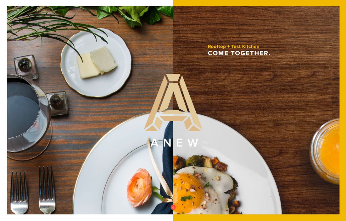
In the design for Anew, above, the description of the business is more important than the name brand. That’s what the design tells users because of the type treatment. They key words “rooftop + test kitchen” are easy to see and read. The name “Anew” appears in a low contrast location under the brand mark. The eye is still drawn to it because of the large logo, but it is not the primary focal point when it comes to reading and information gathering.
Part of the reason this treatment works in this space is because of the content of the design. Think about the symbiosis between the word “Anew” and the bright white dinner plates. It feels fresh, different and enticing.
Conclusion
Obstructed text designs are becoming more popular all the time. Not that long ago you would have been hard-pressed to find anything with this style online. (Print designs have used it more consistently because designers didn’t have to worry about responsive breakpoints.)
Just take care in creating something with text that’s not fully visible. Make sure that words still say (and mean) what you intend. If you have any doubt about how a design will be perceived, or read, when using obstructed text, consider another option. You never want to make your design difficult for users to understand.