Design Trend: Photos That Come Alive
A live photo. Cinemagraph. Moving pictures. Still motion. There are so many names for this trend in web design, identified by a hero image that seems to come alive in a subtle way.
It’s not quite a photo, but not quite a video either. The movement is often restricted to one action in the image to help grab user attention and draw them into the image. Regardless of what you call it, this trend is making an impact and popping up everywhere in web design, as shareable gifs and on social media.
Evolution of the Trend
It’s hard to tell where the idea for “live” photos started, but you might argue that Apple helped make it more popular. The company introduced photography that included touches of movement with the iPhone 6S. That little extra moment of delight is the same concept for living photos on websites. There’s something extra in a stellar image that keeps you looking at it just a little bit longer.
That same concept of moving imagery has started to appear in more places. Seemingly still-frame advertisements on digital billboards include someone who then blinks or winks at you. Even the lineups for Sunday Night Football include player headshots that blink after a second, showing you that it’s actually live action.
Why use this technique? It holds user attention longer and provides a more interesting point of visual reference. Flixel, a company which makes cinemagraph images for customers, says that the average moving photo keeps a users’ attention 9 seconds, compared to 1 second for the average still image.
Photos or Illustrations
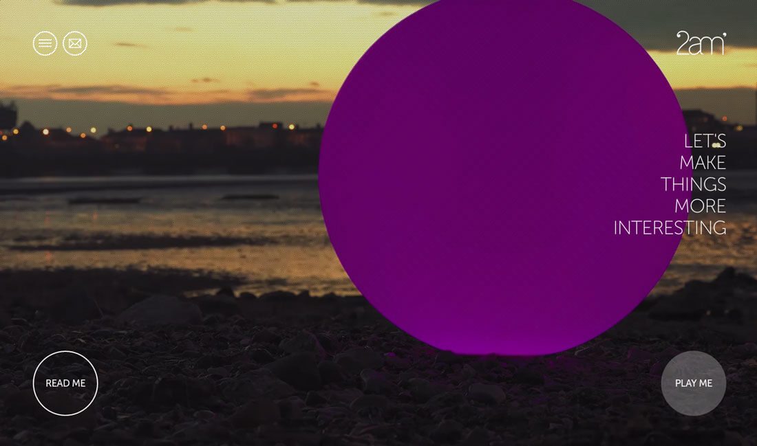
Living imagery or cinemagraphs can work with photographs or illustrations. There’s no rule that says you have to use one type of imagery or another. Looking at the two images above, you can see that either style can be quite effective.
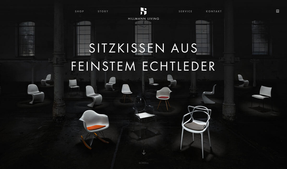
Another consideration is that motion does not have to keep happening in a loop. Hillmann Living, above, casts light on the products on the homepage as it loads. That’s the only motion and then the photo is just that, a still photo. What’s nice about the effect here is that it makes you look directly at the chairs the company is selling right away. The technique shows users what on the page matters and what they are supposed to focus on in a subtle and interesting manner.
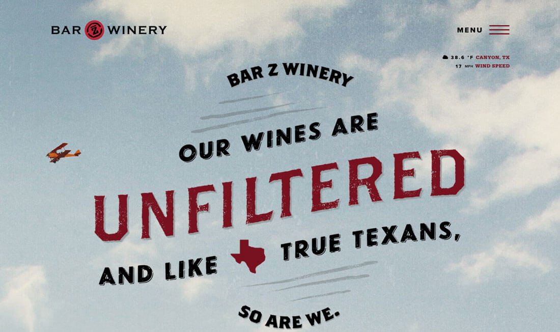
Bar Z Wines takes another approach. The illustrated homepage seems rather plain at first, but a small plane flies through the top center of the screen on a loop. The motion helps direct the user to look at important words on the screen: “Our wines are unfiltered.” The user immediately knows something about the messaging on this website because they are drawn to the most important language thanks to movement on the screen.
Tips for Success
This technique can work in a number of ways and for a variety of design applications. Some of the best examples come from simple scenes or landscapes where a beautiful photograph is the starting point.
The grass might move in the wind or a landscape. A person might blink when showcased in and oversized headshot. A product might tilt or turn or complete the action it is designed for.
The most important thing when thinking about this trend is simplicity. If there’s too much motion, you should probably opt for a video. The element of surprise is what makes it work; users expect a still image, but then it comes to life.
- Stick to one thing, and one use per website.
- It needs to look realistic.
- Movement needs to follow the laws of physics.
- Motion should be subtle but noticeable.
- Don’t overdo it by adding sound or lots of click actions.
- Consider subtle user control, such as motion that happens with mouse movements.
- Develop a moving image that can be used in multiple campaigns, not just your website.
How Do You Do It?
There are plenty of ways to create this effect in your designs. The method really determines on your skill level, how you plan to use the living images and budget.
Some of the options to create subtle motion include:
- Create a gif.
- Use an online tool (there are a number available with varying costs.
- Create the image as video with limited motion.
- Use an app or even your iPhone.
- String together still images in a video format.
Try this YouTube tutorial to help you plan and create a living image.
A Perfect Example
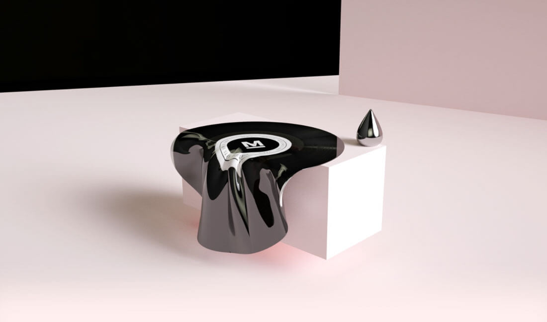
The website for Monochrome Paris is a perfect example of this trend in action. The homepage is a seemingly simple image of a record, but the rigid element almost looks melted and takes on the movement of fabric moving in the wind. The effect is engaging, eye-catching and draws users into the design.
The effect helps create interest in a subtle way. The imagined visual looks a little more real because of the motion. Scroll down the page and other moving elements greet the user, including a normal view of the record spinning.
This website is a great case study in effective ways to use this trend. Head over and click around to help jog your inspiration.
Conclusion
Regardless of what you call it, living imagery is one of those trends that will probably stick around. It’s one more way to add animation to a design without necessarily having to produce an actual video. It’s effective and can be a lot less costly than video production.
The trick to this trend is to make sure it looks intentional and real. Incorporating a silly bit of movement won’t necessarily give you the desired effect. Go back and really look at the examples above, go to the websites and click around. See what that animation leads you to in the design. In each of the examples, movement helps the user get to a specific element or perform a certain action. That intentional and directed use of movement is the key to effective cinemagraph design.