Design Trend: Vivid Rainbow Colors
If nothing else, 2017 has been a year of color in website design. Color trends have dominated the conversation about design, with brighter, bolder hues as a large part of the landscape.
There’s a new color trend that combines a lot of those bright options into bigger color palettes that you might now expect – rainbow color patterns. That’s right, more designers are taking a change with a lot of color and incorporating vivid rainbow, gradient colors into design projects. And it’s pretty cool!
Here’s a look at the trend and some ideas for how to use vivid color that aren’t garish.
Rainbow Animation for Engagement
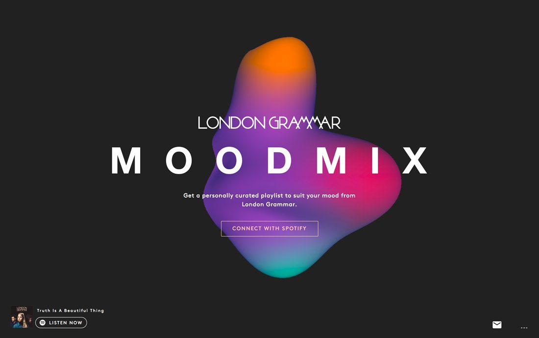
Almost since Spotify came on to the scene, it has been shaping design trends and pushing the boundaries of what cool design looks like. The music site is constantly updating and changing its design and using microsites to highlight specific genres and artists.
The London Grammar Moodmix website design uses a bouncing color blob to grab user attention. The animation is interesting and makes you want to almost reach out and touch it. And that’s the goal of this rainbow-colored animation. Notice that the call to action is right in the middle of all that color.
The result is a simple design with an interesting animation that leads users right to the goal of the design. The animation works with a lot of color because of the movement. The blob would not be near as interesting in a single color.
Color Vs. Dark
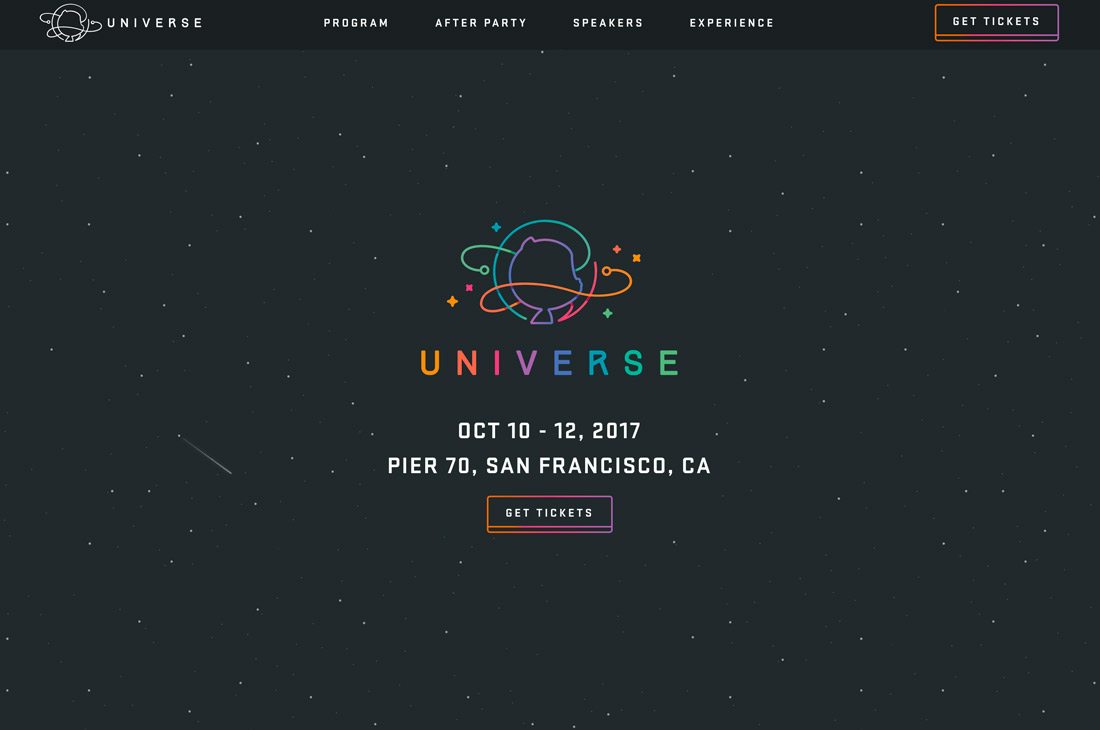
Rainbow colors can be tough to use because of concerns about contrast. Putting bright, rainbow style hues on a dark background can solve most of these issues.
Bright colors will almost jump off a dark background.
Another well-known name in website design and development, Github, is using rainbow colors to promote its conference this year. The simple website uses a fun rainbow style logo and call to action buttons for ticket sales. What’s different about this design from many other rainbow aesthetics is that the design is pretty flat and there’s no use of a gradient for colors. Each line in the logo is a different color as are the letters. A gradient is used only for the CTA button.
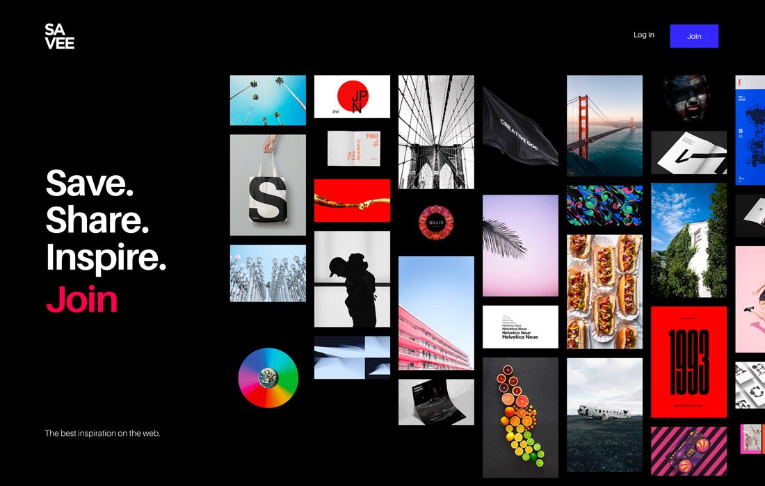
Savee goes in another direction with rainbow color on a dark background, using lots of high-color images to create a mosaic with a rainbow feel. While most uses of rainbow color provide a graduation from red to yellow to green to blue, that’s not always the case. Rainbow color palettes can be anything with wide-ranging hue usage.
Subtle Color
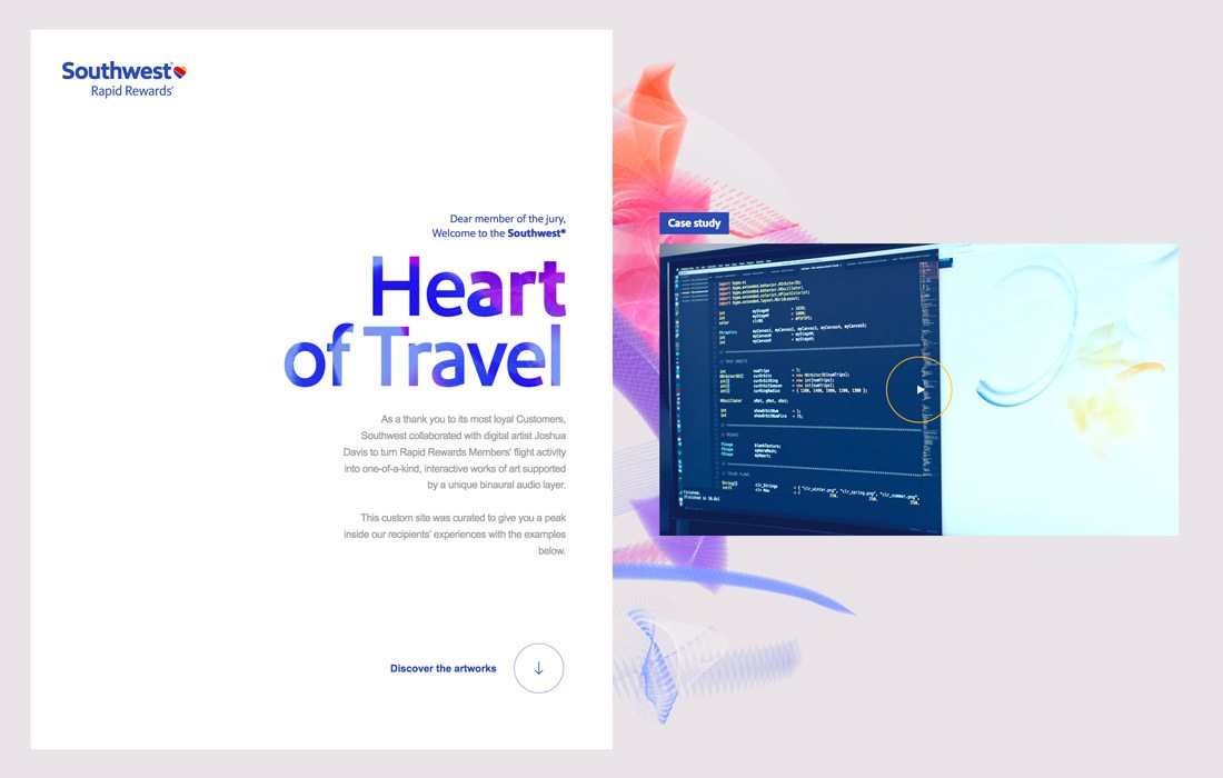
Sometimes the best uses of rainbow styles don’t jump right off the screen. Southwest uses a subtler palette with rainbow tones in the background.
The interesting choice almost bucks many of the other color trends of the year and the result is refreshing. You look at the design almost because it is so different than many of the other website designs out there right now.
Even with a more subdued rainbow color palette, place an emphasis on contrast between background and foreground elements to ensure that each element is easy to see and read. This is the most common problem with rainbow style designs – not enough contrast and challenging readability.
Rainbow Logo
Consider using rainbow colors for a simple logo. This is likely the most difficult use of rainbow color, but can have a striking effect.
It’s challenging because of all the places – and ways – a logo might be used. Opting for rainbow colors might work best for small brands that don’t use the logo in a lot of applications. You’ll definitely want a secondary option as well for when a lot of color just doesn’t work.
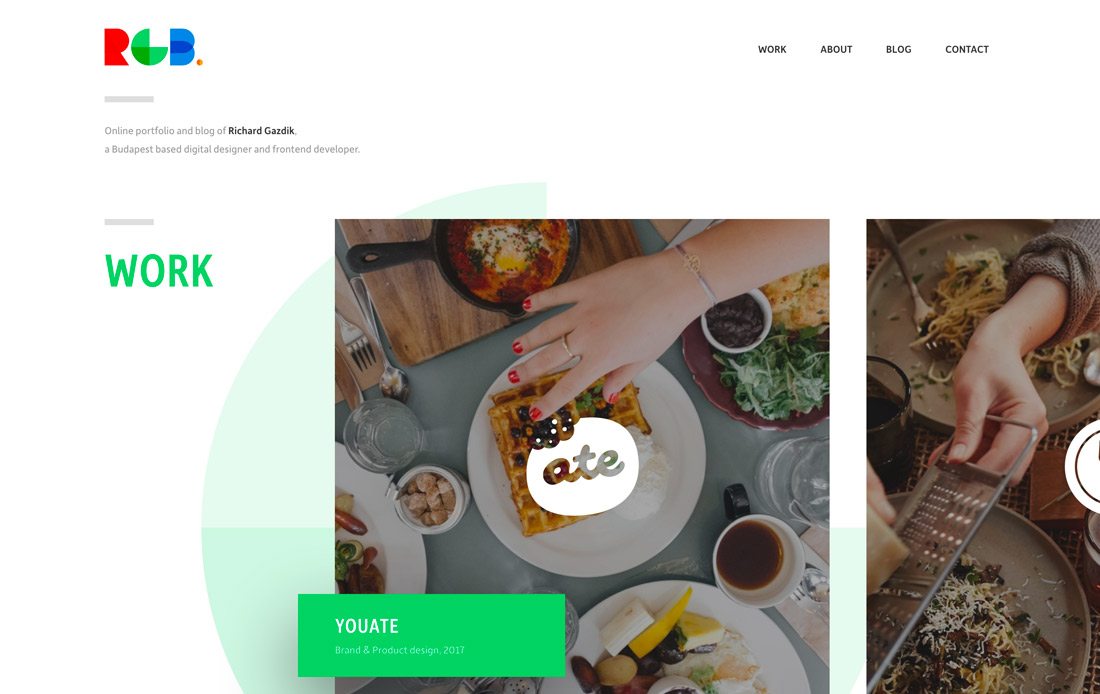
Richard Gazdik uses a rainbow logo for his portfolio – and subsequent navigation. It works almost perfectly thanks to his initials – RGB – and the relationship to the colors selected. Not everyone will get this lucky, but it shows how a high-color logo can be effective in a simple design outline.
Color as a Focal Point
Rainbow color can be the thing that draws users into a design with a strong first impression.
But there’s a thin line between rainbow color that engages and rainbow color that can turn users away. Remember some of the website designs of the late 1990s and early 2000s when almost every website had bright colors splashed everywhere (and blinking)? That kind of rainbow color treatment can be disastrous and turn users away.
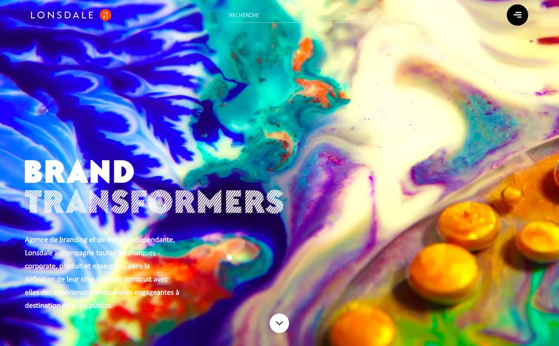
Lonsdale does the opposite with a looping video of rainbow liquid that’s fascinating to watch. The movement and color changes are bold and make you want to watch. The rainbow background is offset by white type and navigational elements to drive users though the rest of the design, which sticks to color in images on a white background.
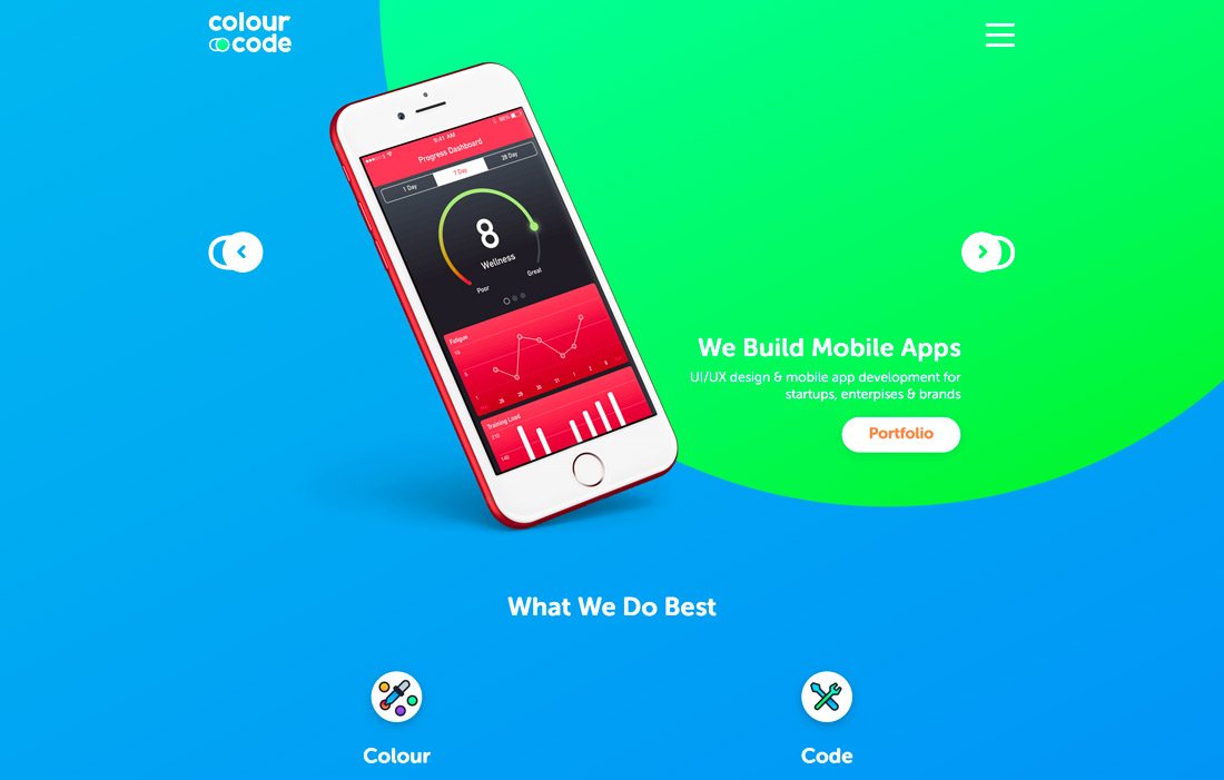
Colour Code takes another approach with lots of bright color throughout the design. Color is used to pull visual focus to the product on the screen – phones and watches showing apps.
Create an Engaging Background
Rainbow blobs could almost be a color trend of their own – liquid animations, ink style, moving color bubbles. As a background element, rainbow color can help set the tone for a project and drive user engagement. (Just think of how much more drawn to color you are than a single beige background.)
While many of these background elements do have some movement in the form of an animation or video, they don’t have to. What’s common among websites with rainbow backgrounds is that they are often contained to the home page or above-the-scroll design and the rest of the website is less busy.
That’s a great technique when it comes to engagement. There’s something right away for users to connect with, leading them to content they can dive into a little deeper.
More Gradient Techniques
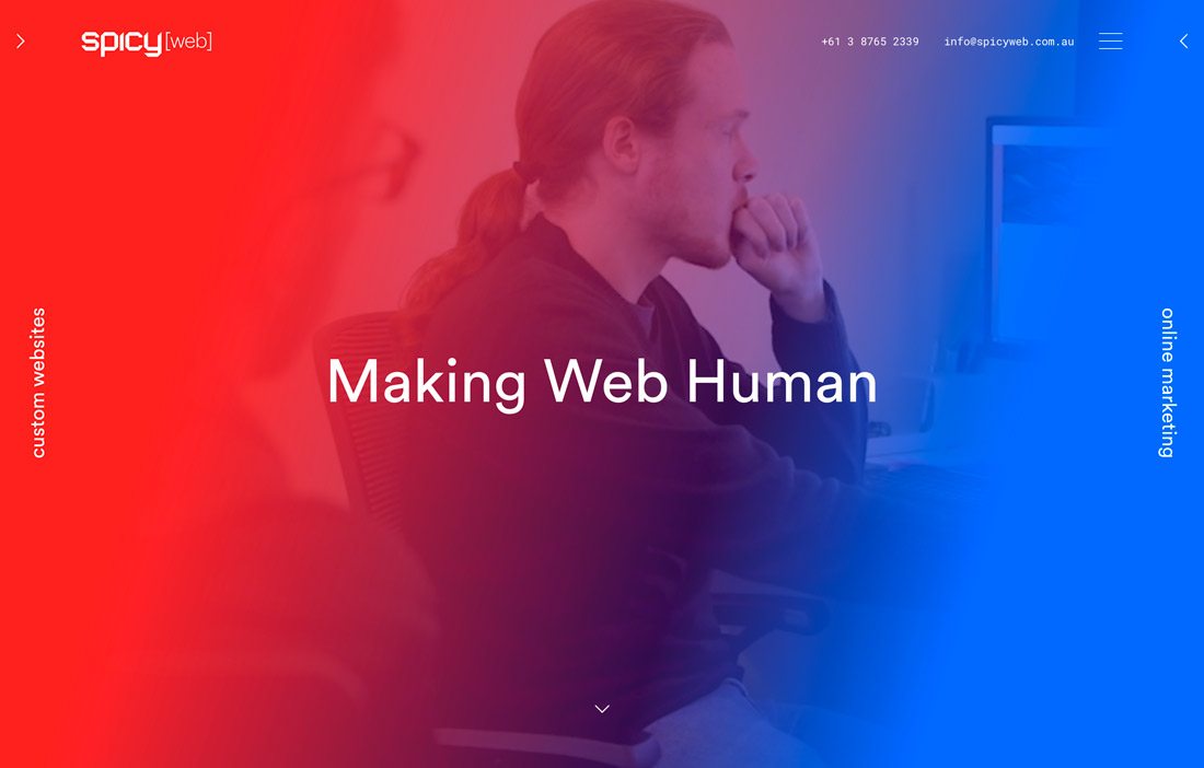
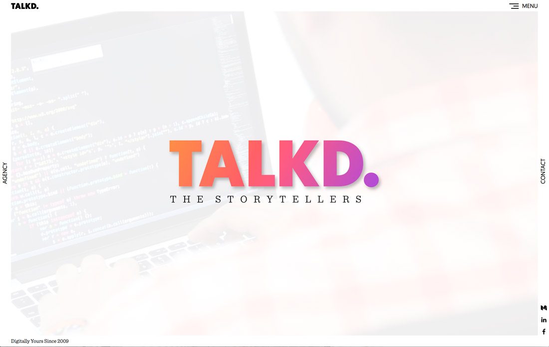
Rainbow colors can be an extension of another color trend from this year – the return of the gradient.
Try a gradient overlay with a rainbow feel to it. Go for a full-scale color change from red to blue, such as SpicyWeb or go for colors that are a little more trendy such as Talkd.
Either way, using a gradient can be a fun way to add color without feeling overwhelming. It works full-screen or in smaller elements. A gradient can also help you incorporate brand colors into a rainbow style color scheme without an all-out website redesign.
Highlight Something Different
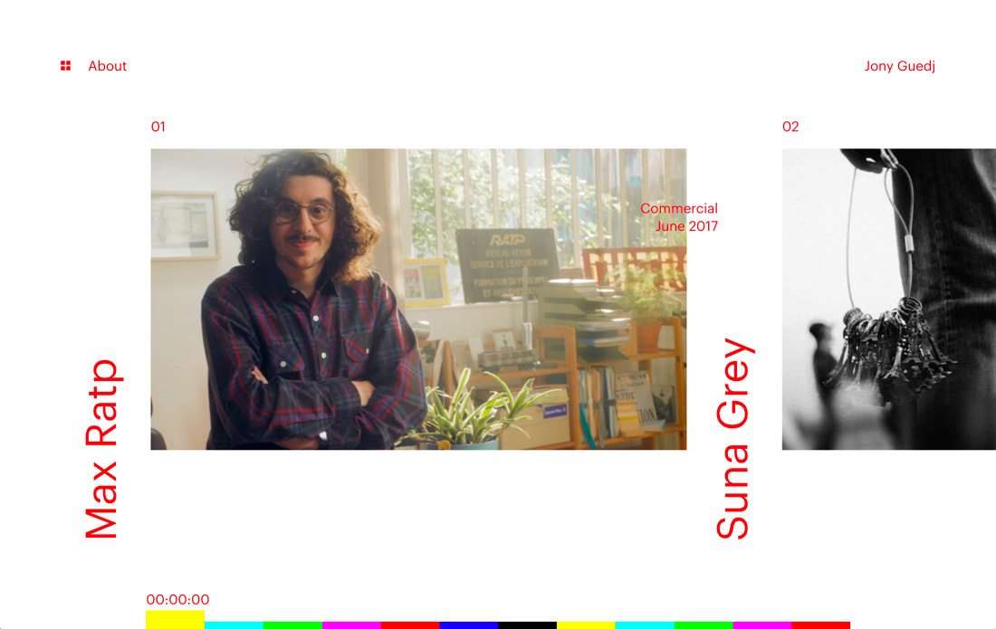
Use the rainbow color trend to highlight something unusual or different in your design. Because rainbow colors are so attention-grabbing, they can help users with an unconventional user pattern, draw the eye to a certain bit of content or part of the screen or help create click and conversions.
Jony Guedj uses color for navigation. The menu elements aren’t composed in the usual way, being at the bottom of the screen and working only with scroll action to display different video clips. While typically this type of design wouldn’t be advised, it works here. The rainbow colors draw users to engage with them and help people understand how to use the website.
Conclusion
The rainbow color trend is a lot of fun.
It can be challenging to use if color intimidates you a bit. But start small with one rainbow color element to see how it works. Most designers aren’t converting entire websites into rainbow designs; they are using rainbow color to create effective visuals that draw users in. That’s likely why the trend has emerged.