Design Trend: Waves and ‘Soft’ Lines
There’s a softer design trend taking over website projects – waves and soft lines. Where backgrounds have been dominated by single “flat” color, we’re seeing a shift toward curved lines and waves.
The elements are lighter, softer and evoke a different overall feel for the design. What’s especially nice is that waves and softer lines can be used a lot of different ways so that each design feels totally different. (It’s one of those trends that can almost sneak up on you because it appears in so many forms.)
Here’s a look at the waves and “soft” lines trend in website design.
Design Accents
When the rectangles and circles just don’t work for the mood of a project, blobs and waves might be the solution. For tiny splotches for specific elements to bigger elements that demand attention the softer lines will make users hop around the design.
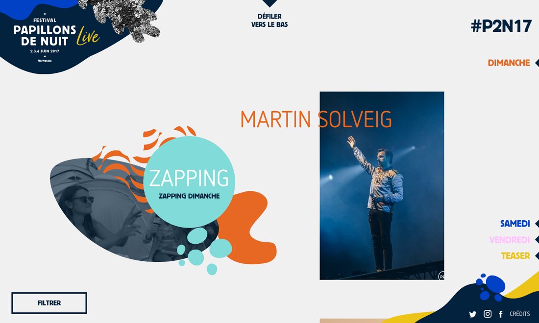
The Papillons de Nuit festival does a great job using waves to highlight elements of the event. Wave-based elements are separated on a light background and each includes something special: the top corner has a touch of animation, the “zapping” element includes multiple waves and the bottom corner draws you to social media links. On the scroll, more waves and soft divots help connect photos and performers at the event.
While this design might be too much for an e-commerce site or financial institution, it is a great solution for an event page. The look is fun, engaging and light (all elements that help drive event traffic.)
Draw the Eye to a CTA
Minimal style design schemes and flat illustrations are still a popular design element. Adding waves can help draw the eye to specific parts of the design, including a call to action.
While you can accomplish this with an arrow or triangular element, the wave provides a subtler directive. Users don’t feel like they are being forced into the clickable element or message.
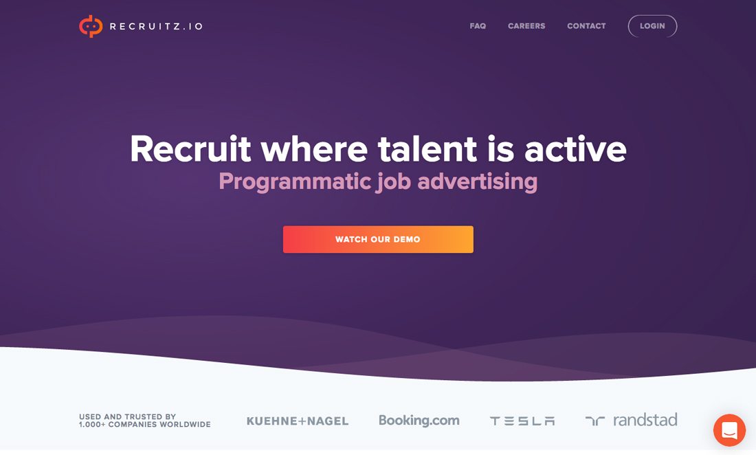
Recruitz uses waves to create separation between the call to action and the testimonial information at the bottom of the screen. The soft divider helps the eye go back and forth between elements with ease and creates depth between elements so the design doesn’t feel plain. (The bright color scheme helps as well.)
Wave Illustrations

While waves can be an impactful stand-alone element for a background, they can also be incorporated into an illustration. This softer feel is somewhat different from many of the hard lines and minimal icons that have been popular as of late, but the result is an easy visual that users can jump right in to.
Waves can also help create softer white space. Retrace Health uses a background with a wave for the sky that moves slowing across the screen. The ebb and flow of the wave increase and decrease the space between the image and the headline, helping push the eye up to it, by making subtle changes to the amount of white space between elements.
Balance Hard Lines
Waves can do more than just stand on their own; waves can also serves as background elements to help balance hard lines or other elements in the visual plan. If the aesthetic is too harsh or needs a little balance to feel just right, consider a wave-style element fix,
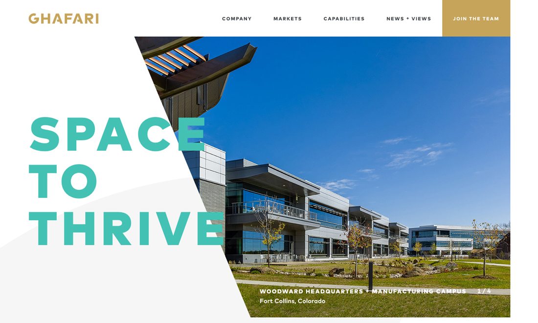
Ghafari’s design includes a subtle wave that you might not even really see on a first glance. The eye is more drawn to the interesting shape of the photo, bright colored text and even the gold button in the top corner. But a gray wave is the piece that pulls it all together. The wave balances the heavier, harsher shapes so that the design doesn’t feel lopsided or off kilter. It’s simple and almost falls completely into the background.
This technique is important to consider. Not all design elements are there to tell users something. Sometimes design elements are more invisible and play a support role to help projects maintain balance and establish just the right feel.
Establish Background Separation
Waves and soft lines seem to be an element that can make Material Based layered-design look a little less formulaic. Rather than strict rectangles and circles for layers or card-based elements, background waves can create the same type of separation.
As with other examples, the result is a little lighter with a less demanding tone.
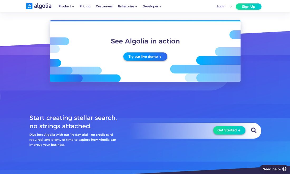
Waves can also work well with another trend – gradients. Algolia does a nice job layering elements in both styles. The design, even though it uses multiple effects, feels simple and is easy to read.
Create Engaging Animations
When you think “wave,” the ocean probably comes to mind. A standard wave-like animation was saved until last to keep this logical association from crowing your mind when it comes to this design trend.
But it is a perfect user of waves. Animated waves can mimic the rhythms and natural flow of the ocean to create a soothing and harmonious visual.
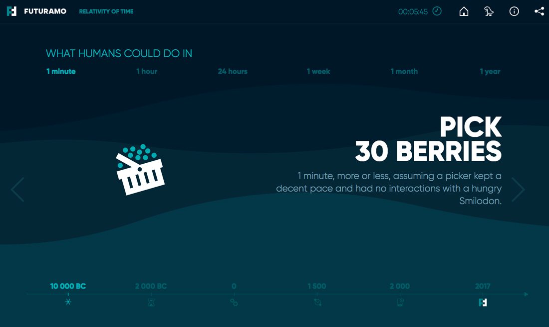
Futuramo does this with the Relativity of Time site. The background waves flow seamlessly into one another. They are simple and move in a natural way. What’s different is that the ways actually have nothing to do with the content on the screen. They simply set the scene for a calming experience as the user moves through the rest of the content.
This example shows how to capture an audience with a simple visual theme that carries through the content. It also connects well because of the aspect of time in the story told through the content and design.
Conclusion
Lines with more curvature create a different flow and mood for projects. The simple addition of a curve to a straight line can shift the feel of an entire project, making it less heavy and more engaging.
Users seem to be drawn to these elements because they almost welcome them into the design. How do you feel about waves and soft lines? Share your thoughts and examples with us on Twitter. (Make sure to tag Design Shack.)