Design Trend: What’s Up With All Those Tiny Corner Logos?
Have you noticed how small logos seem to be increasingly popular on websites? For a while, it seemed the focus in design was to “make it bigger.” That has shifted — in terms of logo size and placement anyway.
The biggest trend in website design right now is the use of the tiny corner logo. We’re going to break down the trend and look at a few great examples. Maybe you’ll find the inspiration to shrink the logo in your next project. Or maybe you’ll decide to keep it big and bold!
Identify the Trend

While there’s no distinct rule that states a logo needs to be in the top left-hand corner of a website, that placement is common for readability and identification purposes. Users are used to looking there for brand information and it provides a good point of navigation reference to help users get back to the home page when they are stuck.
So it’s really no surprise that tiny logos are most often placed in this part of the design. While use of tiny logos is not restricted to this placement, it follows accepted user patterns. That’s important because when you try something different, you want users to understand it without difficulty. In this case, the change is the size of the logo, shrinking it to a “tiny” size might make it less of a dominant visual. By keeping it in the same location, the user can still find it and perform the expected actions without thinking about this change.
This is one of those trends that’s easy to spot. Look for a super-small (often less than 300 pixels square at a standard desktop resolution) logo in a placement that clings to the top and left of the canvas.
Trend Break Down
While the trend is rooted in size and placement of logos, that’s not the only thing that seems to be a common thread. Designers are using similar shapes, iconography, typography and colors as well.
The trend is complemented and is borrowing concepts from plenty of other popular styles, particularly minimalism, bright colors and iconography. That’s part of what makes this trend work; it integrates with other design patterns almost seamlessly.
Squares
The simple square logo is easy to use and provides a nice anchor point for branding. Many of these square logos feature a couple of words (logotype) or small bit of imagery in a colored square.
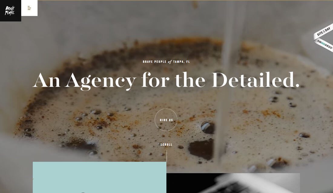
Black is a popular option, as is the case with Brave People (above), but color choices can be dictated by the background of the design and brand colors. There’s nothing to say that a square logo needs to have a stark appearance, but this is rather common option.
Squares are popular because the shape it reusable in a number of places including social media and to convert as an app icon.
Icon Logos
As we design more things for small screens, there is a tendency to simplify and streamline. The same is true with this trend, where a simple icon can serve as the tiny corner logo.
The trick to making this work is that the image has to be “iconic” and simple enough that it is easy to read and understand at the super-small size. Not all icons will work or feel appropriate at smaller sizes.
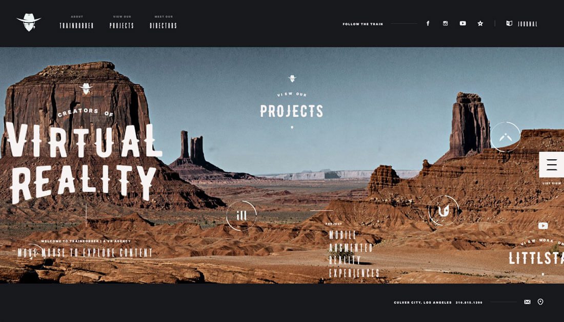
Because this can be rather tricky, most designers opting to go this route are using one-color black of white icons with a few simple lines. While some of these icons depict certain images, such as the Train Robber (above), many others are using geometric shapes. With an icon logo, many of the decisions go back to your brand identity. Do you have an icon that users identify with? Does it work in this context?
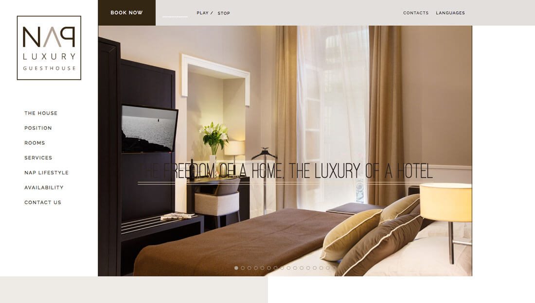
Logotypes
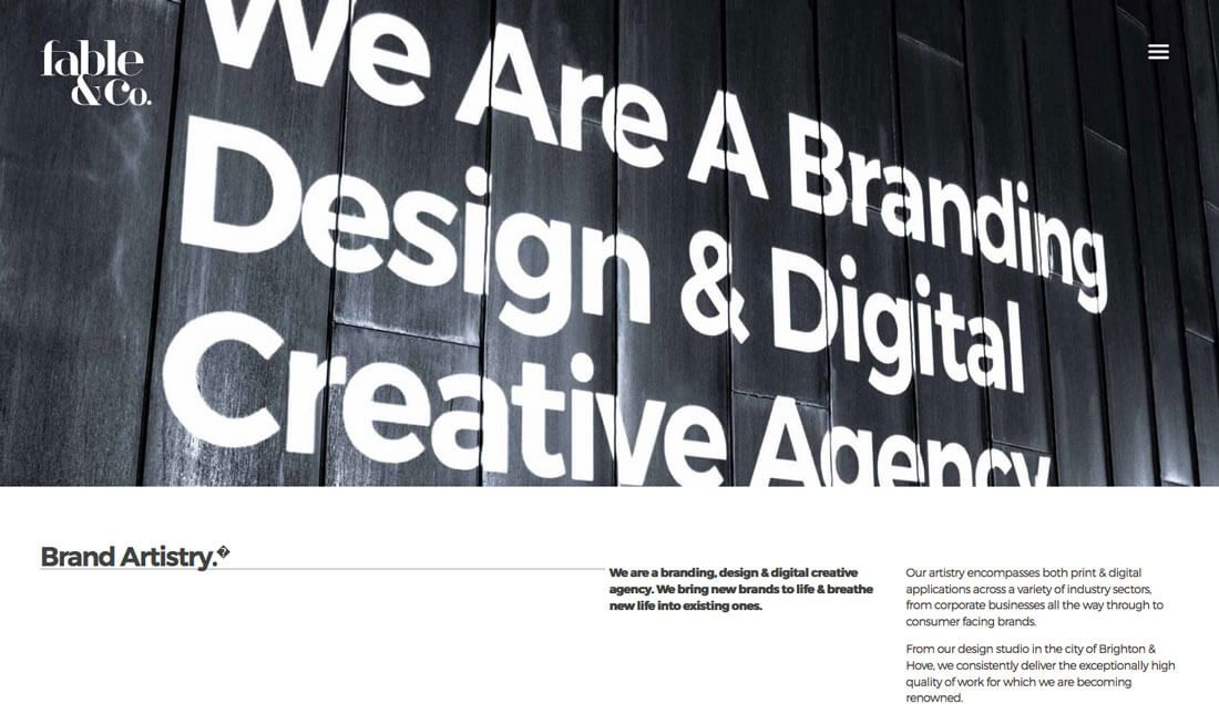
When it comes to tiny logos, logotypes might be one of the best alternatives for most website designs. For brands with a logotype, the solution is already built in. The logotype was probably designed with the idea that it had to work at all sizes in mind.
The real trick to logotypes in the top corner of the design to ensure that they don’t get lost. Logotypes that use super-thin type styles or that include super short words might need more heft than those with longer words or that have thicker typefaces. Placement should be determined by visual weight, not just a pixel guideline.
It’s also important to consider the background where the logotype will live. Make sure the logo remains visible across pages. Try to avoid backgrounds with other type elements or exceptionally busy patterns for maximum readability.
“App” Icon Styles
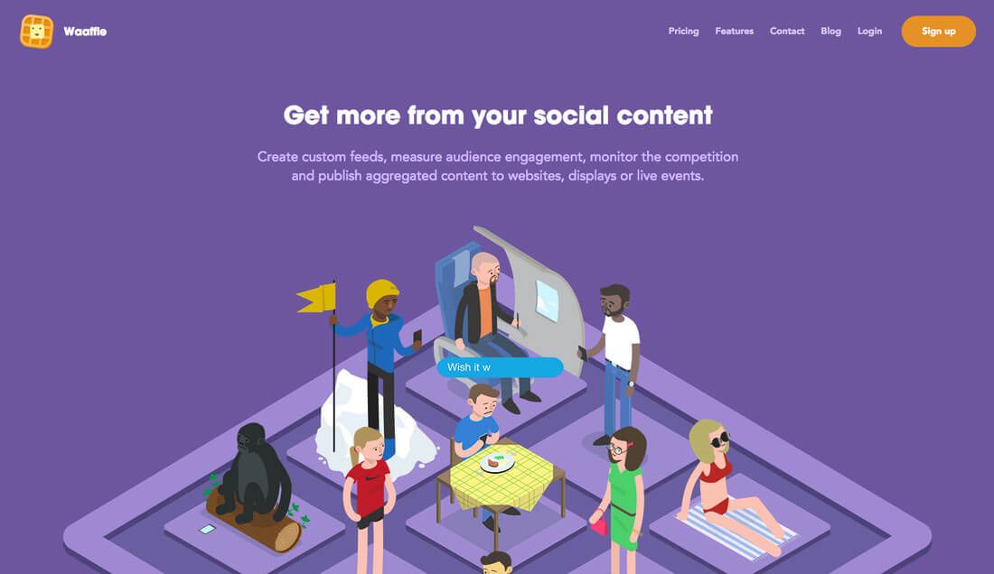
The app icon style works beautifully on websites as well and provides a multi-purpose design element. Placement and design is often similar to the idea behind the square logo, but app-style icons are often set away from the edges of the canvas a bit more, might include more color and are often considered a secondary brand logo.
This style can be a lot of fun to play with but it is important to make sure that your identity isn’t lost if you are using less common branding. Consider incorporating the brand name and primary logo in other places to maintain the visual connection that users expect.
App-based websites often use this style because the app icon is their branding and user recognition. To make the experience just a bit different for users that access the website rather than app, add a hint of movement or hover animation to the logo to surprise and delight.
Shrink It
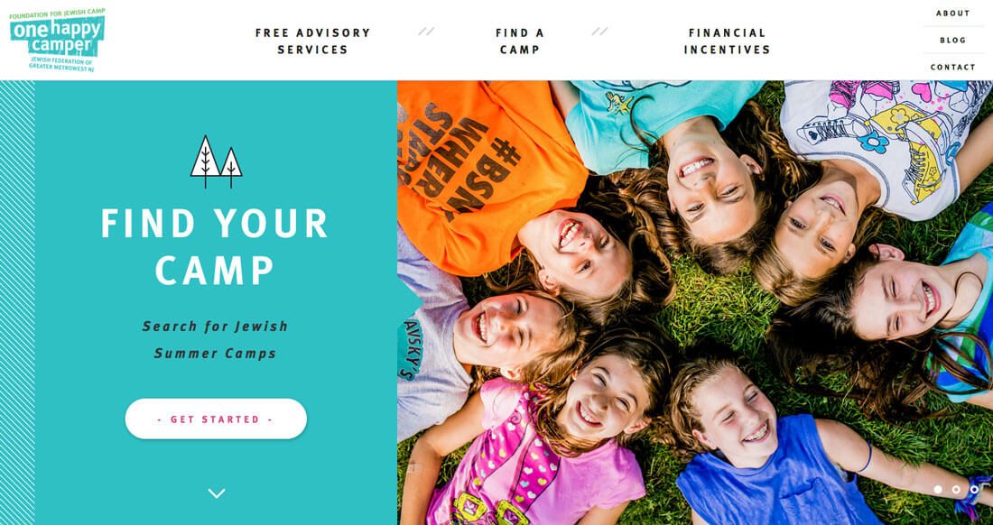
Depending on the logo, it might not take any extra work or redesign to use this trend. Just take the logo, shrink it and pop it in the top corner. Sounds pretty easy, right?
Here’s the trick: Your logo has to already include all the components of readability at a small size. For most brands, this means the logo needs to stand alone in a navigation-type element without a lot of color or other imagery.
One Happy Camper (above) does this rather successfully. The logo is scaled down to “tiny corner size” and contained within a white navigation bar. The primary logo color carries through the main content area of the website, effectively drawing the eye from the logo to the message and back.
Colors
Tiny corner logos tend to feature a lot of black and white. But that does not have to be the case. It’s all based on placement.
Bright, bold colors are still big thanks to influences from flat and material design. These color choices can work in the tiny space as well. The trick to color is to streamline other elements so there is plenty of contrast. Tiny elements can get lost easily if there is too much going on in a competing space.
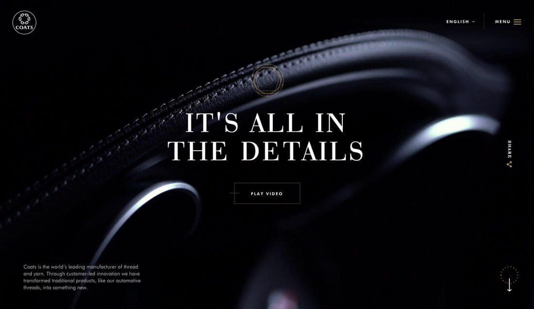
On the other hand, the stark nature of a black and white or black or white logotype can provide the right contrast to set it apart from a busy background. For designs where the logo appears on top of a hero image or video, this is often the best option in terms of readability.
Logo-Navigation Balance
Tiny logos can present unique challenges when planning navigation. Does the navigation have to be tiny as well? How can you create balance without overwhelming the elements or looking off-balance?
There are a couple of solutions.
- Create a balancing navigation element, such as a tiny square logo and complementary hamburger navigation icon with a hidden menu.
- Create a container for the logo and navigation so that they work together.
Both options can work equally well. As long as users can access the information with ease, the design will work. Think about your users and their habits before making that choice.
Conclusion
Tiny is the new big thing. A wise designer once said that if you can make something work at a small size, it will work anywhere. Maybe that’s the challenge for designers – create something that works beautifully on a micro-level.
What’s particularly nice about tiny corner logos as a trend is that it is usable. You don’t have to undergo a redesign to use this concept and can add a trendy feature with just a small design tweak.