Designing a Church Homepage Without the Clutter
Church home pages tend to suffer from many of the same problems that we recently saw with band websites. There’s so much content that gets thrown onto these pages and it all competes for attention to such a degree that most or all of it loses any intended visual significance.
Today we’ll learn how to battle that by designing a dramatically simple and attractive church homepage that still has plenty of room for various messages, announcements and more.
Sneak Peek
If you’re the kind of person that likes to know where you’re headed, check out the finished product below. Note that we’re simply doing Photoshop work today so the result will not be a live site but a layered PSD.
Click Here to Download the Free PSD
Or Click Here to See a Preview

The Project
Recently, a friend of mine was given the task of drawing up a redesign for the church website shown below and asked me for my input. Being the over-acheiver that I am, this is my response.
Admittedly, this site already does a lot better at organizing disparate information than most in its genre. However, the overall graphical scheme doesn’t really resonate with me. Everything seems quite scaled back and there’s no big impact of any kind.

To see some other examples of typical church sites, I ran a Google search to find some churches in my area. Right off the bat, what I found reaffirmed my suspicion that web design is a major area of struggle for many churches.


Changing the Paradigm
From the examples above I decided to toss out the idea of drawing inspiration from other church websites. I know I’ve seen some really stellar church site designs out there, but the pages above really made me want to pull together something that reflects current trends in professional web design rather than following some over-used and/or outdated schema in designing for religious organizations.
So let’s forget everything that we’ve seen up to this point shall we? That includes the original site (which looks much better after viewing the competition!) that we are tasked with redesigning. We know that we need something attractive and clean, but also something that is capable of holding tons of information in an organized way.
The First Step: Color
Most of the time, the first step I take in the design process is to find some colors that I want to build on. Many designers assert that layout should always come first but ultimately, this is completely up to you. The colors that I choose for a site affect the entire theme, which can even dictate how I choose to lay everything out so this is really a pivotal step in my process.
To consciously avoid the type of busy design we’ve already seen, I didn’t want to get carried away with color here but rather go for a fairly simple palette. I wound up choosing the colors below, the first of which is really my only pop of interesting color. Reds and oranges have become quite popular in web design lately and are often most effective when used sparingly on an otherwise subdued page. I’ll utilize the brightness of this shade to call attention to key areas on the page.

The Background
Create a new RGB document in Photoshop (mine is 1265px by 1680px) and fill the background with #eaeaea. Now fill the background layer with a very subtle pattern set to Multiply so that background color shows through. The pattern I used below is actually one of Photoshop’s defaults, if you don’t see it in your Effects menu, try loading in a few more pattern sets until you spot it.
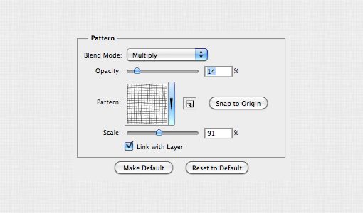
This simply serves to give the background a tiny bit more visual interest than a solid fill. If we were to convert this to a live site we would simply grab a small square of the pattern and set it to repeat in our CSS.
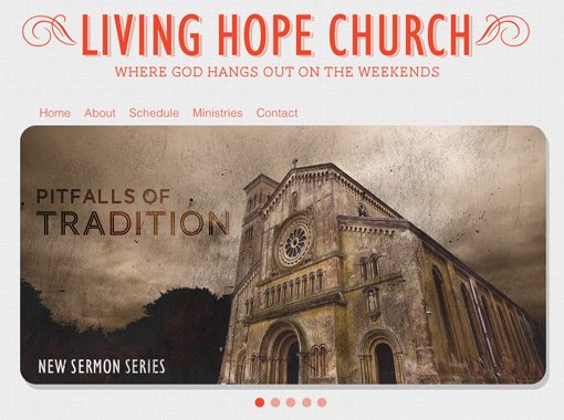
The Headline
Next up is the headline, which simply identifies the church and throws out a tagline to let you know what they’re all about. To start this process, I chose a nice, sans-serif condensed font: Humanist 521 BT Condensed. If you don’t have this particular font, any other sans-serif condensed font will work just fine.
Next I typed out the name of the church and made three different versions of it in three different colors as shown below. Note that the middle layer should really be the same color as the background but I made it white here just so you can see it. Also, the bottom color is simply the top color with a reduced opacity (36%).
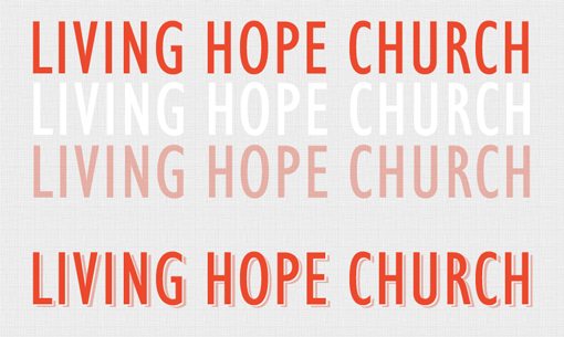
As you can see, I then stacked these layers to create the resulting composition on the bottom. You can stop here but because I’m a little OCD at times, I used the middle layer simply to mask out the bottom layer, that way the background texture would show through on the middle slice.
Next I added some visual flair in the form of little swirls on either side of the headline. I also added a placeholder tagline with a thin slab serif font that I thought complemented the headline nicely. This font is called AW Conqueror Slab and is a free download at Font Squirrel.

Image Slider & Navigation
Many designers are also developers, meaning they can code their own designs into functioning websites. Others simply do the Photoshop work and let someone else take the design live. Regardless of which category you fall into, it’s incredibly important to know what type of tools developers have at their disposal.
For instance, just because you don’t know a thing about writing JavaScript doesn’t mean you shouldn’t be reading about and noticing interesting jQuery effects. This allows you to think about dynamic function even as you lay out a static page. You can then communicate the idea of the functionality to whoever codes the site.
Almost any time I’m struggling with the problem of clutter in web design, I look to jQuery as the answer. A basic jQuery slider is simply one of the best ways possible to place tons of information in a small space and you’ll see me incorporate them into projects time and time again here on Design Shack.
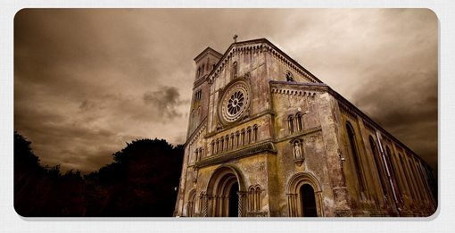
So naturally, that’s exactly what we’ll do here to handle our clutter problem. Our church homepage needs some big, eye-catching imagery in addition to communicating various disconnected messages that will change on a weekly basis. Both of these goals are met in an image slider. To start, I threw in a placeholder image and gave it a shadow with the feathering set to 0 so it’s nice and hard.
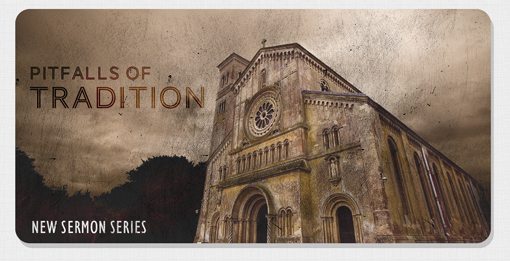
At this point I didn’t quite like the way the image was blending into our established theme. Also, the site wouldn’t just have a photo here but rather a message about something pertinent to churchgoers, like what the next sermon would be about. I took this idea and ran with it to come up with the image below.
After this, the rest is mostly just typical filler to make sure all the necessary functional elements are in place. I added some dots to indicate how the slider would work and threw in a super basic, text-based navigation menu using Helvetica.
Even More Information
The problem with the format of the slider above is that some information is hidden. Sure, the user can access each page by clicking on the little dots but if they’re looking for something specific, how are they supposed to know that it will pop up in the slider? Ultimately, this limitation makes this format best for general announcements that users will benefit from seeing, but won’t really come searching for unless they’re already familiar with the content the church typically places in that location.
We’ve still got a lot more information that we need to cram into the homepage and don’t simply want to repeat the slider above, both because of redundancy and the limitations just mentioned. So what’s the answer?
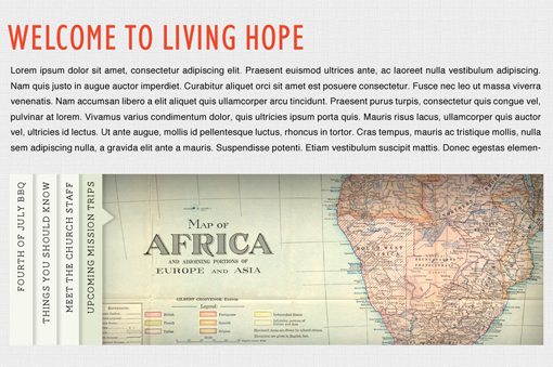
Again I submit that you really need to familiarize yourself with common developer tools and solutions, even if you’re not a developer. To solve the problems we’re facing here I decided this would be a perfect place to implement a SlideDeck, a commercial jQuery plugin that not only looks gorgeous and holds plenty of information, but also allows users to instantly get a peek at everything contained inside. Visit SlideDeck.com for more information and to test out the SlideDeck shown below.

With this awesome product in mind, I created a Welcome message and another content area with a placeholder for a SlideDeck. Again, users will be able to spot the information contained in the slider and instantly click to the banner that they want to see. This combined with our first slider creates an impressive capacity for information on a single page. Each device can be expanded to include as much information as the church needs to showcase on their homepage and every image can act as a link to a dedicated page that holds more content about the topic.
The Footer
Now that we’ve got our content all squared away, all that’s left is to slap a footer on this baby and we’re ready to go. Remember that the footer shouldn’t be rushed through as an afterthought. It’s important to consider what content needs to go here and how it should both reflect and stand out from the rest of the site.
I figured a church would want to make their contact information and physical address prominent and easy to find, so I chose to use the footer for this. I also decided to grab our primary color (#ec492d) and use it as the background for the footer, so it’s sort of the inverse of the header. This utilizes some nice repetition and will make sure the footer is a visually distinct element.

Finished Design
Our homepage is now finished! Here are the pieces all put together. Notice how far we’ve deviated from not only the original design, but from all of the church designs we saw above. Inspiration is great, but sometimes you have to stop looking to others for answers and simply blaze your own path with the goals in mind that you’re looking to achieve.
Click on the image below to see a larger version.

Conclusion
To sum up, remember that you’re not doing your users any favors by cramming everything you can think of into your homepage. Clutter makes specific information harder to find and reduces your usability dramatically while at the same time killing your aesthetic.
As designers, we often over-think problems and look to complexity for the answer. More often than not, a much better answer lies in simplification.
Leave a comment below and let us know what you think of the finished design in relation to where we started. Also be sure to share any links you have to church sites that you think break the mold and really push the limit in both aesthetics and functionality.
Photo Credits:
http://www.flickr.com/photos/normanbleventhalmapcenter/2674833839/
http://www.flickr.com/photos/2create/2152949049/