Designing News: How Top News Sites Handle Tons of Content
If I had my way, along with just about every other web designer, web pages would always contain a fairly limited amount of content in order to keep the focus clear and the line of communication easy to follow.
Unfortunately, real world situations call for web pages with immense amounts of content. To learn to tackle the issues that arise in this arena, we’re going to look at a particular section of websites that are perhaps more overcrowded than any other: news websites. How do the designers at CNN, MSNBC, Fox and others handle the layout of so much information? Find out after the jump.
Header and Navigation
The header is an absolutely crucial aspect to a news site. Every user knows upon visiting a news site that there will be tons of content to sift through and if they want something specific, they’ll go straight to the header to find it.
Here we get our first glimpse of the problem that will plague us for the rest of the article: too much stuff! As I mentioned in the intro, news sites absolutely need to convey lots of information, that’s why they exist. Organizing all of this information is no small feat and just about every decision you make can drastically affect the usability of the site.
Let’s take a look at our first example. The image below shows the header and navigation for MSNBC.com.
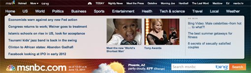
As you can see, there is a lot going on in the first few inches of this site. The very top of the page contains around fifteen links, and these are just for other sites, the internal navigation sits below that and contains another twelve.
MSNBC is using their own interesting spin on a dropdown menu for each section of the site shown in the navigation. Here you see five to six text headlines, some images and still more content leading to another site. After several layers of navigation, we finally make it to the logo of the site near the bottom of the header, alongside weather and search widgets.
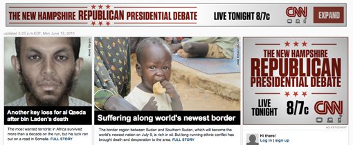
I think the MSNBC header is a bit of a mess, the branding is lost and the load of secondary content is distracting. Contrast this with the header for one of the best looking news sites that I found, CNN.

Here we have strong, clear branding, a search bar right where you would look for it and a simple navigation menu without a single dropdown. This menu is a good balance of minimal design and enough functionality to get you where you want to go without any trouble.
Fox takes a route similar to CNN. It’s a bit more cluttered and spans several sites like MSNBC’s, but the tabs help make the metaphor understandable.

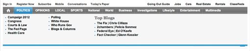
The Washington Post started with a similar idea to MSNBC but pulled it off a lot better. As you can see, the name of the site is nice and big and is followed by a weather widget.

Hovering over the navigation gives you a large dropdown menu, but instead of awkwardly pushing content down as on MSNBC, it’s been structured to cover up the large “Washington Post” area.
The Lesson
I think the lesson here is to not overwhelm your users right off the bat with a cluttered header. This doesn’t mean you can’t have a lot of content, just be wary of mega-dropdowns that don’t really fulfill their promise of making your site easier to navigate. CNN proves that sometimes a plain old horizontal list of links and some nicely structured whitespace can work great even in a mass-content environment.
Featured Stories
The next thing that I want to discuss is how these sites grab your attention and direct it towards what’s important. Every news site has one or two top stories that they know are hot items of the day and have to structure the page to appropriately highlight these stories.
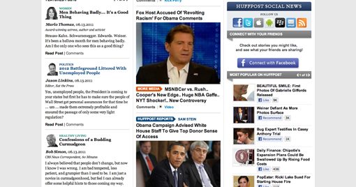
My favorite example of this is The Huffington Post, which opts to highlight a single news story using a huge image and a bold headline, both of which span the entire width of the page container.
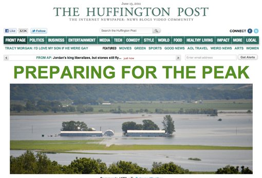
Just take a gander out how clean and beautiful that is compared to other news sites you’ve seen. It’s far from popular for news sites to use this format but you can’t help but admit that it seems to work quite well here.
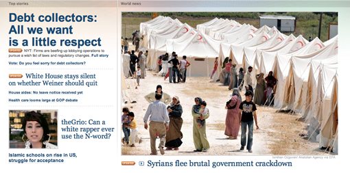
MSNBC takes a similar route but isn’t quite so drastic as to only feature a single story near the top of the page. They have one big image flanked on the left with various headlines. I really like the basic layout, though I do think the random tiny headlines thrown in between major stories clutter it up significantly.
CNN and Fox choose a slightly more cluttered approach, mainly because they weren’t willing to give up valuable ad space to important news stories. CNN has a three column layout with the center being the widest and the last of which is the ad space followed by a login sidebar.
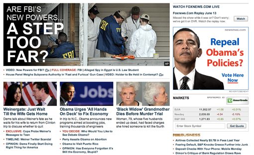
Fox features one large image with three columns underneath, all next to a wide column on the far right for ad space, stock tickers and social information.
The Lesson
With Fox’s page, I get a lot of information, which is great, but my eyes don’t quite know where to land and tend to bounce around a lot before I ever actually read anything. CNN currently grabs my attention with a few faces, which are always good for guiding users where you want them to go.
However, I find that really big images, like those found on Huffington and MSNBC, are really the tool to get me to notice something important. This is reinforced in a major way with Huffington’s huge, bold headline text.
Which method is best for all users is a tricky call. One need only stop by the massively popular Craigslist to see that big images aren’t always needed to make a site appeal to visitors. Sometimes a lot of content organized neatly into a small space is a great thing, especially if you want a quick overview of everything important.
The world isn’t a place where one single event is usually more important than every other, so it’s understandable that sites like Fox feel the need to break this section down quite a bit. My best advice is to give as much importance as possible to the few things that are truly important. If you can swing one large, featured story, go for it. If not, try to keep the number low, otherwise it’s not really a “featured” section is it?
The Story Grid
As we progress past the header and featured content, news sites grow more and more dissimilar, making it difficult to compare them on a point-by-point basis. However, it’s at this point that the real challenge begins. This is where the designers are given a mountain of other content and told to organize it.
Each site is broken up into various unique modules and sections arranged in different grids, but you’ll find that it’s a pretty popular trend to, at some point in the page, break into a three column setup to cover the various articles. Here are examples from The Huffington Post, The Washington Post and The Economist that do exactly that.
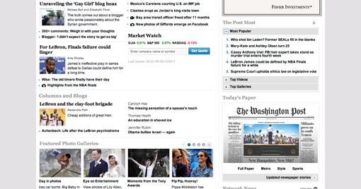

Having three columns splits your content up nicely, either evenly or using a varied width approach like The Economist for more control over emphasis. One major problem with the three column approach is that we’ve taught our brains to ignore that third column! We all know that this is where the ads sit along with all that other crap we don’t want to see so we largely keep our browsing confined to the first two columns.
This can be bad for sites that actually do sprinkle some important column over there as it’s likely to get lost in the mix. Just be mindful of this tendency from users and make sure your third column doesn’t still look like a mess of ads once you get into solid content.
A Refreshing Change
CNN has one of the better approaches to content organization that I’ve seen on a news site. They use a four column grid of equal-height-cards topped with a category headline. The result really feels void of the messy clutter typical of these sections.
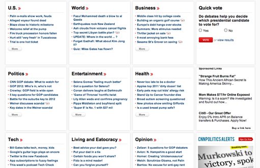
Interestingly enough, when we pull out nearly all of the images and normalize the content, the result is something much more usable. On a typical news site there’s simply too much competing for my attention. Every story feels like it’s trying to scream louder than the one next to it and the result tends to be fairly overwhelming. By contrast, CNN’s story grid is easy and enjoyable to browse.
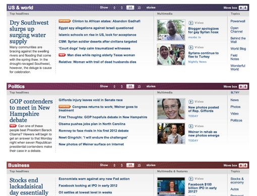
MSNBC also takes a different approach. They organize their stories into categories and place them in clearly defined horizontal boxes. They put a lot of control into your hands here by letting you choose how many stories to show and even giving you controls for rearranging the boxes.
The Lesson
The thing that I noticed here is that I enjoyed using the sites that organized their content into clearly differentiated sections and categories. The three column format, though tried and true, makes for work-intensive browsing that feels more like sifting through clutter.
CNN and MSNBC took steps to create clear visual separation between stories and various types of content and had layouts that looked less haphazard. One of the reasons the three column format looks messy is the varying heights of each module, which sets the content off horizontally and makes for a lot of up and down eye movements. The equal height format helps immensely.
Why Does This Matter to Me?
Most of the people reading this aren’t top designers for The Washington Post, so why are these observations valuable to this audience? The answer is that, while we don’t all work on news sites, we’ve all given our clients the “too much content” speech.
We simply hate it when our clients give us a ton of stuff and demand that we put it all on a single page. Try as we might to argue against it, several situations do in fact call for this approach. Cramming a bunch of content onto a single page while trying to make it both usable and attractive is one of the most difficult situations you’ll face as a designer, if you can beat it, you can design your way out of anything.
The lessons we learned here today can be applied to any website you create where you’re struggling with wrangling in too much content. When in doubt, the answer is usually to simplify. Trim down that big ugly header, try finding one or two really important points and maximizing them and then separate the rest of the content into visually separate sections that are easy to browse and don’t require too much darting around to read.
Conclusion
Now that you’ve seen my analysis, what do you think? Which news sites do you think are the most attractive? Which are the most usable? Can the two goals be synergistic?
Leave a comment below and let us know your thoughts about the information and examples above.