Detox Your Design: 8 UI Elements to Eliminate
Is your design starting to look old? Old and out-of-date user interface elements can make a site feel much more dated than it actually is.
Here, we look at eight UI elements that you should eliminate from your design plan. But that’s not all; each “don’t” comes with a suggestion for modernizing your website. We’ll get that design looking up-to-date in no time!
1. “Flat” Buttons
One of the biggest problems with flat design in general is that everything was, well … flat. For some users this made elements difficult to distinguish and made interactions difficult. “Almost flat” and “Flat 2.0” emerged as a solution to this problem, helping users better find and interact with UI elements.
Try this instead: Add a hint of animation or a hover effect to give a flat-style button a little more emphasis. If you like the look of flat, consider an almost flat alternative or oversized button options that are easier for users to find and interact with.
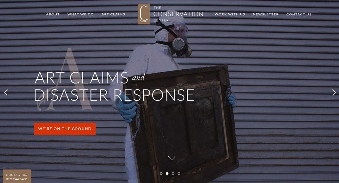
2. Text Carousels
Carousels and sliders can easily become the subject of great debates among designers. Whether they are usable and work well often depend heavily on the content within.
Text carousels or sliders that display long strings of information are not very practical. Sliders that don’t actually slide on their own and require a click aren’t particularly useful either. And none of these options encourage users to click.
Try this instead: If you want to display multiple items, use this technique as a display for a handful of visuals but don’t as a call to action and don’t use it for blocks of text that users are supposed to read in sequence. Place action elements elsewhere on the screen with a direct and easy to understand action.
3. Links for Small Events
Having to click (or tap) within websites to see additional information is a thing of the past. Users want to be able to see information at a glance without losing their initial browser locations. (This is true of websites and apps.)
If you can display information in a way that does not cause users to navigate away from the original source for these divots, you should do it that way.
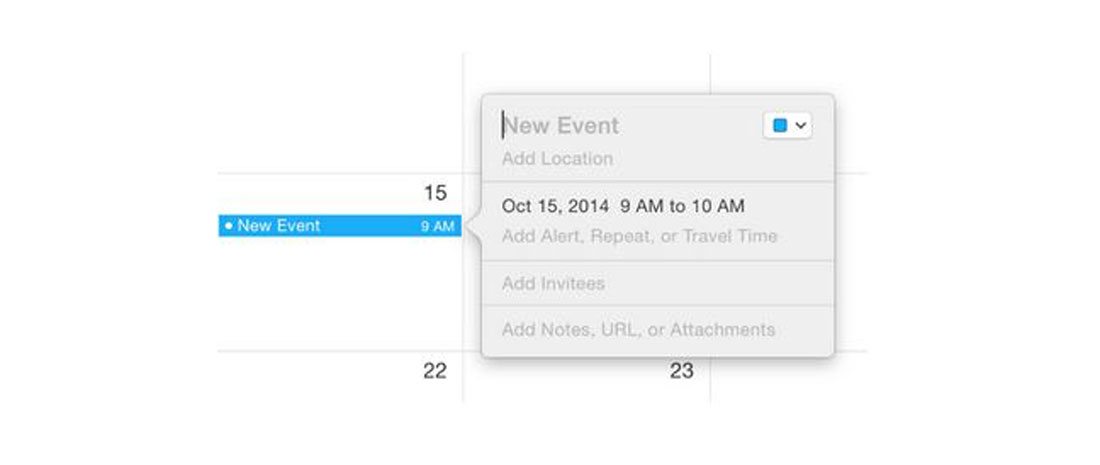
Try this instead: A popover is a small UI element that relates to a specific bit of content. When the user activates the action an almost-notification style element emerges (and then disappears as well). Popovers are one of the touted functions in Apple OS X and for good reason; the provide function without navigation.
4. Flash-Based Anything
There’s only one thing to say about Flash: If you are still using it for anything on your website, please stop.
Try this instead: HTML5 is not new anymore and provides all the functionality you need to play audio, video and other bits of multimedia. (Plus it works across all devices.)
5. Icons with Long Shadows
This outtake of the flat design trend was fairly short-lived. While you can still find a few long shadow icons or buttons out there, the style already has a dated feel.
Try this instead: Try creating a button using a flat style with some hints of shadows or texture. These subtle effects make it easy to “see” than an element is designed to be interacted with, while keeping with a simple aesthetic that does not detract from other visuals.
6. Mega Menus
While a mega menu can help users navigate a website with a lot of content, they are not practical on smaller devices. The problem with these oversized menus is that there is often so much content the user does no know what to do next, gets overwhelmed and abandons the site.
The other problem with huge menus is that many are designed to open on hover and then cover up much of the screen. This can cause confusion for users and further distract users from why they came to your site or moved to the menu in the first place.

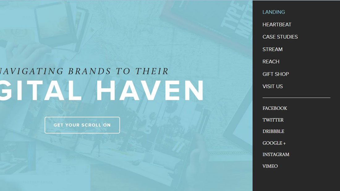
Try this instead: Use strong in-site linking to lead users through bits of related content. Make it easy for users to find and see patterns in the design to move from one element or bit of content to the next.
Using site analytics, you can find user flow and patterns from page to page to help create strong page relationships. If you feel the need to go big with navigation, consider a full-screen slide out menu that is clicked intentionally and can be hidden just as easily.
7. Too Many Social Media Icons
At this point users know how to share content on social media – even if there are not dozens of icons strong across the page. All those icons are likely distracting from your content.
Even worse is a strong of social media icons with all the different colors and shapes of various channels. These icons are killing your design. There are better options.
Try this instead: Add custom social media share buttons to your header or footer and keep them off individual content. Design them with subtlety so that they do not distract users from the design and actual reason for visiting your website.
Or be a little bolder and consider ditching them altogether. Dig into your analytics; how many people are actually using the share buttons?
8. “Fake” Animation
Do buttons, elements and other calls-to-action spin, jump or change color to get users to look at them? Those techniques will date your site instantly.
The design should draw in users; attention because of a ridiculous amount of motion, should not.
Try this instead: Design elements with intent. Give users somewhere to focus in the design. Each screen should include no more than one actionable item (aside from social media share options). So make it clear what users should do and design an element that can help them accomplish that goal.
Card-style elements are a good option here. Because the containers are larger than a standard button, they provide plenty of clickable space and information. This can make it easy for users to find and click to the appropriate action. (And cards are responsive-friendly as well.)
Conclusion
Are you making any of these UI mistakes on your website? Simple fixes can help you refresh and modernize the design while making it easier to use.
Make sure to look at the examples (and click through the links to see how they work in action) for a look at ways you can use different types of user interface elements well. And make sure to share some of your work with us in the Design Shack gallery.