DIY and Web Design: What We Can Learn From Home Renovation
If you’re anything like me, you see design everywhere. It’s not just on websites, posters, or business cards. All the same concepts you use for work also get used in other aspects of your life.
So, what about the other way around? Have you ever thought about how projects around the house inspire you to become a better designer? What tricks and techniques carry over from do-it-yourself projects to design work? Let’s dive in and take a peek at a few things you can be on the look-out for!
Get Your Tools in Order
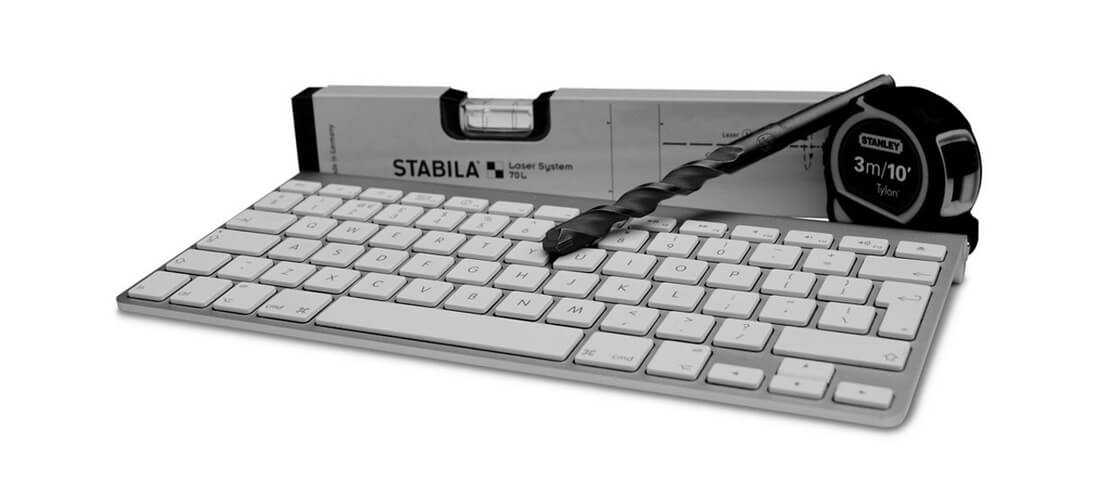
Before you start any project, you need a solid grasp on what you need to get the task done. (You aren’t going to paint a bedroom without a paintbrush are you?) Make a list of things you need and create a plan of action. Gather them up and then get started.
As with a home project, it helps to put everything in one place so you have all the tools at hand. When it comes to web design, this includes gathering all the pieces that you’ll need – logos, images, color and type palettes, and project scope guidelines.
Use a digital and paper filing system can help keep projects organized. Use the same folder name in both locations and store all your digital files in one folder and keep printed materials in the other. (This can include everything from samples given to you by the client to invoices to notes about the project.) Easy access folders keep everything simple to manage and make it even more convenient when you have to retrieve information at a later time. (Just like saving leftover paint and writing the name of the room it is used for on the can.)
Create Bigger Spaces
If you watch any of the DIY home improvement shows on television, there’s a recurring theme: Everyone wants to make a small space feel larger.
Think about these tips from HGTV and how you can use them for website design:
- Same color, different shade: Mix up similar hues in the color palette to add visual interest without moving focus to other places.
- Consistently neutral: One easy on the eye color can help guide users through the navigational pattern and allow them to focus on elements that matter.
- Oversized: Using a lot of tiny elements will only feel crowded. Pick one thing and go big with it for impact.
- Concealed storage: Hamburger or pop-out menus, anyone?
- TV as art: Switch out TV for typography and you get the idea.
- Custom cuts: Opt for a custom texture or background that fits seamlessly with other elements for a polished look.
- Raised furniture: Add depth with layered elements, such as the styles made popular by Material Design.
- Conversation pieces: Include at least one visual that demands the attention of the user. It should be unique to your site and content.
- Adjacent spaces: Think about how each page (or flick of the mouse) connects to the next and include effects such as parallax scrolling or bold color changes that make this transition interesting.
Accent, Accent, Accent

Think about the way you approach designing a room. From the location of furniture to the color of walls to where things hang or what floor coverings you select, there is a focal point and accents.
Do the same thing with your website. The landing page should have a main aesthetic. This is often a big image or with simple wording or a video. But it is complemented by plenty of extras – a call to action, navigation, animated divots and the list goes on.
While these accents might not be as fun as the primary image, they are the elements that really sell the site design. You should have multiple accent points that all bring the user back to the primary message. Everything on the screen should support one concept.
It’s Going to Be Messy

No one ever said design was simple. This is true in your home and with website design. (I have honestly wanted to move out of my house almost every time we took on a major project or renovation. And I’ve wanted to throw in the towel on web projects that include a ton of parts.)
The messiness is part of the process. It can help foster your creativity. Embrace it. (Just don’t let it overwhelm you.)
You’ll Change Your Mind
How long do you leave a room in your house the same way before it demands a refresh? From new pillows to furniture to paint and fixtures, we tend to change our minds a lot. It might be because of something we saw on TV or a new trend or just a shift in mood or life experience. But it is inevitable, change will come.
Changing your mind is not necessarily a sign that you were wrong at the time of the project. It shows a change in information available or your continued growth as a designer. Go with it. Be ready and willing to change your mind and give that room (or website) a fresh look.
When it comes to website design projects, little refreshes can be easy or complex. Start with simple changes based on the trends of the day to bring new life to a project that feels a little stale. (Right now we are loving full-screen pop-out navigation and tiny animations.) Just adding a simple element like this won’t require a full scale redesign, but can give you the visual recharge you want.
Or you can rip it down to the studs and start over. (And that’s OK, too!)
Conclusion
Look for cross-inspiration in everything you do. Use DIY projects to help you think about web design work, and take web design concepts into your home projects. The key is not to let your creativity live in isolation. There’s inspiration everywhere.
What else inspires you? I’d love to know. You can share your thoughts with me on Twitter. Tag @carriecousins and @designshack.
Image Sources: Mark Hunter, Stacie, Nitesh Talreja, Andrei Niemimaki, and bark.