Do You Need a Hero Image? Maybe Typography Is Enough
The go-to concept when it comes to the hero area of a website design is an image or video with text and a call to action. But not every design has high-quality visual elements to make this style of hero image work.
It begs the question: Do you even really need a hero image?
For some website projects, the answer is no. You can design a stellar hero area for a website with great typography and a few small details. Let’s take a look at how to do it and some examples that we simply love.
Benefits of a Hero Image
The primary benefits of using a hero image or video for a website are the attention-getting nature of the visual element and the information it conveys. An image can say a lot about your website or project and what the content is about.
Images are a vital part of storytelling and it would be hard to create any complete design without them. While we are thinking about designing a hero header without an image here, it is important to note that these websites are seldom completely without images.
Humans, for the most part, are innately visual. We gain understanding through seeing things. That’s why hero imagery is so popular.
Benefits of a hero image also include:
- Shows a product or service
- Visually connects website visitors to what you do or are about
- Creates a sense of want or need for what’s in the image
- Drives visual focus on the screen to other elements such as text or calls to action
- Gives users something to engage with and stay on the screen longer
Benefits of a Typography-Based Hero
The primary benefit of a typography-based hero header area is that it communicates something clearly. Words, particularly with strong readability and legibility, are the primary way to communicate information from the screen to a website visitor.
You can use typography to tell users exactly what you want them to know.
Other benefits of a typography-based hero area include:
- Clear focus and understanding for the design
- Potentially more room for words
- Visually disruptive homepage that will catch attention because it is different
- Works on any screen size without have to think about different crops
- Can flow well with other design elements such as small animations, sound, or bold color
5 Reasons Typography Might Be Best
The decision to use a typography-based hero area for your website design shouldn’t be made on a whim or because you don’t like a photo. It should have purposeful intent just like any other design element you choose.
So other than just not having the right image, why would you use a typography-based hero?
- An interesting typeface is more in line with your product or business than an image. It communicates a more consistent story.
- You have a lot to say and what to put emphasis on the words. It communicates a more direct message.
- Typography is aligned with what you do. It communicates a skill or technique that’s applicable for your website.
- You can use it to create layers of depth and information or to establish spatial relationships. It can communicate a feeling that matches the words.
- Images or videos seem to fall flat and create a disconnect with website visitors. It communicates clarity and vision.
Try Interesting Typefaces
When it comes to hero areas with a strong typography focus, there are two schools of thought:
- Keep it simple.
- Try an interesting or even experimental typeface.
Both are correct and you can even try them together.
When you use highly visual or interesting typefaces, they have some innate meaning built into them. They can make users think or feel a certain way. They can also create confusion if the words are too difficult to read.
So there’s a distinct middle ground that almost every successful typography-only hero balances. And it is hard to define until you see – and read – it. Hopefully, the examples here give you an idea of what that looks like.
5 Examples We Love
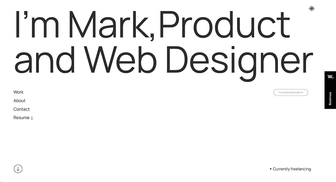
MKTLM
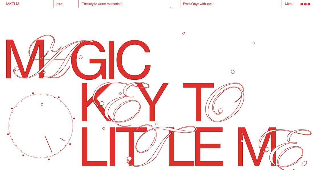
A combination of a simple san serif and outlined script make you look at the words on the screen here. The minimal background pulls it all together as do simple animated elements.
Function & Form
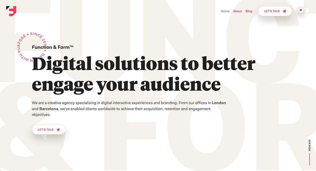
Function & Form uses multiple layers of text to create a stunning hero area that looks simple but is quite complex. There are trendy elements everywhere – the rotating circle, a serif typeface, heavy copy blocks – and it all comes together in a way that’s easy to read and understand while looking great.
Near North Studio
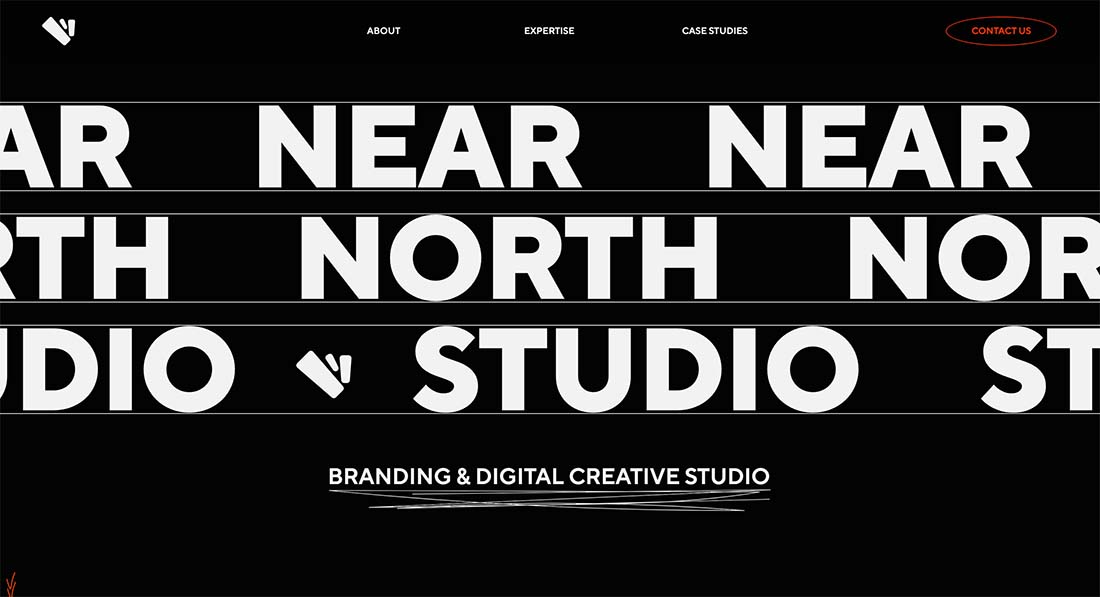
There’s nothing by itself that would make you stop on the design for Near North Studio, but when you put all the elements together, the typography-based design is striking. The animated scroller with three levels of text speed is attention-getting.
Liferay.Design
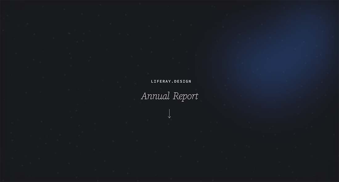
The combination of simplicity and subtle details in the background is what takes this typography-based design to the next level. “Annual Report” is in a typeface and style that’s unexpected and the simple animated arrow makes you want more.
ReadyMag
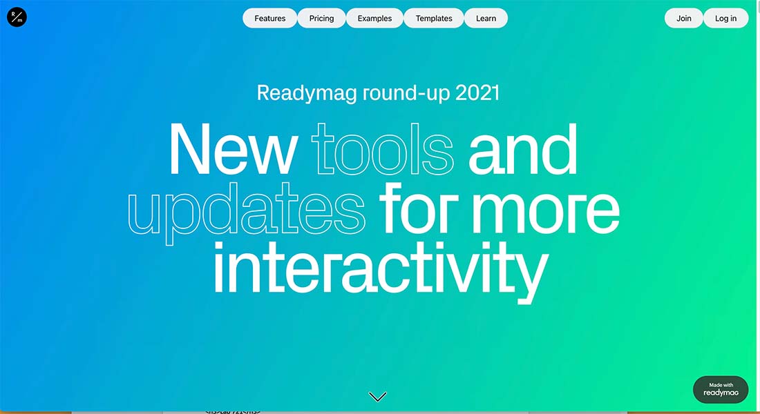
The design for Readymag might be the most simple on its face, but the color-changing background keeps you looking at the design. It is then that you realize the interesting divots and shapes to the typeface that also includes an outline style. The weight of the words really draws you in to figure out what’s next.
Conclusion
Now go find a fabulous font and get going with a stellar header that features typography. Don’t forget to add some subtle extras – such as motion or color – to create more focus and visual interest.
And edit, edit, and edit again. Nothing is more important than strong copy when your only visual element is words.