Dribbble, Philosophy and the Art vs. Design Debate
Always eager to jump into a debate, today I tackle the concept that artsy eye candy is currently too prevalent in design. Design inspiration galleries and communities are constantly critiqued for displaying art when their focus should be on design.
Can we cut through the biases and assumptions of the common rhetoric and discover the proper place for artistic talent in relation to functional design? Let’s find out.
Art Vs. Design
There has been a significant amount of discussion lately about the differences between art and design. There seems to be a tendency among designers right now to view aesthetic dressing as something inferior to function-based design.
As “enlightened designers” we take pride in our minimalist creations that score high on the usability charts while making heavy use of whitespace and simple typography. From this lofty position we look down upon the uneducated designers who are still using such antiquated effects as gradients, drop shadows and God forbid, a reflection.
An interesting and important aspect of this debate is that it sets up two distinct practices: art and design. Art being the practice of creating something attractive as an end in itself and design being the arrangement and styling of some form of communication or interface.
Dribbble Under Fire
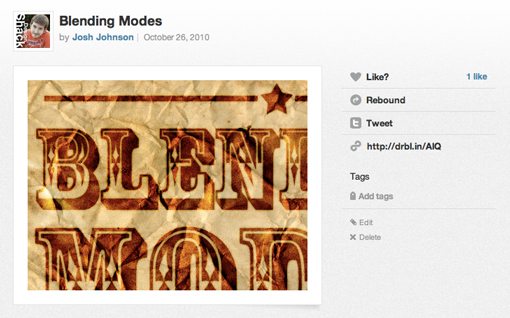
The star of this entire debate right now seems to be Dribbble, a self-proclaimed “show and tell for creatives”. Basically, you upload a little picture of what you’re working on (most often a heavily-cropped portion) for other designers to see, comment on and be inspired by.
The argument that I’m hearing from a lot of designers is that Dribbble is filled with a bunch of eye-candy that doesn’t really count as real design inspiration. So is Dribbble full of art or design? Which one should it be used for?
What’s The Big Idea?
The question that we’ll set our sights on today is whether or not this debate holds water. What is the relationship between art and design? Are they mutually exclusive? Is one better than the other? Let’s find out.
Why Design Isn’t Art
To start off, let’s give credence to the idea that art and design are genuinely not the same thing. One of the main reasons or proofs of this can be seen if you take a content-centric approach to design.
Design as we know it usually has one of two different functions. The first is commercial design: you want me to buy what you’re selling. This covers everything from business cards and letterheads to websites and cereal boxes.
It doesn’t matter if it’s for a corporation, an individual or a non-profit. It’s nearly always the case that the message is the primary concern. Messages, be they long or short, are inherently visually boring. Design’s sole purpose in this case is to take the message above and beyond plain text and transform it into something that is engaging from a user’s point of view. The designer can take a reserved approach or go crazy, either way, he/she must keep in mind that the focus is on the content.
The second type of design is interface design. This goes beyond software and extends to how we interact with real products in the physical world. Here the content-centric focus is on functionality. Buttons, levers, sliders, etc. make both real and digital interfaces easier to use. For instance, Photoshop has a wealth of functionality, which is the heart and soul of the software, by focusing on how to make this functionality user-friendly, the UI designers at Adobe have created the palettes, buttons and tools we know today.

Contrast these ideas with the concept of art. Art is emotional, whimsical, mysterious, fun, clever and often intentionally complex. There are underlying concepts that are meant to be peeled and chipped away at. The viewer can attempt to discover the artist’s intention for a piece or impose their own. Both prospects are equally legitimate.
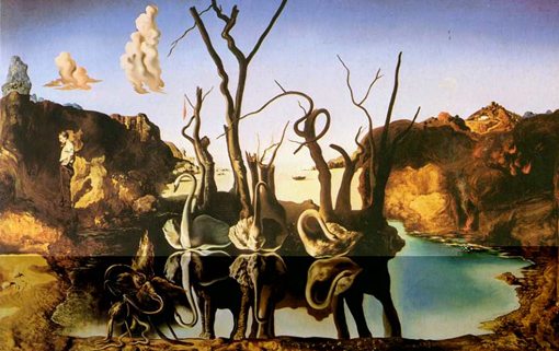
Art doesn’t need to have a clear goal or focus. It can, and many prefer that it do, but when these are stripped away it doesn’t cease to be art. This line of thought establishes that art and design are, at heart, different practices. However, at this point we’ve perhaps made too much of a distinction between the two. As is commonly done in this debate, we’ve created a conceptual chasm between art and design that doesn’t always exist in the real whorld.
The Science of Art
Have you ever taken a close look at art from the Renaissance period? If you have ever studied art history, you’ve no doubt learned that artists during this time often based their compositions on a triangle.
Don’t believe me? Take a look at one of the most famous pieces of art ever! See how Christ is structured with his hands spread to create a triangle?
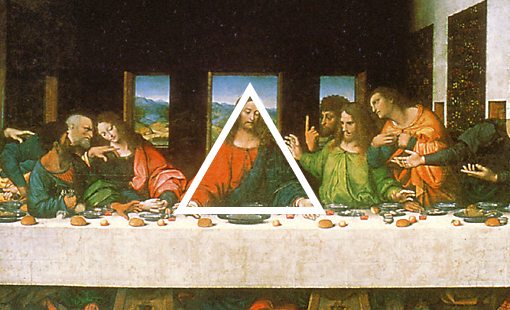
Leonardo, Michaelangelo, Raphael, I’m not talking ninja turtles mind you but famous artists who used triangles heavily in their compositions. Just Google “Renaissance art” and you’ll find that most of what you see has at least a subtle suggestion of a triangle.


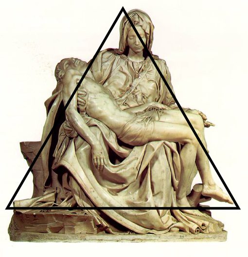
Why a triangle? This shape creates a strong structure that is attractive, balanced, and utilizes the number three, which was often ascribed importance. The key here is that these artists realized that triangles were a tool that helped them create better artwork. This hints at the possibility of there being a science to aesthetics.
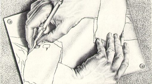
Let’s take a look at the work of another famous artist, M.C. Escher. This time we can identify several principles at work: contrast, repetition and symmetry to name a few.
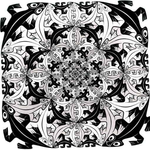
Do these concepts sound familiar? They should, they’re the same ones that we use to define good design! There is a massive realization here: a large portion of art is designed. Here we are arguing that art isn’t design and we find traces of design in art!
If we look close enough at art we find science, function, layout principles and even a message all mingling together in what we thought was purely an aesthetic exercise.
Presuppositional Thinking
In Philosophy you are taught to assess a thing in light of any presuppositions. This leads you to analyze the nature of different things by ascertaining what is most basic about them. As an example, the sentence “blicks are grue” is often given with the question of whether it’s true or false.
Obviously, you can’t know whether this statement is true without knowing what the terms mean. Therefore, meaning is more basic than truth. Put another way, truth presupposes meaning.
We find a similar relationship in art and design. We perceive something as aesthetically beautiful if it meets a certain criteria. Often, the criteria here is our recognition of order. We see intentional symmetry or maybe even a chaos of shapes with a nicely balanced color scheme and perceive art (sometimes even the noticeable lack of these things is also an artistic statement). We are using what we instinctively know about design to shape how we see art. In other words, design seems to be more basic than art.
We designers are visual creatures so let’s look at this a different way. Here’s an example of a great-looking web design. We see that an artist is at work here, there are several drawings and visual stylings that add aesthetic quality to the page. But the simple fact that this page contains art doesn’t mean that it isn’t design.
In fact, it’s possible to separate the design from the art to a certain degree. We see that the functional design of the page is more basic than the art layer that sits on top. However, the two work together to create a finished site.
So you see, the fact that design and art are two different things doesn’t necessarily negate the idea that the two are intensely related concepts. In the same way that design gives life to boring content, art gives life to boring design.
Can too much focus on art detract from the strength of a design? You bet. Are some designs genuinely stronger when they are simpler? Absolutely. But that doesn’t mean that art has no place in design or that designers shouldn’t strive to be good artists. Show me a good artist and I’ll show you someone that I can easily teach to be an amazing designer.
Stop Taking the Art Out of Design
This lengthy and perhaps overly-cerebral argument is meant to bring you to the conclusion that all this talk of how designers are too caught up pretending to be artists is misguided. Taking the two website examples in the previous section, if you can produce the second one, congratulations, you have a modicum of talent as a designer that you might or might not parade as superior in the name of minimalism.
This is all well and good, just don’t go and start looking down on the guy who made the finished Convax website design because in reality, he might just be a better designer than you.
Once upon a time, graphic design tools and artist tools were indistinguishable. In fact, our profession came from artists who were hired to make ads. Photoshop and CSS can now perform so much heavy lifting that we dare to suggest that artists should tone it down and remember that a bare interface is a good one. We complain that services like Dribbble are riddled with people possessing real artistic talent because we’re insecure about the fact that we can’t sketch to save our lives.
The bottom line is, I think it’s time for the design community to stop belittling the most creative among us. If someone Dribbbles something that you consider to be art, remember that just because you can’t see past the art to the design doesn’t mean it’s not there. Also remember that people enjoy aesthetically pleasing design. Finally, remember that, even if it’s a clear example of pure art for art’s sake, it’s still a good exercise that every designer should practice.
Conclusion: Drummers Make Better Guitar Players
As a guitar player, I always notice a lot about how other people play. One specific group of players that I am always envious of are those that began their musical education as drummers. Trained drummers have an incredible understanding of rhythm that your average Joe like me simply doesn’t possess. For this reason, when they pick up a guitar, the result is a much more rounded musician and ultimately, a better guitar player with much more complex and interesting strum patterns than someone who only knows how to play guitar.
This is a good metaphor for designers and artists. I’m admittedly more on the designer side of the spectrum than the artist side, but this doesn’t mean that I think my way is better. In fact, I envy and respect those with more artistic talent than me and I openly recognize that this talent makes them better designers. Good artists can make Photoshop do things that I never thought possible and dream up interfaces that people will line up to get their hands on.
In closing, consider that the great thing about communities of designers is that we can all learn something from each other. If everyone on Dribbble were just like me, it would be useless. Because there are people on there that can do things that I can’t or simply haven’t thought of, the service has value. Let’s focus on recognizing and learning from great designers more than shaking our fingers at those who create something that doesn’t fit into our conceptual box of what design is and isn’t.
