5 Tips for Designing the Perfect eBook Cover
People are going to judge your eBook by its cover. The cover is the first impression and first chance you have to hook a reader. It has to be visually appealing, include lettering that’s easy to read and entice users to download (and read) your book.
The perfect eBook cover stands out from all the other books available, communicates what the book is about and sells a benefit to readers for downloading.
That’s a pretty tall order for a design that users are likely to only see for a few seconds (if that) when deciding to make a purchase. But there are design elements you can use to help encourage downloads. Here are five tips to help you design the perfect eBook cover.
1. Use a Descriptive Image

There is so much competition for a reader’s attention when it comes to your book cover. Look at the row of suggestions for Goodreads, above. Some of the titles and covers stand out quickly and you have an idea what the book is about, while others leave you guessing.
In many cases a good, descriptive image helps sell your eBook to readers. It tells them a little something about the story therein and can help garner interest.

A descriptive image can be a photo, but it doesn’t have to be. Look at the cover above for “Death Comes to Happy Acres.” The outline of a cat on a colored background provides an immediate glimpse into a character in the eBook. The imagery also provides a great backdrop for the text that’s easy to ready and visually engaging.
A simple image is often better than something more elaborate when it comes to an eBook cover. Keeping in mind that many users will first see the cover at a small size on a screen (maybe even their phone), among other book covers.
2. Stick to Easy-To-Read Typography

While physical books can include a lot of text on the cover, that should almost never be the case for an eBook. The cover should, at a maximum, include three bits of copy:
- Book title
- Author’s name
- Any accolades, such as New York Times Bestseller
Easy to read typography can make or break an eBook. Text has to be easy to read and in a typeface that’s appropriate to the content of the book.
- Use the top half of the space for the title of the book, unless it is for a well-known author.
- Opt for a display typeface that’s rather bold. Sans serifs with uniform strokes are often easiest to read. Think of typography for an eBook cover in the same way you would display type for a mobile website. The shape and function are similar.
- Design plenty of contrast between the background and text to ensure readability.
- Don’t be afraid to make lettering big. A significant part of the canvas can be given to the book title.
- A drop shadow or interesting type treatment is acceptable, but don’t go crazy with effects. The goal is readability, not to have the flashiest effects.
3. Give Every Element Space

Because the canvas of an eBook cover is pretty small and because thumbnails are one of the first ways users will interact with the design, make sure to give every element plenty of space. Use of white space can make text easier to read, images easier to see and make the entire designer easier to understand at a glance.
Designing eBook covers allows you to use some techniques that might not otherwise be in your toolkit.
While website design is often focused on creating layers of content, such as text on top of images, eBook covers work better without a lot of layering unless there is a lot of space and color separation between elements. It’s OK to create a special container for text elements – such as a white box – to set lettering apart from the rest of the design.
Most eBook designs benefit from a familiar pattern of elements with the title at the top, descriptive imagery and the author’s name at the bottom (the title and author positions can be swapped).
The cover for “the Watson Girl: A Thriller,” above, uses this concept well. There’s a mysterious image, paired with bold easy-to-read lettering. There’s some layering and overlap, but the elements are mostly separated to ensure optimum readability.
4. Use a Standard Shape

An eBook cover should look and feel like a book cover. Nothing screams amateur like a square or misshapen book cover image.
Before beginning the design get specifications for the platforms where the book will be published. There are often image resolution requirements, file format and even multiple size requirements to consider. (Kindle and iPad cover sizes are slightly different, for example.)
Then try to design based on the standard book aspect ratio of 3:2, which is the vertical shape that most readers are used to. Leave plenty of room around the edges to account for slightly different ratios on different eBook readers so that the cover design looks the same across devices. (Many readers do pick up reading on multiple devices.)
Make sure to create the design in a high-resolution format (vector is best if you can). Remember, screens are getting better all the time and bigger, better files may be needed in the future and you don’t want to recreate eBook covers.
5. Develop a Brand Style

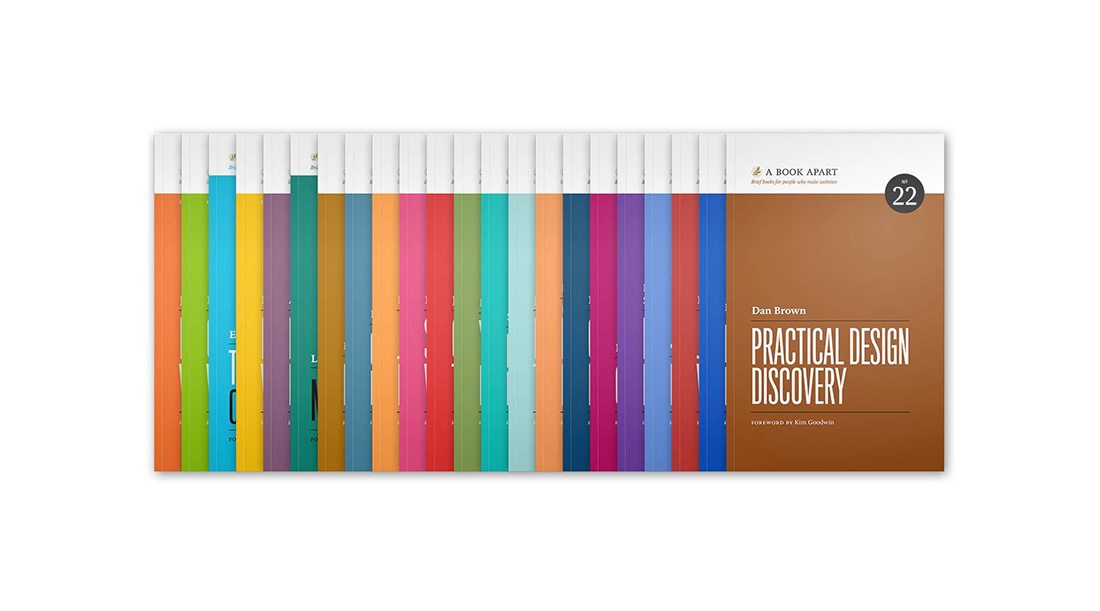
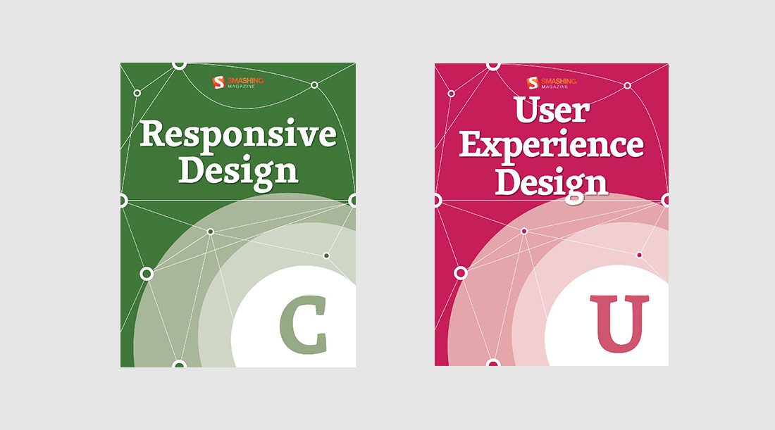
Authors should consider a brand style for eBook publishing. Use a similar theme for a series of books, the same typeface for titles or a consistent color palette to help readers identify eBooks.
Sue Grafton has a series of books with a single letter on the cover in a style that’s clearly identifiable. It makes finding each new book in the series easy and helps loyal readers find her books quickly.
While not every eBook publisher will have something so distinct to work with, a consistent color or typography palette is a good starting point. Use that same eBook cover branding in other places as well to help carry an established visual theme – social media, email newsletters and on the book website.
Conclusion
When designing an eBook cover, think in thumbnails. Most places where an eBook cover is listed won’t be at full-size or resolution; it will be featured in a list with other covers at thumbnail size. Every element in the eBook cover design should render clearly at that small size, with the most important elements being the imagery and book title.
There’s a strong chance that the thumbnail view is the only impression you’ll have before a reader decides to download or even see the full-size cover option and description of the book.
And remember, readers are judging almost every book by its cover – whether consciously or subconsciously – so it needs to look professional.