7 Tips for Effective Use of Icons in Design Projects
Designing icons can be a lot of fun. But once you have a good set, what do you do with them?
Icons are not just miniature links for Facebook or Instagram — they can be fully interactive cues that help lead users through a design and provide extra visual spark. Icons can be small or large, black and white or colored, flat or intricate. No matter what style appeals to you, effective use of icons can enhance usability and the aesthetic value of almost any design project.
1. Add Visual Interest
Not every image is going to be a breathtaking landscape. Sometimes images just fall short.
Fun iconography can help add more interest to these somewhat uninteresting photos. Use icons to enhance the content of the photo, provide an extra bit of information and provide an interaction cue.
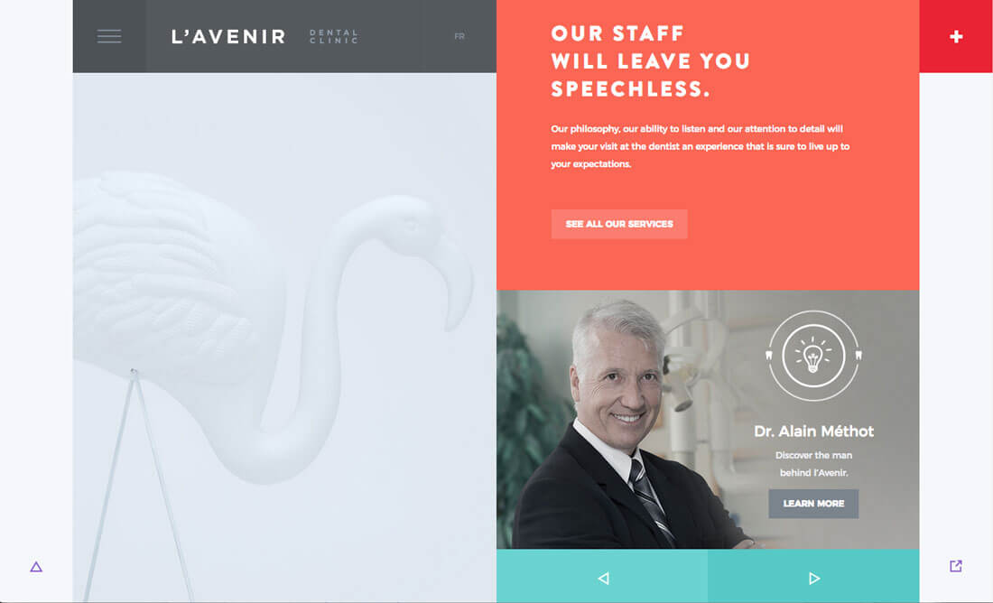
Take the example above for a dental clinic (admittedly, not the most interesting visual concept.) The design is fresh, bright and inviting. The simple icon next to the face is a new take on the “light bulb idea” – note the tiny teeth. The balance between the light part of the screen on the left and the bright white icon also helps draw the eye across the design. The rest of the site uses other tiny icons as well for navigation.
2. Create Interaction
Icons don’t have to fit into specific placements to encourage user interaction. (Too many templates use the three column icon/text combination in the scroll.
Icons can actually be the element that drives interactivity. Pair iconography and parallax scrolling so that items move across the screen. Layer icons with images or another background to create an element that’s a bit unexpected.
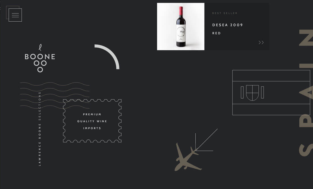
Boone Selections creates a travel scene for its wines using iconography in a way that makes you want to scroll. The airplane icon travels on a plane following the arrows on the screen (which react to scrolling). Each line-art icon renders as a drawing as the user scrolls to that part of the screen. The movements are simple, classic and highly effective.
3. Use Animation
No one ever said that icons have to be static elements. Animate them!
But don’t go too crazy. The best icon animations relate to the content of the icon itself. Movements shouldn’t be too fast because it can be a little unnerving. Movements shouldn’t be too slow because users might miss them. There’s a sweet spot in the middle where icon movement provides a bit of delight.
Sweet Punk does this brilliantly. The icon is the “same old lightbulb” that gets used everywhere, but with a stamp of personalization. Note the inside of the bulb – it’s a flame. Then there’s a fun hover action as the lightbulb bounces with an idea swirl. Further, the circle pattern around the lightbulb gently moves and seems to respond to mouseover patterns.
4. Create Icon Clusters
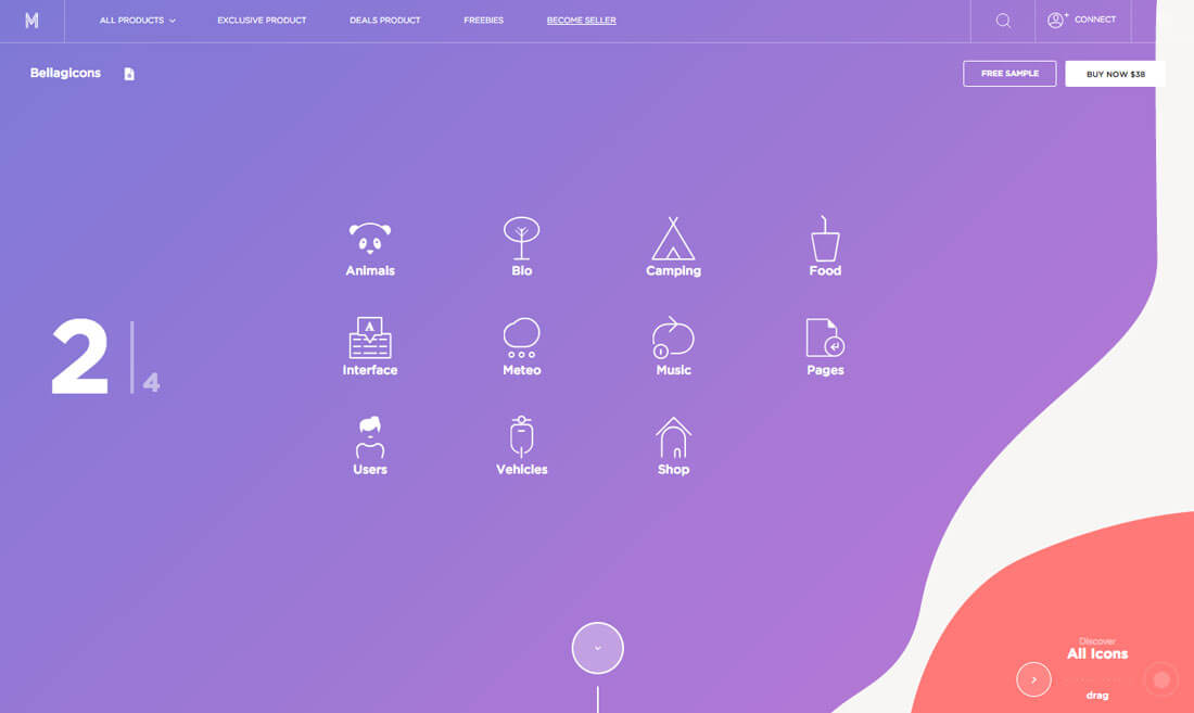
Clusters of interesting shapes, sketches or otherwise hand-crafted icons can make an interesting visual. The concept is displayed commonly on websites that distribute icon packs (such as the one above), but it has wider application.
Consider rows of icons – toy with using them under- or oversized for more impact – when you are lacking a good visual. Icons can work as links or just images that stand on their own. Clusters can include just two or three icons or three times that many. Let your content drive that decision-making process.
What’s nice about using clustered icons is that you can really think outside of the box and do something creative. The other bonus? You can even start with an icon pack if you like and customize icons to make them your own. Either option can be a lot of fun and give you a way to try something totally different.
5. Combine with Trendy Elements
Icons should be just one part of a design strategy for a project. Think about your content and pair iconography with another trendy element to create a modern aesthetic.
The nice thing about using icons is style flexibility. Icons come in seemingly every shape and form from line art, sketch-based styles to flat cut-out designs to elaborate miniature pieces of art. Once you have settled on a design style for a project, create a set of icons that match that visual tone.
The website for a History of Icons does this beautifully. The site showcases how icon styles have evolved over the years – which is a cool case study in itself if you are looking for more inspiration – but every icon is placed inside a container element in a material design style pattern, featuring rather flat layers, tactile movements, clean typography and bright color.
6. Put a Whimsical Twist on It
For certain icons, there are standard designs that you’ll want to use so that users know exactly what those elements do. This can include icons for social media links, search, shopping carts and navigational arrows. You should never sacrifice usability for a new design.
But you can put your own whimsical twist on these standard icon styles. Change the color, tweak the shape or even redraw the icons in your style. The trick is to do something that feels unique while maintaining visual recognition so that users don’t question what the icon means.
Simple changes can go a long way. This kind of adjustment can help common elements become part of your design and visual story as well.
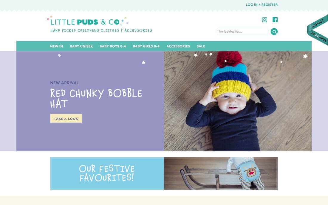
Little Puds & Co. does this in a way that’s absolutely charming. The common icons in the top corner are identifiable, but take on the website’s branding color. The icons seem a little softer than they would in the normal Facebook and Instagram color palettes and seem to match the more whimsical, child-like style used throughout the design.
7. Create Custom Sketches
Icons can be miniature art canvases in themselves. While the iconography trends lean more toward super flat, line art renderings, detailed sketching can provide a great custom option that is your own.
Every hand sketched set will be different. There’s no real way to categorize them other than to find something you can own. Sketched icons are often part of the identity of the brand that uses them.
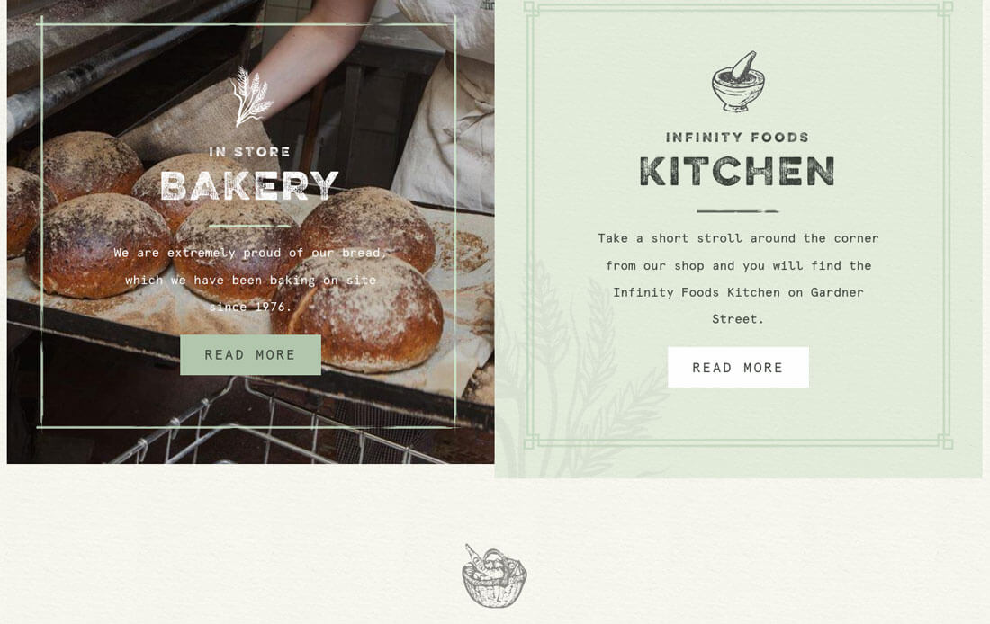
Infinity Foods uses this style wonderfully throughout its design. (You should really go click around to look at the full icon set.) The sketch style starts with the logo and the same detailed, pencil style is used for every icon element in the design.
Conclusion
While icons might be one of the least thought of elements in a design project, they can be one of the most interesting. Good iconography can pull together a project in a way that gives it that bit of polish and finesse.
The nice thing about working with icons is that a good, vector-based set can be used in a number of ways and at varying sizes. Interested in grabbing thousands of icons for a bargain subscription price? Creative VIP has you covered!