Effective Package Design Does More Than Look Good on the Shelf
Package design is deceptively simple. Many designers wrongfully approach this task as merely a matter of aesthetics and give no thought to the fact that packaging has to succeed on many variables.
Today we’ll go over some basic principles to keep in mind the next time you’re designing either the package itself or merely the artwork. Along the way we’ll see a few amazing and not-so-great examples to learn from.
Sell The Product
The fact that a package is created to hold a product is really a secondary goal from the designer’s perspective. From where you’re sitting, a package is created to sell a product. Many designers like to approach packaging as their own little canvas of creativity and the current trend is towards minimalism: the less the better. As much as we designers would love for that to be true, it simply isn’t always the case.
Consumers are cautious and want to learn about the products they are buying. If the first time they’re seeing it is on the shelf, the best way to do this is by picking it up and having a look. If all you have is the name of the product written in Helvetica on a white background, what are you teaching them? If the version of the product next to yours at Wal-Mart has a list of features and benefits, shoppers will reach for that one instead.
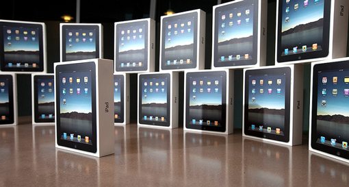
There are of course exceptions, but know what products do and don’t fit into this category. Every designer wants to create packages that look like Apple’s beautifully simple boxes with hardly anything on them but a photo of the product, but Apple can sell products like that for several reasons: a design-focused target market, an informed customer who knows what the product is already, and the fact that the Apple store doesn’t let you choose iPads from the shelf but rather allows you to play with the actual product and decide on a purchase before ever even getting a glimpse at the package. Can you sell a new vitamin-enhanced sports drink the same way? Probably not.
Package designers in the real world have to deal with complications: the consumer needs to know what the product is, how to make it work and why they should buy it. We’d love for them to be fooled by a nice font, but you have to give them more credit than that.
Also, don’t be tempted to think that shoppers should put design first (designers always think that), because we all know that a good designer can absolutely dress up a crappy product. Simply put, if the consumer trusts your fancy design, you’ll screw them over and they know it.
The Food Watcher?
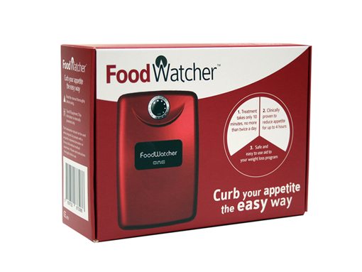
As an example, take the product below: The Food Watcher. Now, no one knows what the heck this thing is just by looking at it. The name is vague and the image sort of looks like a scale, which works with the concept of food so it’s easy to be mislead.
The designers and marketers working on this product were tasked not with simply creating a fancy-looking piece of cardboard to hold the product, but instead with creating an educational ad that informs people about the product and attempts to sell them on it.
It’s easy to spot marketing principles in action here. Right off the bat we see a call to action “curb your appetite the easy way.” This is an interesting promise that draws the customer in, where they can of course find more information about how the item works.
Is this my favorite package design? Far from it. However, I think it provides an excellent case study for people that want to design packages from a fantasy world where people spend their hard-earned money on products that they know nothing about simply because the designer slapped some edgy artwork onto the front of the box.
Know Your Target Audience
More marketing drivel? Isn’t this a design article? As we saw above, marketing should have a huge impact on how you create designs for certain products. You can’t simply impose your personality onto a product, you have to do your homework and learn who is meant to buy it, what their socioeconomic situation is, where they’re from, what their gender and race is and even what the typical personality traits are within this group.
The study of the target consumer is one of the most critical aspects of any product launch or redesign. It’s an extremely simple concept that you can’t ignore: if you know who you’re talking to, you can communicate more effectively.
When The Target Audience is Forgotten
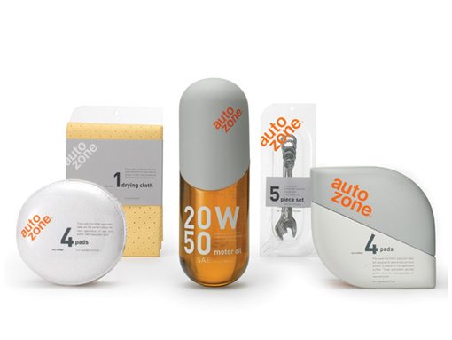
When you’re browsing galleries of concept packing design, there’s often a good reason that these seemingly great ideas will never see the light of day. Take the student project below. On the surface, this person has created some really cool looking packages by utilizing interesting shapes, materials and colors. From a pure design perspective, this is great work!
However, when we bring marketing into the mix, things go downhill fast. Without any research, I’m going to guess that the typical Auto Zone customer is a low to middle class male in his thirties. These guys aren’t clean cut and shaven, in fact, they’re not clean at all. They walk into the store with grease on their hands and oil stains all over their shirts. Not because they’re generally nasty people but because they’re working on a filthy car!
Typically, these types of guys like sports (Auto Zone always has NASCAR promotions), drink beer, love red meat and wouldn’t be caught dead getting a manicure.
Now, weigh this group of manly men against the products above, which look like they came out of a health spa. Do you see how the target audience is way off the mark? These products might appeal to a 21 year old female college student, but Joe the mechanic would surely scoff at them and perhaps even be embarrassed to be seen carrying one of them!
Several of the men in my family are frequent Auto Zone customers and I know for a fact that if Auto Zone tried this, my dad would head to Napa or Checker (competing stores) in a heartbeat.
You could try to make the argument that reaching out to new segments is a good thing. The problem with this logic is that you can’t gun for new customers in a way that alienates the people that keep you in business.
Let the Product Inspire You
One trick that is almost always a good idea is to draw design inspiration from the product itself. This can take the form of color, shape, size, materials, photography, etc. Whatever you can do to make the packaging consistent in some way with what’s inside.
At heart, this is merely utilizing the concept of repetition in design. The product itself has been designed a certain way, and you’re repeating that in some attractive way with the package.
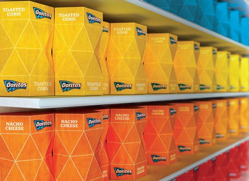
The Doritos concept box below is an excellent example of this type of thinking. While most chips are round, Doritos have always stood out due to their triangular shape. This designer leveraged that trait and used triangles heavily to define shape of the box.
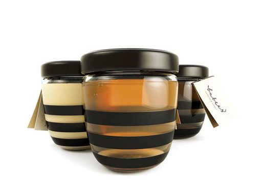
Along this same line of thinking, here’s an awesome honey jar that breaks the bear shape cliché and instead opts for an awesome design that immediately makes you think of a honey bee.
Make It Practical
While taking inspiration on the shape of a product, don’t let your imagination run too wild. There are a few variables concerning practicality that you must consider. One of these is shipping. Is the shape of your design such that the products can fit closely together in a crate or is your idea going to make the product more expensive to ship? IKEA is known for closely integrating shipping concerns into their initial product and packaging design phase. Everything from their boxes to the shapes of their cups are created with shipping economies in mind.
The second variable is practicality from a consumer’s standpoint. Is the package unwieldy and awkward to them? Will is stack nicely in their pantry? One idea that occurred to me upon seeing the Doritos box above was that a small travel version could be made to fit perfectly in a typical vehicle cup holder, making Doritos a very convenient snack for road trips.
Leverage a Good Brand
My final piece of advice for creating effective package is to find ways to really feature the brand identity of the product for which you are designing. This obviously works best for those rare designers who are working with really big brands that are instantly recognizable by a huge audience.
In these cases, you might think that it’s a given to feature the brand heavily, but many companies actually hide it with busy, confusing or even overly generic designs (Tropicana and Pepsi are excellent examples that we’ll take a look at in an upcoming article).
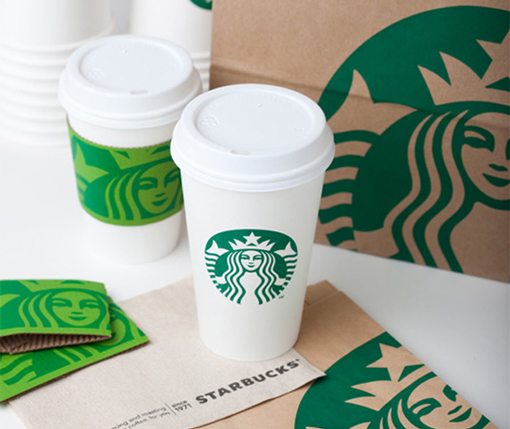
Check out the result of the recent Starbucks rebranding. Yes, they simplified their logo, but in a way that really enhanced their recognizable icon rather than ruining it. The packaging that arose from this project features the logo as the hero in several different ways.
This concept is far too simple for most brands, but with a mega-brand like Starbucks it’s really all you need! Notice how friendly the brand seems now with such a strong emphasis on the smiling face illustration. It’s also interesting to note that most of the previous branding said “Starbucks Coffee” while this new direction simply says “Starbucks” a subtle yet powerful hint that the brand would like to emphasize that they are more than coffee (they have tea, baked goods, breakfast, etc.).
For Small Brands
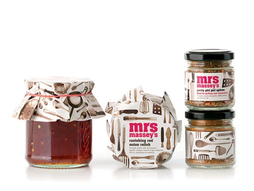
This same concept can apply to brands that aren’t instantly recognizable the world over, just in different ways. For example, I’ve never heard of the Mrs. Massey’s brand below, but I think the personality of the brand has really been executed in a stellar way through the packaging.
Just the name “Mrs. Massey’s” makes you think of a kind old lady making sauces at home. The designer here ran with that concept particularly well with the products on the left side of the image above. I love how the jars mimic that home made look with the decorative cover for the lid.
Conclusion
Today’s packaging design advice was to remember that your goals are to sell the product, know your target audience, let the product inspire you, keep practicality in mind and always leverage a strong brand.
These tips will not only help your designs be more attractive, but more importantly, more effective. Never forget that commercial package design is most often not to be seen as your own little art project but as a marketing challenge aimed at appealing to the right people in such a way that inspires purchase behavior.
