Favicon Examples, Best Practices and Techniques
Do you ever pay attention to those tiny icons at the tops of browser tabs? How about when you save a shortcut to a website or page online? Those tiny images, or favicons, are designed especially for that purpose.
There’s a pretty distinct difference between what makes for a good or bad tiny icon. You’d be forgiven for thinking that design decisions at the tiny scale matter less. But a poorly designed favicon can reflect badly on your brand.
Today we’re looking at what these icons are, basic design techniques for them, and the specs you’ll need to follow.
What Is A Favicon?
Simply, a favicon is a small, transparent icon used to represent a website, brand, or business. Favicons help improve user experience by providing a consistent marker that tells website visitors that they are on the same site as they navigate thanks to a consistent visual.
The term favicon comes from “favorite icon.” This terminology dates to Internet Explorer days when bookmarked pages were called “Favorites.” The favicon was first adopted by the World Wide Web Consortium (W3C) for HTML 4.0, circa 2000, and it started appearing more consistently in browser windows the following year.
Use favicons to flip quickly between browser tabs, identify a bookmark, or find a saved app or shortcut on your phone. The visual identifier is what most people use to associate these links and pages with the right button to access them.
Traditionally, favicons used an .ico file format, but that’s less of an issue now. Any transparent file type will work in most instances; .png is often the format of choice.
Technical Considerations
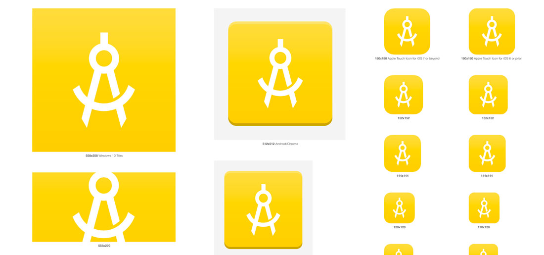
At one time all favicons were super small 16-pixel squares. That’s not the case anymore with more high-definition retina screens and shortcut icons to consider.
HTML 5 includes standards for favicons with multiple sizes for all kinds of uses, from tiny browser icons to computer docking station icons to home screen icons. You don’t even really need that 16-pixel square anymore.
Modern favicon sizes and usage:
- 32×32: Standard for most desktop browsers (replaces 16×16)
- 128×128: Chrome store and small Windows 8 star screen icon
- 152×152: iPad touch icon
- 167×167: iPad Retina touch icon
- 180×180: iPhone Retina icon
- 192×192: Google Developer web app recommendation
- 196×196: Android home screen icon
Best Practices
While it seems like an icon that’s so might be insignificant in terms of the overall design, that’s far from true.
A favicon says a lot about your brand and website. Users have come to expect them if they can’t identify them by name. These small elements contribute to the overall user experience and brand.
So how can you make the most of a favicon?
Keep these best practices in mind:
- A favicon should connect to your brand identity, but is often too small to include an entire logo. Use an identifiable element such as the first letter of your brand name or a tiny mark that you use in conjunction with the brand.
- Think about shape. The space for a favicon, by default, is square. If you want anything else, a transparent background is necessary. Some systems can also round the edges, making that another consideration to keep in mind.
- Make sure the file is small, but not too small. Upload a favicon size that will render properly on most devices, but won’t bog down the overall website.
- Avoid words or complex elements in the favicon design.
- Stick to a simple streamlined color palette for the favicon. It’s too small to get crazy with color. That’s why most of these tiny icons use little more than a background and foreground color with a lot of contrast between the two.
Design Techniques

Since a favicon is small, you might be inclined to design it on a whim in Photoshop. That’s not the recommended route for longevity.
Build your favicon in a vector tool such as Illustrator or Sketch, then export the design to the necessary sizes. This will ensure that as screen resolutions change, you’ll have a favicon that stands the test of time. (All you’ll have to do is re-export at a new size.)
The top visual design rule for favicons is to keep the design simple. Don’t go overboard with color or text or brand elements. Looking at the examples in this post, you’ll see that almost all of these tiny elements are readable at 16 by 16 pixels.
Avoid tricks such as animation; they only get in the way here.
Consider it a design challenge. It can be pretty tough to create something so small that it’s easy to read.
Save the file as a transparent png. It’s a good habit that ensures you won’t end up with odd edges or borders on the favicon. (Nothing looks worse than a jagged white edge surrounding the icon.)
Use the principles of good design. You never know when the favicon might be used for something at a larger, more visible size. Saving a website bookmark, for example, can use a large version of a favicon. The same is true for docking and even in search engine result previews.
Even though it is small, this icon represents your brand. Design it well.
Once you have the file ready, you can add it to your website with just a couple of lines of code. (Many WordPress themes and website builders already have a favicon element included so you don’t even have to think about this step.)
After uploading the image file, insert the following code into the header of your website, noting that “iconpath” and “iconname” refer to your specific file element:
- HTML index file: <link rel=”shortcut icon” type=”image/x-icon” href=”iconpath”>
- WordPress: <link rel=”shortcut icon” type=”image/x-icon” href=”<?php bloginfo(‘url’) ?>/iconname”>
Examples
The examples below include some brand elements with associated favicons. (Make sure to click through and show the designers some love on their Dribbble pages.)
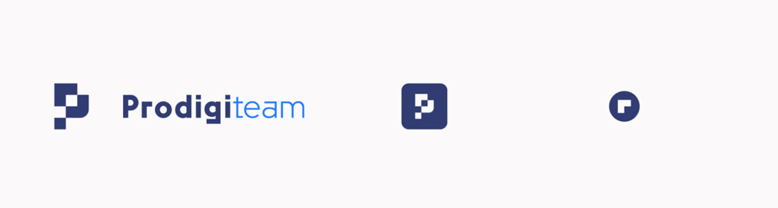
Prodigi.team Responsive Logotype
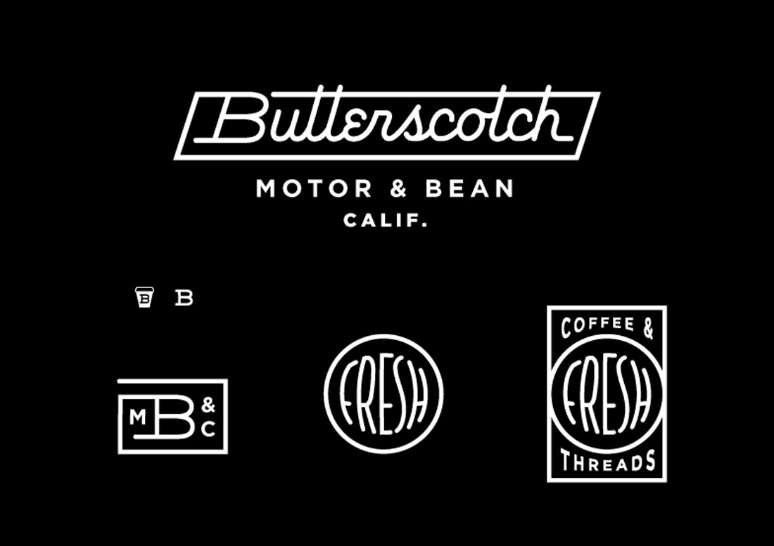
Butterscotch Proposed Logo System
Logo Favicon Display
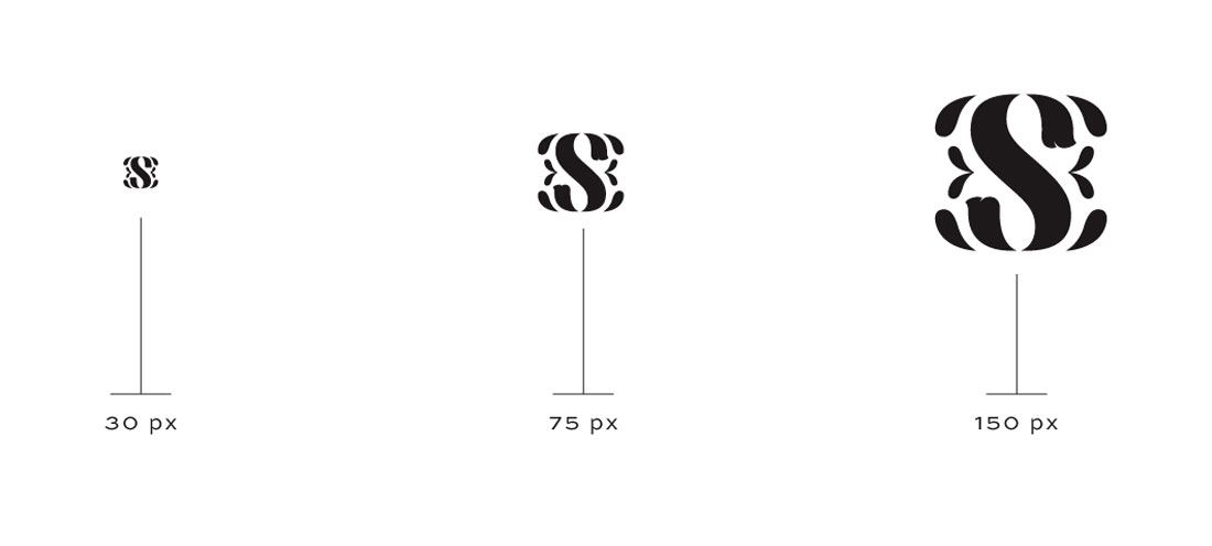
Favicon Template
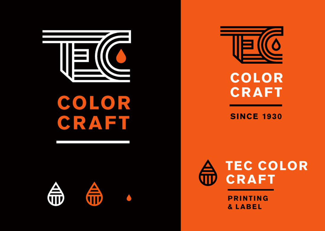
TEC Logo Option 2
Conclusion
What favicons lack in size, they make up in user experience. These icons serve as navigation tools for visitors on your site and those that tend to leave too many browser tabs open.
As a general rule, a favicon is a quick visual identifier that links the user to your digital presence. Take care with it to ensure it is the best, more accurate representation of your brand.