Flat Design: An Evolving Trend
Is the flat design trend finished? We don’t think so. It’s not dead yet. But the trend has evolved to be less stark and more engaging for users.
The early days of flat design were marked by a complete lack of design elements such as shadows, gradients, or realistic elements with texture. Many of those design elements are back, but are being paired with the overall idea of flat design to create a website user experience that’s both simple and easy to engage with. Depending on what side you are on, it might be a better version of flat design.
Here’s a look at the flat design trend evolution, and where we are today.
Flat Design 101
Flat design was the rebellious answer to all the overly realistic – and often fake – three-dimensional elements and textures that flooded the web in the early 2010s. Part of the overly real design paradigm came from Apple, because that was the style of icons in the app store and on its devices. (The company eventually switched to a more flat style after the trend really got going.)
Flat design really was just that. It embodies clean lines and a more 2D style that proponents said made it easier to understand and use. Flat design schemes also focused on high color and typography-focused elements, rather than lots of images. Commonly a single image or illustration can carry the entire homepage in a flat design scheme.
The problem with truly flat design is that wasn’t always the case. Some users found the stripped down styles lacked enough information to help guide them through the design. But, overwhelmingly, designers loved it. Flat design is probably one of the biggest and most revolutionary visual trends of the past decade because it lives on.
Material Design
To fully understand why flat design changed so quickly, it’s important to look at material design, the visual language Google established for its products and apps.
Material design took the best parts of flat design and then added back subtle touches of dimension. The concept focused on enhancing usability and user interaction by merging the digital world with reality using tactical effects and realistic motion.
It brought back elements such as drop shadows and seemed to “soften” the almost harsh nature of early flat design.
Material design is a well-defined concept with plenty of ever-changing documentation by Google. It, too, continues to evolve with trends and user wants. Why material is so important to flat is that it pushed the evolution of flat that much faster.
Flat 2.0
Enter Flat 2.0. Here’s how we described the trend in the early phases: “Flat 2.0 is easier to use because it combines the best of flat design with additional user interface cues to help you create website design that’s beautiful and functional. It’s also highly adaptable and works with almost any concept. Unlike some of the purest flat designed websites, Flat 2.0 combines elements of flat with subtle additions to enhance user-friendliness.”
We did not come up with “Flat 2.0” at Design Shack. It was first used by designer Ryan Allen: “Flat 2.0 is an evolution, not a revolution. Where flat design was a radical departure from the rampant skeuomorphism of days gone by, Flat 2.0 is a playful branch off the flat tree. Flat design is the Christmas tree, Flat 2.0 is the ornaments and candy canes. And presents. No tinsel though, that stuff is a mess to clean up.”
Flat 2.0 allows designers to break the hard rules associated with flat design and bring back some of the techniques that make visuals more engaging (in moderation, of course).
- Highlights
- Gradients
- Multiple tints and color values
- Drop shadows
- Any color palette (not just super bright)
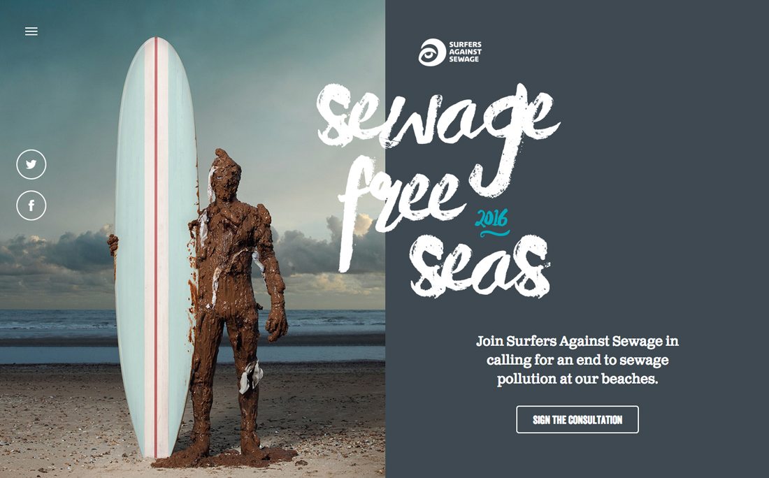
Flat 2.0 doesn’t live in a world where everything is a UI element or icon. Photos and videos are a large part of Flat 2.0 interfaces. (Many early flat design purists thought these visual elements took away from the pure intent of the aesthetic.)
Flat 2017
Now most designs fall somewhere in the middle of all these trends and ideas. There’s still a real leaning toward flatter styles, but there’s much more to the designs. This evolution hasn’t been named yet, but you can see common characteristics in many website designs.
Here’s what flat design looks like in 2017:
Flat Elements
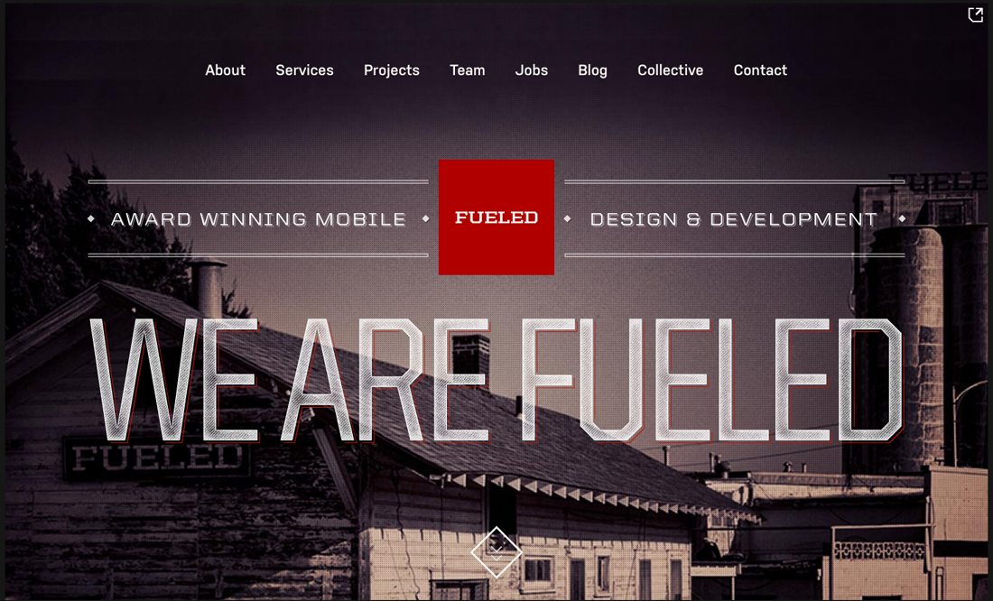
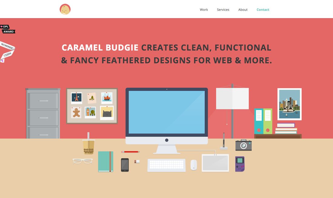
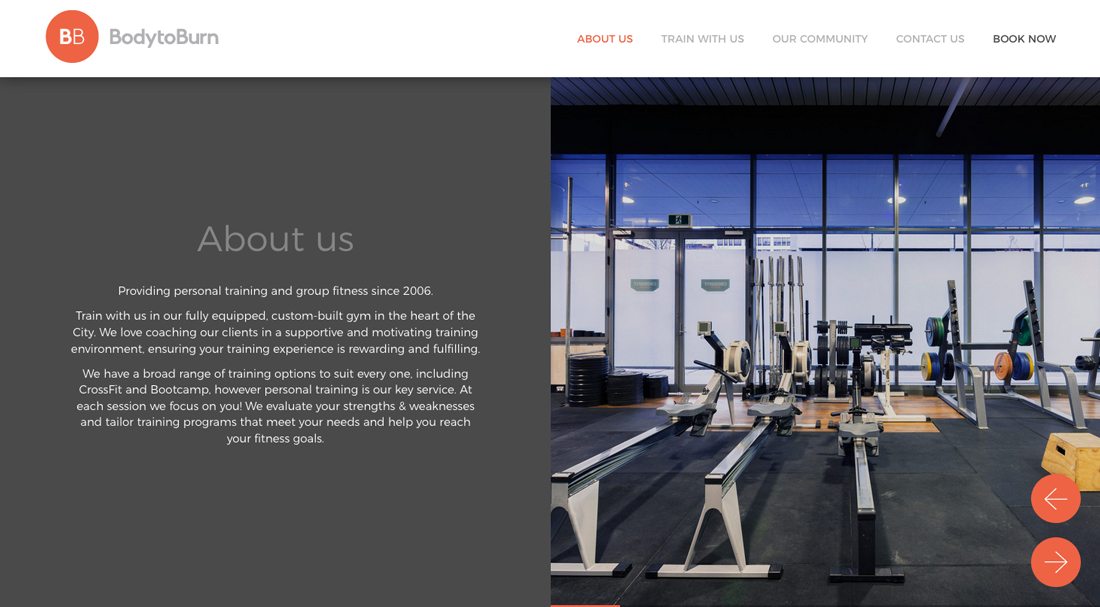
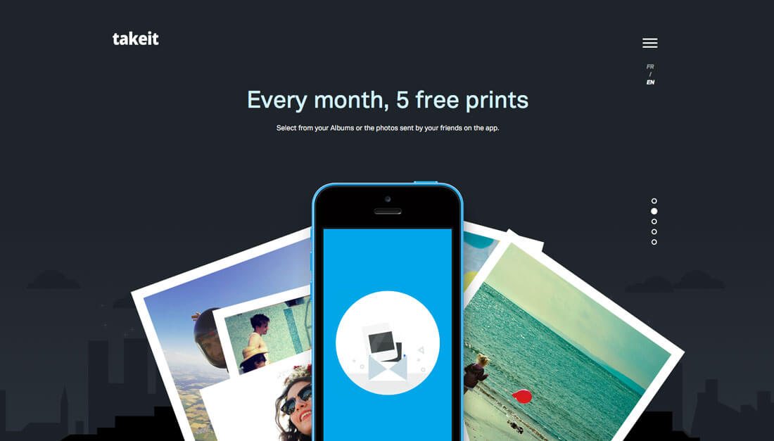
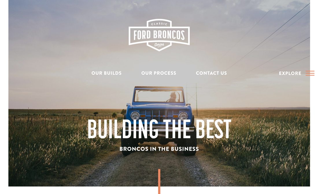
Many of the button styles and user interface elements from early flat design projects stuck. The more simple button style – rectangle box with square or slightly rounded edges with white of black text – is common. Logos and icons also took on that flat style, and paired with a more elaborate homepage design, these really stand out.
Streamlined Navigation
The hamburger icon and hidden navigation was born out of flat design because designers were trying to strip elements out of the visual flow.
Bold, Bright Colors
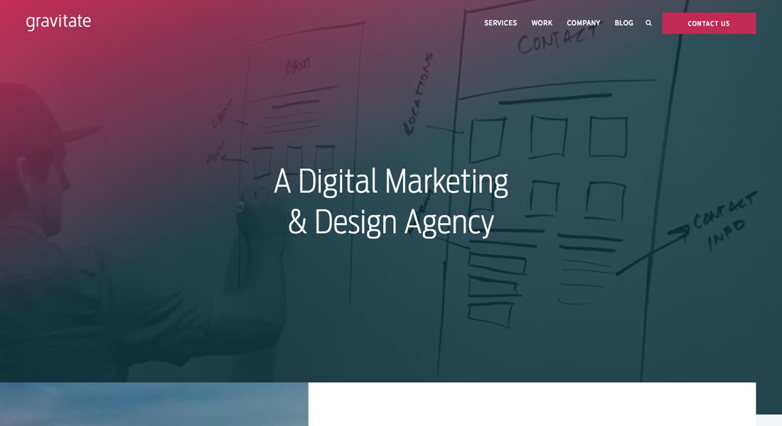
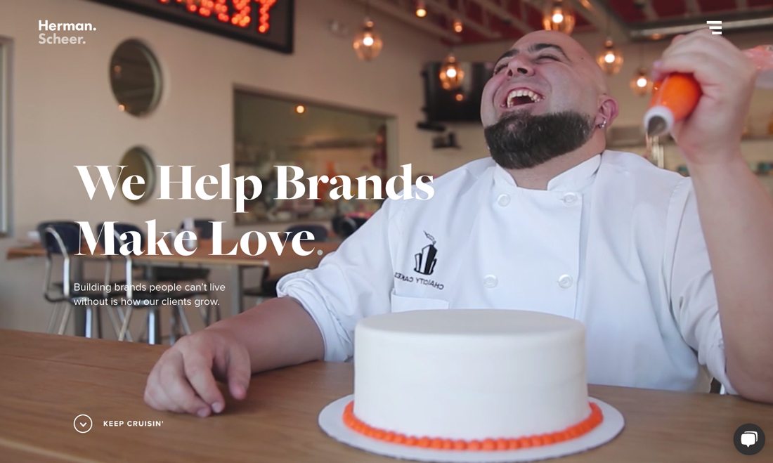
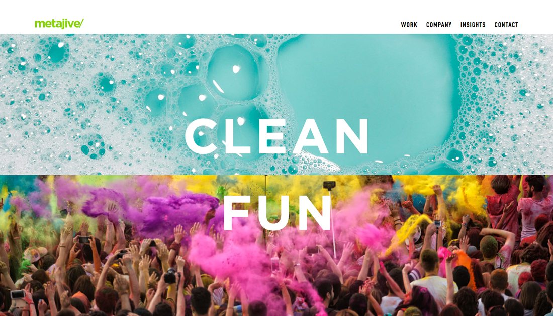
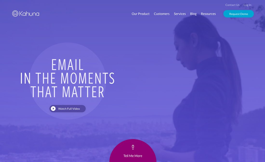
Thanks to bright color palettes and acceptance of more color overall from flat patterns, the web got a little happier. This has evolved to a big current trend of using bright color gradients on homepages, as a dominant visual or as a photo overlay.
Minimal Homepages
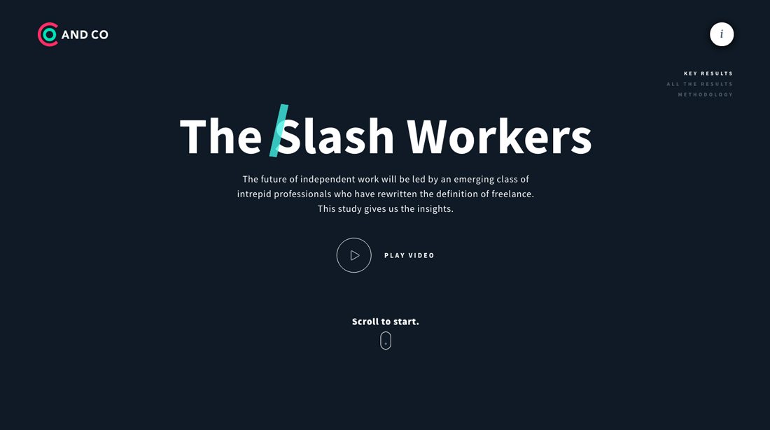
As a general rule, homepages are a lot less busy and tend to focus on singular actions. Even with multiple elements, a single user direction or action makes the entire project seem a little less busy.
Better Typography Everywhere
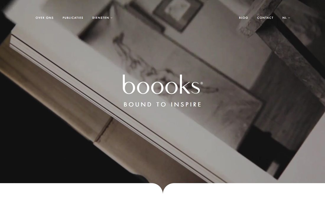
Stripped down designs had to focus on great type. That idea paired with the growing use of better type kits and web typefaces has made it easier for designers to focus on typography online.
Fewer “Fake” Effects
Skeuomorphism really hasn’t come back. While more design techniques are being used in 2017’s version of flat design, the over-designed-trying-to-be-real styles have not re-emerged.
Integrated Motion and Feedback
The biggest takeaway from material design was the idea of the feedback loop as it applied to visuals and communication with users.
Plenty of Whitespace
Screens have gotten larger (on desktops and mobile devices) and designers are taking advantage of that space by using it as whitespace to maintain the minimal feel of flat. (And most of the time, this extra space isn’t white.)
Flat Layers
Layered elements without ornamentation can look great and provide additional information for users.
Oversized Design Elements
Large text, large images and large buttons and icons are pretty much the norm, thanks to even the earliest projects using flat design.
Conclusion
The evolution of flat design has left us with a better web. It’s easier to read; it’s more usable; it just looks nicer.
The best thing about this trend – and the reason it lives on – is that it is flexible enough to evolve with ease. Designers can take the parts and concepts from flat design that work best and incorporate them into almost any project. That’s why we still see so much of it in today’s projects and why flat design wasn’t just another short-lived fad.